Infographics are great communication tools because they deliver information quickly, efficiently, and in an aesthetically pleasing package. A truly great infographic piques the readers’ interest from the jump, tells a strong story, and presents content in a way that makes it easier to consume, synthesize, and ultimately recall. But how do you write an infographic that does this successfully? Glad you asked.
We hate when bad infographics happen to good people, so we’re here to help you. Having created infographics for over a decade, we’ve picked up a few tips and easy tricks that will make your infographic far more engaging, interesting, and effective. Just read on.
How to Write an Infographic Effectively
Just because you make an infographic doesn’t mean you’re communicating well. Too many marketers think slapping together words and pictures will suffice. Hence, the Internet is littered with lengthy, dull, and poorly designed pieces that contain zero story but sure do waste a lot of time.
To write an effective infographic, every data point, piece of copy, and design element must support the core story. Here’s how to make sure your story stays front and center—and keeps your viewers’ attention along the way.
Step 1: Hook the reader with an interesting title and subtitles.
Titles and subtitles are easy ways to draw the viewer in, as they’re what people tend to scan first. This is a prime opportunity to capture attention, so it’s important to generate interest and stay on story.
When you write an infographic, make sure your titling is relevant to the subject and fits the story. Sometimes the titling will come naturally (before you even write the bulk of the story), but other times you’ll need to spend some time on it.
Note: While there are plenty of opportunities to use creativity in your titling, clarity and specificity are always important. A punchy title is key for drawing in viewers, yes, but going overboard with alliteration or puns can be tiring and sometimes totally distracting.
Example: This infographic by Learning House uses simple, intuitive titling to communicate the infographic theme and lead the viewer through the content.

Step 2: Provide context for the data.
Data is a great storytelling tool, but sometimes you need to do the heavy lifting by highlighting the significance and meaning of the data they’re looking at. Consider who will be reading your infographic, what their knowledge level is, and if additional content can make the data visualization impactful.
Additionally, if you have multiple data visualizations, use copy to tell that story clearly and draw the connection between them. In the case of a single dataset, one explanatory paragraph is typically all you need. (If you’re having trouble finding the story in your data, here are 5 easy ways to uncover it.)
Example: This Newscred infographic effectively calls out and summarizes data findings to communicate the significance of the data.

Step 3: Guide the reader through in a logical hierarchy.
Ordering your content in a logical and concise way is essential. As a general rule, an infographic should start with any necessary background information to give context to the content, then move through the story (and/or data) intuitively. We recommend a 2- to 3-sentence introduction to the whole graphic and 1 to 2 sentences per sub-header.
It’s also helpful to structure (and design) content modularly. This helps you organize your thinking (e.g., if this, then this, then this…) and makes it easy to extract single panels to accompany other relevant content (e.g., blogs) or promote on social.
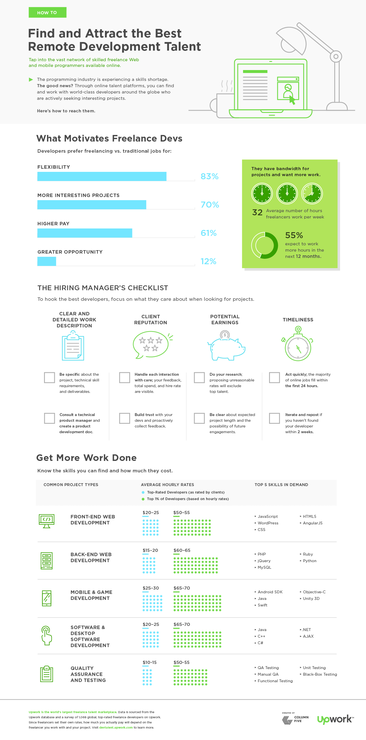
Example: This Upwork infographic uses clear section headers and modular design to guide readers through the hierarchy.

Step 4: Highlight notable story findings/insights.
When your objective is to convey a clear and specific story (rather than a more explorative experience), it’s important to directly call out key takeaways.
While you may have a clearly defined story or message, your tone should remain analytical, not opinionated. (The interjection of opinion makes for a clear bias, which calls into question the integrity of the data being presented. This includes any biases that may come from mentioning a brand or sales messaging in the copy.)
Example: This Digit infographic makes good use of callouts, drawing readers to the most significant content.

Step 5: Provide a sound conclusion.
Once you’ve presented your story, you want to lead your viewer to a desired conclusion without spelling it out for them. This can sometimes be a delicate balance between making a strong statement that clinches the narrative for readers and one that allows them to form their own opinions. Most importantly, it’s important to offer some sort of solution or recommendation that speaks to any challenges or hypotheses introduced in the opening paragraph.
Example: This Lucidworks infographic makes a strong statement, emphasizing collaborative tools as the solution to a CIO’s biggest challenges.

The most impactful editorial infographics have narratives that are focused and direct as they communicate sometimes complex ideas and information. In order to give your infographic the greatest opportunity for success, spend time refining the story you want to tell before you begin, and make sure every piece of copy you write plays an essential role in its unfolding.
7 More Ways to Make Sure Your Infographic Is a Success
Remember that everything from copy, to design, to distribution influences whether or not you get eyes on your content. Follow these tips to make sure your infographic gets the traction you want.
- Improve your infographic production process. Use this creative brief template to keep everyone on the same page, and see our complete guide to make effective infographics, which covers everything from brainstorming to distribution.
- Follow best practices for infographic design. Experiment with different infographic design styles, and find how to avoid the most common infographic design mistakes.
- Use your visual language. A strong brand identity is crucial to create consistent, cohesive infographics. Find out how to keep your infographics on brand.
- Get inspired by the pros. Check out these 75 examples of beautifully designed infographics.
- Use better tools. Here are 101+ tools, tips, and tricks to make the process easier.
- Optimize for SEO. Here’s our handy guide to make sure your infographic gets the most traffic.
- Repurpose your infographics once they’re live. There are plenty of ways to repurpose, reuse, and remix your old content. Learn how to bring yours alive through motion.
Most importantly, don’t be afraid to call in re-enforcements if you need a little support. If you’re on the hunt for an infographic design agency, ask these 10 questions to vet them and try these tips to work together more effectively. Of course, we’d be happy to chat about whatever you need. Just holler.


Wow! This has been one of the best sites I have ever visited! I have just spent the entire afternoon lapping up all your free resources. Thank you so much for leading by example and creating content that adds value and educates your audience. I am a solopreneur so free, quality marketing information is never wasted on me.
You guys rock!
That’s so awesome to hear! Glad to help.