
Infographic design is no different than any other type of visual content design. It’s not just there to make things look pretty; it’s there to help tell the story. According to MIT, the brain can process visual information in as little as 13 milliseconds, which is why infographics are such an effective tool—if done well.
Infographic design plays a huge role in how you communicate your story, but too often we see design that does a disservice to the content. Whether it’s too cluttered or too confusing, bad design is one of the biggest threats to your infographic’s success.

15 Common Infographic Design Mistakes
Remember: The number one goal in infographic design is to enhance the story through design. To make sure you’re doing that, here are 15 of the most common infographic design mistakes to avoid, plus our best tips to help you fix them.
1) Incorrect or Weak Data Visualization
As data visualization geeks, this might be our biggest pet peeve in infographics. It’s also an epidemic. Too many infographics feature misleading data visualization that incorrectly or inefficiently displays data. Even if you choose the right chart (which many don’t), you still need to design it to make the data as easy to understand as possible. Little things like ordering, labeling, color use, or comparison can greatly impact the success or failure of your data visualization.
The Fix: Brush up on your data skills to make the most impact. Start by following our guide to designing the most common charts and graphs. Once you’ve designed visualizations, carefully review them to see what might be added or removed to increase comprehension (think adding a trend line to a line chart, adding or removing labels, etc.). You can also check out our 25 tips to improve your data visualizations, including best practices and helpful breakdowns to help you present your data accurately and effectively.
Example: Marketo’s “Email Cheatsheet” infographic features a variety of simple data visualizations that follow best practices and support the story.

2) Endless Length
Admittedly, we thought this trend had died a few years back, but we still come across the endless-scrolling infographic from time to time. (The only one that did this well was Joe Chernov’s “Shark Attack” infographic—and that only worked because the outrageous length was the encoded message.)
The Fix: If you’ve tried to cut content but you just can’t lose it, consider breaking it up into an infographic series to get more mileage for your work.
3) Visual Clutter
Even though everyone preaches the gospel of white space, we still see instances where infographic designers try to be “economical” with space and therefore cram it all in. The problem is that when you emphasize everything, you emphasize nothing. Common culprits: chart junk, drop shadows, 3D, callouts, overlabeling, irrelevant or superfluous illustrations, etc.
The Fix: Focused and thoughtful visuals will increase comprehension and ensure your story is portrayed in the clearest way possible. Keep your design focused on enhancing the key takeaway you want your audience to remember. Anything else can actually work against you—even if its pretty.
4) No Visual Language
This might be the most common infographic design mistake we see. A brand makes a ton of different infographics, and each looks like it was made by an entirely different brand. A visually consistent brand identity makes a tremendous impact, so creating and adhering to guidelines in every aspect of infographics—from data visualization and colors to imagery and logo placement—is crucial.
The Fix: Make sure you have a strong, easy-to-understand brand style guide with guidelines specifically for your infographics.
5) Too Much Typography
Typography can give your viewer a clean, intuitive experience—or a total headache in the form of intruisive headers, indiscernible labels, and more. Beyond using too many typefaces or type styles, inconsistent type doesn’t bode well for building and preserving your visual brand.
The Fix: Limit the number of font families used to no more than 3 or 4 total, and keep type styles consistent throughout.
Example: Manduka’s “Find Your Soul Mat” infographic uses a chic, clean typeface that is easy on the eyes, well spaced, and follows a clear typographical hierarchy in terms of headers and callouts.

6) No Clear Hierarchy
Aside from too much visual junk, hierarchy is all but nonexistent in many sloppy infographic designs. If you’re trying to deliver a specific, clear message, it’s fairly impossible when your reader doesn’t even know what block of text to look at first.
The Fix: It can help to wireframe out the hierarchy/structure of your infographic prior to jumping into design. You should also design around a main focal point to help guide your viewer through the content.
7) Insane Colors
Some people think “eye-catching” and “bold” translates to seven bright colors that really “pop.” Please, put the palette down. Color is its own language. The good news is infographics give you an opportunity to use it creatively to increase comprehension, such as an accent color to call attention to a data point or a callout. Even a lack of color (e.g., black and white) can look fresh and clean. But neon type on black? No thank you.
The Fix: A helpful rule of thumb is to use 1 or 2 dominant colors, plus 2-3 accent colors. Also, make sure you’re following your brand style guide.
8) Crazy Copy
We talked about not making the content too long, but making it too dense is a problem all its own. This usually comes from too much content (a symptom of ineffective storytelling).
The Fix: Make sure you are telling a single story in your infographic, and look for opportunities for design to do the heavy lifting. For example, a single visual diagram may explain something more efficiently than a block of text.
9) Over-Illustration
A great theme and a tasteful illustration can bring a story to life or help make a concept clearer. But adding “personality” through illustration can sometimes backfire, especially when it comes to characters, which are the hardest to illustrate. If you don’t have a “defense of design,” where you can explain why and how the illustration enhances comprehension or the story, you don’t need the illustration.
The Fix: To enhance design through illustration, choose only a few elements to bring to life.
10) Irrelevant Design Themes
A theme is a great design tool. It ties things together and keeps them cohesive. While we don’t want to call anyone out here, we’ve seen some crazy infographic design themes—and not in a good way. A little creative treatment isn’t wrong, but when you have an infographic about cloud computing designed around a Taylor Swift theme, you’re probably off base.
The Fix: Design should always follow story. Choose a single theme that intuitively reinforces the subject.
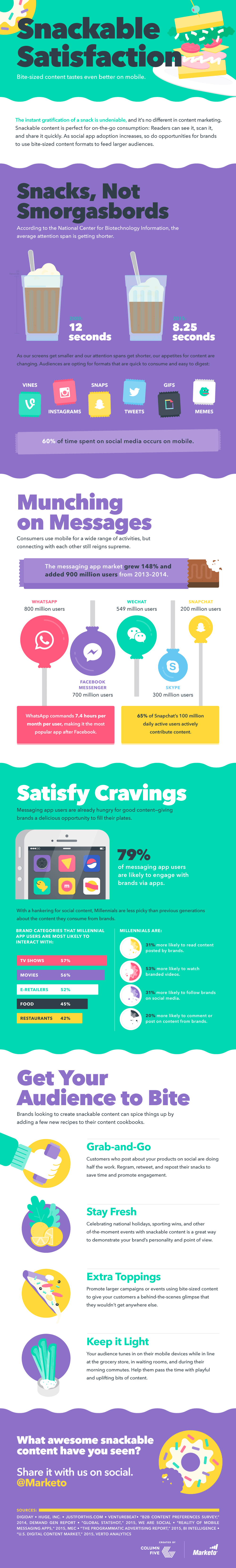
Example: For Marketo’s infographic “How to Create Bite-Sized Content,” we used a snacking theme, reinforced in everything from illustrations to lollipop bubble charts.
11) Icon Issues
When it comes to icons, there are three common problems. They’re either too cliché, too confusing, or there are just too many. Simplicity, comprehension, and intuitiveness are the key to good icon design. Don’t try and distill complex ideas or processes into a simple icon—confusion and misinterpretation are the most likely outcome.
The Fix: Iconography should reflect your visual identity. No matter what you choose to design, use a consistent illustration style (no combining 2D and 3D or different weights).
12) Wrong Format/Resolution
As technology progresses, so must design. But a lot of infographic design is sabotaged simply by the wrong dimensions or poor resolution, incompatible with the devices or platforms the infographic is meant to be viewed on. (We’ve admittedly made this mistake before, too.)
The Fix: Double (even triple) check your specs before you start design. Ask questions about how it will be viewed. These things will influence the user experience.
13) Redundancy
With infographics, some people assume that means everything in an infographic has to be designed—and that the key to comprehension is content. This can result in a lot of redundancy, which defeats the purpose of a visual medium. If a chart denotes something, the subhead, callout, and chart header don’t have to reinforce it.
The Fix: Look for opportunities to condense, cut, or clarify content. That may mean combining charts, tweaking labels, removing callouts, etc.
14) The Small Stuff
In all infographic design, the devil is in the details—those little tweaks that individually may not seem so significant but collectively affect how the viewer experiences the infographic. Things like sloppy alignment, inconsistent illustration styles, or spacing can degrade the quality of your infographic (and, by default, the perception of your brand).
The Fix: Consider creating a final draft review checklist to ensure everything looks good before it goes out the door.
15) No Experimentation
Maybe it’s not a big deal today, but repeating the same infographic design ideas over time will stagnate and sink you. Yes, it’s important to create cohesive design for branding’s sake, but that doesn’t mean you have to follow the same template and dampen your creativity. Challenge yourself to mix it up.
The Fix: There are so many different visual formats to explore (see our guide to find out which is best to tell your story) and so many ways to mix up what you do with infographics, whether through motion or microcontent.
Of course, great infographic design should be built on great content, which means your team needs to get the story right from the get-go. For more tips on creating great infographics at every stage:
- Try these 16 ways to come up with great infographic ideas.
- Find out how to craft an effective infographic narrative.
- Get our best tips for making great infographics, based on the 4,000 we’ve made.
- Learn how to optimize your infographic for more traffic.
- See 9 infographic design examples that will leave you inspired.
If you still need a little help with your infographic design, we’d love to work together.

Let's upgrade your marketing game
Get fresh tips, how-tos, and expert marketing advice every week. (15,000 people already are.)