Infographics are an engaging way to deliver information quickly and effectively, whether you create infographics for your blog or visual tutorials for your products. But if your infographic design is inconsistent or varies too widely, your infographics may only be doing half their job. Infographics are meant to inform, yes, but they’re also a way for your brand to cultivate a relationship with people, to become their go-to resource for information. If your infographics don’t have a unifying visual language, it’s difficult for people to recognize your content, become familiar with it, and—most importantly—seek it out.

Does Your Visual Language Include Infographic Design?
Above all, a visual language (aka your visual identity) is a tool to communicate your brand identity, to show people your personality and entice them to engage with you. There are many design elements that help you do this. From your logo and typography to your colors and iconography, each element serves a unique purpose. Together, they create a powerful visual language that cultivates familiarity with your brand.
Consistency and uniformity are the secrets to a strong visual language; thus, every piece of content you create should reflect your visual language. This is especially true when it comes to infographics, which are inherently one of the most visual forms of communication. But how do you ensure accuracy and consistency in your infographics? Here are five steps to make sure all of your infographics reflect your visual language.
1) Consider All of Your Infographic Applications
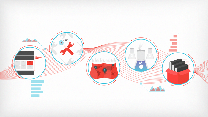
Infographics are a fantastic communication tool that can be used in many ways. You may create editorial infographics to generate brand awareness, mini-infographics to engage on social, interactive infographics to create immersive experiences, visual tutorials to explain processes or products, and the list goes on.
Your goal is to create a flexible visual language that can be adapted for all sorts of applications. Thus, the first step is knowing what those are (and who they’re created for). It’s also important to consider the environments in which infographics live or will live so that your visual language accounts for various technological needs or limitations.
Take a look at all the types of infographics you currently create. How do you currently use infographics? How might you use them in the future? Are there formats you’ve wanted to experiment with? When it comes time to design your visual language, this information will be invaluable.
Example: From infographics to print publications, Google has a number of applications for infographic design, all of which must adhere to their visual language.

2) Identify the Elements of Your Infographic Visual Language
Your brand should already have a basic visual language designed. (Here’s everything you need to start, in case you don’t.) This usually includes things like logo, color, typography, etc. All of these elements will be applied to your infographic design, but there are additional elements to consider as well. (If you’ve done your research and viewed the different types of infographics you create, you should be able to identify the standard elements that you need to consider.) These include things like:
- Dimensions
- Headers
- Subheads
- Callouts
- Pull quotes
- Icons
- Illustrations
- Source formatting
- Interactive elements (if applicable)
- Etc.
As you design your visual language, consider the different tools being used to create infographics across your organization. For example, you may have presentations consistently created in PowerPoint, while your creative team uses Illustrator, Photoshop or After Effects to produce advertising or marketing materials. This can pose a challenge in developing a consistent style, as the programs obviously don’t have equal capabilities.
Ideally, you want to focus on simplicity and practical application so that the software with the least capability can still replicate your visual language. (It also helps to know what common infographic design mistakes to avoid so that you can provide accurate, intuitive guidelines.)
3) Follow Best Practices for Data Visualization
Good data design makes it easier for your reader to consume, comprehend, and synthesize the data. Conversely, bad data design can actually misinform and misrepresent the data, hurting the reader’s experience and your brand’s credibility. Therefore, it’s imperative that your data design not only adheres to your visual language but follows data visualization best practices for things like charts, graphs, etc.
That said, we know data design is a skill that even experienced designers can struggle with. To make sure your visual language includes accurate guidelines, take a look at our Data Visualization 101 guide, which shows you how to design the most common charts and graphs.
Example: Little things like pie chart ordering or the distance between bars in a bar graph can make a big difference. As we see in this infographic, using Google’s signature red in the pie chart segments is a subtle way to brand the graphic while improving comprehension.

4) Create Your Brand Style Guide
Once you have determined infographic visual language, add the guidelines to your brand style guide. Most importantly, beyond your general infographic design guidelines, include real-world examples to make them easier to apply. For example, you might create an infographic checklist so that content creators can double-check that each infographic element adheres to the visual language.
Once completed, distribute the guidelines to your team, ensure that any outstanding questions have been addressed, and assign a point person to keep the guidelines updated. (If you haven’t created a style guide before, see our step-by-step guide to creating one.)
5) Consider Templates
Beyond a style guide with real-world examples, you may consider creating infographic templates. This can be a more efficient and economical choice if your team is limited in time, budget, or skill. Simple templates can ensure a consistent look for all infographics, no matter the creator.
If you choose this route, make sure your templates are created by a skilled designer, and built around an intuitive design system that allows creators to add, remove, or tweak elements based on content.
(Remember, too, that your design doesn’t always have to be complex. Here are 10 examples of beautiful minimal infographic design.)
Continue to Educate Your Team
Remember: Great infographics start with a great idea, matched by great execution. Therefore, it’s important to equip your team with the knowledge and tools to succeed at every stage of the infographic creation process. For more tips, here are a few things that might help:
- Use this creative brief template to keep your team on the same page from the beginning.
- Learn how to tell a strong story in your infographics.
- Try our best tips for making infographics, based on the 4,000 we’ve made.
- Use these 101 resources and tools to create better infographics.
- Find out how to optimize your infographics for more traffic.
And if you plan to outsource your infographic design, here are 10 questions to ask before you hire an infographic agency. (We’re also happy to chat through your next project, too.)


Let's upgrade your marketing game
Get fresh tips, how-tos, and expert marketing advice every week. (15,000 people already are.)