Every report takes a lot of energy to create. Whether it’s survey results or a campaign retrospective in your marketing report, the information gathering, collating, and synthesizing into valuable insights is a lot of hard work. But why do so many people put so much work into the report but totally ignore the report design?
Content is often thrown into a document and sent off by deadline with little thought, which is a huge missed opportunity. A strong marketing report should distill information, communicate it succinctly, and present it in an easy-to-navigate format. Report design plays a huge role in this, but it’s too often overlooked.
How Design Can Transform a Marketing Report
A great report can—and should—be a compelling story that helps people process information (and often, make decisions based on it). Good report design can drastically improve how people experience that story, especially when you’re sharing data insights that are often lost in a spreadsheet. Why? Because our brains are prewired to process visual content more effectively than written content alone. If you want to make it easier for your audience to interpret, understand, and extract meaning from your reports, here are three reasons to make design a priority.
1) It increases appeal.
According to MIT research, humans can process visual content in as little as 13 milliseconds. This is because the brain is innately drawn to beautiful things. Color, shape, and other design elements grab attention. A column of numbers in a spreadsheet might seem impenetrable, but a few colorful charts are visually stimulating and, therefore, instantly spark interest. This is especially important if:
- Your report is for external use. According to the Content Marketing Institute, 37% of B2B marketers use research reports for content marketing. If you are trying to stand out in a sea of content, something as simple as a visually arresting cover will pique interest. This is especially important for SEO traffic. According to Hoosh Technology and ISDIA research, 63% of all visitors who click on a Google image will go to the website.
- You have a ton of content. White space provides enough breathing room on the page to not overwhelm your audience, and a clear hierarchy makes it easier to navigate.
- You need to call out certain highlights. Design elements make it easier to draw attention to certain info.
Regardless of what your report contains, you need to attract and keep your readers’ attention. A beautifully designed report does that far better than a boring, text-heavy document.
Want to increase the appeal of your reports?
- Tell a strong story. A good report is a compelling narrative. Find out why storytelling can transform the way people experience your report.
- Use visual content to your advantage. Find out how to improve your design.
- Follow best design practices. Avoid these common design mistakes.
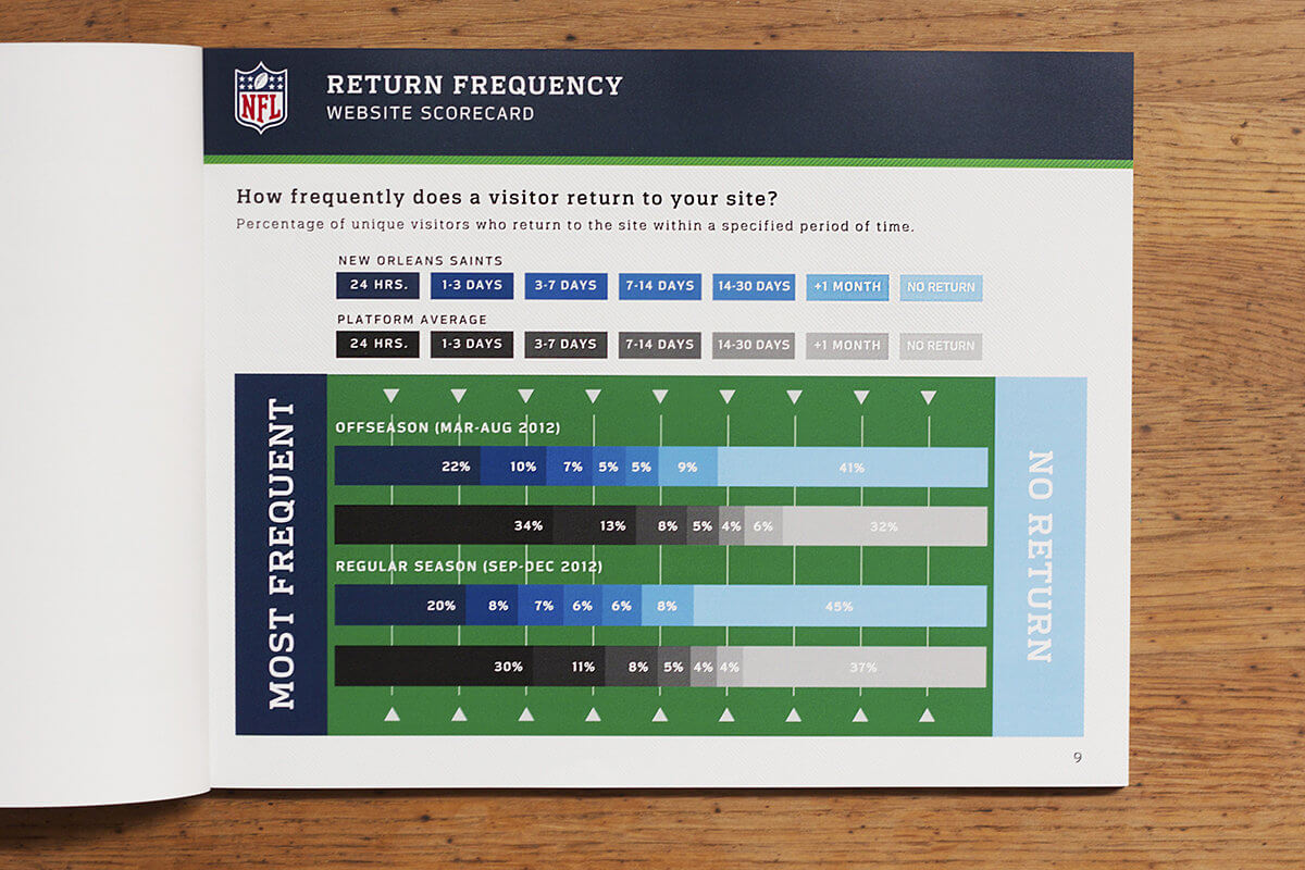
Example: We partnered with the NFL to produce print reports featuring data and analytics for each team’s web performance. Each report contained detailed information, presented in a visually engaging way for easy reference.

2) Content is easier to comprehend.
Many marketing reports are incredibly data-heavy, and it can be exhausting to slog through. Data visualization is powerful because it makes all that data easier to interpret by helping your audience “see” what the numbers are saying.
Through preattentive processing, the brain picks up on visual cues and helps you instantly derive meaning from the visual. Report design that includes charts, graphs, or other visual elements makes this easier for the brain. This is why visual communication is so useful to depict not only data but things like process or hierarchy.
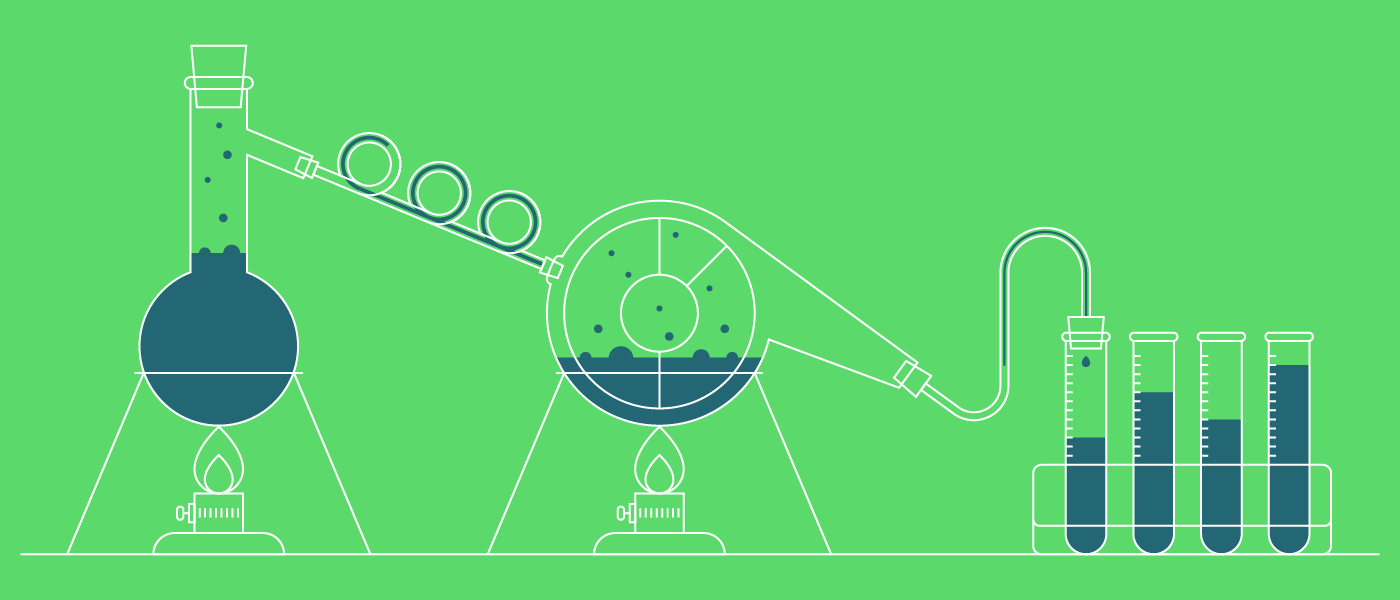
You can see your own preattentive processing at work here:
Want to enhance comprehension?
- Find the story in your data. Learn how to identify what’s most interesting in your data.
- Craft an effective narrative. Find out how to properly guide readers through a data story.
- Bring your data to life. Find out how to design the most common charts and graphs, and follow these 25 design tips to make your data more effective.
Example: We partnered with Zendesk to create The Zendesk Customer Satisfaction Index, a report that includes insights from an analyzation of key help desk metrics. The report design presents the data in a straightforward manner and uses design elements like color to call out interesting insights.
3) It helps the reader retain information.
When your brain sees visual information, it identifies, recalls, and ultimately stores those images in your memory. Visualizations trigger your brain to reference long-term memory, making your brain connect to already stored information while cementing new concepts.
As John Medina says in Brain Rules, “Hear a piece of information, and three days later you’ll remember 10% of it. Add a picture, and you’ll remember 65%.”
Want to make your marketing report more memorable?
- Focus on visualization. Learn about the keys to a memorable data visualization to make the most of your data.
- Follow best practices. Try these 10 tips to create a great report.
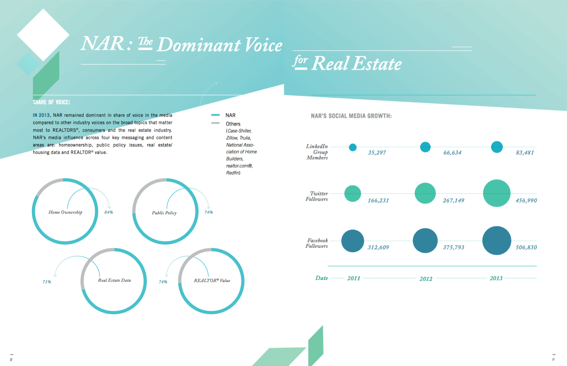
Example: The data visualizations in the National Association of Realtors 2013 Annual Report bring data to life, making the info easier to synthesize and recall.

Don’t Let Your Reports Go to Waste
Reports are often used to make major decisions internally, but the information they contain can be relevant to your customers, your colleagues, your industry, and major publishers. Thus, one of the best ways to make the most of your reports is to translate those insights into unique content marketing. If you’re not sure what that looks like, here’s how 7 brands are creating unique marketing with their reports.
That said, we know you may not have the bandwidth or resources to produce high-quality reports (or incorporate them into your content strategy). If you need some pro help, take a look at our tips to find the right content agency, or holler at us.


