

Whether it’s for marketing, sales, clients, or accounting, every report is created to communicate valuable information. But the best reports don’t just deliver information; they distill it into a simple, concise package to tell a compelling story. To do this well, you need to use every storytelling tool in your arsenal. That means writing good copy and using report design elements like color, shape, imagery, and data visualization to make your content not only aesthetically pleasing but easier to comprehend (a huge service to your reader). Luckily, there are many simple things you can do to enhance your reports.
10 Tips to Turn Your Reports into Compelling Stories
We’ve helped all sorts of brands create beautiful, on-brand reports. And we’re here to let you in on a few tricks of the trade. Whether you’re presenting a project recap or a quarterly review, try these tactics to enhance your next report design.
1) Know the story you’re telling.
There’s a reason you’re creating a report. You might want to educate your reader, influence their decision-making, shed light on a challenge, or reveal interesting insights. Regardless of your objective, your job is to craft a report that communicates that narrative.
Tip: Know the takeaway. After reading your report, is the reader meant to draw their own conclusions or come away with a specific takeaway? If your report is meant to garner support for your brand in some way, make sure that underlying story is clear and reinforced.
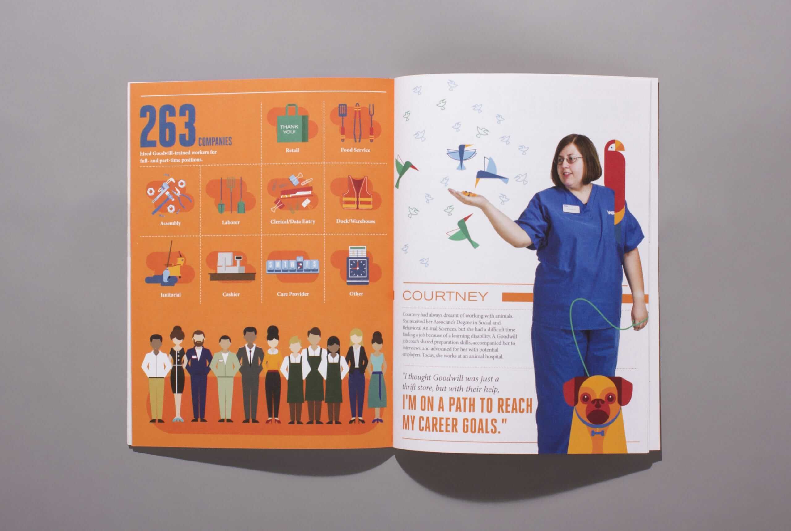
Example: We collaborated with Goodwill of Orange County to create an annual report that told the story of “The Good Effect,” outlining how the organization and its contributors helped the community over the year. Since the annual report is meant to showcase the organization’s accomplishments and inspire support for the coming year, putting this story front and center was a great way to create a cohesive narrative.
2) Use the right language.
Language and tone affect how the reader absorbs your narrative. It also affects how they perceive your brand. It’s important to speak in their language, at their level. Don’t talk above them or down to them, and don’t bore them to death with jargon and buzzwords.
Tip: Use things like subheads and callouts to entice your reader, introduce the subject, and make important information easy to synthesize.
3) Be brief.
Yes, you probably have a lot of information to include in your report design, but if all your content is crammed in there for the sake of being “economical,” you’re only giving your reader an excuse to tune out. Long, winding paragraphs of text can make any report feel especially dense and overwhelming. Remember: The more succinct you are, the easier it will be to tell a strong story and create a beautiful report design to reinforce it.
Tip: Compile your report, then give a second pass to condense, edit, and extract only the most relevant insights and information that support your narrative. Look for opportunities to let design do the heavy lifting as well. For example, you might compare two data sets instead of visualizing them separately, or craft a flowchart to explain organizational systems.
Example: The 2015 Pacific Life Annual Report makes great use of negative space, offering key insights through simple blurbs and data points.

4) Add a wrap-up.
Consider ending your report with a simple one-page wrap-up that explicitly outlines key takeaways. This is especially helpful if your report insights will influence decision-making or help you garner support for your cause.
Tip: If you don’t have much space, just include a simple bulleted list.
Example: Nielsen’s 2021 Era of Adaptation annual marketing report includes a final page of key takeaways to help marketers put the info shared into real-life practice. 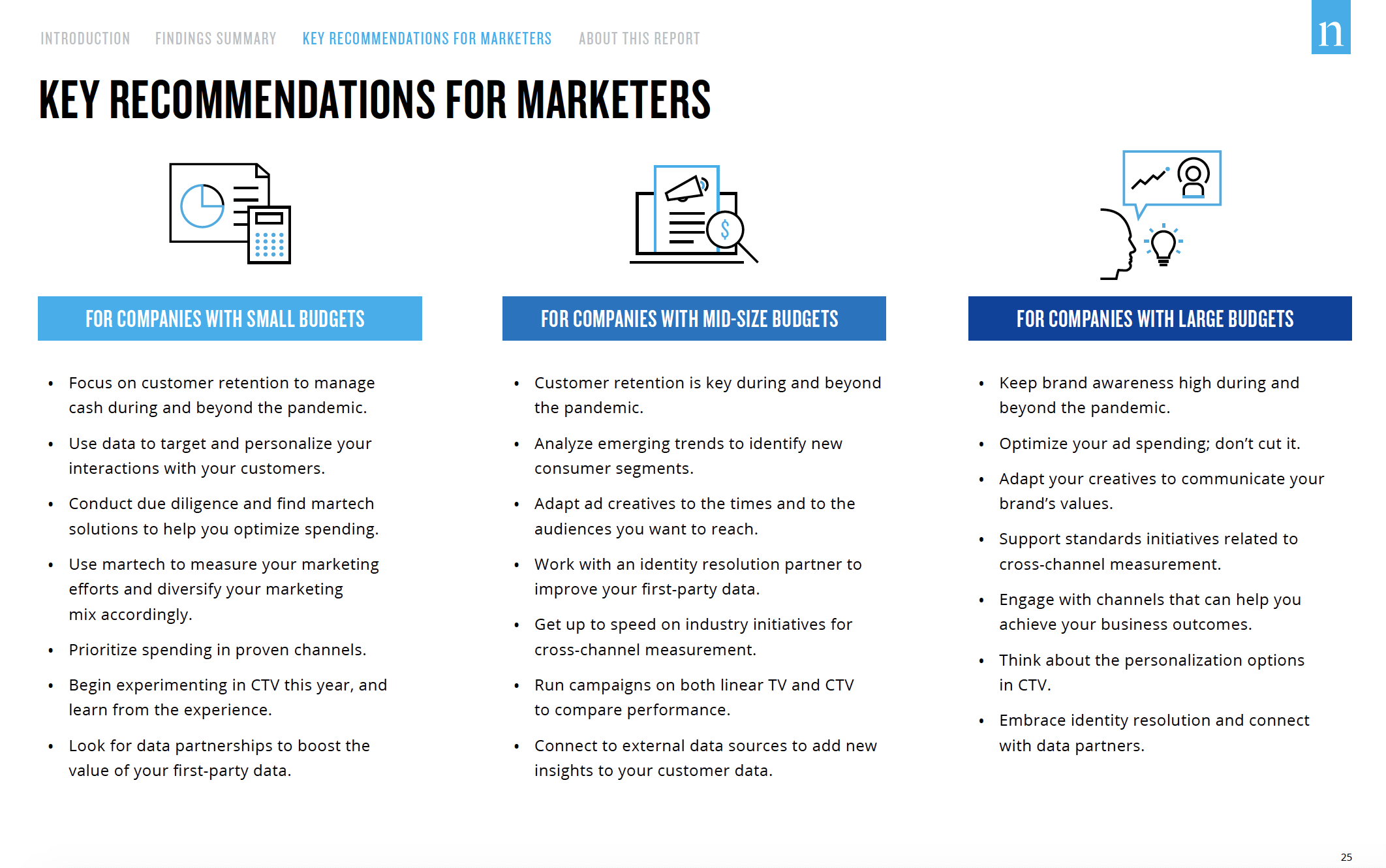
5) Infuse your brand personality.
Regardless of what type of report you’re creating, if it’s a piece of communication your company makes, then it’s a reflection of your brand. Thus, it should feature your brand’s voice, personality, and visual identity to maintain consistency and cohesiveness.
Tip: Give content a quick pass to see if any words or messaging seem off, and keep an eye out for specific words you should and should not use. For example, we do our best to avoid cheesy marketing speak like “rockstar” or “guru.” (If you don’t have a uniform voice, see our guide to identify your brand personality and voice.)
Similarly, make sure you’re applying your visual elements correctly, such as logo, color, and typography. If you don’t have a documented brand identity, see our guide to build a style guide. (Make sure it’s up to date too.)
6) Use color to increase comprehension.
Color is a visual cue that helps the brain instantly identify and process information. As such, it’s a useful tool to highlight certain information, whether it’s the highest bar in a bar chart or an important note in text.
Tip: Choose a single color to use as your accent/highlight color throughout.
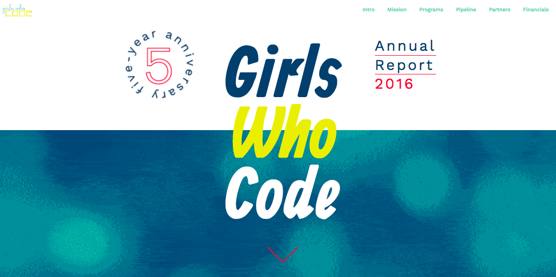
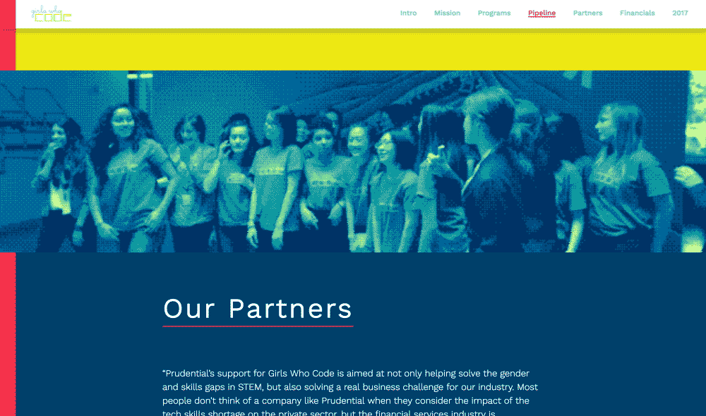
Example: The interactive Girls Who Code 2016 Annual Report uses bold color and playful animations to bring the report to life.
7) Visualize your data.
If you don’t visualize your data, you’re doing your reader a disservice. Unfortunately, a lot of designers think throwing data into any old chart will do the job. No bueno.
Good data design is about increasing comprehension, so it’s important to not only visualize data but choose the best visualization for that data.
Tip: To do this effectively, learn how to properly design the most common charts and graphs, and follow these 25 tips to improve your data visualizations.
Example: The 2014 Stony Brook Foundation Annual Report used clean, colorful data visualizations to engage readers.

8) Use an intuitive hierarchy.
Your readers want to know the most important information from the get-go. (This is especially true if they’re reviewing the report on a time crunch or right before a meeting, which happens a lot.) For this reason, designing a clear hierarchy that guides the eye is crucial.
Tip: Add callouts to provide important context or identify particularly meaningful insights. Also, make sure that headers, subheads, and callouts are easy to identify and consistently spaced. Follow the fundamentals of good report design and give the eye some breathing room.
Example: Clear Channel’s The State of Listening Today report uses clear callouts and headers to highlight new industry trends.

9) Add imagery.
This is especially helpful if you’re designing an annual report. Illustrations or photos can go a long way to communicate your personality, add a more human element, or reinforce a theme.
Tip: For inspiration, check out these 40 beautiful examples of annual report design.
Example: The 2014 National Association of Realtors Annual Report incorporated photos of their team, as well as brand colors, to infuse the report with brand personality.

10) Design templates for future reports.
One of the reasons people struggle to create a cohesive brand is because they don’t have enough time to approve every piece of content that goes out the door. That’s understandable, but you can make your life easier with a simple trick, especially with reports that you regularly produce.
Tip: Design a simple report template that features a variety of elements to mix and match, such as images, charts, headers, and callouts. That way even a non-designer can create beautifully designed reports. (And you’ll rest easy knowing it’s on-brand.) You can follow these same steps to create templates that are easy to mix and match.
How to Do More with Your Reports
Creating a good report takes effort, so why not make the most of your investment? While many reports are designed for internal eyes only, you may be able to translate report insights into interesting and unique content marketing. If your report tells an interesting story about an industry trend or reveals a surprising insight about your business, why not share those insights with your audience?
For example, we turned one of our internal marketing reports into a blog post about how our new marketing strategy increased leads 78%. If you want to see what this can look like in the wild, check out how these 7 brands have translated their reports into content marketing to extend their reach.
Of course, if you’re already maxed out on brain space or resources, you may not have the energy to do that. If so, we’d be happy to chat about how we can turn your data into content that gets results.


Let's upgrade your marketing game
Get fresh tips, how-tos, and expert marketing advice every week. (15,000 people already are.)


Design templates for future reports is very important learning for me. Very good and simple content.
Glad to hear it!