An annual report is an important extension of your brand’s story. Presenting that information in the best package possible is crucial, yet many brands overlook the power of annual report design. That’s a shame, especially when you have so many tools at your disposal. Through photos, illustration, data visualization, color, typography, and more, you can easily turn copy and numbers into a beautiful and interesting story that captivates the viewer. Want proof? We’ve got it. To give you a little inspiration, we’ve rounded up 50 of our favorite annual report examples in a variety of formats, including print, interactive, and video.
50 Awesome Annual Report Examples
These impressive creations show just how clever and creative you can be when you’re willing to experiment. We hope you enjoy—and if this happens to inspire your next annual report design, we hope you’ll share it with us.
Print Examples
1) Well Done 2006 Annual Report by Bruketa & Žinić
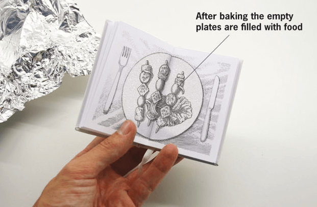
This incredible report features a tiny booklet hidden within the report, printed with thermo-reactive ink. The reader must wrap it in aluminum foil and bake it to see the text magically appear. The only catch: If you don’t cook it precisely, the pages will burn and you’ll be left with nothing. This is genius annual report design at its finest.
2) Austria Solar 2011 Annual Report by Cargo Collective
An alternate take on thermo-reactive ink, this report is only visible when activated by the sun—a genius idea for a solar company.
3) New Products Group of Companies 2013 Annual Report by Tough Slate Design
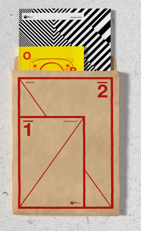
This visually appealing report’s bright colors, bold designs, and unique packaging make for a beautiful presentation.
4) Vrijwilligersacademie Amsterdam 2011 Annual Report by Da Costa Design, Studio Pino, and Veenman+
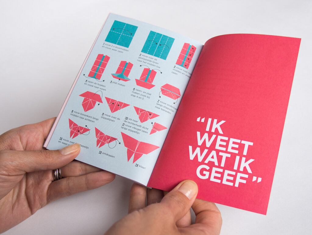
If you ever wonder what you should do with an annual report after you’ve read it, this one provides an entertaining solution. The report features origami instructions within its pages so you can fold little creations as you read through.
5) Prometey Bank 2012 Annual Report by Backbone Branding
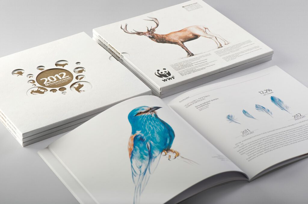
The beautifully drawn animals featured in the pages of this annual report remind readers about the threat of extinction. It also includes some clever data visualization by using animal lifecycles to represent statistical numbers.
6) Anthon B Nilsen 2009 Annual Report by Heydays
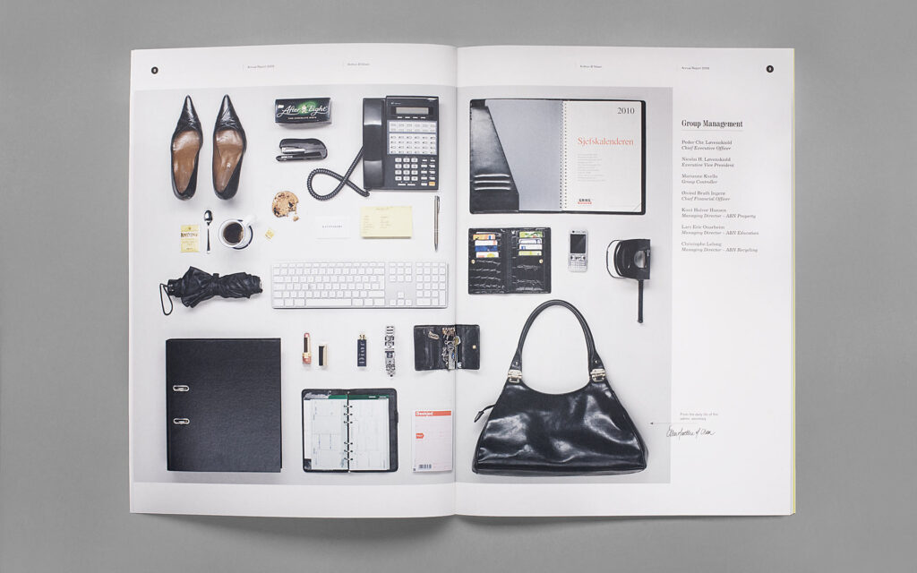
Rather than feature images of Anthon B Nilsen employees, the designers at Heydays decided to show employees’ belongings to let readers get to know them on a more personal level.
7) Informe 2009 Annual Report by Huaman Studio and Petit Comitè
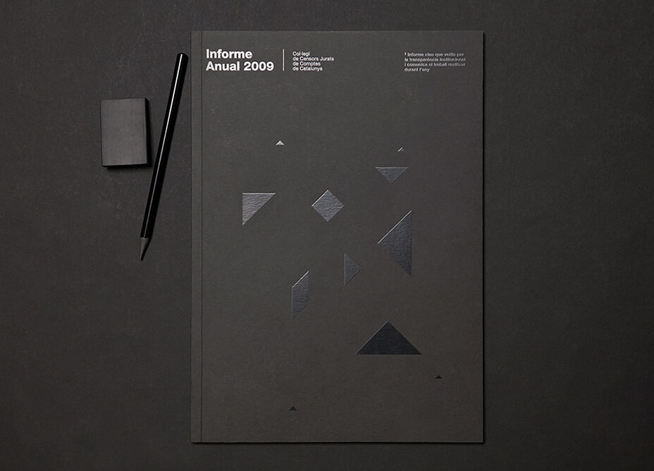
This annual report design includes a visually stunning cover with an elegant black-on-black design, as well as tangram designs. Both combine to make the report feel contemporary and sleek.
8) Pirelli 2013 Annual Report by Cacao Design
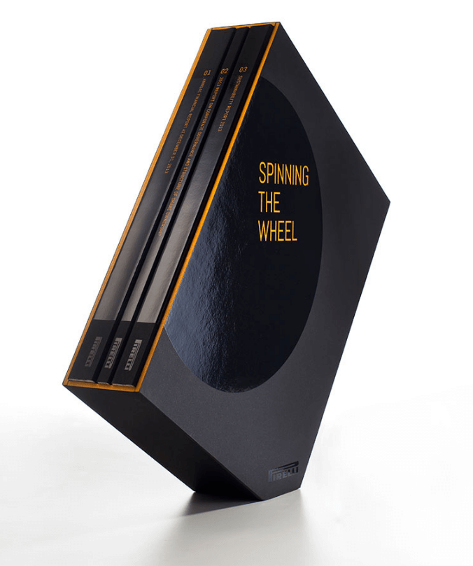
This is what happens when you turn a report into art. The sculptural presentation is inspired by the theme (spinning the wheel). The brilliant design of the seemingly off-balance position makes it feel as if the reports are actually rolling.
9) AEGIS 2016 Annual Review by SVP Partners
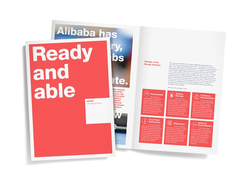
This annual report design features modular design, strong typography, and beautiful data visualizations that make it a joy to flip through.
10) Human Rights Campaign 2012 Annual Report by Column Five
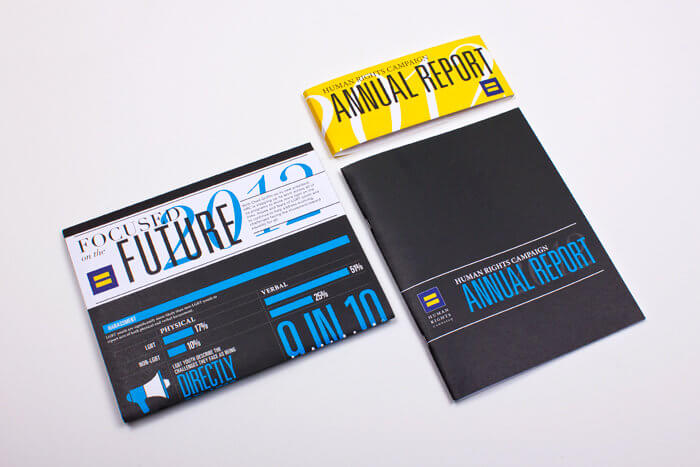
This annual report design includes unique packaging and bold data visualization that effectively communicates the organization’s story.
11) Clear Media Limited 2014 Annual Report by Phoenix Communications Limited
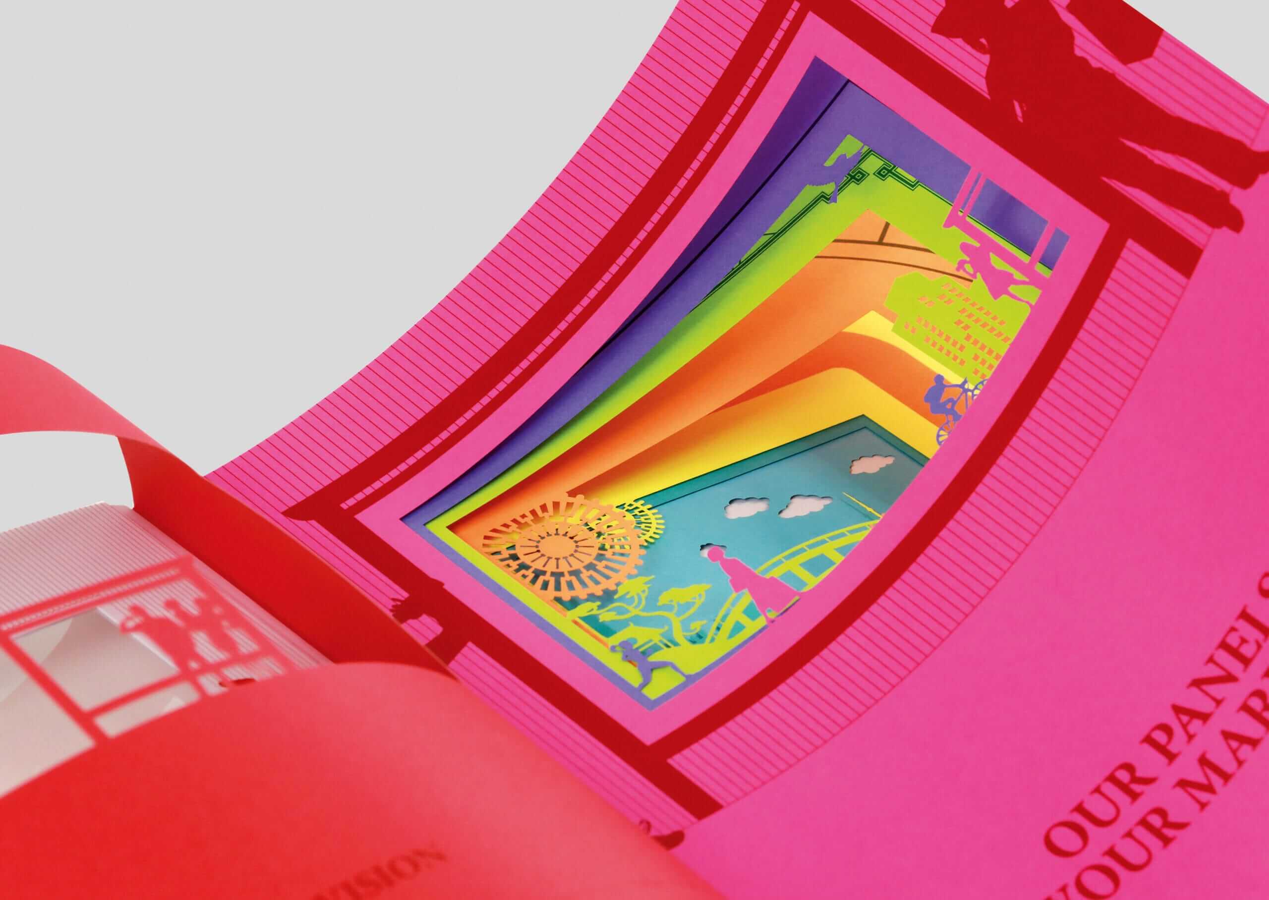
This gorgeous annual report used laser-cut technology to carve intricate scenes on each page. When closed, the layers combine to create a colorful overview for the readers.
12) O’right Corporate Social Responsibility Report by Ting-Chen Fan
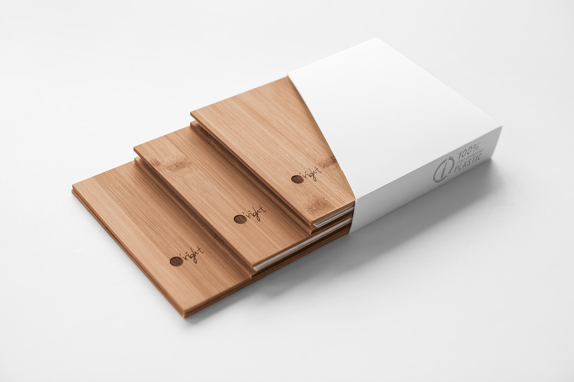
For a haircare brand that promotes sustainability, this annual report design is the best way to walk the walk—with covers made from recycled bamboo and plastic.
13) ERGO Hestia Group 2016 Annual Report by Hanna Dyrcz
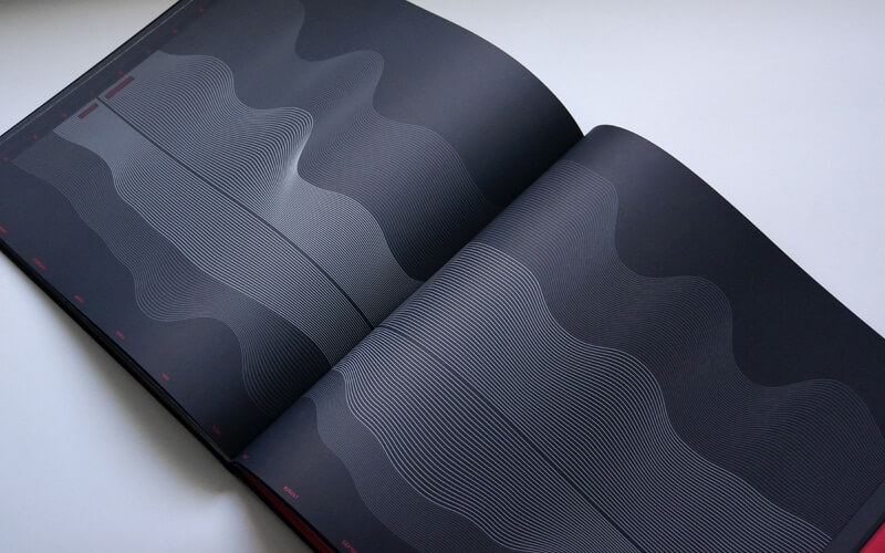
You might consider this piece less of a report and more of a jaw-dropping showcase of data visualization, delivered as a black-on-black print masterpiece.
14) Sonae 2012 Annual Report by Ivity Brand Corp.
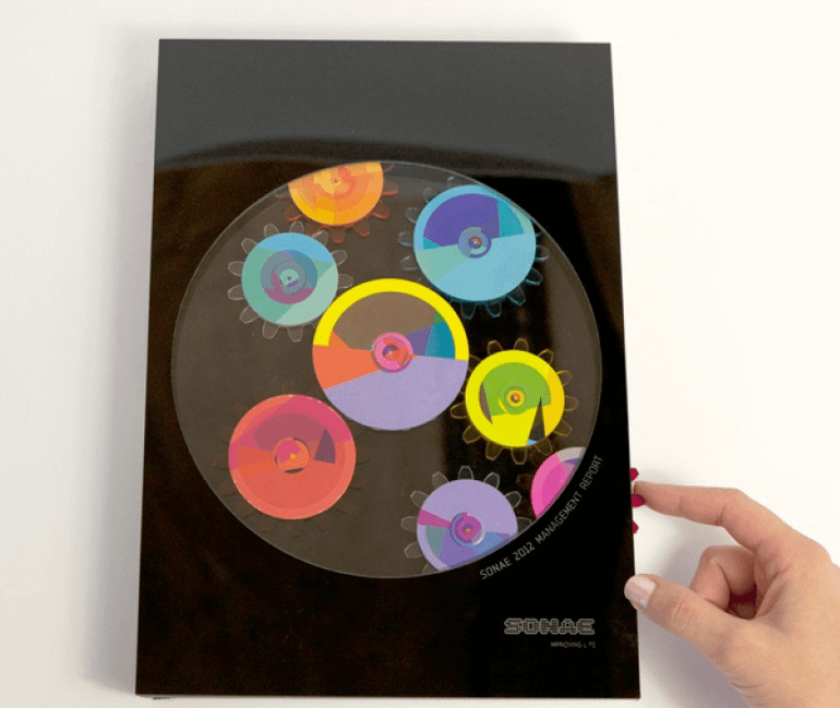
This clever annual report design goes old school with its mechanical engineering. It’s an analog interactive, featuring colorful cogs to spin and beautiful overlays throughout its pages.
15) Banques Alimentaires Québec 2012-2013 Annual Report by LG2 Boutique
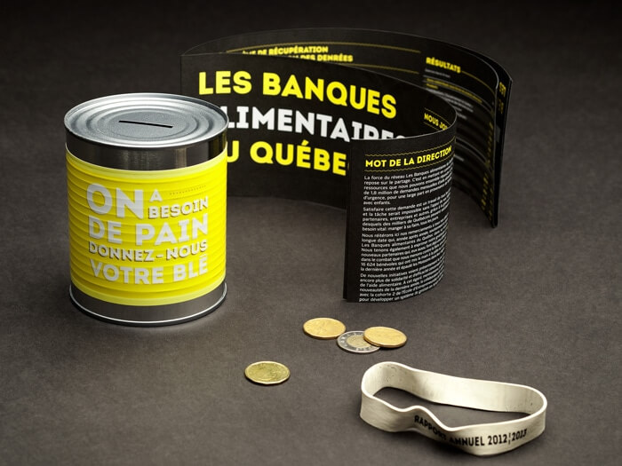
This is another great example of genius packaging: a report presented as a coin bank—the perfect presentation for the Canadian bank.
16) Amnesty International Hong Kong 2011 Annual Report by TGIF
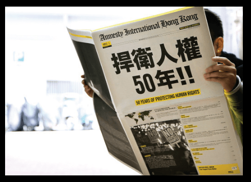
This report was constructed as a newspaper rather than a bound book, showcasing eye-catching yellow designs throughout its pages.
17) Feltron 2014 Annual Report by Nicholas Felton
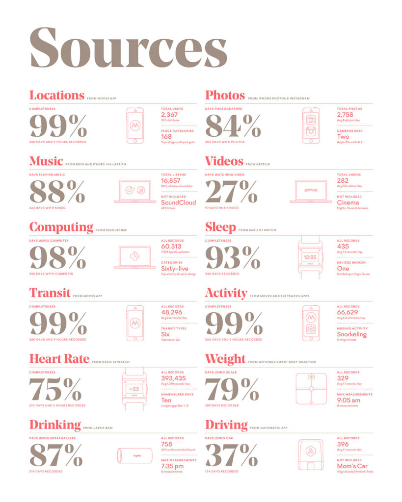
18) Ablynx 2015 Annual Report by Soon
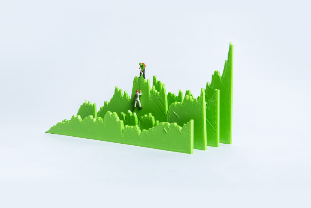
This report brings the data to life through 3D-printed visualizations, built and photographed individually.
19) Kuoni Group 2014 Annual Report by Noord
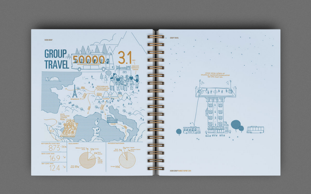
This design’s gift-wrapped presentation, simple binding, and lovely ink drawings make for a subtle but entertaining annual report.
20) Ablynx 2014 Annual Report by Ablynx
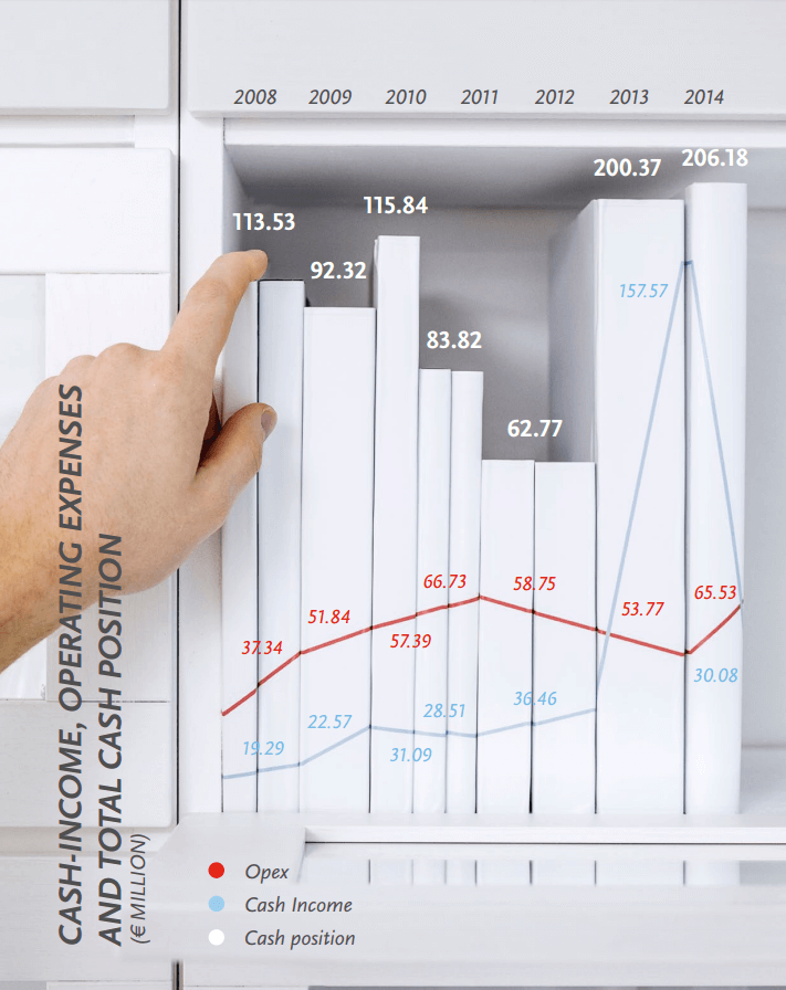
This report is a great example of combining photography and data visualization. The data visualizations are designed on everyday props, such as graduated cylinders, pulled-out dresser drawers, and circular dining tables, giving the data a creative twist.
21) Applegreen 2013 Annual Report by Biográfica
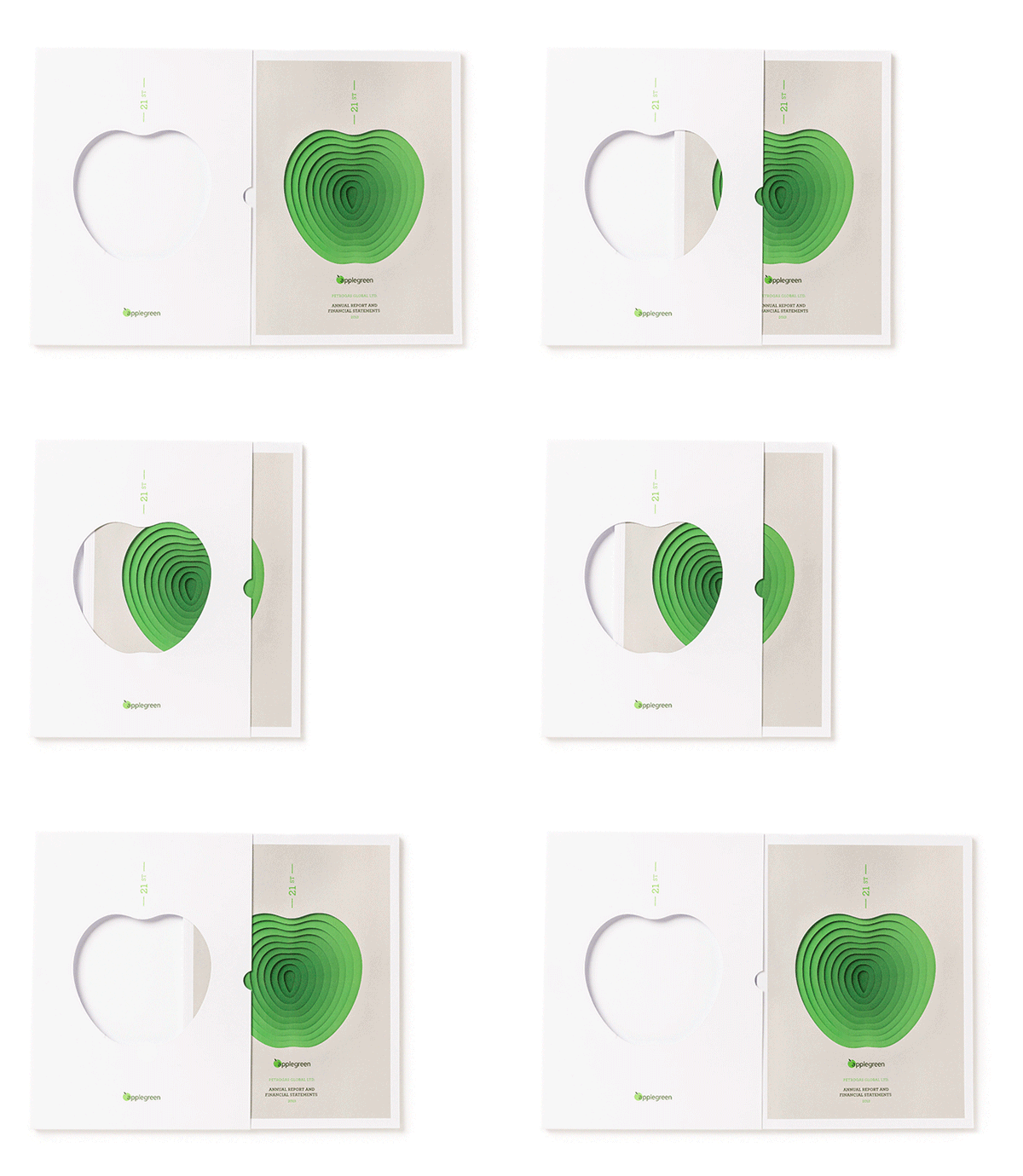
Similar to the laser-cut images of the Clear Media report, Applegreen’s annual report features images of multilayered, 3D paper artwork that makes the information seem to jump off the page.
22) Pacific Life 2015 Annual Report by Column Five
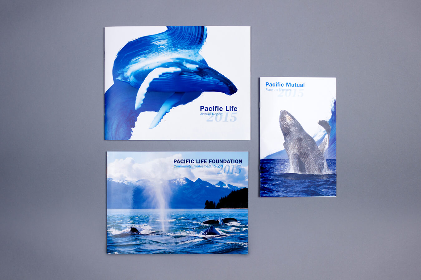
An annual report is particularly effective when you can inject life and beauty into a company or industry that isn’t always glamorous. That’s what this report does for life insurance company Pacific Life. An oceanic theme is pervasive throughout, bringing beauty and vitality to every page.
23) ComfortDelGro Corporation Limited 2016 Annual Report 2016 by SiliconPlus Communications
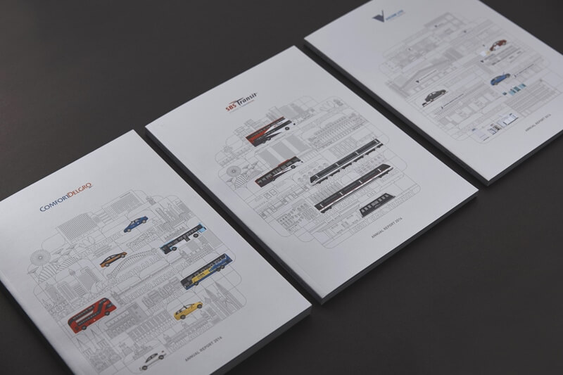
Detailed illustrations make for a visually arresting printed piece, as a unique transportation motif appears throughout the annual report design.
24) Tronox 2016 Annual Report by SVP Partners
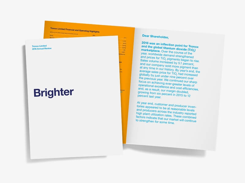
You might not expect a chemical company to create such a beautiful annual report design, but Tronox did it well with a clean, simple, and elegant minimal design.
25) MMC Norilsk Nickel 2016 Annual Corporate Social Responsibility Report by DDVB
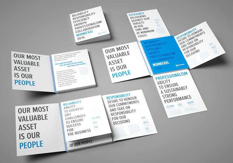
Unique oragami-esque packaging and bold typography make this report a work of beauty.
Digital/Interactive Examples
26) 2016 Boston University Annual Report by Boston University
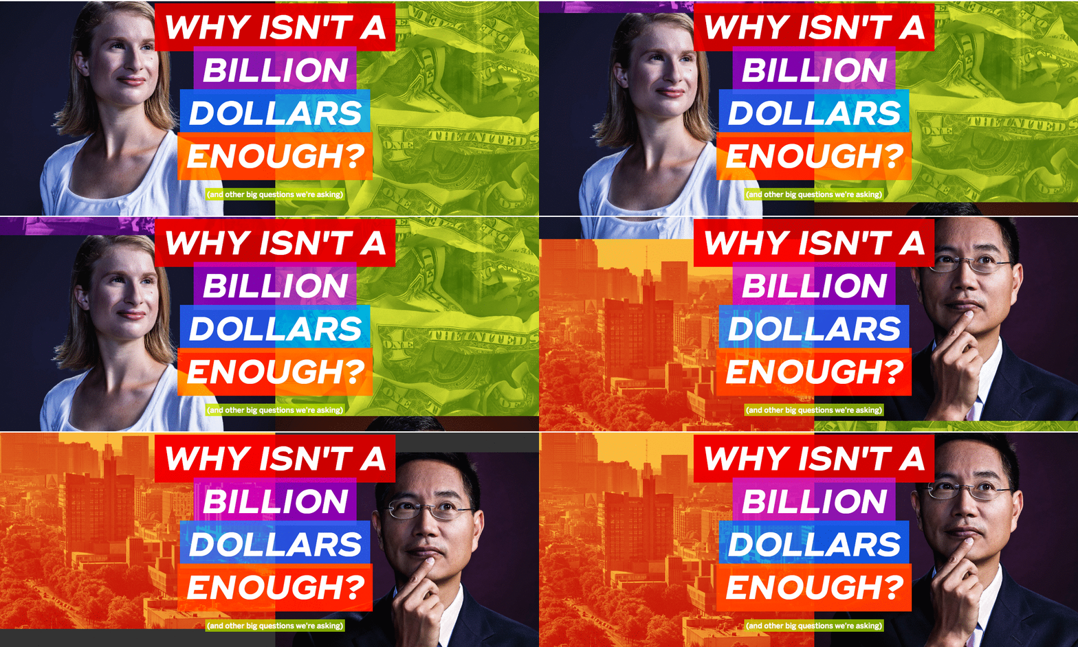
Bold and bright, this colorful annual report design features the many faces of Boston University, presented in a slick and stylish interactive site.
27) Warby Parker 2014 Year in Review by Warby Parker
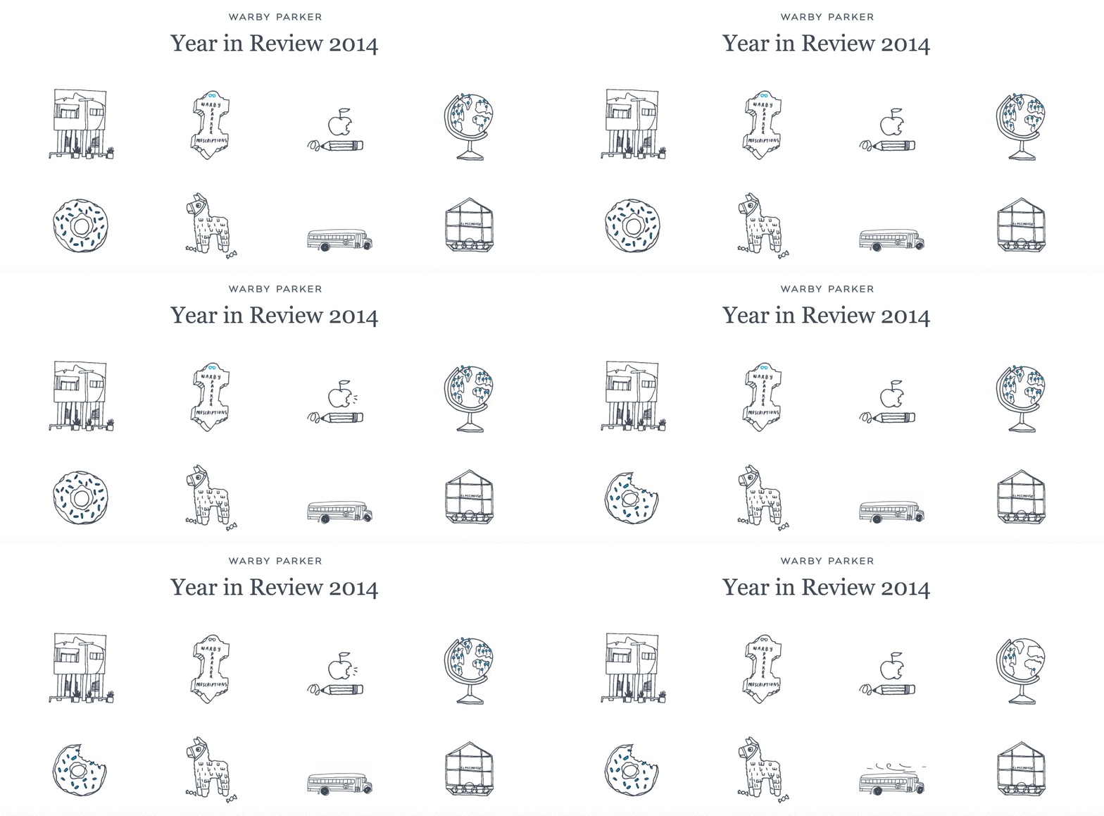
This digital report features GIFS and an interactive timeline to share company highlights, as well as an opportunity to make your own annual report by inputting personal data.
28) Artsy 2014 Year in Review by Artsy
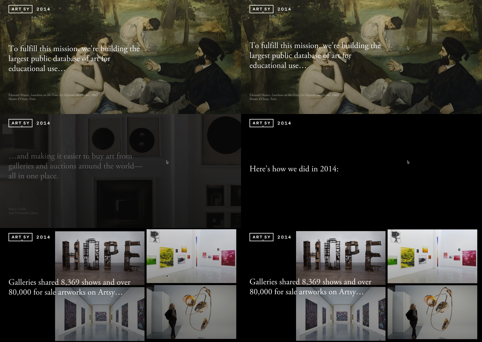
Artsy’s image-heavy scroll-through is a perfect representation of the company’s values and core mission: to make the world’s art accessible to anyone with an Internet connection. As viewers cycle through the report, they’re treated to a visual feast, along with information about the company.
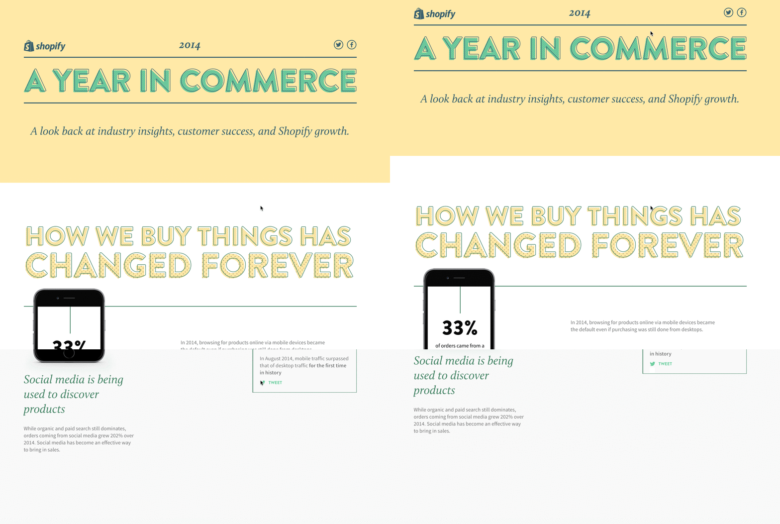
29) Shopify 2014 Year in Review by Shopify
This to-the-point digital report presents information in a short, sweet, and simple way for easy comprehension, allowing the information to speak for itself.
30) Total Specific Solution 2011 Annual Report by Total Identity
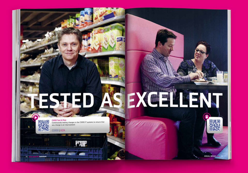
Technically this is a printed report, but the company utilized QR code technology to allow readers to digitally interact with the information provided. By scanning the codes, readers are treated to a video explaining the related material.
31) Flywheel 2015 Year in Review by Flywheel
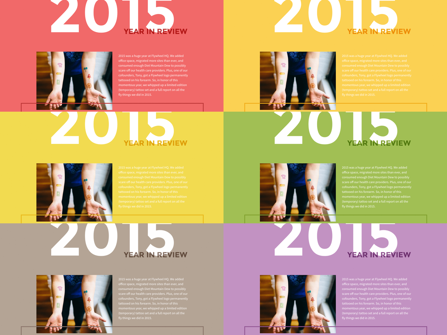
Not only is this a gorgeously designed digital year in review, it also includes custom temporary tattoos (in honor of a founder getting the company logo tattooed). Even cooler, the temp tattoos are symbolic, such as the Diet Mountain Dew can, which represents the 3,744 cans employees consumed over the year.
32) PSD2HTML 10 Years in Review by PSD2HTML
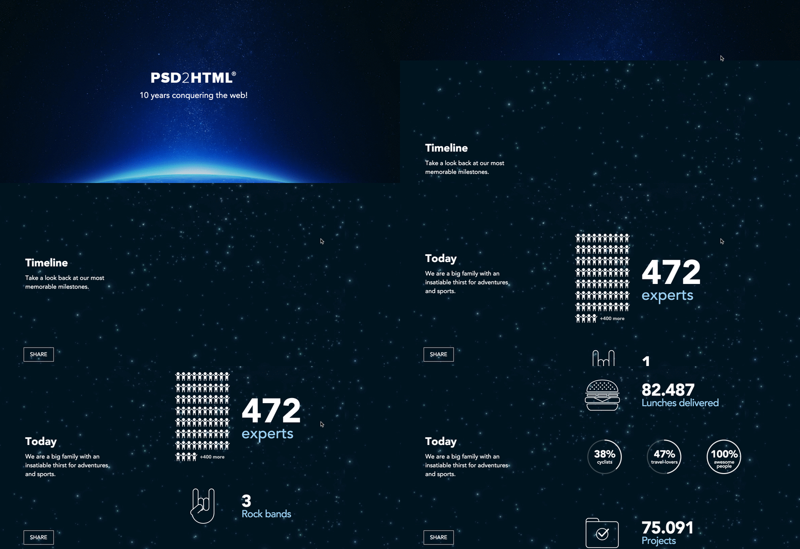
This simple annual report design provides a dazzling galactic view as readers cycle through each animation-filled page.
33) 10 Years of Git by Atlassian
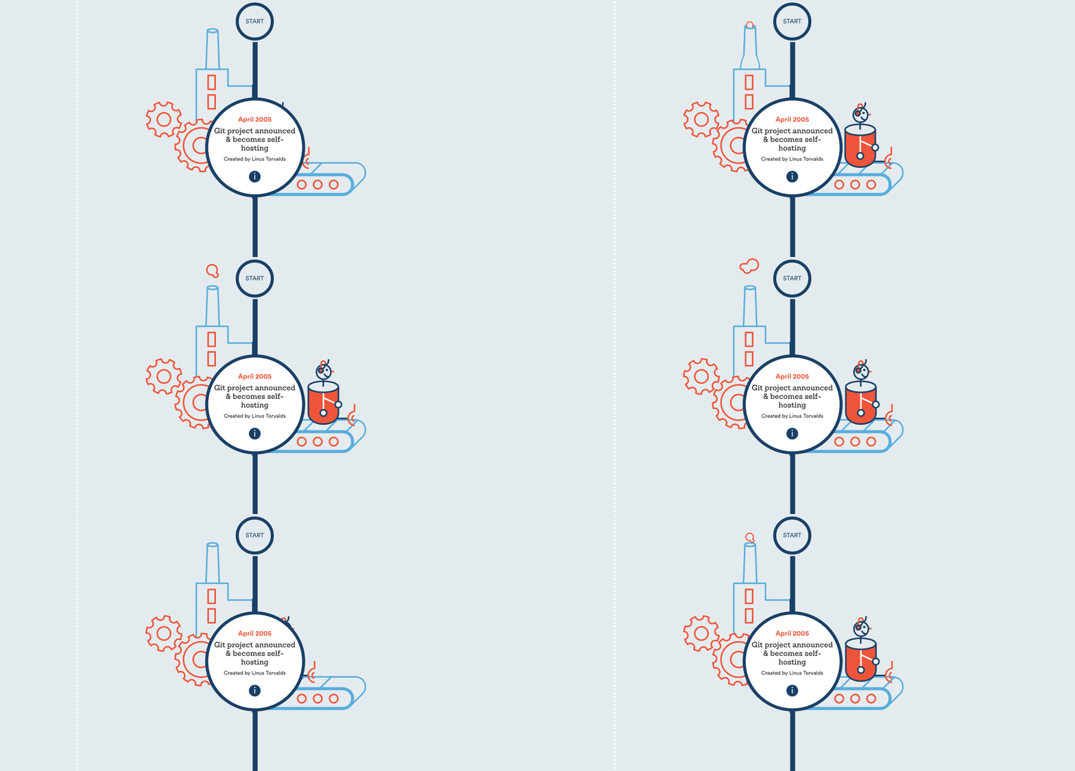
The adorable animated graphics in this report make it seem playful, but the report still provides the necessary information without distraction.
34) Energy Trust 10 Years Anniversary by Energy Trust
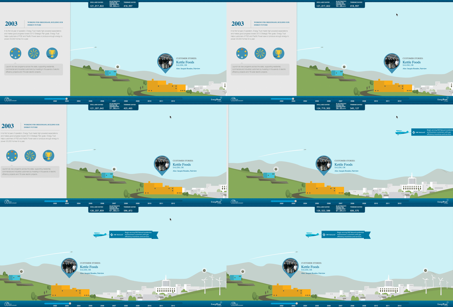
Unlike the other scroll-throughs on this list, the Energy Trust report goes left to right, rather than top to bottom. As the reader progresses through the report, charming designs of landscapes and cityscapes fill the background, creating a journey of milestones.
35) Krochet Kids 2013 Annual Report by Column Five
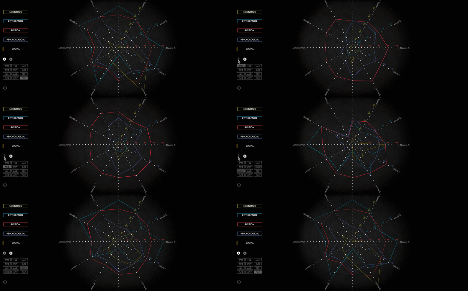
This nonprofit apparel company empowers impoverished women by teaching them to knit and crochet. To reflect the company’s mission, this interactive report features data visualization and other elements visualized through thread art.
36) VNG 10th Anniversary by VNG
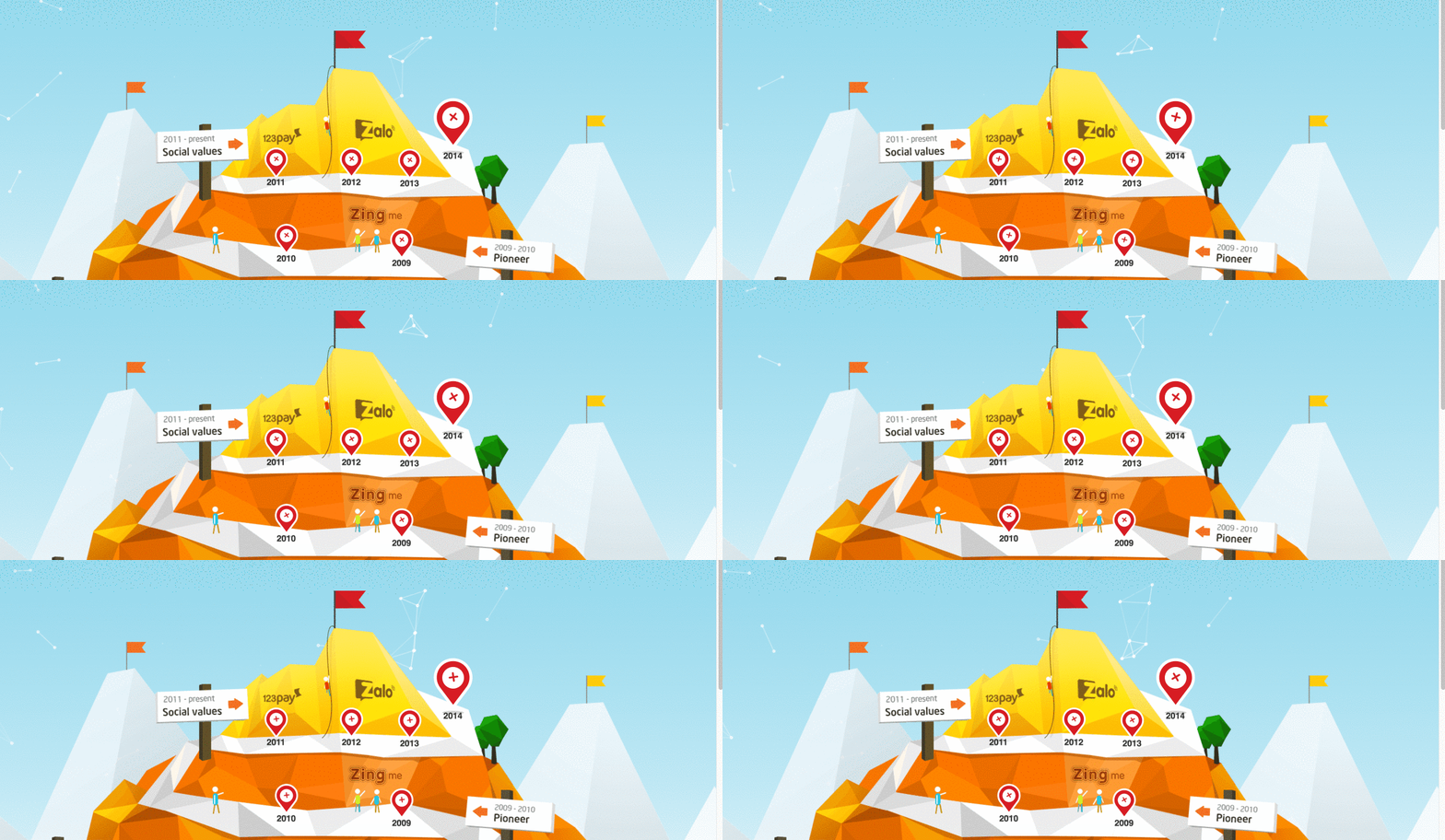
This interactive presents company information as a mountain, allowing you to explore the milestones along the way to the top.
37) Kickstarter 2016 Annual Report by Kickstarter
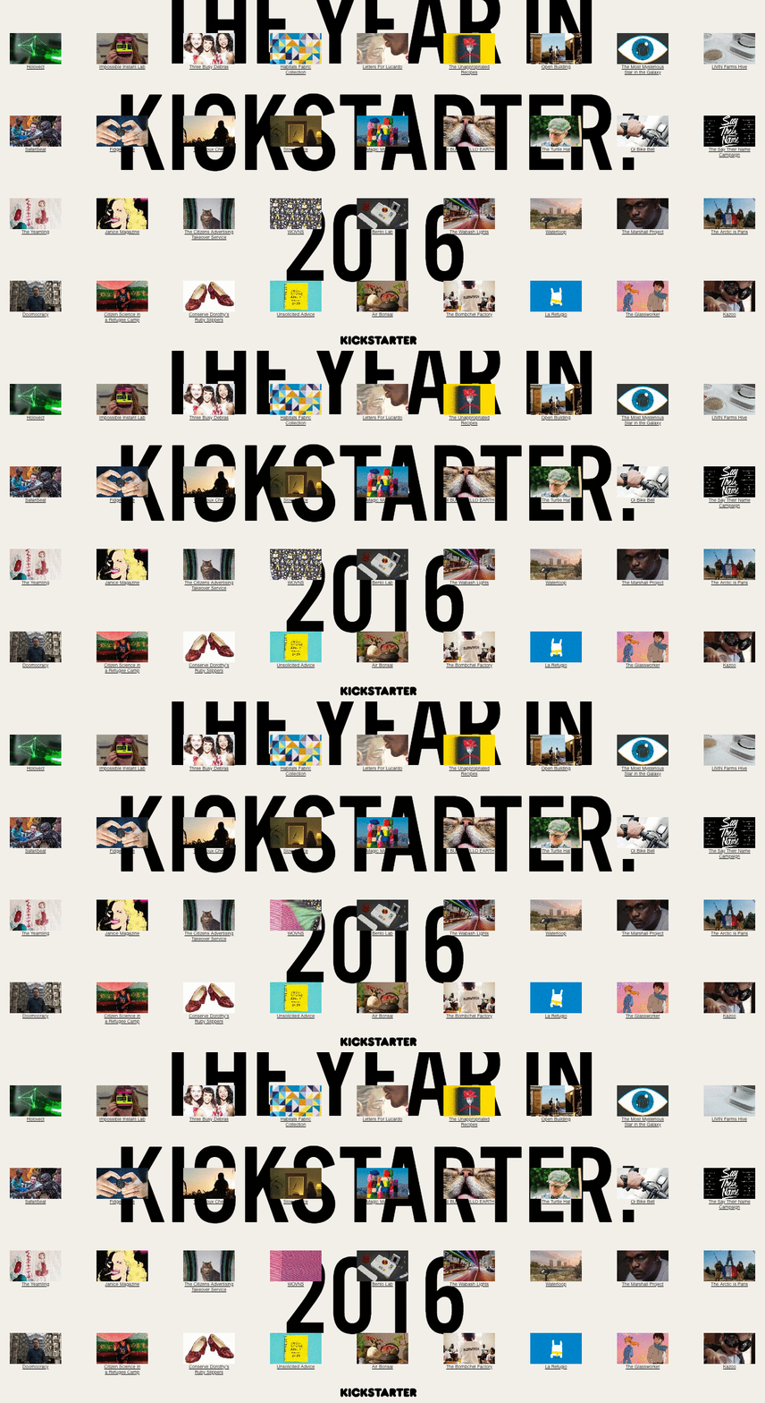
Kickstarter turned its annual report into a playful pick-and-choose interactive site, letting you explore year-end highlights.
38) ThankYou 2015 Year in Review by ThankYou
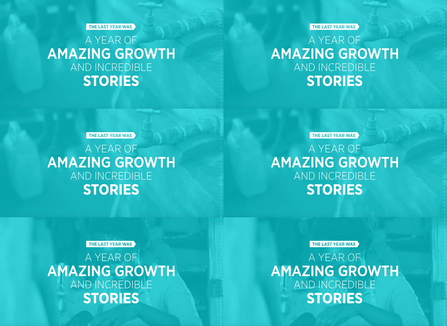
Instead of presenting straightforward information, the company turned their annual report into a storytelling masterpiece, making the narrative come to life.
39) W.K. Kellogg Foundation 2015 Annual Report by W.K. Kellogg Foundation
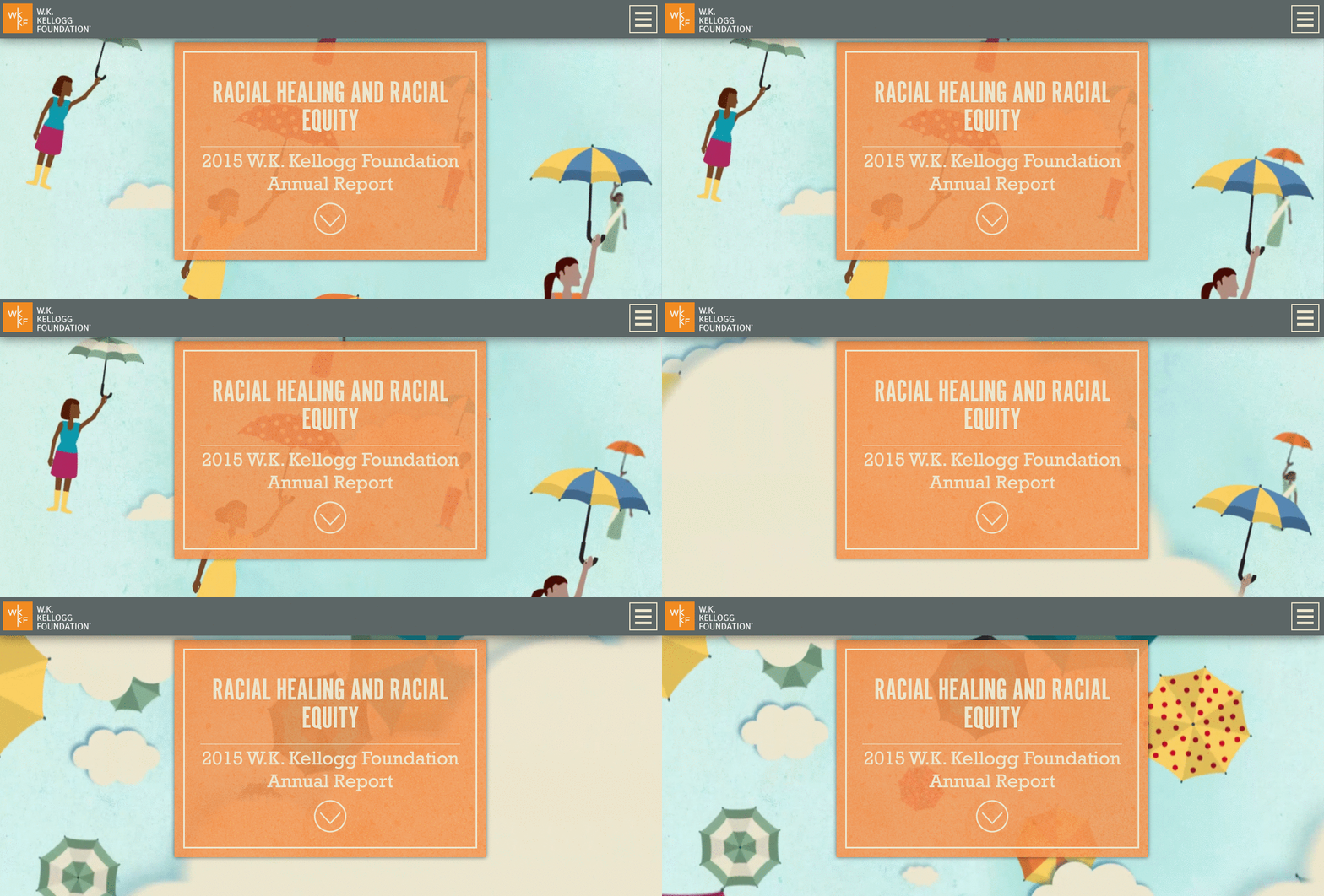
This colorful, illustration-heavy interactive features tasteful design for a serious subject: racial healing and racial equity.
40) Nielsen 2015 Annual Report by Nielsen
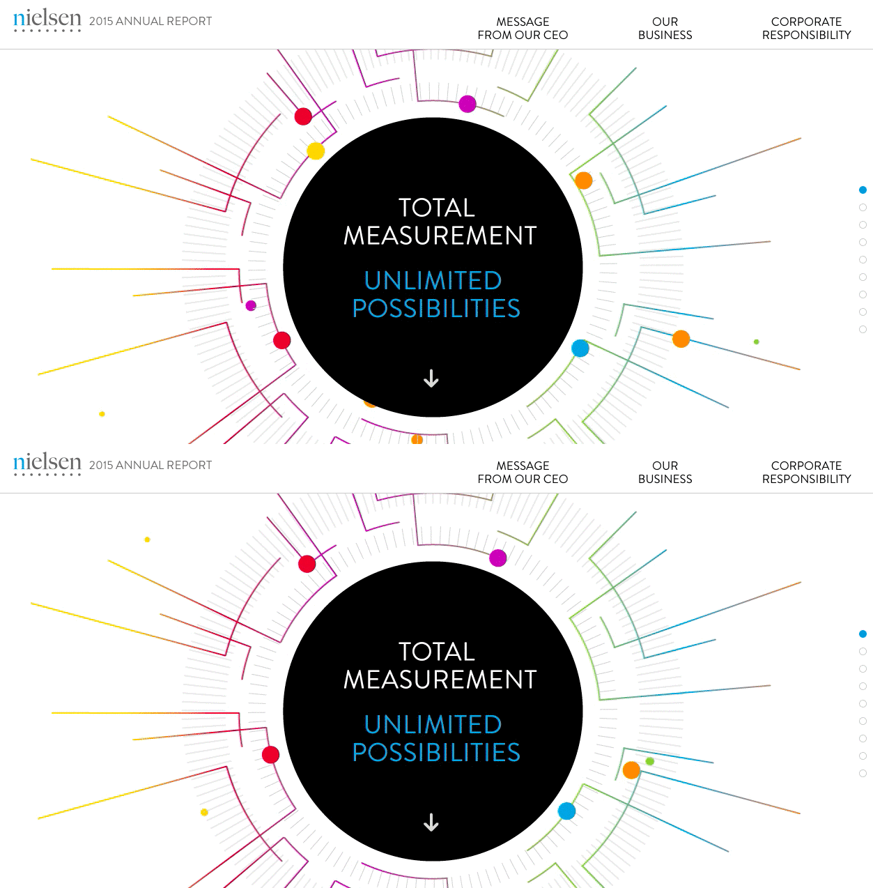
This report offers vibrantly colored animations to bring the information to life. The design itself is simple and straightforward, making the material easy to comprehend.
41) Girls Who Code 2016 Annual Report Design by Column Five
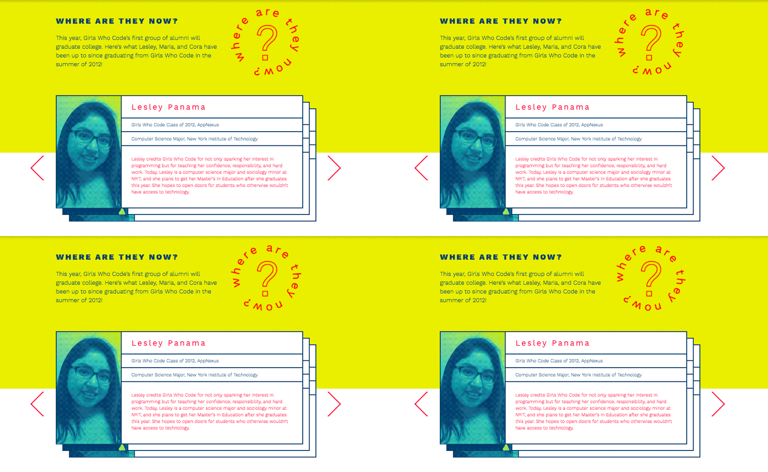
This annual report design features vibrant colors, people-heavy imagery, and personal profiles that shine the spotlight on the girls who benefit from the organization’s efforts.
42) 2016 Weatherford Annual Report by Oakwood Agency
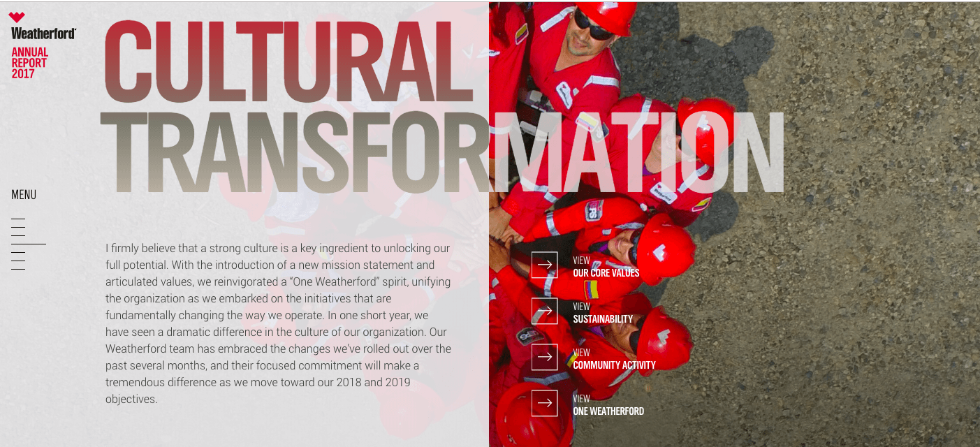
This interactive report is cleanly designed with high-quality imagery and an easy-to-navigate layout that makes it easy to find the info you want.
Annual Report Design: Video
43) Vimeo 2013 Timeline by Vimeo
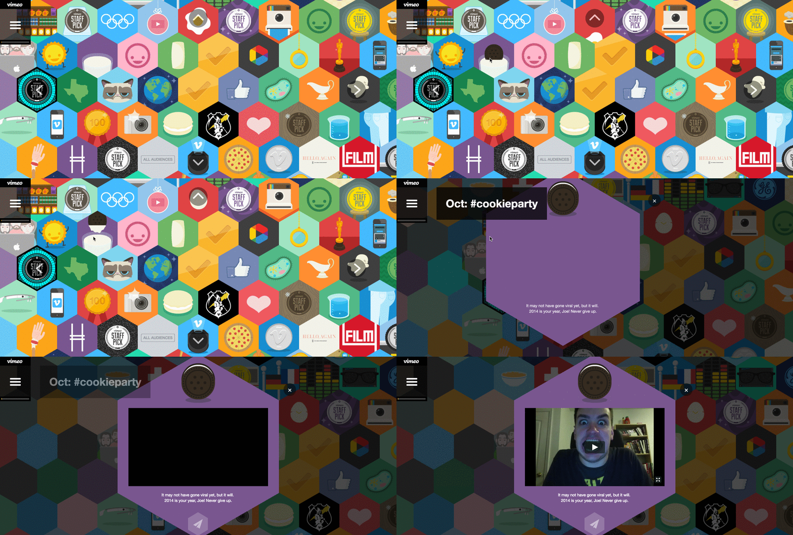
This clever report highlights what Vimeo is all about (videos, obviously), but it does so through a colorful, exploratory experience. Viewers can interact with animations to learn more, encouraging maximum engagement.
44) Charity: Water 2012 Annual Report by Charity: Water
Viewers have the option to scroll through Charity: Water’s report or watch videos highlighting the company’s year of good works and accomplishments. The videos are an uplifting way to showcase the company’s ideals and goals.
45) Pelayo Iconic 2014 Annual Report by Biográfica
This colorful video shares the year’s highlights in a highly stylized way, using real objects to represent the information. It also creatively integrates iPad screens to give the report rhythm and energy.
46) ProSiebenSat.1 2014 Annual Report by ProSiebenSat.1 Media AG
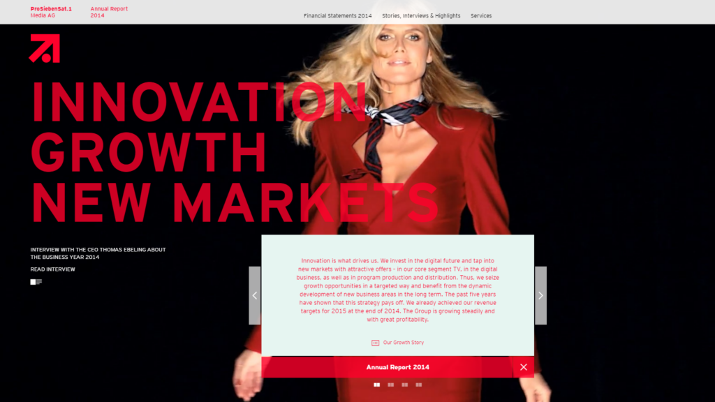
This report utilizes video to create an entertaining backdrop to the report itself. Movie scenes and live concert recordings flash across the screen as readers click through a scrolling box to learn more about the company’s endeavors.
47) Pelayo Paper 2012 Annual Report by Biográfica
Another great video by Biográfica, this one features a stunning stop-motion pop-up book inhabited by moving cutouts and 3D objects. As the information scrolls across the screen, it’s also accompanied by clever animations.
48) BBVA 2014 Annual Report by BBVA
The BBVA video report feels more like an artfully directed short film than an annual report. Music reminiscent of Explosions in the Sky plays in the background of a black-and-white film, while simple motion graphics communicate company highlights.
49) RTL Group 2015 Annual Report by RTL Group
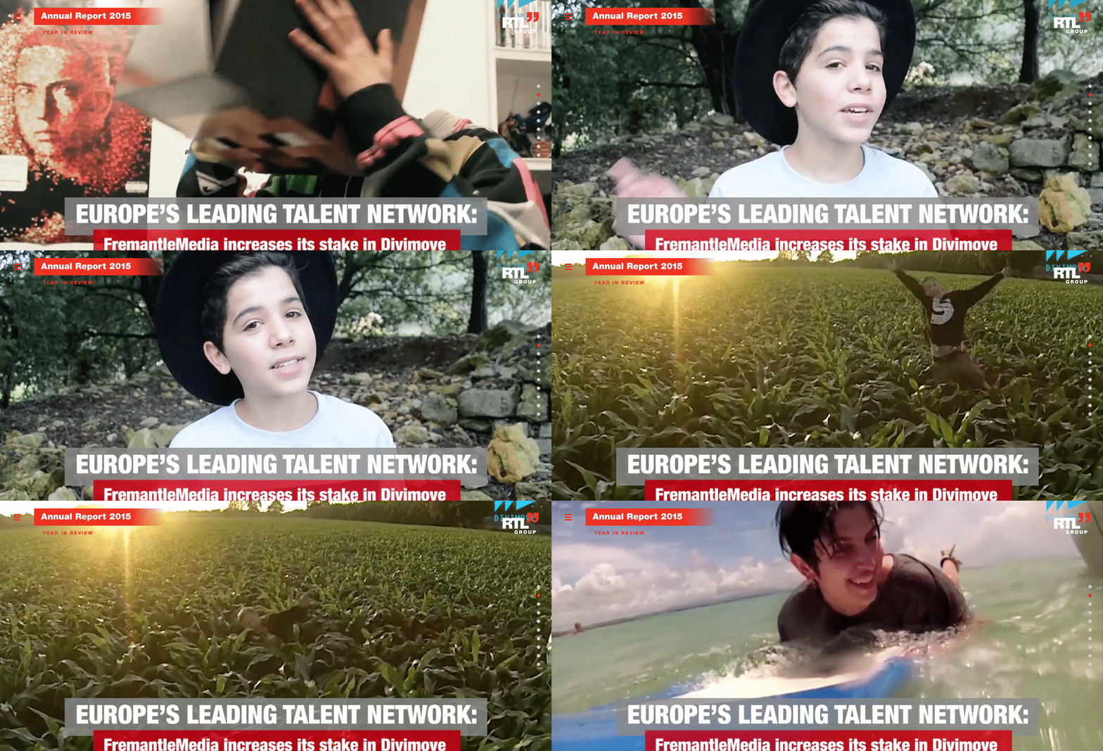
This year-in-review video features snippets of YouTube stars and movie scenes to correspond with the information presented on screen. Each new screen has a completely different theme and comes with its own soundtrack to make it entertaining and lively.
50) Pfizer 2015 Annual Report by Pfizer
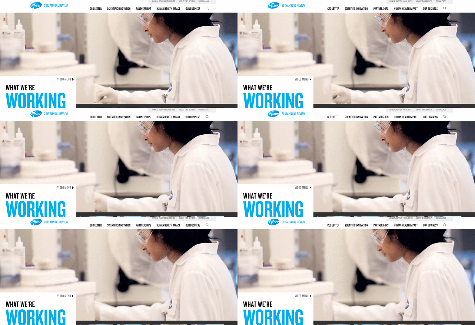
Instead of featuring static information about the employees and medical scientists at Pfizer, viewers are treated to short videos in which employees explain their role and what they’re working on. This allows viewers to see a more personal side of the company.
More Tips for Annual Report Design
Regardless of your brand, product, or service, your annual report is always an opportunity to engage and connect with people, whether it’s stakeholders, employees, or customers. For more on creating great annual reports…
- Tell the right story. Follow these tips to create a compelling annual report.
- Learn how to design data. Good data visualization isn’t about making things pretty. When done correctly, you can increase comprehension and recall too. Find out how to design the most common charts and graphs to make sure you’re using the right visualization for the right data.
- Use your brand identity. To bring your story to life, you need to add a little personality. If you don’t have an established brand voice, use our free template to find it. You can also follow these tips to make sure your report reflects your visual identity.
- Get more inspiration. See how these 5 brands nailed their annual reports, and find out why Warby Parker might be the GOAT of annual reports.
And if you think you could use a little help with your annual report design, let’s chat.



I loved your blog but it kept logging out on me. I had to try a dozen or more times just to get to the end.
We are looking to do an Annual Report for our school that is web-based and I found your site very helpful.
Miigwech (“thank you” in Ojibwe)
Siobhan Marks
Communications and Marketing Director
Indian Community School
Oh yikes! Sorry to hear that. We’ll check what’s going on.
Thanks Katy for the useful tips! In fact, corporate reports are important communication tools. Digital platforms help create visually engaging interactive reports, distribute them and get insightful analytics about white papers performance. Check out this white paper for more information: https://bit.ly/2qEEi8w
Check out EPA’s new online annual air trends report https://gispub.epa.gov/air/trendsreport/2017/
Another great example. Thanks for sharing!
Please send me more ideas to improve on my annual report design.
Hi, Elizabeth. Check out our annual report archive for more useful tips: https://www.columnfivemedia.com/category/annual-reports
No problem. Here’s another great article to improve your storytelling skills in your annual report. Hope it helps.
I have learnt new ideas. Thanks for this site.
A report you bake? That’s insanely awesome.
True genius.
This is great inspiration for our next report. thank you.
No problem. Good luck!
Some kickass reports right here.
Very true.
Wish I could see these in person. So lovely!
Us too!
I want to know how to write report but it doesn’t show
Hi Khwerana, You can find some useful info here: https://www.columnfivemedia.com/7-ways-compelling-annual-report