Maintaining quality and consistency in your brand’s content is a challenge, especially if you’re creating a large volume of content (or working with many content creators). Without the right direction, you can easily end up with Frankensteined content plagued by incorrect colors, misplaced logos, and off-brand messaging. Creating a seamless brand experience is crucial. (According to research, 35% of organizations achieved 10-20% revenue growth by presenting their brand consistently.) But how do you ensure your content is always on brand?
Create a comprehensive brand style guide—and use it.
A brand style guide acts as the blueprint for everything your team creates. It’s never just colors or logos. It’s a complete approach for a unified look, voice, and feel across every single audience touchpoint.

What Is a Brand Style Guide?
A style guide is simply the documentation of your brand identity, presented in a format that makes it easy to apply the identity to any content you create. From your logo to your brand voice, it’s a toolkit to help you present a consistent, cohesive brand to the world.
Why Do You Need a Brand Style Guide?
Everything you create should represent your brand accurately. But the larger your network, the harder it can be to monitor content and make sure everything is up to par. (Sometimes it isn’t even a freelancer’s fault; in-house teams can get a little too lax as well.)
This is why a brand style guide is so important. Not only does this provide consistency but it actually benefits your brand in several ways.
- More quality control: Not everyone has an Art Director available to look over every project, and oftentimes you’re up against a deadline. These, and many other variables, can result in content that is disjointed and ineffective. Your reputation depends on the quality of your creative content, so having well-documented guidelines ensures that you’re always putting out content you’re proud of.
- Increased comprehension: Clear communication and good design make life easier for your reader or viewer. Guidelines for things like data visualization, color use, or typography help creators design content that is more effective, creating a better content experience overall. Also, this simple act is a tremendous service for the people you want to connect with. It shows that you value their time and are invested in helping them get the info they need and want.
- Better brand recognition: Brand guidelines help you deliver a cohesive brand experience, making it easier for people to recognize your valuable content. When you provide consistent, high-quality content, people come to rely on you and—even better—seek out your content. They trust you will deliver what they want every time, and that trust is the basis of every strong relationship.
Ultimately, if you want to build a successful brand, you need a style guide.
Example: Whether it’s an e-book or infographic, LinkedIn adheres to a strict visual language, including consistent use of their signature blue color, data visualization style, and other details.

What Should a Brand Style Guide Include?
Your goal is to create a practical style guide that empowers brand creators to create a variety of on-brand content. While style guides are often thought of as design-only, you want a document that helps people understand how your brand looks and speaks. What might that look like?
Brand Heart: This is basically the high-level explanation of your brand’s core principles, which can influence everything from the way you speak to customers to the way you design your websites. It encompasses your:
- Purpose: Why do you exist?
- Vision: What future do you want to help create? What does the future look like?
- Mission: What are you here to do? How do you create that future?
- Values: What principles guide your behavior?
Verbal Identity: This is everything related to how you speak about your company, describe your products, communicate with customers, etc. This includes your:
- Brand essence
- Voice
- Tone
- Personality
- Messaging
- Tagline
- Value proposition
- Messaging pillars/differentiators
Visual Identity:
- Logo
- Colors
- Typography
- Additional elements (if needed)
- Photography
- Illustration
- Iconography
- Data visualization
Note: If you’re a new brand, you may not have a full brand identity created. But you should at least have the basics (logo, color, typography), as well as brand voice and personality guidelines.
If there are any of these elements you haven’t built out yet, see our guides to:
- Articulate your brand heart.
- Find your brand voice and personality.
- Write a great tagline and value prop.
- Create your messaging pillars.
- Design a brand identity.
What Makes a Good Style Guide?
An incomplete style guide is basically just as effective as no style guide at all. If you want yours to be as helpful as possible, it should be:
- Comprehensive: Again, your style guide should help anyone create on-brand content, so make sure you have included as much relevant information as possible.
- Practical: You want your style guide to be comprehensive, but you don’t need to overwhelm people with information. (This will make it cumbersome, and your team will probably avoid using it.) Provide clear direction with simple, succinct language, and helpful examples.
- Accessible: Everyone on your team should know where to find your style guide.
Most importantly, your style guide should be customized for your brand’s unique needs—whatever they may be. For more insights, check out how to create brand guidelines that work.
How to Create a Style Guide
So how do you make guidelines that work for everyone? Just follow this step-by-step guide.
Step 1: Choose Your Format
Depending on your needs, you can design your style guide for multiple mediums.
- Static (print): If you’re going old school, you can create printed guidelines. We’ve seen plenty of brands transform their guidelines into works of art in this way. (See the award-winning hard copy of the Fisher and Paykel brand guidelines.)
- Static (web): Digital guidelines are the easiest way to make your guidelines accessible from anywhere. You can simply create a PDF for your site or server.
- Interactive (web): More and more brands are opting for interactive style guides, which are easy to navigate and more dynamic.
You may even experiment with all three formats, depending on your needs.
Step 2: Create a TOC
Your brand guidelines are the summation of your brand strategy. They basically function as your bible; therefore, they should include everything anyone might need to know about your brand. To guide your creation, outline the elements you plan to include.
Again, you don’t have to include each of these items if they aren’t relevant, but you should include the basics (verbal identity and logo, color, typography).
Brand Heart: You can also include your company history, milestones, or any other relevant info one would want to know about the company’s background. This information is important because it explains the core of your brand: who you are, what you do, and why it matters.
- Purpose
- Vision
- Mission
- Value
Verbal Identity: In addition to these, you can include any other elements that help people communicate more effectively or provide more context (e.g., a list of words you DON’T use, or the standard descriptions of your services).
- Brand essence
- Voice
- Tone
- Personality
- Messaging
- Tagline
- Value proposition
- Messaging pillars/differentiators
Visual Identity:
- Logo
- Colors
- Typography
- Additional elements (if needed)
Photography
Illustration
Iconography
Data visualization
Depending on the size of your company, the industry you’re in, or the content or products you produce, you might include directions for additional things, such as audio branding or even scent branding.
Step 3: Build Out Your Style Guide
Now that you have your outline, you can start to flesh out your guidelines. Focus on clarity and practicality as you write your copy and add design. To make your style guide easier to apply, you can also include tips, call-outs, sidebars, etc. We find it especially helpful to include:
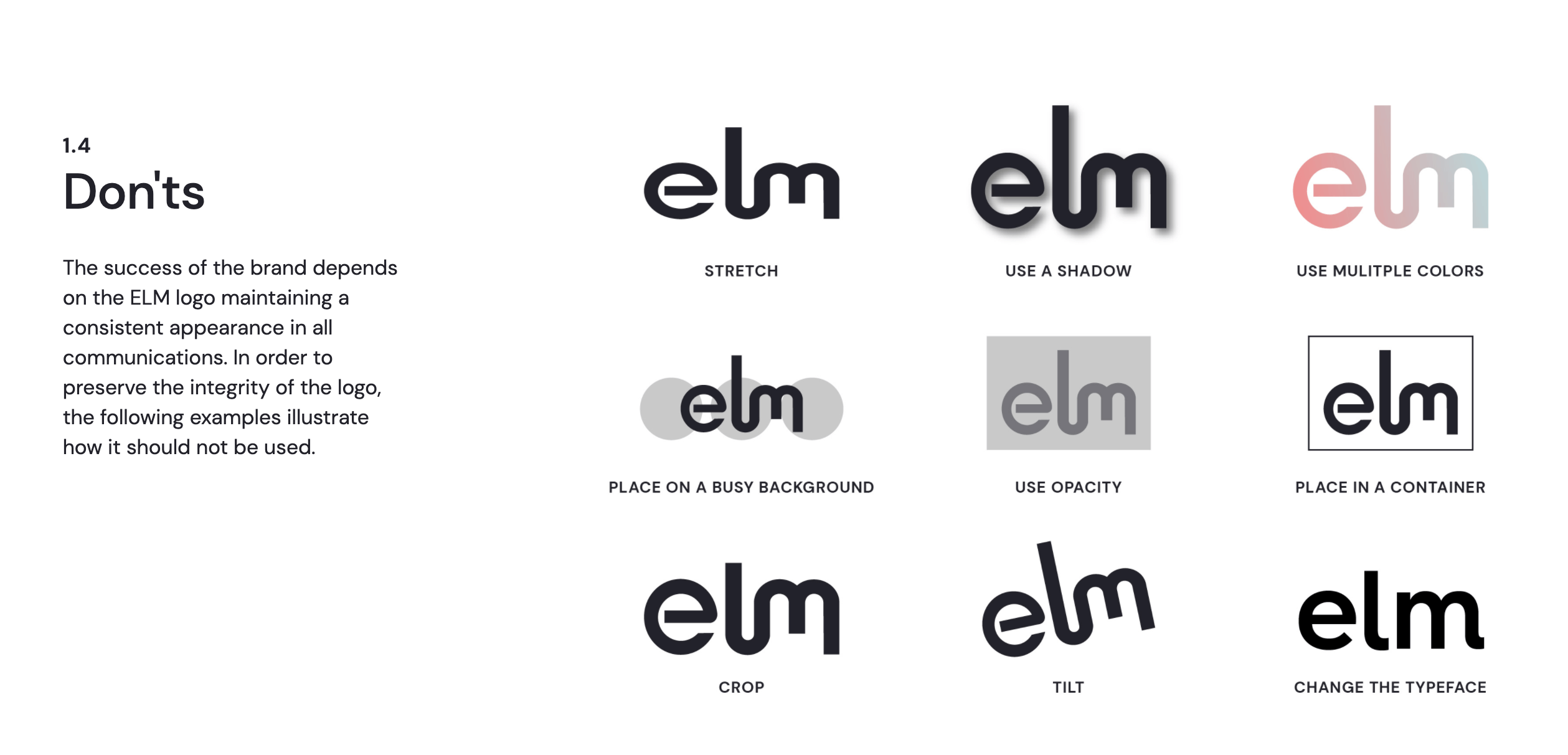
- Dos and don’ts: This is helpful to identify the key mistakes to avoid.
- Checklists: It’s probably not realistic for every single piece of creative content to be approved by an Art Director, but it’s important to give content a final edit/once-over to ensure on-brand design. A simple checklist can help catch any of those little errors like incorrect logo usage—before it goes out the door.
- Examples: How should your brand voice be used for social, press releases, marketing emails, or product descriptions? What does your typography hierarchy look like? What are the correct logo dimensions? Showing what these things look like in real life makes them much easier to emulate.
- Tools and resources: Do you use an app to double-check your hex codes? If it helps you, it will probably help others.
For each section, give enough detail to explain but don’t exhaust your reader. If your brand guidelines are the size of an encyclopedia, they will only serve as a beautiful paperweight on someone’s desk. (And if a noob can’t interpret it, you’ll be in trouble.)
Example: The Expanded Special Project for Elimination of Neglected Tropical Diseases guidelines provide direction on proper logo use, including when and where colored logos should be used.
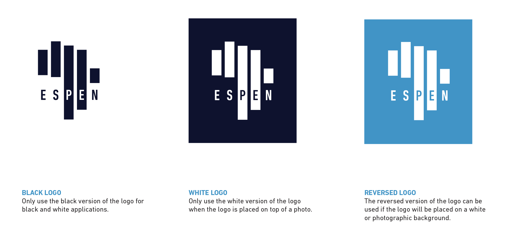
Remember: Helpful brand guidelines don’t just tell—they show. When and where you can, let design do the heavy lifting. Also, your brand guidelines themselves are a piece of branded content. Inject your brand personality wherever you can.
Step 4: Vet Your Style Guide
The whole point of a style guide is to eliminate questions about how to design on-brand content. Whether you have 5 content creators or 500 working for your brand, it’s smart to ask someone to proof and sanity-check your style guide before you distribute it to everyone. (Otherwise, you may be flooded with questions and comments.)
Share it with someone who is intimately familiar with the brand to find out:
- Is it clear?
- Is there anything missing?
- Are there additions that may improve the reader’s experience?
Ultimately, a style guide only helps a brand if it helps the people who work for the brand.
Step 5: Make Your Brand Guidelines Easy to Access
One of the most common reasons people ignore brand guidelines is simply because they can’t find them, and that’s how you end up with 1,000 brochures printed with your old logo.
Make sure your guidelines are in an easy-to-find place (e.g., company server or company Wiki) and shared with everyone, especially new employees or creative partners. Even if you have a printed version, render a digital PDF too.
5 Awesome Brand Style Guides to Inspire You
Every brand is unique, but if you want to add a dash of creativity to your guidelines (and who doesn’t?), here are some of our favorite style guide examples that do it the right way. For more, see brand identity design and examples and our curated list of brands with a bold and beautiful visual identity.
1) Mailchimp
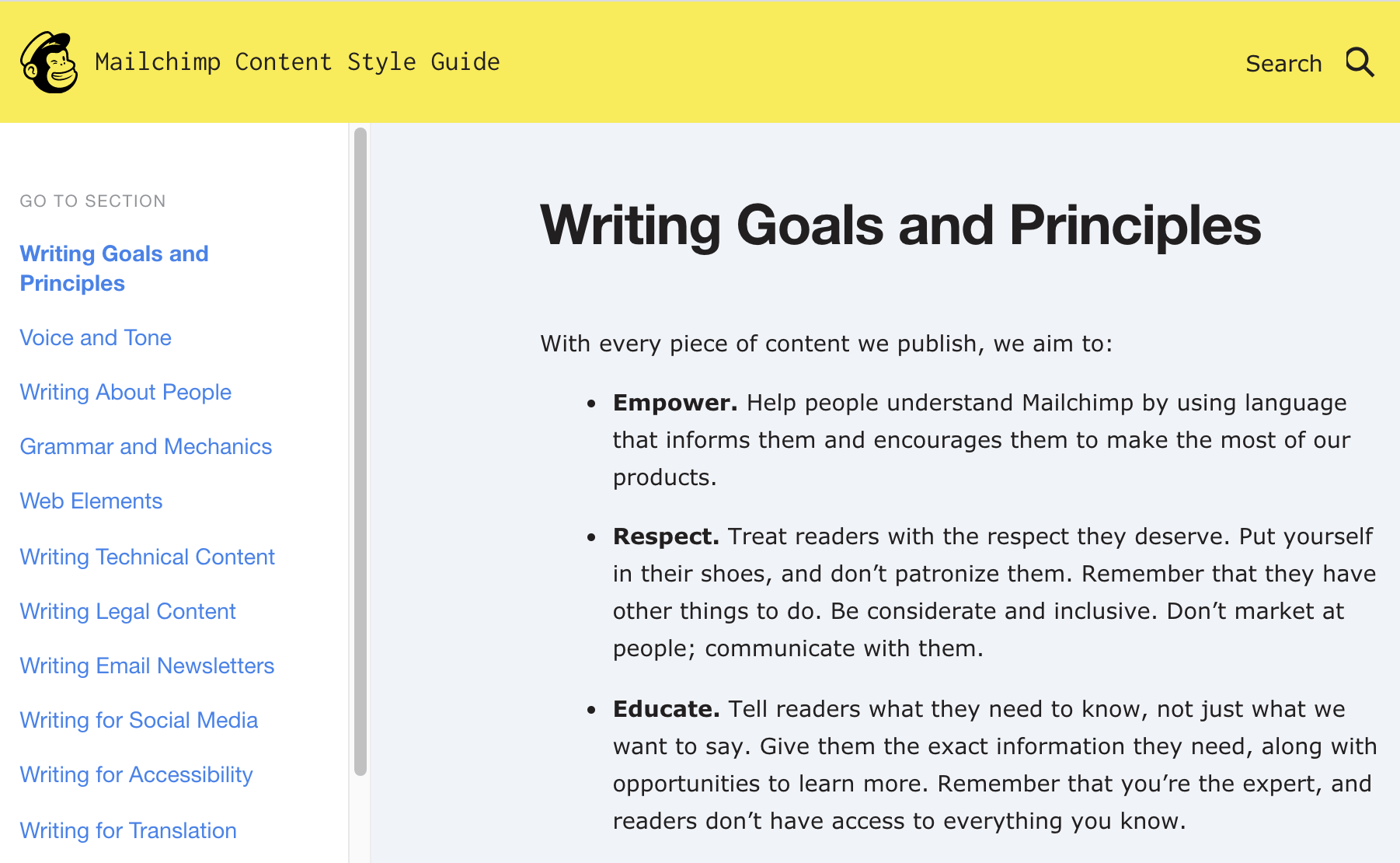
Mailchimp offers interactive guidelines for both copywriting and design. The level of detail they provide for copywriters is unparalleled. Want to know how to write legal content? Newsletters? Social content? They detail it all, along with writing principles, web tips, word stylization, and more.
Similarly, their design guidelines are both beautiful and succinct, communicating the brand’s design philosophy through the guidelines themselves.

2) Zendesk
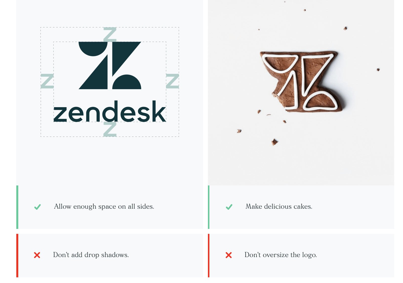
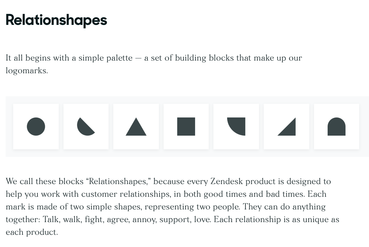
A strong brand identity is able to tell a strong story, and Zendesk does that supremely well. In fact, their style guide feels less instructional and more editorial, as they break down the elements of their brand identity, including simple dos and don’ts, tips, and resources to make it easy to apply.
3) Gusto
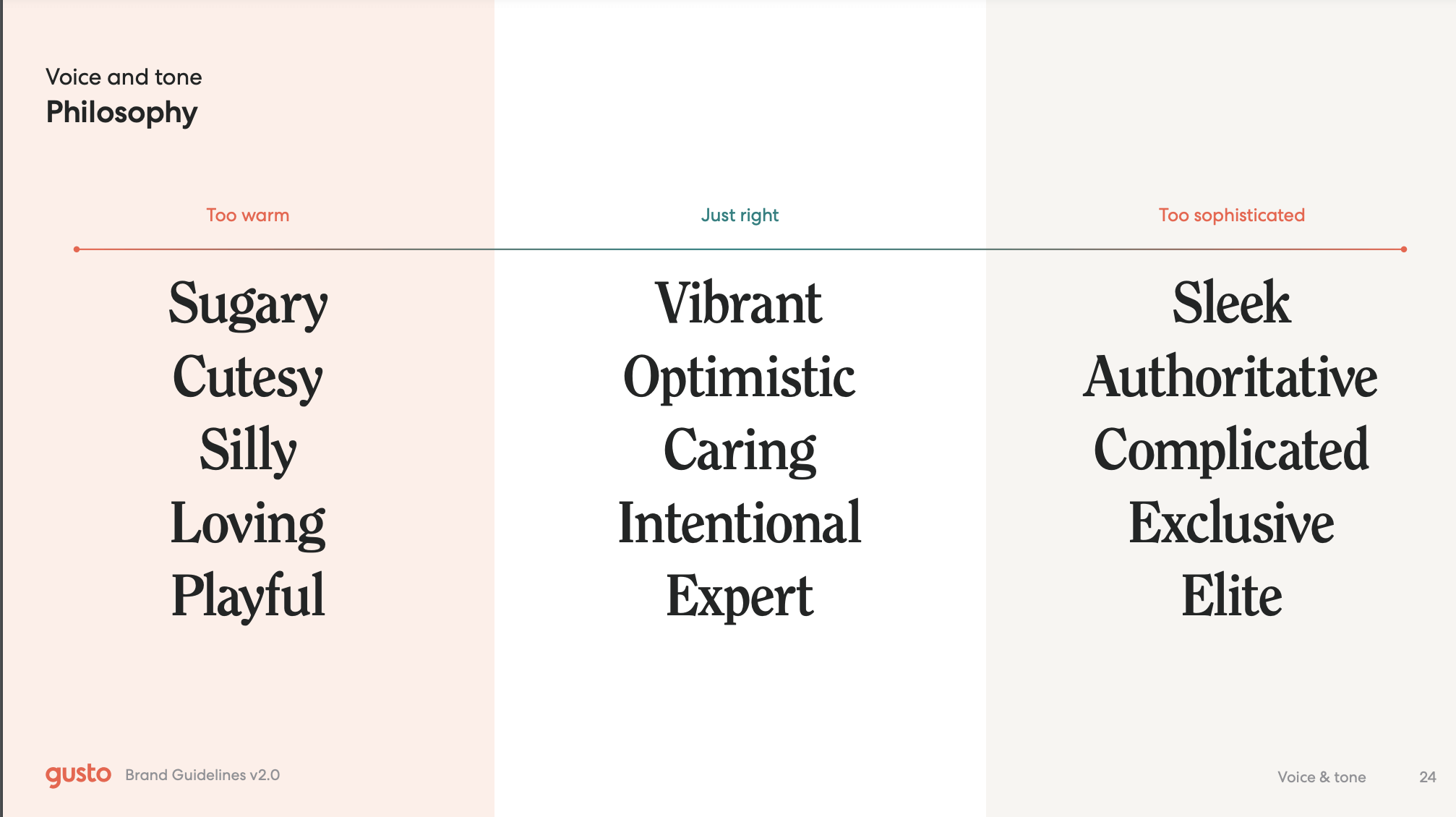
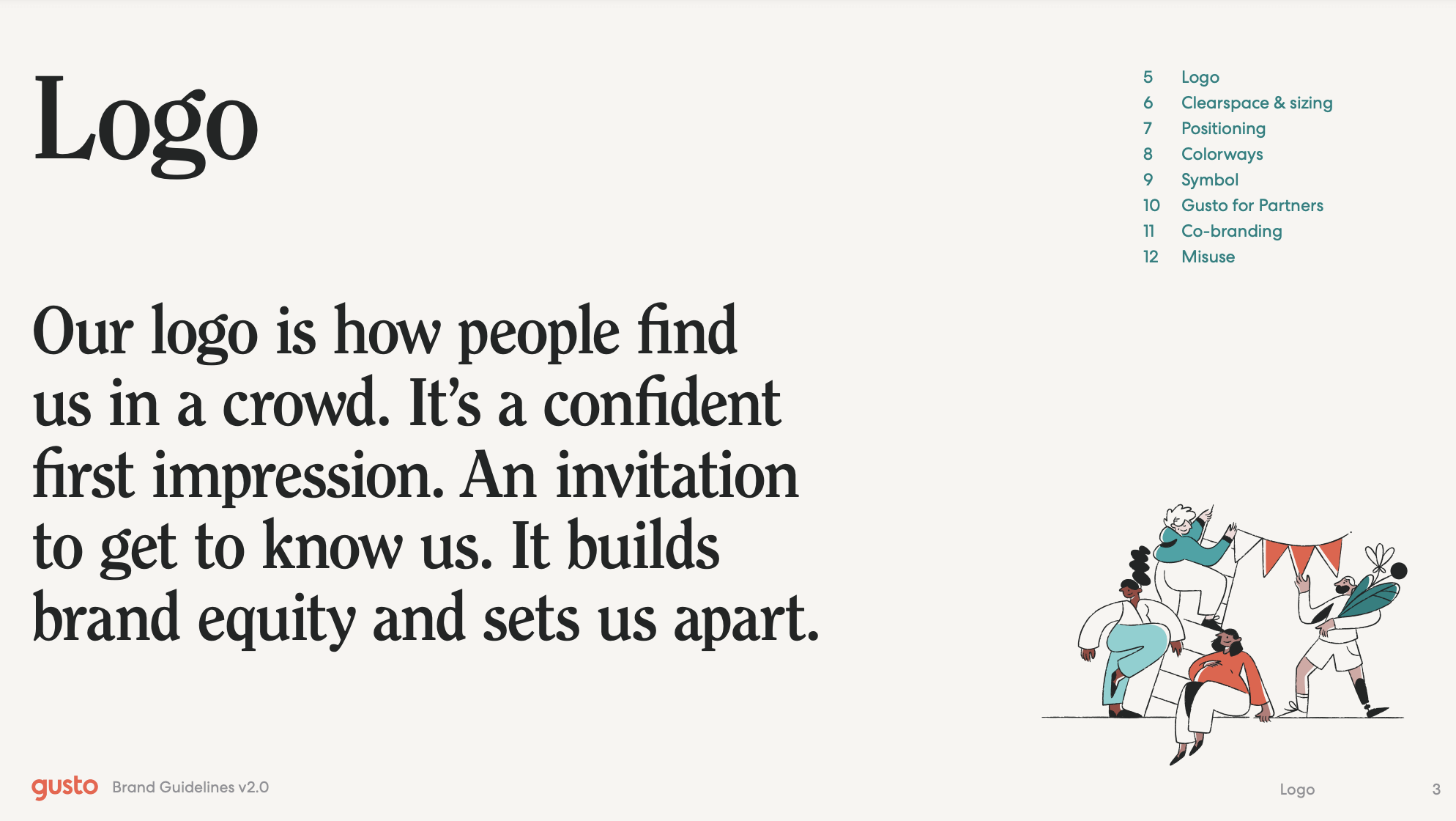
Not every brand needs to design a clean interactive. A well-designed PDF can be just as helpful, as Gusto proves. Their brand guidelines shine because of their simplicity and efficacy. Not only do they provide practical guidelines but they really educate the user on why these guidelines are so important and how they communicate the brand’s philosophy.
4) ELM
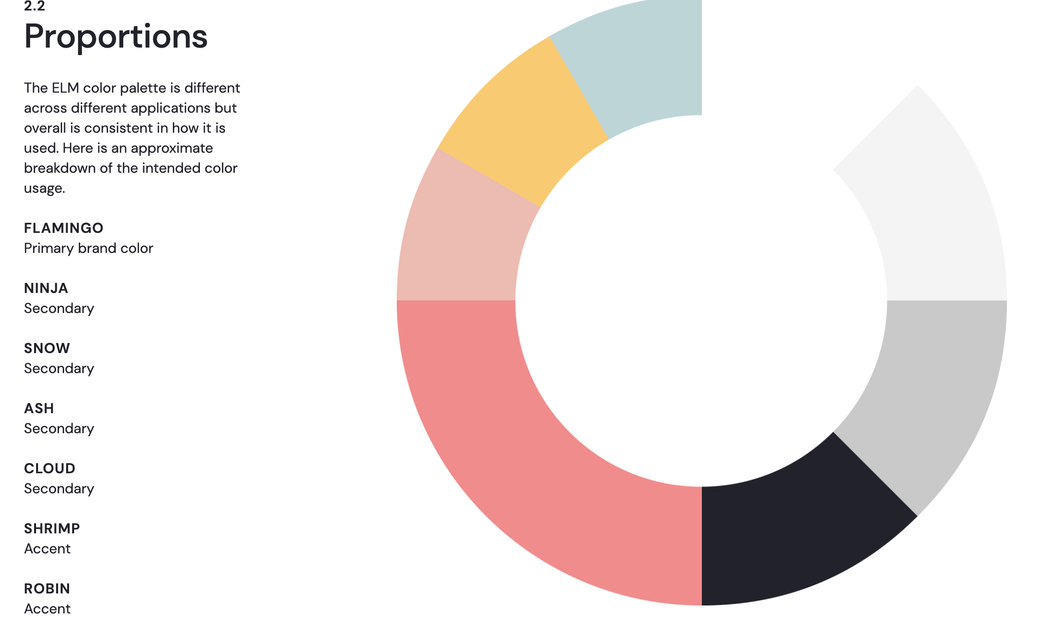
Colorful, clean, and engaging—those are the hallmarks of ELM’s brand guidelines. Smooth interactivity, animation, and visuals make this a joy to behold. They do a fantastic job of letting design do the heavy lifting, too. For example, instead of simply explaining how the primary, secondary, and accent colors should be applied, they created a colorful data visualization that breaks down usage across the brand. This is exactly the type of creativity that can turn brand guidelines into a powerful piece of communication.
5) Starbucks
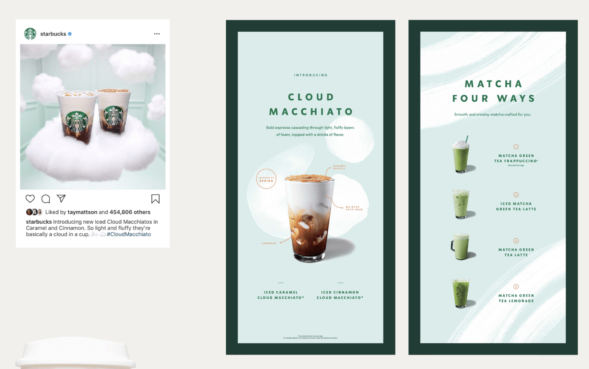
For a megabrand like Starbucks, maintaining a cohesive brand identity is a challenge. But with their comprehensive brand style guide, Starbucks provides all the guidelines creators need to succeed.
The interactive guidelines are beautifully designed according to the brand identity itself, featuring the brand’s signature colors, as well as animation and a bevy of case studies (aka visual real-world examples) to capture attention.


Always Keep Your Brand Guidelines Updated
Your brand is always growing and changing, so your brand guidelines should reflect that. Work with your brand team to schedule regular content reviews to make sure the guidelines are being appropriately applied. Brand stakeholders should also identify what needs to be updated, expanded, clarified, removed, or edited.
Most importantly, have regular conversations about what is or isn’t working, and ask your team for any ideas that will make using brand guidelines easier. For expert help, preserve your brand integrity with professional brand guidelines.
Brand Style and Storytelling Pay Off
At the end of the day, a sharp, consistent brand style creates trust. Your content will better connect. People will start to recognize and remember what your company represents. That feeling of familiarity? It pays dividends over time.
That said, if assembling guidelines feels like too much, consider calling in outside experts who live and breathe consistency. Find out what it’s like to work with Column Five on your brand identity. We’d be happy to take it off your plate.




Thank you. I like ease of creating shown by your narrative.
I’m blown away by the insights and knowledge shared here.
Thanks so much! Always trying to provide helpful info for our audience.
Good business
brand Style Guides is a good business