A strong brand identity doesn’t happen overnight. You can’t just pick a few colors and haphazardly slap a logo together. You need to approach your design strategically to build an identity that truly reflects your brand—and can support you as you grow. This requires deep thinking, a team with strong communication and design skills, and an intimate understanding of who you are, what you do, and how you want to present your brand to the world.
This work isn’t easy, but it’s some of the most important work that any brand can do. So if you’re going to do it, you might as well do it the right way. Of course, tackling a brand identity can be both intimidating and confusing. What should it include? How do you start? Who needs to be involved?
Don’t worry. With the right guidance, you can move through the process effectively, and that’s why we’re here. With 15+ years of experience in bringing bold brand identities to life, we know the tricks to make the process easier (plus mistakes to avoid), and now we’ve distilled all our knowledge into this simple step-by-step guide, along with a handy toolkit to help you along the way. Follow this guide and you’ll end up with a beautiful, functional brand identity that will help you outshine your competition, connect with the right people, and tell your brand story through every piece of content.
Let’s get into it.
Note: First published in 2016, this post has since been updated to include our streamlined process and free brand toolkit.
What Is a Brand Identity?
Is it your logo? Your color palette? Your infographic style? It’s all that—and more.
Branding pro Marty Neumeier defines a brand identity as “the outward expression of a brand, including its trademark, name, communications, and visual appearance.” To us, a brand identity is the sum total of how your brand looks, feels, and speaks to people. (Sometimes that even includes how it sounds, tastes, feels, and even smells.)
That said, when most people talk about brand identity, they’re referring to a brand’s visual identity. For the purposes of this post, that’s what we’ll be focusing on.
Why Do You Need a Brand Identity?
A successful brand identity is not about making pretty packaging; it’s about communicating your brand story effectively. Design is a powerful tool that can transform how people interact with your brand in three important ways.
- Differentiation: How can you stand out in a crowded marketplace? Your brand identity can play a strong role. Whether you want your product to stand out on a shelf or you want your ads to stand out on Facebook, creating a consistent, cohesive presentation is the secret to success.
- Connection: The more effectively you communicate who you are, the easier it will be for people to engage with you and, ultimately, join your community of lifelong fans.
- Experience: Everything you create reflects your brand. Thus, if you want to create a consistent, cohesive brand experience, you need to present a consistent, cohesive identity. From your website and social media to your decks and one-sheets, a strong identity is the key to elevating your brand experience.
Some brands elevate brand identity to an art (think Apple or LEGO). Some brands make it their entry into the playing field (think Warby Parker). Others struggle because they don’t know who they are or don’t know how to communicate it effectively. (The truth is too many brands fall into this camp.)
Regardless of where you fall on that spectrum, one thing is certain. If you want to be a competitive and successful company, crafting a strong brand identity is mandatory.
What Does a Brand Identity Include?
When you create a brand identity, you’re basically building a toolbox of visual elements to help you communicate effectively. This can be basic or extensive; it all depends on your brand’s needs.
Regardless, every brand needs a basic identity, which includes three core elements:
- Logo
- Color palette
- Typography
If you create a wider variety of content (or plan to), you may also design additional elements to express your brand across mediums, including:
- Photography
- Illustration
- Iconography
- Data visualization
The good news is you don’t have to design everything all at once. If you don’t have a ton of resources (or don’t know what your future needs will be), start with the basic logo, color, and typography. You can build out additional elements as you need.
What Makes a Strong Brand Identity?
Here’s the thing. Having a brand identity on paper doesn’t mean your identity is good or effective. Even if you design every element needed, it may not help you achieve your long-term goals.
A strong brand identity needs to work for everyone, both your internal team (e.g., brand ambassadors, content creators) and the people who will interact with it (e.g., customers).
To truly succeed, you need to build a brand identity that is…
- Distinct: It stands out among competitors and catches people’s attention.
- Memorable: It makes a visual impact. (Consider Apple: The logo is so memorable they only include the logo—not their name—on their products.)
- Scalable: It can grow and evolve with the brand.
- Flexible: It can be used in many different applications (web, print, etc.).
- Cohesive: Each piece complements the other.
- Easy to apply: It’s intuitive and clear for designers to use.
If you design an identity that doesn’t resonate with your target audience, or doesn’t truly reflect your brand, you will have wasted a lot of work. (Luckily, we created this guide to ensure this doesn’t happen.)
How to Build a Brand Identity
To demystify the process for you, we’ve broken the process into 10 steps to get you from A to Z. These steps are listed in this specific order, as different elements of your identity are built upon others. Whether you’re building a fresh identity from scratch or embarking on a rebrand, follow this sequence to design a strong brand identity that sets you up for success.
Before You Start
Download our free Brand Identity Toolkit, which includes tools, templates, and checklists to help you along the way.
Step 1: Know Your Foundation
Before you jump into the steps we detail here, know that the visual aspect of your brand identity is not the first thing you should tackle when you’re building a brand; it’s actually the last thing. A brand is like a house; it should be built on a solid foundation.
First, you need to know who you are: What’s your personality? What do you care about? What do you do? How do you talk about what you do? These are the core elements of your brand that your visual identity will communicate. If you don’t have this foundation to build upon, you can’t design a visual identity that properly tells your brand story.
How to do it: Before you proceed, make sure you know your:
- Brand Heart: This is an articulation of your brand’s core principles (specifically your purpose, vision, mission, and values). Your Brand Heart is the foundation of your brand strategy, guiding all decisions about who you are and how you grow, so it’s crucial to have it well-documented. (If you haven’t done this, use our guide to find your Brand Heart to get it on paper.)
- Brand name: If you haven’t done this already, find out how to choose the right name. Note: You really cannot design a logo without a name.
- Brand essence: This is your brand voice, tone, and personality. See our guides to find your voice and personality if you need more clarity on these.
- Messaging: Your visual identity will be directly influenced by your tagline, value proposition, and messaging pillars. Use our brand messaging framework to ensure you have a cohesive messaging ecosystem that is accurate and compelling.
Additionally, you need to know why you’re going through this process at all. If you’re starting from scratch, it’s obvious why you need to do this. If you’re rebranding, make sure everyone on your team understands the challenges you’re facing with your current identity and what you’re hoping to achieve with a new one. (FYI, here are 10 reasons to consider a new brand identity.)
As long as you have your core brand elements established, and your team is on the same page, you can proceed.
Step 2: Assess Your Current Identity
Good branding is ultimately about good communication. To make sure your visual output aligns with your brand values, reflects your personality, and communicates your total brand story, you need to have an intimate understanding of your brand.
Thus, you should start with a brand assessment to understand:
- The current state of your brand’s identity
- How that brand identity might be crafted or tweaked to align with your goals going forward
By taking a critical look at your brand, you can get the insights you need to build an identity that accurately communicates it.
How to do it: Use the Brand Audit Template in the toolkit, and follow our guide to audit your current brand identity. You’ll have more conversations about the direction you want to go in later, but this template is the first step to make sure you’re moving in the right direction.
Step 3: Audit Your Competition
Building a brand identity is all about differentiation: making your brand visible, relevant, and unique. Thus, it’s crucial to understand not just who your competition is but how your brand compares in terms of your visual presentation.
Through a competitor audit, you can compare your brand to each competitor, and compare your competitors as a whole, which can surface some surprising insights.
For example, we once did competitive research for a brand and found that all of their competitors used the exact same four colors. This isn’t uncommon, as many industries tend to gravitate toward the same visual elements (think Netflix and YouTube’s use of the color red), but it revealed a great opportunity to differentiate.
Fun fact: The video platform Twitch made a splash with their all-purple branding (at a time when their competitors used bold greens and reds). The color instantly became a hallmark of their brand (now a multi-billion dollar company).
Noting these types of opportunities is why a competitor audit can be invaluable.
How to do it: Use the Competitor Brand Audit Template in the toolkit to assess your top 5 competitors.
As you move through the process, pay special attention to how your competitors present themselves in terms of common visual elements, trends, industry-specific visual themes, brand personalities, etc.
Step 4: Hone In on a Visual Direction
Now that you’ve taken a critical look at both your current identity and your competitors’ identities, it’s time to get your team aligned on the direction you want to go in.
Design can be incredibly subjective. Colors that convey power and strength to one person may be perceived totally differently by others. Even the vocabulary you use to describe your brand can be interpreted differently across your team.
At this stage, you aren’t ready to design yet; you first need to have important conversations and move through exercises that will help you land on a shared vision for your effective brand identity.
- What are the key brand traits you want to express through your visuals?
- What type of visuals communicate these traits?
- What do you want people to feel when they “see” your brand?
Note: It’s important to get brand stakeholders in the same room to have these conversations, identify the path forward, and make sure everyone on the team is aligned. (The insights you get from these conversations will help you craft the creative brief that graphic designers will use to bring the visuals to life.)
How to do it: To prompt these conversations, it helps to conduct exercises to guide your conversation. (Think of this as a creative therapy session.) Use the Brand Attributes Spectrum Exercise in the toolkit to help your team identify the main brand attributes you want to convey through your brand identity.
Note: You won’t get the insights you need in a single meeting. It may take several meetings to talk through and come to a consensus.
Step 5: Write Your Branding Brief
Once you’ve completed the previous steps, you have the information you need to start designing. However, you shouldn’t jump right in. Start with a creative brief that details the pertinent info you need to keep your team on the same page—and ensure you create an identity that aligns with your brand goals.
How to do it: Use our Branding Brief Template to detail your specs. Note: Don’t provide too much or too little info. Your brief should always inform, not overwhelm. Again, remember to include all existing messaging and documented brand elements for reference.
Step 6: Design Your Logo
A brand identity is an intricate design system. Each element influences the other, but it starts with your logo. A strong logo captures the essence of your brand, helping you make your mark (literally) in the world.
How to do it: You can go old-school here and bust out the pencils to free-sketch in black and white. You want to make sure that the core imagery is powerful enough to deliver the message on its own, without the enhancement of color. To start, work on loose shapes and complementary imagery to inspire your logo mark. For step-by-step instructions, check out our guide to design a logo you love. If you’re looking for creative inspiration, you can also check out these 15 examples of brands with an awesome identity
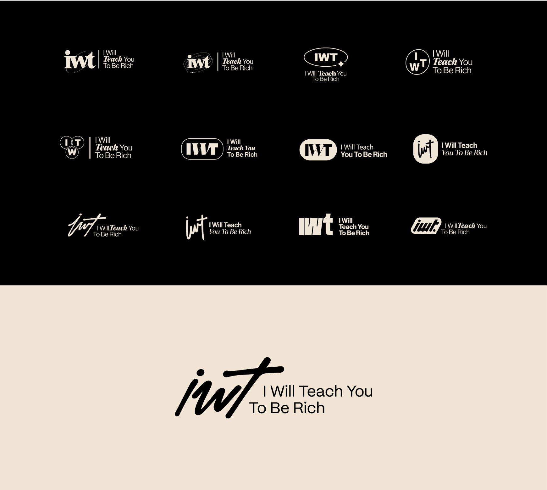
Example: You can see many iterations of our logo for IWT, along with the final logo.
Step 7: Choose Your Color Palette
Once you have a solid logo, you can explore your color palette. Color is a great tool to differentiate your brand from competitors, but know that color can also elicit strong emotions, so choose wisely.
How to do it: A good color palette is clean and flexible, supplying designers enough choices to be creative but not enough to overwhelm. This includes:
- 1 main color
- 2 primary colors
- 3-5 complementary colors
- 2 accent colors
For more tips, see our guide to choosing the right colors for your brand identity. Note: Consider accessibility in your design in things like contrast, legibility, etc. (And see our tips to create more inclusive marketing for more on that.)
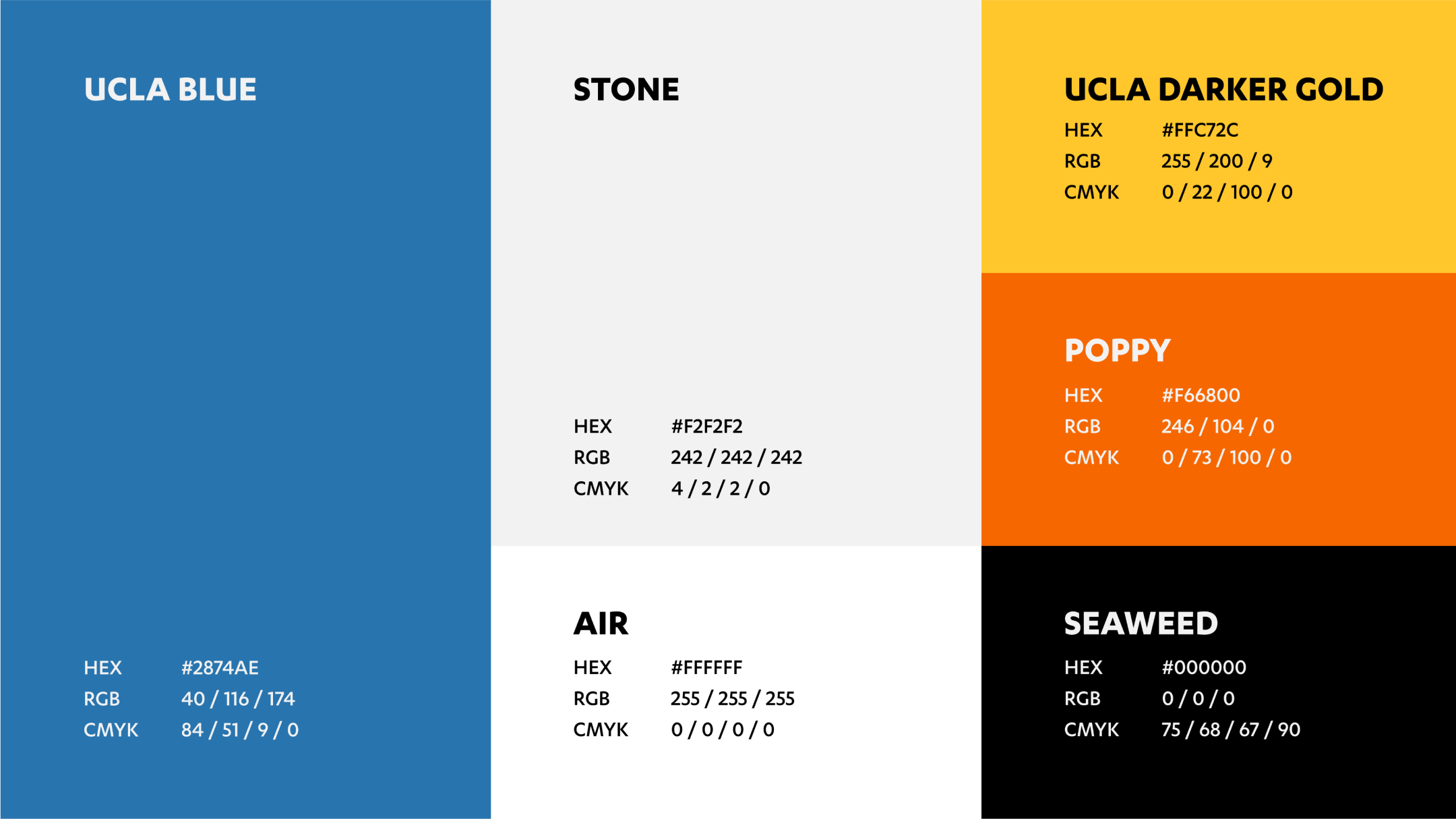
Example: The color palette for UCLA’s Rothman Family Institute for Food Studies easily translates across channels, from digital spaces to branded items.

Step 8: Choose Your Typography
Every visual element in your identity should contribute to a cohesive visual language, and thus each should complement the other. This is particularly true of typography, which should be informed by the shape of your logo.
How to do it: Every stage of design has its own unique challenges, but typography can be tricky in a visual language, especially when brands follow trends that are hot for a second but quickly become dated or appear unoriginal (serif vs. non-serif).
To keep it simple for future designers and content creators, limit the number of typefaces to 2-3. This generally includes primary and secondary brand typefaces for specific purposes, such as body copy typeface, UI typeface, etc. For a deeper dive into choosing typography (including whether or not to license fonts), see our guide to choosing the best typography for your brand.
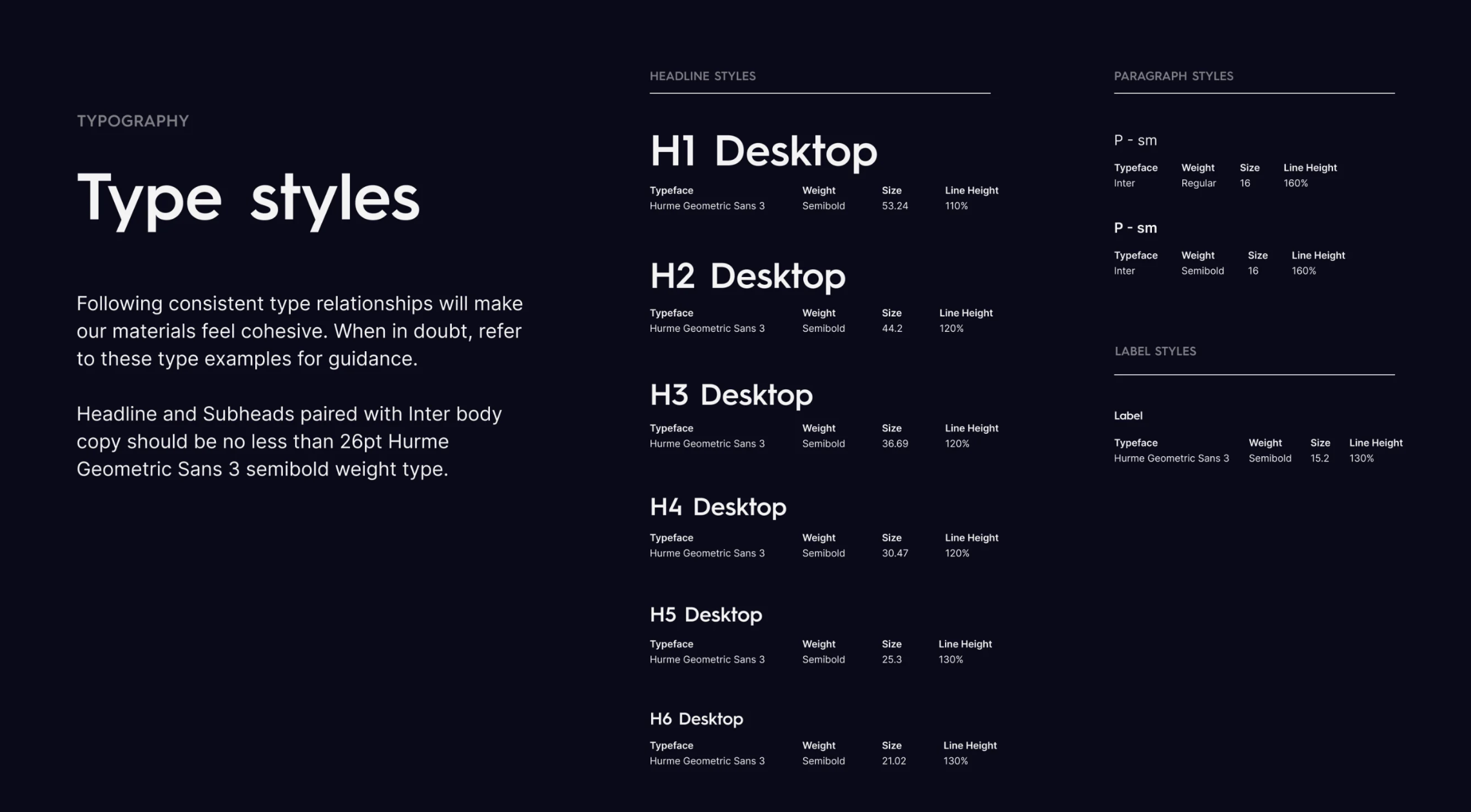
Example: Our Column Five brand guidelines dictate how typography should be used, including hierarchy examples.
Step 9: Design Additional Elements
Every brand’s needs are different, so you may or may not need to design a comprehensive identity. That said, consider your brand’s future needs. If you are planning to experiment with different types of content, make sure you include those elements in your identity.
Photography
Photography plays a huge role in your brand identity, from your product images to your advertising. It’s important to identify clear guidelines about the types of images (and visual treatments) that are and aren’t appropriate.
To learn more about the role of images in storytelling, see Fabrik Brand’s guide to brand photography.
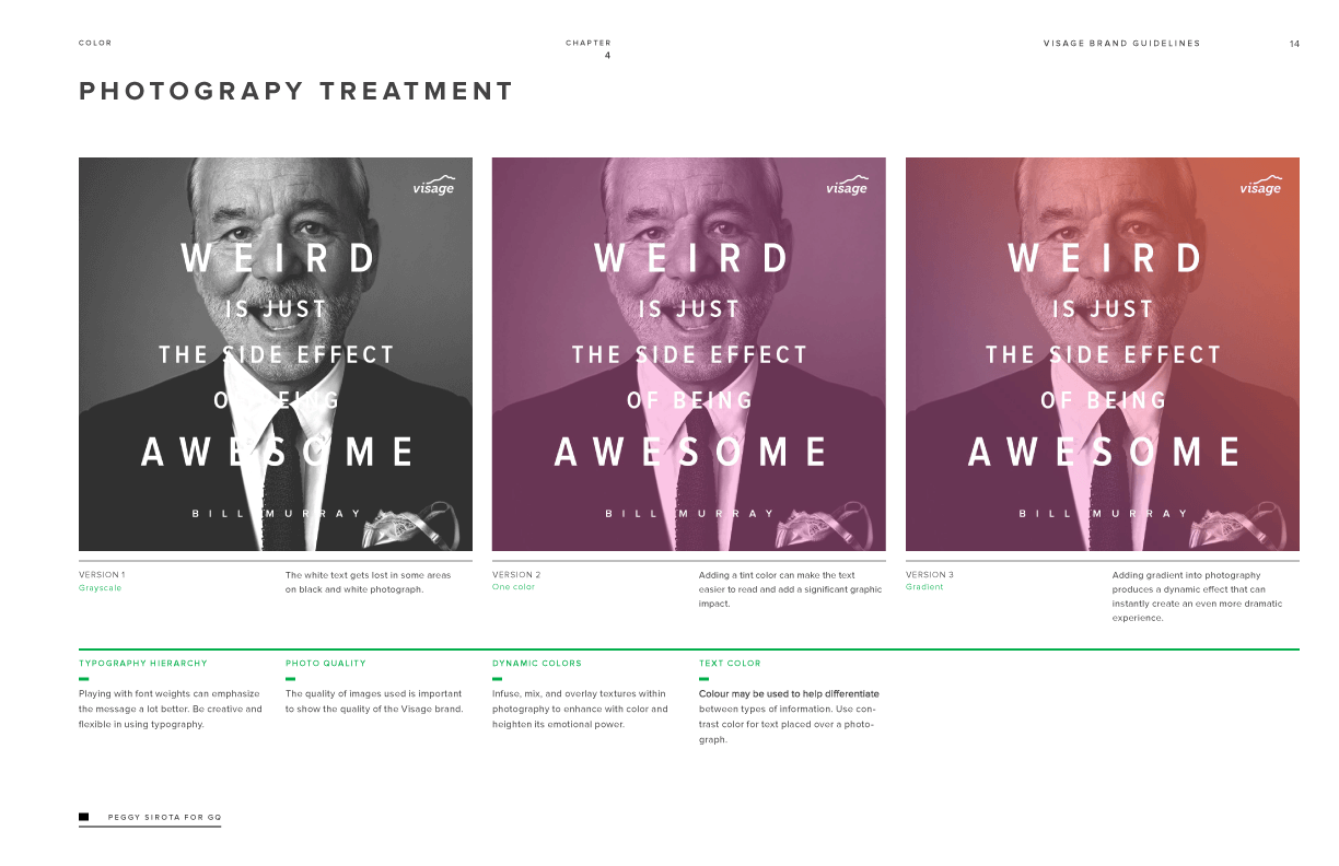
Example: The photo guidelines from the Visage brand identity include detailed instructions on the use of filters and typography.
Illustration
When it comes to illustration, you need a cohesive and uniform language. Don’t over-illustrate or use clashing styles. Instead, think of how your illustration will be used in conjunction with other visual elements.
To figure out how to illustrate your brand, follow Smashing Magazine’s tips for drawing a strong identity.
Example: The Civ.works brand identity includes a simple and relatable illustration style.

Iconography
Good iconography is influenced not just by the creative visual language but by the applications for the work. It depends on what your product or service is, as well as the industry and medium (e.g., website vs. printed sales brochures).
Iconography is part art, part science, so you want to make sure things are as clear as possible. For more tips, see Design Systems’ complete guide to iconography.
Example: Iconography details in Data3’s brand guidelines provide context around use and intention.
Data Visualization
In addition to aesthetic appeal, data should be designed for clarity and comprehension. Thus, it’s important to design visualizations that adhere to data visualization best practices.
If you’re not familiar with data best practices, find out how to design the most common charts and graphs with our Data Visualization 101 guide, and check out these 25 tips to improve your data visualizations.
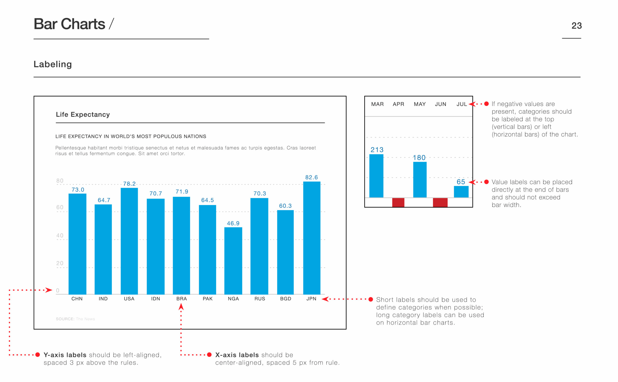
Example: Detailed design directions in the Avalere Health brand identity, such as the space between bars, ensure that data is easy to digest.
Before you move on, use the Brand Identity Checklist in the toolkit to ensure your visual language is complete and adheres to best practices. You can also bookmark these 75 tips, tools, and resources to help your team create a great brand identity.
Step 10: Build Your Brand Guidelines
The only thing more heartbreaking than a poorly designed brand identity is a beautifully designed identity that is never used or used incorrectly. A brand style guide is the savior here—if it’s crafted the right way.
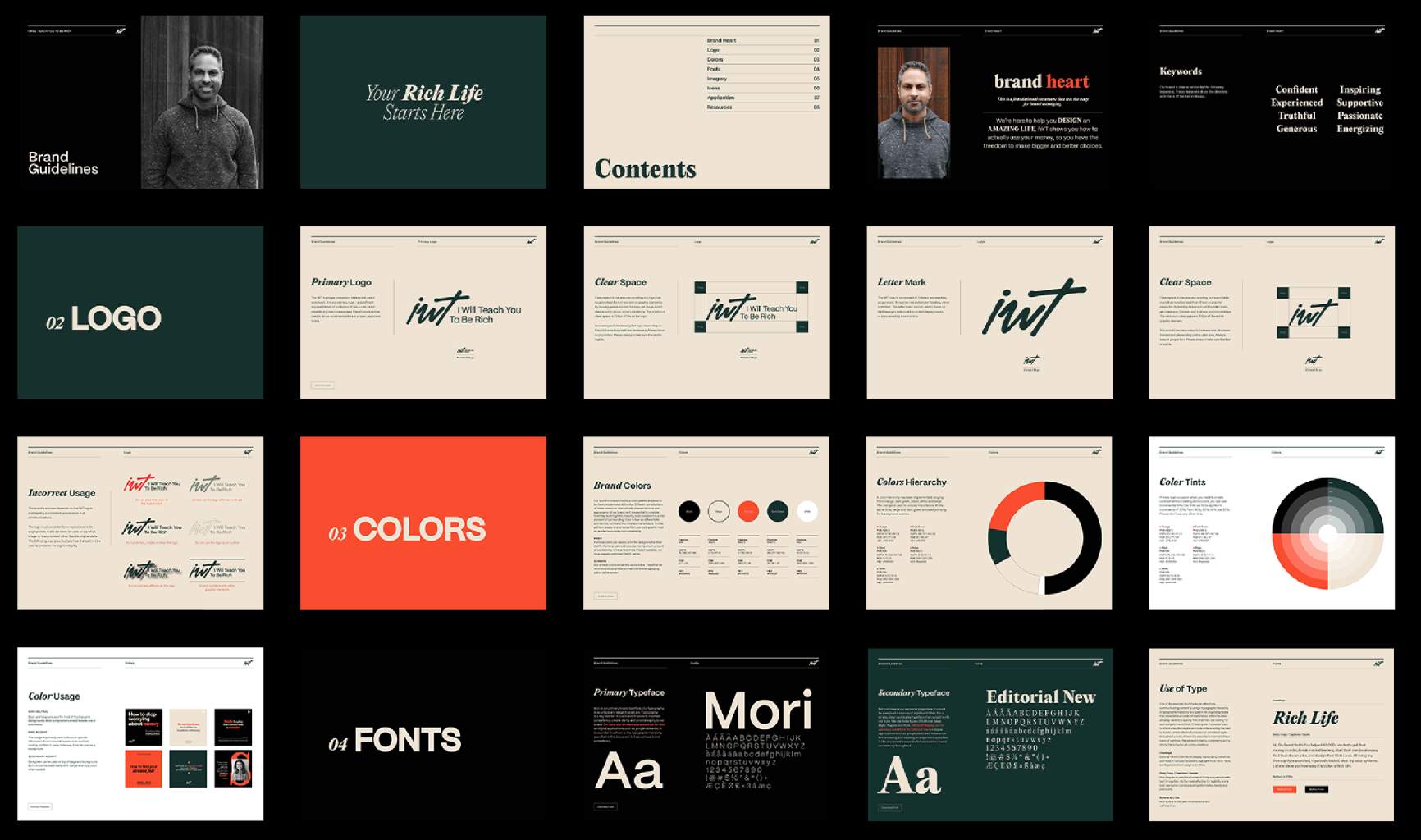
How to do it: Include clear, easy-to-follow guidelines for every part of the brand identity, including examples and use-cases for print, web, video, and interactive elements (if applicable). Also include practical detail, denoting as much information as needed to help your designers replicate the brand identity successfully. For more direction, plus great examples, follow our guide to create a brand style guide people will actually use.
Once completed, make sure guidelines are distributed to the team, stored in an easy-to-access place, and regularly updated.
Example: The IWT brand guidelines include robust directions for applications across channels.
How to Use Your New Brand Identity
As we know, consistency is key when it comes to building a strong brand. You can’t toss your fresh brand identity into the world and expect people to know how to use it immediately. Designate a point person to answer any and all questions related to the brand application, and implement a system of quality control to preserve your brand integrity at every touchpoint. You should also…
- Find out what brand identity mistakes to avoid at every stage.
- See our 5 tips to launch an effective rollout.
- Follow these tips to make sure all your content is on brand going forward.
- Align campaigns to a documented content marketing strategy so every activation reinforces the identity.
And if you’re feeling overwhelmed or don’t have the resources to take on the project yourself, consider bringing in some expert help. Follow our tips to find the right creative agency for you, or chat with us. We’re happy to help you get your brand strategy on the right track.
Brand Identity Quick Answers (What people ask)
Q1. How do I create my own brand identity?
Follow a proven sequence:
- Align your foundation (purpose, vision, mission, values, voice, messaging, etc.).
- Audit your current brand and your top competitors.
- Align on a visual direction via attributes/mood exercises.
- Write a tight creative brief.
- Design your logo → define color palette → choose typography → add supporting systems (photos, illustration, icons, data viz).
- Package everything into clear brand guidelines and roll it out consistently. (Grab the free toolkit to speed this up.)
Q2. What’s the difference between brand identity, brand image, and brand strategy?
- Brand identity = the outward expression (how you look, speak, and show up).
- Brand image = how audiences perceive you because of that expression.
- Brand strategy = the plan (positioning, audience, promise, messaging) that informs what your identity should communicate. Strategy guides identity; identity shapes image.
Q3. Do I need an agency, or can I DIY my brand identity—and how long will it take?
You can DIY with templates and our toolkit if the scope is small and decision-makers are aligned. Bring in an agency when you need deep research, complex systems, or fast consensus. Timelines vary, but expect: foundation & audits (1-3 weeks) → direction & brief (1-2 weeks) → design system (2-6 weeks) → guidelines & rollout (1-3 weeks). The more stakeholders and deliverables, the longer it takes.



Great article! The step-by-step advice on building a brand identity is easy to understand and useful for anyone starting out
Such a comprehensive guide to building a brand identity! I love how you break it down into actionable steps, from understanding your foundation to designing the final elements. The emphasis on creating a cohesive and memorable identity is key. Definitely a must-read for anyone looking to refine their brand! Visit : https://www.brandsjar.com/
This is a comprehensive guide.Thank you very much for the information shared here
I’m glad you found it useful.
Excellent guide on creating a brand identity! 🌟 Your step-by-step approach and focus on consistency are key for success. As a digital marketing service, we find these insights invaluable for helping clients build strong, memorable brands. Thanks for the practical and clear advice! Visit : https://www.brandsjar.com/
I really like your wordpress design, wherever would you down load it from?
Superb details easy to understand…
I am impressed by the quality of information on this website There are a lot of good resources here that cane be really help me a lot! Thanks for sharing with us!
As we delve into the 2024 web design trends, it becomes evident that the ingenuity of web designers in Seattle, WA, is not just a local treasure but a pivotal force in shaping digital futures.
Thank you for sharing simple and very educative
Glald to help!
You have a nice content! Your ideas are helpful and you explained your thoughts well. Thank you!
Great post! I like the way you’ve broken down the process into steps, with examples from other businesses.
We wanted to make it as easy as possible.
Your article is very informative for us and we have learned a lot from it. It was a pleasure to read about your experience.
That’s great to hear. Best of luck with your own branding efforts.
Really Brand identity is much important in now a days, this Article explains it clearly in a interesting manner. Great article
Thanks for sharing.
Thanks for reading!
This topic helped me alot
Happy to hear it!
How do I download this content?
Hi Guilherme, you can submit your email here for download: https://www.columnfivemedia.com/resources/brand-identity-toolkit/
really great for original self creation people like me i did mine life time ago i can follow steps easy id bye that foe a $ i need more i be in touch thanks bye leon b
Glad to hear it
happy to know of identity kits well advance for people in life love very mu
Me encanta el blog, me ha servido demasiado y además tiene una estética muy hermosa ♡
Thank you so much. very helpful. As a creative designer I’ve learnt a lot.
That’s so nice to hear!
I love everything about how you broke it down for us
So glad it’s helpful!
Exactly what I am looking for, thank you!
That’s great to hear. Hope it helps!
Thanks for the guide. Very good and write very well
Thanks much! Hope it helps.
It is a complete information a person or an organization would have to keep in mind in order to be a successful brand. It is something which have to be in every organization and they must follow some of these steps. When i was about to start my brand name for my little startup i was very confuse but a tool NamoBOT was very helpful for me at that time and now this article would be beneficial for me in a long term.
This is undoubtedly the best thing that I’ve come across today in the internet. It was a long time that I have been thinking on this topic but I couldn’t satiate my quench for knowledge through any post that I read. However, today that I came across your article, I seem to have learnt a lot and I have also gained enough knowledge on this topic. Thanks once again
This is undoubtedly the best comment we’ve come across today 😉 So happy you found it useful.
Good post!
Thanks much!
Cheers, certainly food for thought, hope it will never be too long before an update
Amazing job! Thank youuu so much
Happy to help!
One of the best guidance I’ve ever met. Hopefully I’ll learn from it and apply it on the real project as well.
Thank you team for your full of meat educations!
That’s great to hear!
Hey! Amazing content. Curated and on point.
Thanks so much!
your online resources are amazing, honest and the want to help is apparent. heros!
Thanks so much, Daniel! Happy to help.
Having read this I believed it was really informative. I appreciate you taking the time and energy to put this article together. I once again find myself personally spending a significant amount of time both reading and posting comments. But so what, it was still worthwhile! brandaid.in
Thanks so much!
Hey! I would love to discuss some branding identity with you guys, hope i hear from you 🙂 Im usually a generous guy!
Thanks, Christoffer! If you haven’t already, you can get in touch here to tell us a bit more about the project. https://www.columnfivemedia.com/contact/
Brilliant detailed article. Thanks for sharing a helpful tips for creative design for a brand..
we are Creative Production design agency at Los Angeles welcoming community of trailblazing visionaries and creators. We are committed to delivering the highest-quality content, designed to captivate and inspire your target audience.
Super detailed article! I think we’ve got at least 70% of them right.
The challenge is to have foresight to how people might use the brand identity guide and assets and be able to create something that stands the test of time.
I hope the identities we’ve created at neuentity.com can last. Open to feedback if you guys have any,.
This is so incredibly helpful! I’m a young creative redesigning a brand I created when I was 16, and I love how you’ve made such a massive process bite-sized. Thanks!
We’re so happy to help, Alexander. Best of luck with it.
I love this! Thanks so much for sharing. Branding is definitely not a work in the park and I’m struggling with my own as a one-person start up. The article was informative and I appreciate the links for more resources.
Great to hear. Best of luck in your business, and make sure to subscribe to our newsletter since we have non-stop tips for you 😉
Thanks a lot for sharing deep knowledge and resources about brand strategy and brand identity design. It helped me understand brand from the scratch.
Thanks, Amit. Best of luck building your brand.
Thank you soooooo much for all the free content available on your website!!
Happy to help, Fernanda!
This is actually one of the best articles I have come across when it comes to brand identity. Thanks for making it informative. This article really gave me some important tips.
Thanks so much, Olivia! Glad it helped.
This is a kind of book I would buy , if it were published. You guys delivered it.
That’s so nice to hear!
I am absolutely inspired by the way you make things so clear and doable.
Such high praise. Thanks so much, Alexandra.
Thank you so much for this information, it’s very helpful!!!
Thanks, Tina! We try 🙂
Great article Nate. Thanks…
Awesome and well written article. The examples and elements are good and valuable for all brand identity designs. Speaking of awesome, check out this website https://a2designlab.com/, they do a lot of unique and insight branding.
Omg! This has to be the most comprehensive article on the web! It was absolutlely helpful and very well written. Simple to understand and so insightful. It was everything I needed and more. Thank you! Great Job Column 5
Thanks so much, Bamise! We try to create exactly the things we wish we had when we were starting out 🙂
Hi,
My name is Ivan. I just started a clothing brand called Whatever Label (www.whateverlabel.com) & @whateverlabel (instagram).
I finding difficulties establishing my brand guidelines given that I want to focus on skateboardes and surfers. I think the target audience is broad and there are a lot of brands out there already. The thing is that, I would like to avoid the term fashion brand or any fashion trend.
Therefore, in terms of defining our competiton, I like to resonate with those “free spirit” & “rebel” brands that I have around where I live (Bali).
My question is; do you think i should define my brand guidelines based on the competitors I have around? or should i focus on any world brand that has similar values?
thanks,
ivan
The article is worthy of applause.
I also want to draw your attention to choosing the right brand name. Here is an article https://gapsystudio.com/services/branding/ that says the following about the name: The correct name should reflect the vision and ideal position of a particular brand. The name should also indicate the level of creativity and uniqueness in order to emphasize it and give your business or company the right personality.
Everything revolves around uniqueness!
This was really helpful and inspiring…thanks
Glad to hear it, Amusan!
Nice article
i just here to ask.
Where do i have to put the brand positioning?
I now brand positioning is about how the market look a brand and mission is about how the core team perceives the company.
I would appreciate your comments.
Hi Jahir, Good question. It is important to know where you fit into the marketplace. You can complete your market positioning along with your brand strategy. If you need to figure out your positioning, a competitive analysis is helpful: https://www.columnfivemedia.com/how-to-do-a-competitive-analysis-in-5-steps.
Thanks a lot for really helpful informations !!!!!!!!I. Im impress ….
Very helpful information, Thank you so much
Hope it helps, Sarah.
Such an informative read! If you’re looking for to find a solid YouTube video on the subject, I found this step by step video very helpful when learning how to build a brand from start to finish. The main thing I found extremely useful, is that there is a free branding template in the description that helps you get started: https://youtu.be/r4WPjBFtOzs
Also the YT channel The Futur has some great content as well.
WOW….It is very resourceful article. Thanks for your clear guidance.
Thank you so much, Joe. We were trying to make the one thing we couldn’t find ourselves.
Invaluable info!! Just at the perfect time. Thanks so much!
Thanks so much! We hope it helps.
great post – very informative – Thanks for Sharing – it was a great help how you broke each section down … Thanks again
Glad to help! Best of luck on your own branding.
Great post! Developing a strong brand strategy enables you to identify and refine your core client profiles, then target marketing to the appropriate niche markets. Knowing your target markets also allows you to hone key messaging that strikes a cord with their specific needs. When we talk about ‘brand’ we aren’t just talking about your logo. Your brand is the sum of all your business represents. It’s your logo, tagline, photography, font, colours, language, and your business’s general vibe. It’s how your business as a whole is presented to your target market. At Chilli, we are incredibly invested in building our client’s brands, as this is the ONLY single asset that will carry it’s worth across platforms and tactics.
Well said, Stephany.
What a quality article! Thanks for sharing.
Thanks, Donny. Hope it helps!
Great and complete discussion. It guides a good design direction for many new brands.
Thanks, Herries!
A very informative read.
Thanks a lot Nate
Thanks, Marlene. Hope it helps.
Katy French!!!
This is so perfect. Thanks a lot.
So happy to hear that!
Thank you for this! Such a great place for me to start with my small business.
So happy to hear that, Sarah! Best of luck.
I truly love this article for the direct yet supportive guide on visual character! Very straightforward however brimming with astonishing and valuable data. Much obliged!
Feel free to visit here:
Creative Logo Design
Happy to help!
This was very detailed and informational. Now, I couldn’t wait to get started on this.
Good luck on it!
What an intriguing read. Amazing content for a Graphic designer looking to initiate a brand identity. Thank you
Thanks so much, Joshua. We do our best 🙂
Thank you so much for this, simple and concise.
Deepa Joshi
Thanks, Deepa! Glad it brings some clarity.
Well done.
What a great read – thanks for making it clear and simple and powerful. I’ve had to try and explain this so many times and this article has been a huge relief and will also serve as a great tool for other.
Thanks!
Thanks, William! The same goes for us. (Hence, we decided to get it out there once and for all.)
I really appreciate every article on this web page. It helps a lot and it’s written in the language that anyone can understand. Thanks for your effort and time.
Great post – very useful!!
It rare to find useful articles of such worth.
P.S I have noticed a spelling error within the first paragraph of the Typography section. Should it be ‘your brand identity…’ instead of ‘you brand identity…’? Sorry. It’s the designer in me.
Thanks, John! (Typo fixed — we appreciate it.)
I genuinely love this article for the straightforward but helpful guide on visual identity! Quite simple but full of amazing and useful information. Thanks!
That’s great to hear. Best of luck on your visual identity.
Amazing article! (also the blog aesthetics are perfect)
Thanks so much, Benjamin!
Hello Nate & Column5 folks, I represent a tiny (but impactful !!!) Aussie NFP and we are working with some special young people to create a social food enterprise. We are starting with purpose and brand development (as you do). This content is so amazing, I was hoping to gain permission to use it (with due accreditation of course), for educational purposes only. You can check us out @BigFeedAU on Twitter & Insty to see how we roll. Our mothership charity is http://www.childrensfoodeducation.org.au, looking forward to your thoughts.
Hi Kay, Thanks for reaching out. We’ll be in touch.
This is a great content. I’ve learned so much. Thanks a great deal for sharing.
What an ass! To use someone else’s blog to sell your company services. Great job on your article, by the way. I always knew there was a lot to branding (much more than I’d care to do), but you guys mad so many of the parts easy to comprehend. Thank you for the step-by-step. And, I’ve bookmarked you guys. I can’t wait to work with you.
Thanks, Anna. We’d love to chat!
Great blog. However, I’d like to mention that once your brand identity has been created, you should always analyze and refine the brand identity accordingly. Track, target and test new strategies and tactics to know what works best. At Om Infosolutions, we have a number of clients that have approached us for revamping their brand identity, which has proven to work really well then.
Absolutely! Thanks for the reminder.
This is a great, very comprehensive and perfect in volume piece of content. Not to mention it’s providing so much value with only the lightest of implications of selling the service. Loved it!
Thanks, Tasha. We’re just trying help people build better brands and great content. 🙂
Very thorough and clear summation.
All I would add is to consider size and simplicity in logo design. A company logo may be used in ways you can foresee — signs in offices and on letterhead are a given, but they may also be printed on small give-away items at conventions or as a tiny icon next to a browser’s URL. The larger or more complicated a logo, the worse it can look in those situations.
Yes, Wes! Such a great thing to keep in mind.
very resourceful
Glad to help!
Comprehensive and easy to follow.
Very useful guide to create a power brand identity. Fantastic and informative article. I appreciate it.
is there a way to choose a good color palette? i always find myself stuck when picking color combinations
It’s always good to consider what message you are trying to convey visually, but if you ever want to chat, we’re here to help.
the images for each step are super helpful. i work visually so they’re always appreciated
Glad to hear you found them helpful!
there’s so many things to consider that I’ve never even thought about. there’s a lot I guess I still need to learn
If you need help, we’re always here to chat.
thank you for always putting together fantastic guides. they’re invaluable to me
Happy to hear that they are useful to you!
this is a great article. i’ll be using this in the future as a quick guide
Thanks, Jeff!