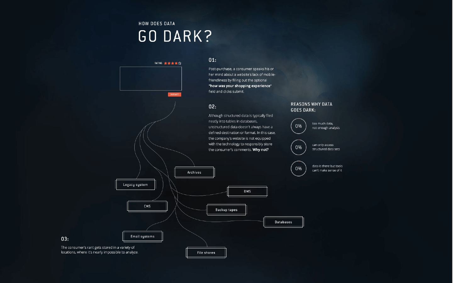
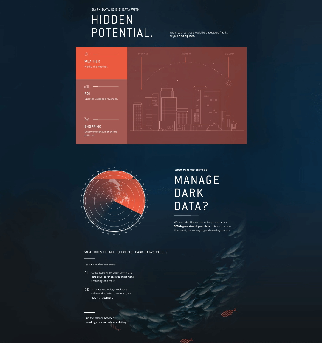
Over the past few years, we’ve grown our partnership with Lucidworks through infographics, ebooks, and paid outreach services, helping to position the brand as a thought leader in their industry. For this collaboration, they wanted to create an educational tool for business executives that would redirect the conversation in their industry from big data to dark data, explain why enterprises are missing something in dark data, and show how Lucidworks can help them find it.
Data isn’t always the sexiest subject, so this project presented a huge opportunity to experiment. How do you turn a somewhat tedious topic into an engaging, compelling story? By creating a unique interactive experience.
Our goal was to create an interactive microsite that didn’t just deliver information but immersed the user entirely. So, instead of designing a straightforward site, we approached this project as a moving editorial piece, which required time to experiment with narrative creation and development approaches before finding the right creative concept.
Ultimately, we decided to introduce the concept of dark data through the metaphor of an iceberg, using visuals to reinforce the narrative. Through copy, imagery, animation, and interactivity, the user dives deeper into the story, heading into the (literal) dark abyss below to learn about the value of dark data, ending with a solid CTA to learn more.
Thanks to Lucidworks’ openness to experimenting, our team’s creativity, and fun new tools like Canvas, GreenSock, and ThreeJS, we were able to create a sleek, sophisticated piece of interactive content marketing to engage Lucidworks’ audience in a unique way—another reminder that experimentation is always worth it.
“Just wanted to say this is really f****** fantastic.”
—Andy Wibbels
Director of Marketing, Intuit


