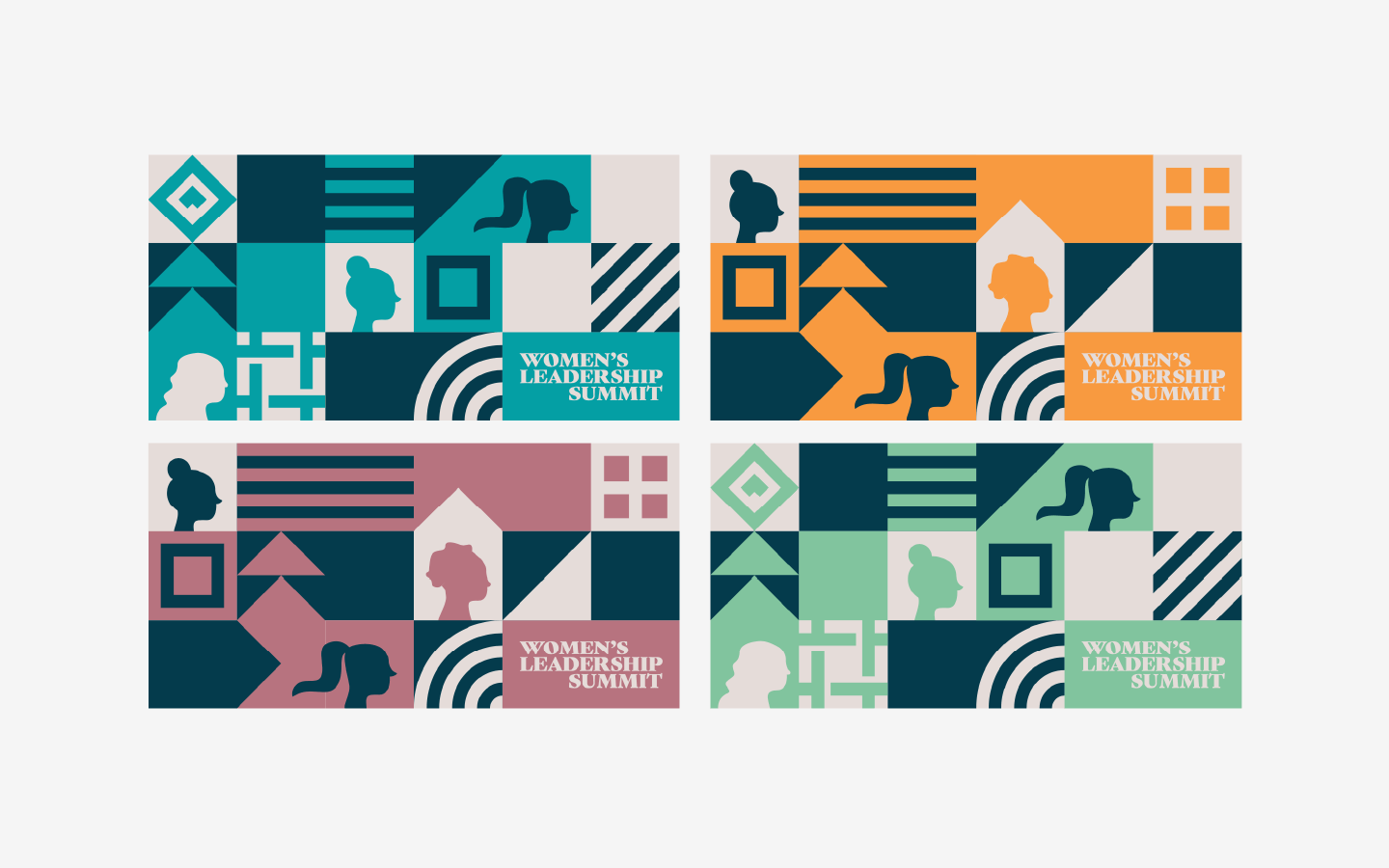
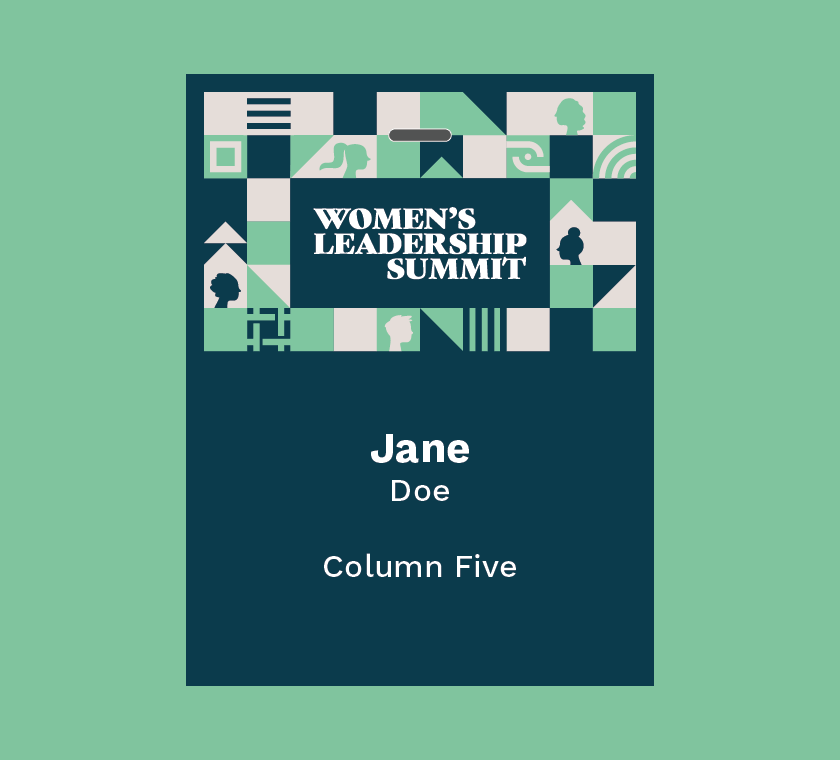
For Github’s Women’s Leadership Summit brand identity, we focused on designing a visual language that would communicate the spirit of the event and easily translate to everything from signage to badges.
We approached content in the same way. Knowing customers would encounter the content across a variety of platforms, we focused on telling a cohesive story to generate excitement and support the brand’s goals.
To create effective branding, you need to take a strategic approach to get to the core of the brand first. During our discovery phase, we immersed ourselves in the GitHub brand, exploring their mission, values, personality, and goals for the Women’s Leadership Summit. With this intimate understanding, we identified the core attributes to communicate and fleshed out imagery to express it.
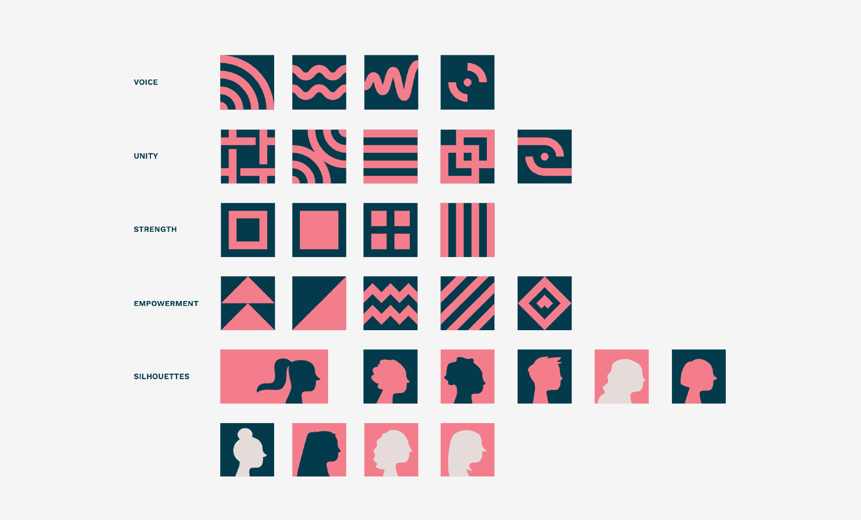
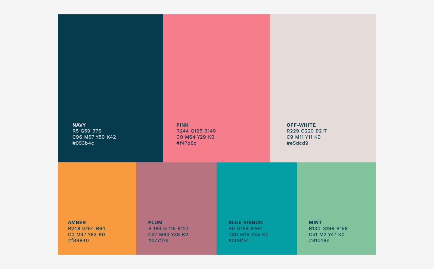
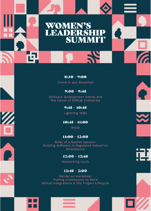
To celebrate the enthusiasm, sense of community, and innovation cultivated through the Summit, we focused on creating an identity that balanced sophistication and dynamism. Through a simple, clean wordmark in the elegant Gastromond font, bold colors (including blue, pink, purple, and green), and illustrated pattern blocks featuring female profiles, each element worked in tandem to capture the brand’s energy.
As this identity would be used for signage, placards, badges, and other promotional assets, we also crafted a handy style guide that empowered all content creators to apply the brand easily and consistently.
Of course, while in-person events are excellent places to build brand connections, GitHub also needed to elevate their content marketing practice to reach a larger swath of customers online. Having collaborated effectively on the brand identity, we were excited to lend our visual storytelling skills to fresh campaigns.
Much like our branding work, we strategically approach every piece of content we create to ensure it reinforces the brand’s strategy. This creative approach allows us to tell a consistent, cohesive brand story in a variety of mediums.
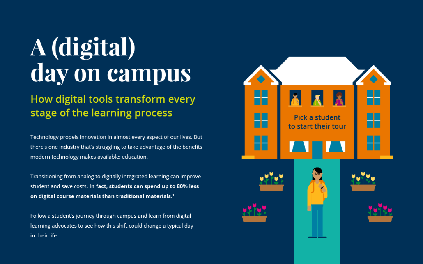
Luckily, having previously done a deep dive into their brand, we were well acquainted with their goals and used these insights to design a large volume of content, including ebooks, case studies, one-pagers, ad units, and more across web and print. Fortunately, GitHub was a willing and open collaborator, eager to experiment with larger projects they had never undertaken.
We were especially proud to produce “The Check-In,” their (first) quarterly webinar that updates users on product improvements and offers tips to use the platform. We also created GitHub’s first motion explainer video, which uses robust illustration and animation elements to communicate what they do simply and succinctly.
Thanks to the success of our engagement, we have collaborated for more than two years and continue to cultivate a creative partnership to elevate their brand.
One of the most unique aspects of this partnership is that our teams have used a GitHub repository to initiate, manage, and archive completed projects. This has allowed us to experience the brand as both partner and user, giving us a clearer understanding of the utility and flexibility of the GitHub platform. With this intimate knowledge, we’ve generated more content ideas to help spotlight the brand’s unique service.
