An annual report is an important piece of communication for any company—and it should be treated as such. A great annual report expresses who you are, what your mission is, and what you’ve achieved. And with a little creativity, you can bring that story to life in beautiful ways.
When Code2040 asked us to help them turn their first annual report into an interactive experience, we jumped at the chance—not only because we love this type of creative challenge but because we support their mission.
Code2040 is a nonprofit that aims to empower underrepresented minorities in the tech world, with a focus on Black and Latinx people. By 2040, they aim to ensure those groups are proportionally represented in America’s innovation economy as technologists, investors, thought leaders, and entrepreneurs. We enjoy collaborating with nonprofits (in fact, it was our work on the interactive annual report for Girls Who Code that prompted them to reach out to us), so we were all in to help them craft an effective annual report.

The Ask
Many organizations produce an annual report, but Code2040 needed something that would not only inform but compel the larger public to support their mission, including business partner organizations, prospective donors, current donors, media, etc. To achieve this, they needed an annual report to introduce who they are and what they do.
The Interactive Annual Report
Instead of a standard static annual report, we aimed to create something as dynamic as their organization. Considering their tech-centric mission, we knew an interactive annual report was the way to go.
To help communicate their brand story, we focused on creating an interactive experience that embodied the forward-thinking, fun aspects of Code2040 as an organization. The organization is vibrant and ambitious, so we incorporated these elements at every stage of the creation process. Every aspect, from the copy and imagery to the design and layout, was intentionally crafted to present Code2040 as the forward-thinking, innovative, awesome organization it is.
To provide a comprehensive experience, we created the slick interactive report, as well as a downloadable PDF version for anyone who visits the landing page.
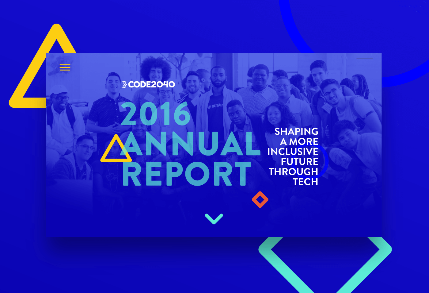
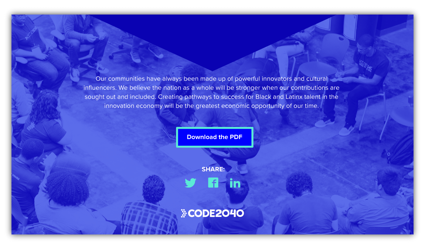
Seamless scrolling guides the reader through the organization’s story while offering the chance to click to learn more about certain programs.
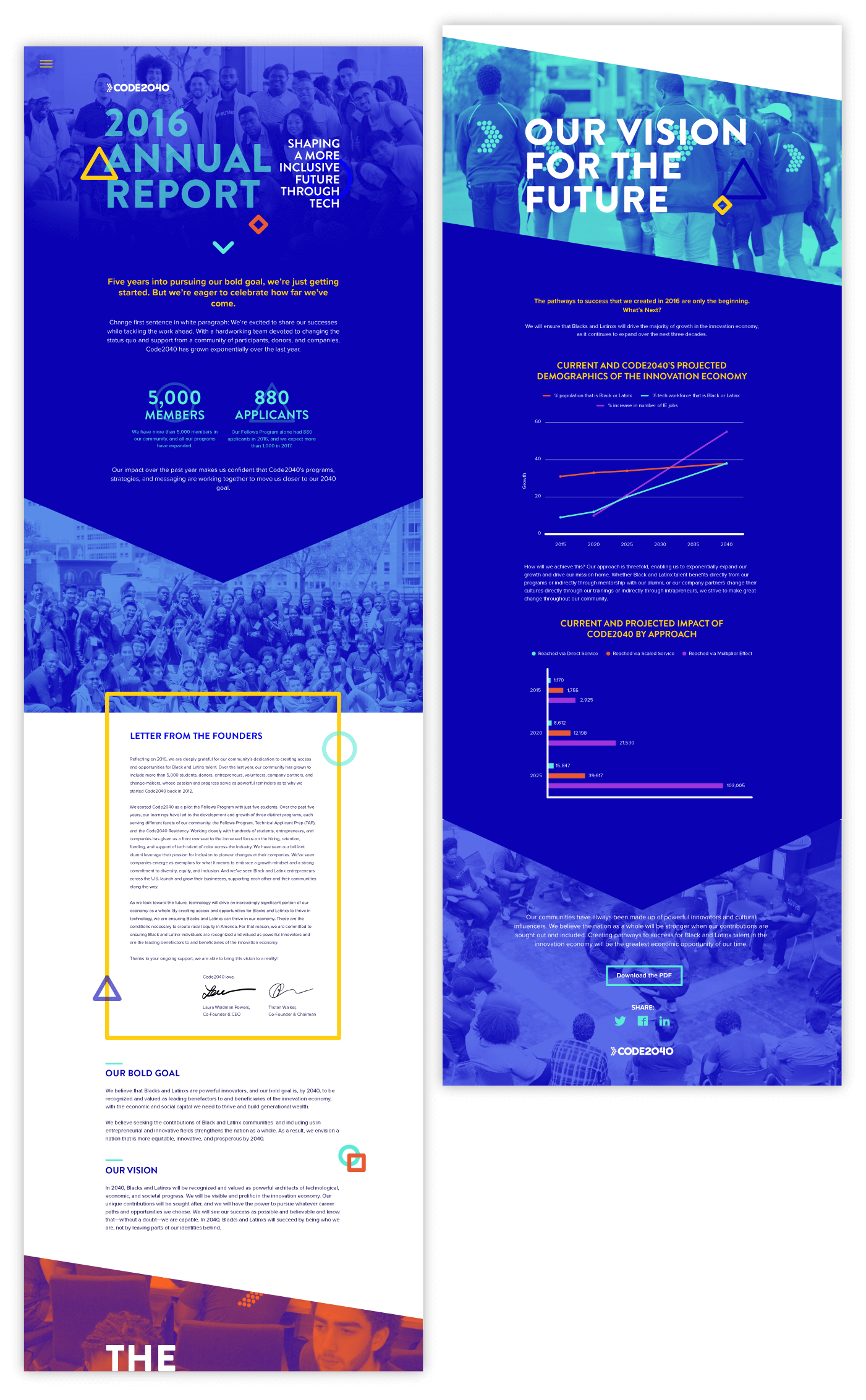
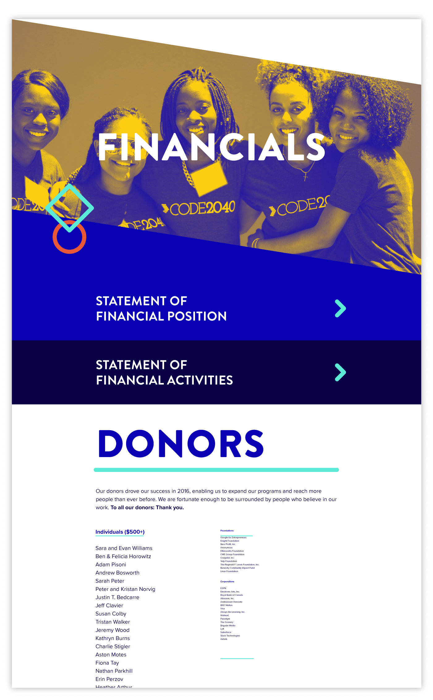
Bright, bold colors and illustrations add personality to the report.
Because people are the focus of their work, we used a lot of people-centric photography.
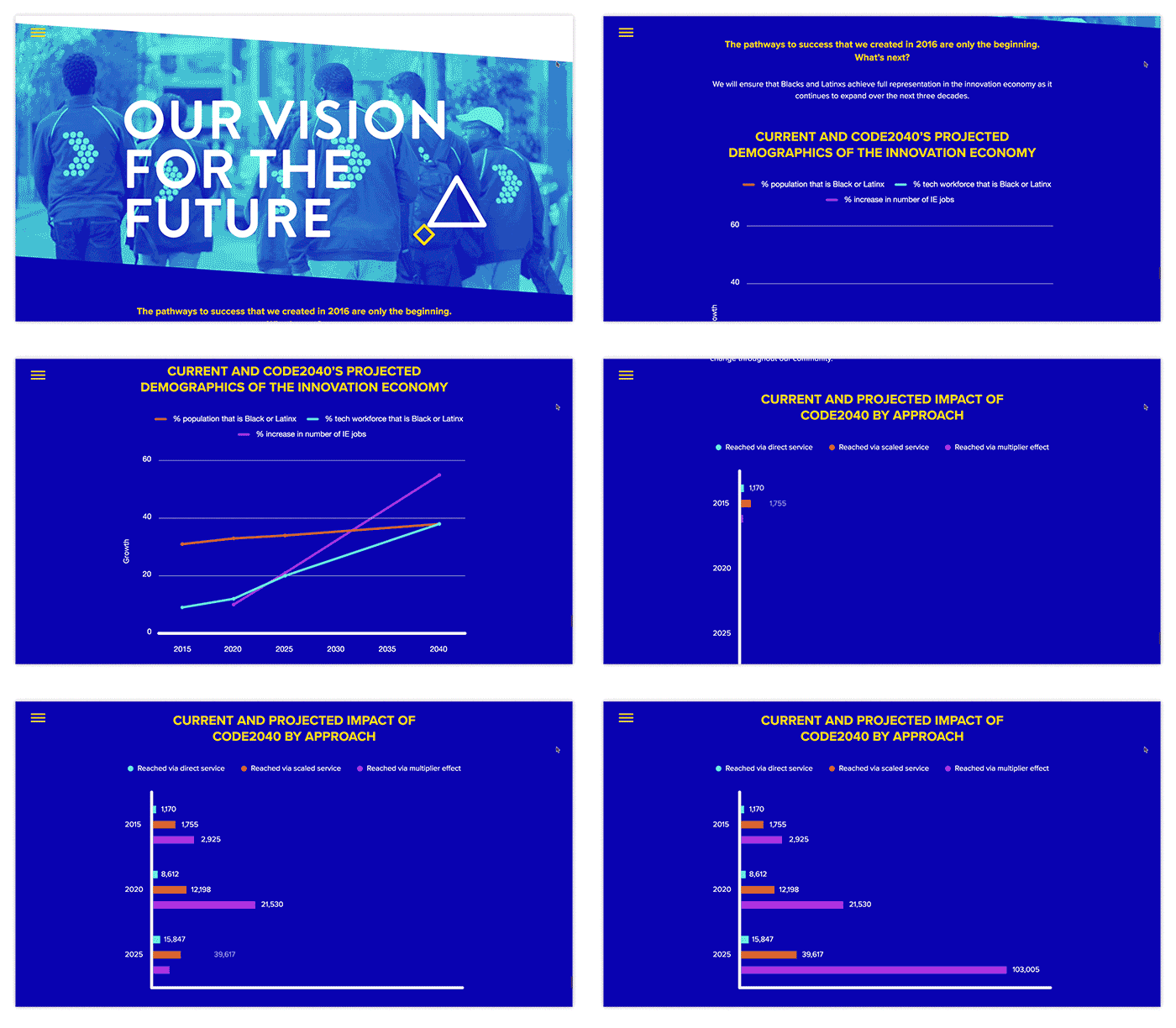
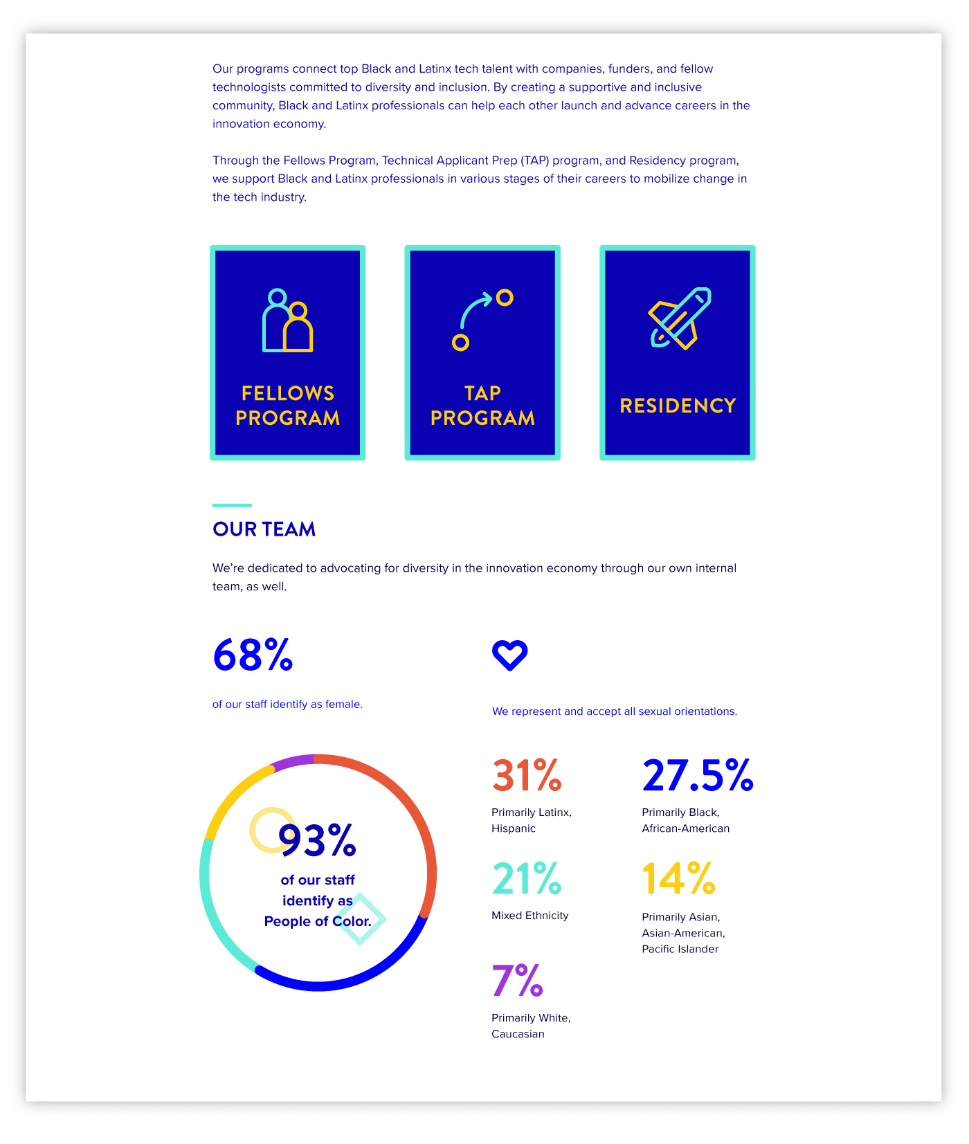
Animated data visualizations help bring the numbers to life while showing the organization’s success.
We are so happy when we get to lend our creative skills to a great cause. As Senior Producer Jonathan Sweet says, “This was a project our internal team all really cared about, and I think that is very clear in the gorgeous design.”
If you want some inspiration for your own annual report, you might dig these posts:
- Find out why your annual report should be a storytelling masterpiece.
- Learn about the 7 keys to an awesome annual report.
- Go behind the scenes of the Robin Hood Foundation annual report.
- Check out the embroidery-themed interactive annual report we made for Krochet Kids intl.
Interested in your own interactive annual report? Let’s chat about it.


