Meet Mike Nudelman, Graphics Editor at Business Insider. In addition to designing graphics for BI’s family of sites, he vets hundreds of infographics submissions, looking for those that tell the most compelling stories. That means he’s seen the good, bad, and the hideous—and knows exactly what will increase your chances of getting infographics published.
We recently caught up with Nudelman to chat all things visual content, including what gets his attention, what he sees for the future of graphics, and what he never wants to see again. If you create any sort of visual content and want to get it placed in a major publication, take note.

C5: How do you make the most your team’s design resources?
MN: We have a six-person team creating graphics for BI’s family of sites: Business Insider, Tech Insider, and INSIDER—vastly more resources now than three years ago when it was just me! It’s always best to work on something you’re interested in, so we try to divide our work by who’s most excited to make it. It’s a win-win: You do a better job when you’re more engaged.
C5: What value does including graphics in posts add?
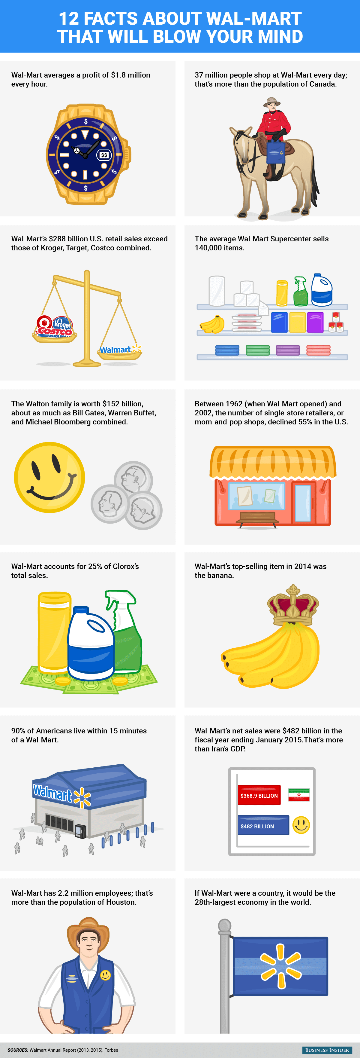
MN: Graphics are a unique opportunity for us to be more creative in visualizing a story. For instance, our Samantha Lee created this wonderful image to complement a story about Wal-Mart:

We really had fun with it; the Mountie holding the Wal-Mart bag is just one of several clever and absurd decisions that make this graphic entertaining.
C5: What factors influence your decision to run an infographic in BI?
MN: Would I read this, and would I care enough to share this? That’s the primary criteria. Every graphic we publish should inform, amuse, entertain, or otherwise create value for readers.
C5: What visuals get the most shares or engagement on BI?
MN: The visuals that are most clear and intriguing are always the most popular. Our readers love narratives they can learn something from.
C5: What role do you believe design plays in infographics?
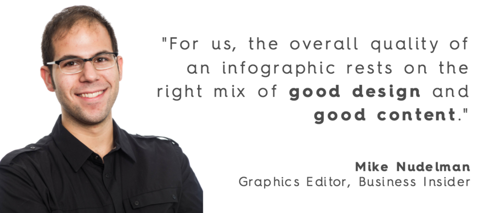
MN: For us, the overall quality of an infographic rests on the right mix of good design and good content. Design alone isn’t enough to make people care about boring content. I see so many infographics out there that are beautifully designed but are about nothing—or something so niche that you have to wonder, “Who are they making this for?” So start with a solid story, then just use all your tools as a designer and illustrator to bring it to life.
C5: What’s most likely to get an editor’s attention?
MN: A not-boring infographic will always grab our attention. Big percentage signs, lots of little guys in a grid, colorful pie charts—over it. I want to see something that I’m still thinking about one hour—or one day—later. Graphics that showcase the designer’s personality are the most memorable, and idiosyncratic design decisions are usually preferable to clichéd ones.
Overdesigned and otherwise fussy graphics are my biggest pet peeve. At BI we have a modern and straightforward aesthetic. We’re incredibly economical about every design decision we make. The fewer decisions the better! In our view, a simple and airy template is the ideal stage to let our content and creativity shine.
C5: What are some tips for people who want to get their infographics published?
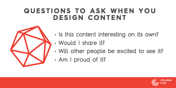
MN: First of all, the content has to be interesting enough on its own. Consider if this is something you would read and care enough to share with your friends or network. And it’s important to be mindful about how you felt while making it. Was it fun? Are you excited to see how people (not just designers) react to it? Are you proud of it? There’s no excuse for more boring infographics, so if you push yourself to think a couple layers beyond the obvious, yours will stand out.

C5: What trends do you anticipate for the future of visual content on publications?
MN: Interactives, mobile-first, and more bite-sized graphics are a newer area of focus for us. Interactive data-based maps and charts are incredibly popular and will only get more robust and compelling in the coming years. The idea of the static, tall, and skinny infographic is falling by the wayside. They don’t scale well on mobile, and the format is stale. Our solution has been to take a deconstructed approach to the infographic. Our templates are modular, which gives us the flexibility to easily excise certain sections to use in more abbreviated contexts, like Instagram.
See more of Nudelman’s Graphics here and follow him on Twitter @nudelmanmike.
If you want more info on making awesome infographics that will get published:
- Check out our 3 predictions for the future of infographics.
- Download our free e-book, The Ultimate Guide to Content Distribution.
- Ask these 5 questions to know if your content idea will work.


