Your visual branding is simply a tool to communicate who you are and what you’re about. Like anything in life, the better your tool, the more success you’ll have. Unfortunately, too many companies struggle to present a strong brand identity that is both flexible and easy to apply. We hate to see brands plagued by these issues; that’s why we’re determined to equip you with the knowledge and tools you need to create a beautiful and practical brand identity that works now—and in the future.

7 Keys to Better Branding
If you’re getting ready to create your branding (or thinking about revamping your existing branding), it’s important to know what hurts and what helps throughout the process. To make things easier on yourself, just follow these seven tips to design a better brand identity.
1) Understand Your Brand
Your brand identity is the visual manifestation of your brand strategy. But it isn’t just about creating nice visuals; it’s about strategically communicating who you are and what you do. Thus, you need an intimate understanding of not just who you are but what you’re trying to achieve.
How To Do It
Follow our guide to conduct a brand audit. This will help you dive into your brand and gain the insights you need to craft branding that works.
2) Make It Comprehensive
The whole reason you’re creating a cohesive visual brand is to empower content creators to communicate on behalf of your brand. Whether they’re creating quote cards for Instagram, animations for a brand video, or a new infographic, your branding should empower them to do their job well.
How To Do It
If you don’t know already, talk to your brand team to find out what types of content you’ll be creating, as well as any challenges you’re facing with your existing branding. (For example, your current logo may be clunky or challenging to work with on smaller screens.)
Depending on your brand’s needs, you may want to add specific elements to your brand identity toolkit, but these general basics are a good starting point:
- Logo
- Colors
- Typography
- Hierarchy
- Photography
- Illustration
- Iconography
- Data visualization
- Interactive elements
- Video and motion
- Web design
Above all, remember that each of these elements should also be designed for maximum impact.
- Use our brand identity checklist to make sure you’ve designed everything correctly.
- Try our best tips on designing logos, colors, typography, data visualization, and interactive elements (all based on research and science).
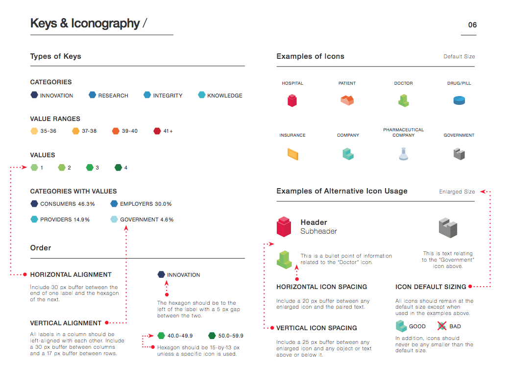
Example: We created a comprehensive brand identity for Avalere Health, including a flexible design system, iconography, and more.
3) Make It Future-Proof
A good brand identity is flexible enough to grow with your brand. This means it evolves with your business, whether you’re branching out into new products, services, or industries. This also applies to the type of content you’ll be creating. New platforms and mediums are likely to emerge (for example, Instagram didn’t even exist when we started our agency), and your brand has to be ready to adapt.
Consider how things like mobile-responsive design, web-friendly typefaces, and even brand colors can affect your brand experience, and make sure you’ve accounted for these in your design.
How To Do It
Consider the people you’ll be catering to. This is especially relevant when it comes to things like disability accessibility online. If you’re not sure who you’re designing for, find out how to create personas that give you better insight.
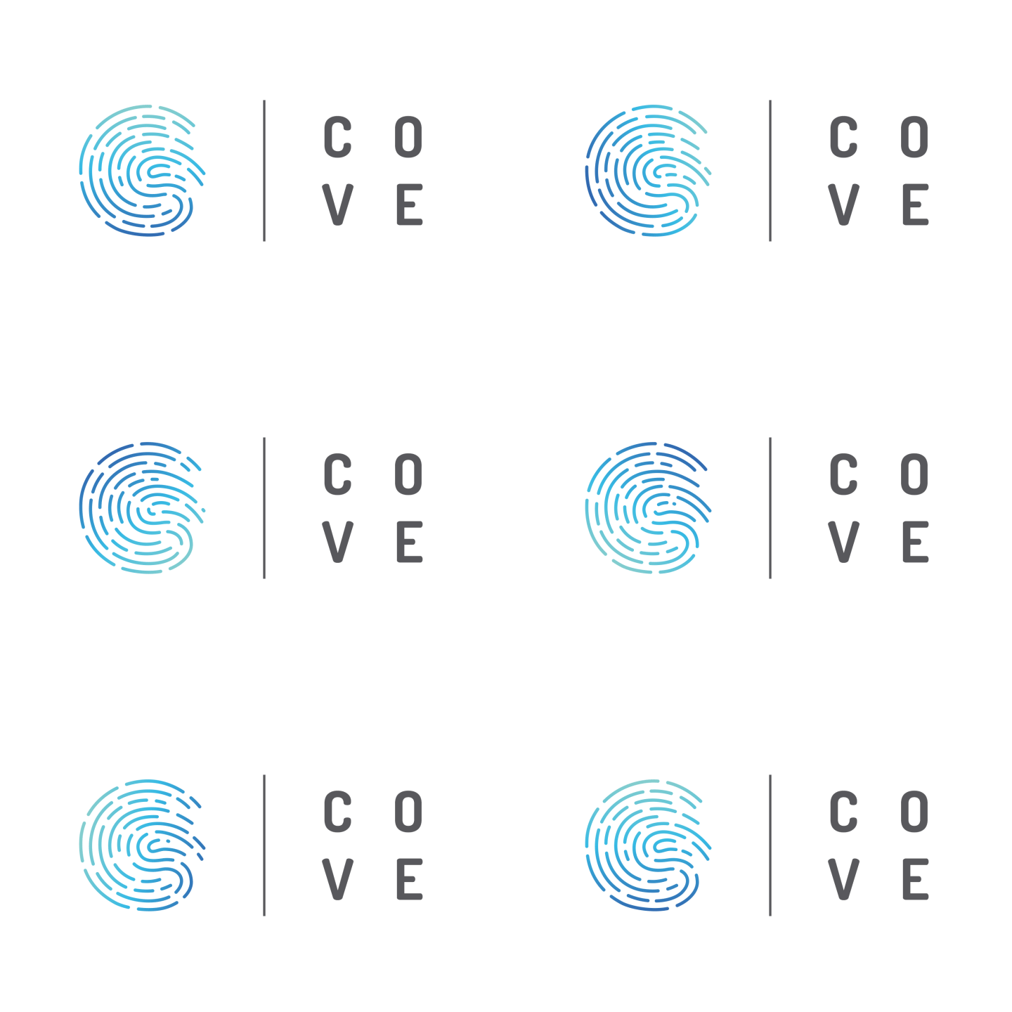
Example: We collaborated with UCI’s Applied Innovation to create branding that works in multiple mediums, including a static and animated logo.
4) Make It Personal
Your visual branding should accurately represent your brand: who you are, what you do, what you believe in, and what you care about. Communicating this is a challenge, but it is crucial to do it—and do it well. (When there is a visual disconnect or any sense of inauthenticity, people clock it quickly.)
How To Do It
Think about your brand personality and how you can bring that to life through your design tools (such as color, shape, etc.). If you don’t have your brand personality officially documented, follow our guide to find it in 5 steps.
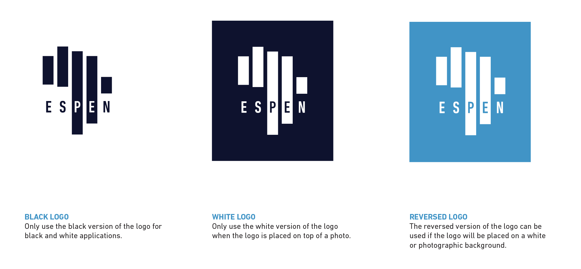
Example: We created a new identity for the Expanded Special Project for Elimination of Neglected Tropical Diseases (ESPEN), a WHO organization on a mission to eliminate five specific tropical diseases. To bring their mission to life, we created a symbolic logo that features a rendering of the African continent, made of five bars: one for each disease they’re battling.
5) Make It Unique
In addition to representing your brand accurately, you want your image to be distinct within your industry. Thus, you should avoid hopping on design trends or mirroring your competition. This is especially important to be aware of, as many brands within a single industry will start to homogenize subconsciously.
How To Do It
To understand what others are doing, download our competitive analysis template. This will help you audit your competitors to identify ways that you can differentiate.
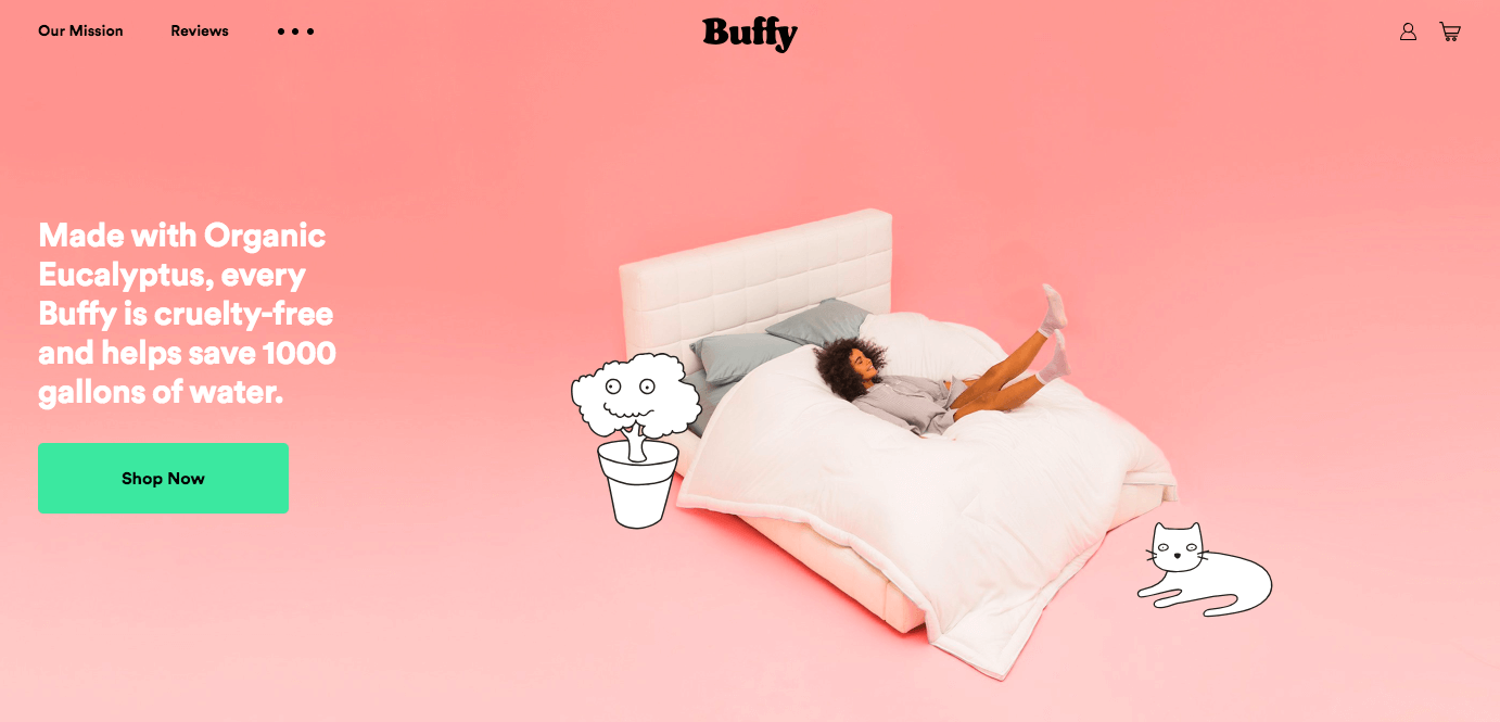
Example: Buffy is a comforter brand with a very distinctive visual style. For more inspiration, take a look at these 15 brands with a strong brand identity.
6) Keep It Cohesive
A good brand identity isn’t just beautiful; it works at every level. If any part of your design clashes or feels out of place, you make it harder for your team to create beautiful, cohesive content—and ultimately risk diluting your brand.
How To Do It
Make sure your design is:
- Consistent: The aesthetic should be consistent throughout, from icon to illustration.
- Complementary: Each element should work beautifully with the others.
- Comprehensible: All elements should be clear and easy to interpret (think of things like your iconography or typography).
- Intuitive: The design system should be easy to apply.
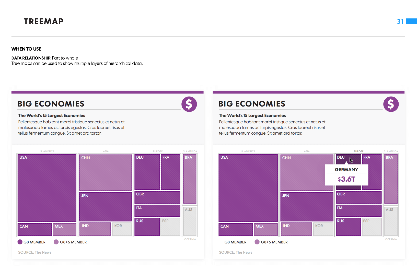
Example: When we were brought on to help USA Today rebrand their infographic and data visualization design, we crafted a brand identity that fit seamlessly with the paper’s overall aesthetic.
7) Document and Share It
If you’re a growing brand that creates a lot of content, it’s likely that you already use outside freelancers (or will in the future). With that many hands on your content, it can be difficult to keep quality at a certain level.
How To Do It
Make your brand identity easy to use by creating comprehensive brand guidelines. This helps keep everyone on the same page, assures that guidelines are applied appropriately, and makes life easier for the whole team. As you build out your guidelines, make sure they’re:
- Complete: Include guidelines for anything relevant to content creators, including both brand messaging and visual guidelines.
- Full of examples: Use real-world examples that leave no room for misinterpretation.
- Accessible: Make sure everyone knows where they are.
-
Updated: Have your creative director or brand team maintain the guidelines and address any issues or questions creators have.
Example: For inspiration, you can check out Column Five’s interactive brand guidelines.
Remember: Your Branding Is Only One Part
There are many elements that contribute to a strong brand. You need every element aligned if you want to tell a consistent, cohesive brand story at every touchpoint. To help your brand do this successfully:
- Complete your brand strategy. Follow our brand strategy guide to identify your brand heart, articulate your brand messaging, and build out your brand identity.
- Create better content. Find out how to optimize your content creation process, and how to make sure your content is on brand.
- Tell better stories. Find out how to tell your story in every piece of content, and get more brand story ideas from these creative brands.
And if you get stuck at any stage of the process, consider bringing in expert help. Find out what it’s like to work with us on a brand identity, or reach out.
