We talk a lot about how to master your B2B marketing. But we don’t always get to talk about how we help our clients master theirs. Today, we’re breaking down how we helped Digiphy develop a comprehensive brand to tell a consistent, cohesive story across channels.

The Client
Digiphy is a contextual marketing and commerce platform that lets you build and manage contextual pages, QR codes, third-party marketing plug-ins, and analytics to elevate brand storytelling and deliver dynamic digital experiences from any physical product.
The Challenge
As a newly established startup, Digiphy was eager to expand their marketing operation, but first they needed to solidify their core brand foundation verbally and visually (including brand heart, messaging, and visual identity). To set the company up for long-term success, Digiphy asked us to develop a brand that would communicate what makes Digiphy special, resonate with customers, and work across a variety of mediums.
How We Tackled It
When it comes to brand development, our job is to help guide our partners through a metaphorical excavation, helping extract what makes the brand unique and articulate it as a neat and compelling brand story.
This is a detailed process, which we move through in three specific phases to build an intentionally crafted brand that is both strong and flexible enough to evolve with the business. Before we enter those phases, however, we start with heavy market research.
For Digiphy, this included a full brand audit to understand the brand’s current positioning, as well as a competitive analysis to identify opportunities to differentiate. These insights directly influenced how we translated the core foundation of Digiphy’s brand into a single cohesive story through the subsequent phases.
Phase 1: Brand Heart
A brand’s heart is comprised of its purpose, vision, mission, and values. It functions as the backbone for the entire business, guiding everything from product decisions to marketing strategy.
To help Digiphy eloquently and succinctly articulate the brand’s core beliefs, we used our proven framework to guide discussions about why the brand exists and what it wants to achieve. (We find these discussions can be surprisingly emotional for stakeholders, which is why we give space for having open and honest conversations.)
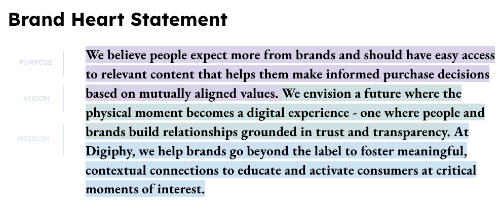
Through this process, Digiphy realized that their brand heart is more expansive than simply equipping clients with innovative product marketing tools; they also help their clients’ customers. Guided by this sentiment, we continued to refine language until we landed on a brand heart articulation that everyone was not only aligned with but enthusiastic about.
Phase 2: Brand Messaging
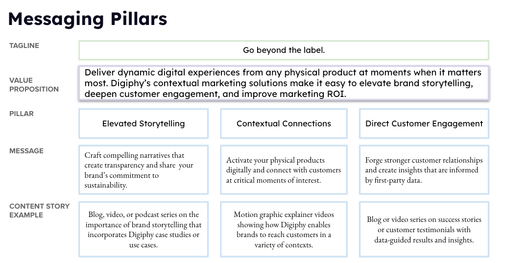
With their brand heart established, we moved on to articulating Digiphy’s messaging (including value prop, messaging pillars, boilerplate copy, brand story, and brand personality).
The Digiphy platform has several unique offerings and features, so we needed to clarify how to best communicate their positioning and value proposition. Additionally, Digiphy already had a strong tagline but lacked supporting brand story pillars to define what it actually meant and how it delivered value for its clients. (Pillars can be great prompts to brainstorm fresh content ideas, so articulating them effectively is crucial for future marketing efforts.)
Of course, t0 create messaging that tells a compelling and cohesive story, we needed to understand how the platform unlocked unique value—not only for Digiphy’s clients but also its clients’ customers (a nod to the brand heart).
After surveying Digiphy’s early clients about their experience with the brand, we realized Digiphy’s biggest value (and most powerful messaging opportunity) lay in the critical moment of interest between consideration and purchase, when customers want to know if the brands they purchase from are transparent in their production practices and/or using sustainably sourced products. Digiphy’s QR codes are the key to getting that information, transforming the physical experience of interacting with the product (by reviewing the label) into a digital experience (after scanning the QR code). In that moment, Digiphy connects the brand and consumer and creates a lasting relationship. That is the core of Digiphy’s brand story, and that is what we built their messaging framework around.
Phase 3: Visual identity
Finally, with the brand story distilled into meaningful language, our team could work on bringing Digiphy’s story to life visually. We approached the process this in three stages:
1) Envision: Before concepting, we analyzed Digiphy’s competitors to assess if there were any common visual codifications (aka common tropes to avoid). With these insights, we began to envision ways to communicate the brand story visually—and do so in a unique way to make Digiphy stand out.
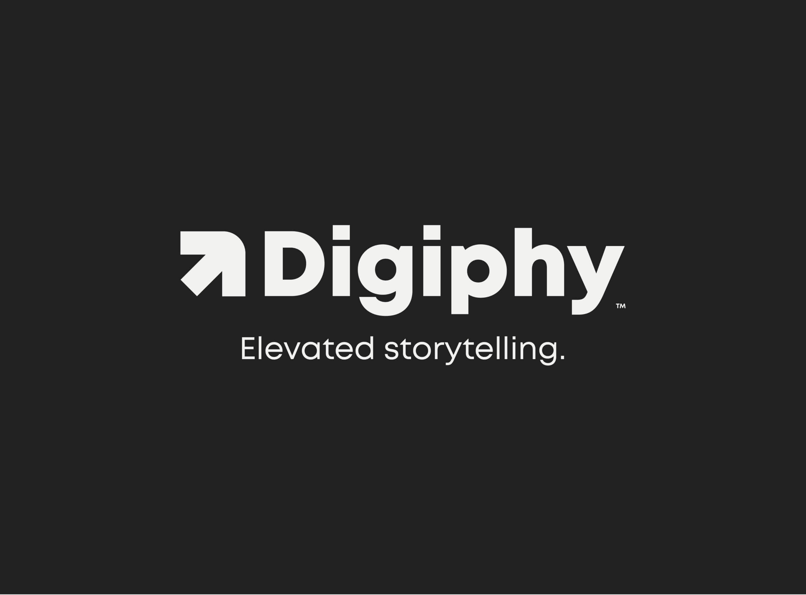
2) Design: Our design approach is grounded in strategic thinking to communicate and reinforce a brand’s story through every visual element. During our competitor research, we noticed that most competitors used QR code symbol imagery in their visual identity. Of course, the QR code is an integral part of Digiphy’s story, but we wanted to incorporate the theme without making it cliche. Instead, to make the brand stand out, we formed a logo out of a squared-off arrow. The arrow represents movement from the physical to the digital space (reinforcing Digiphy’s value), and the square mimics the design of a QR code (a nod to what the brand does).
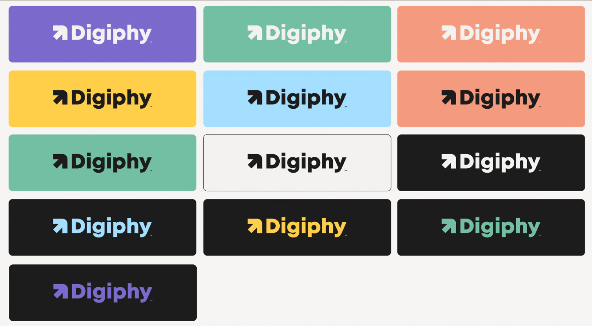
For colors, we used a base dark and light gray but added a brighter palette for contrast and flexibility. Digiphy serves many different types of customers but provides the same service to all. This broader range of colors allows them to create content for a variety of audiences while maintaining consistency.
For typography, we chose Mont, an approachable and charismatic font that works across channels.
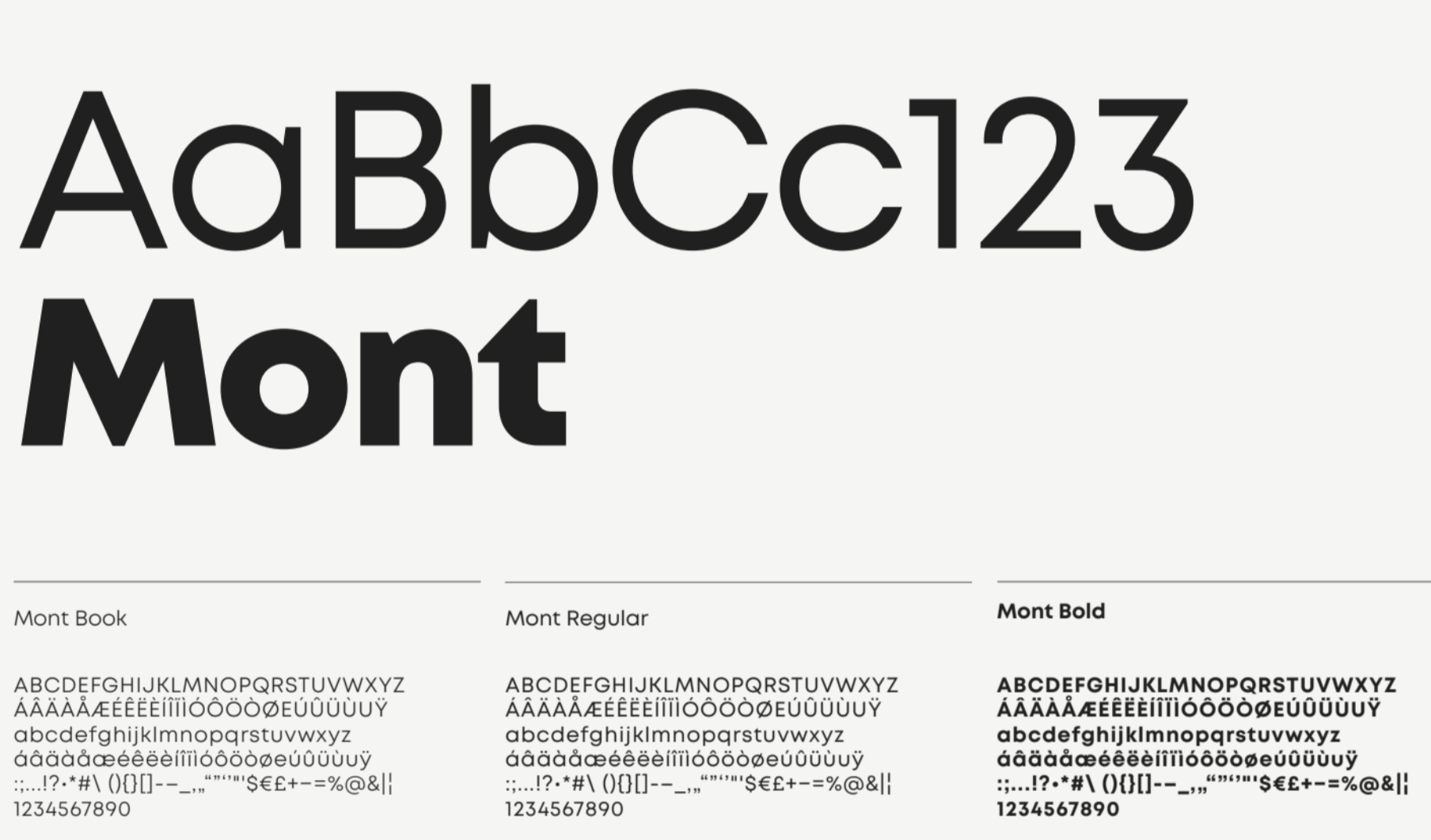
3) Build: To help the team apply this fresh brand easily and consistently, we built a robust set of guidelines, including clear directions for using logo, color, typography, etc.
Although design is always challenging, Digiphy’s strong core story made it that much easier to visualize, and we loved having the chance to combine critical thinking and creativity to create a fresh visual language for a great company.
The Results
With a strong brand heart to guide their decisions, clear messaging to speak to their audience, and a beautiful visual brand to grab attention, we’re proud to say Digiphy now has every tool they need to tell a compelling story across all channels, from their website to their social media. Best of all, as they continue to scale their marketing efforts, Digiphy can ensure every piece of content they create will be both on brand and on message, helping them connect—and convert—one customer at a time.
The Takeaways
If you think it’s time to refresh your own brand (or build a brand from scratch), it’s important to approach each phase strategically.
- Know why you’re doing it. A rebrand is a significant investment, so it’s important to have a strong reason to proceed (with buy-in from your team). Here are seven reasons you might consider it.
- Follow best practices. Download our free brand strategy toolkit to walk through every phase we covered here today, and see our guide to rebrand successfully to avoid common mistakes.
- Use experts (if you need them). A rebrand can be an intimidating prospect, and if you have a lot of stakeholders (and stakeholder opinions), an expert agency can be an invaluable guide through the process. If you’re on the hunt, see our tips to find the right agency for you.
And if you want to start your search with us, head on over to our brand strategy FAQs or reach out. We’d love to turn your brand story into our next case study.
