When you’re trying to reach different audiences—and make them convert—you need good content and a solid call to action to close the deal. Unfortunately, terrible CTAs are sabotaging marketers across the web. (We’re not naming names, but the problem is far more pervasive than you might realize.) Luckily, you don’t have to be an award-winning copywriter to write an effective CTA that converts. You just need to know a few simple tricks. The good news? We have ‘em for ya, along with real-world examples so you can see why and how they work in the wild.
But first, let’s recap what a CTA is.

What Is a Call to Action (CTA)?
A call to action (aka a CTA) is exactly that—a simple invitation to your audience to take a next step. A CTA can be a button, a link, or a message that encourages a user to do something, such as sign up for a demo, schedule a consultation, or download a whitepaper.
The best CTAs are clear, concise, and compelling.
Remember: Every piece of content marketing you create is an opportunity to build a relationship with your audience, and CTAs are the key to strengthening that relationship. Whether someone just read your latest e-book or stumbled across your website homepage, you should always give your audience a next step to engage with your brand more. That is the power of a CTA—and why such a small piece of messaging can have such a huge outcome on your business.
7 Tips to Write an Effective Call to Action
Because CTAs are so important, you need to make sure your brand is nailing each and every one. That’s where we come in. No matter your audience, industry, or marketing budget, there are a few simple hacks you can use to write stellar CTAs that convert.
1) Use a command verb.
Whereas your regular marketing content may lean a little more editorial, your CTA is the place to get to the point, create a sense of excitement, and direct people where to go/what to do next. Hence, using imperative verbs (aka verbs that give people a command) are so important. These are verbs like walk, run, go, sign up, try, download, etc. (You have seen this language everywhere, even if you didn’t realize it.) These simple but impactful directives remind people where to go and what to do next.
Examples of imperative phrases:
- Claim your free trial now to start enjoying our premium features.
- Get your free e-book download today and learn how to boost your productivity.
- Try our limited-time offer!
- Join our community of like-minded individuals and start achieving your goals.
- Register now to secure your spot in our upcoming webinar.
- Upgrade your account now to unlock additional features and benefits.
- Start your 30-day challenge now and transform your life.
- Download our app today and enjoy instant access to all our services.
- Book your appointment now and take the first step toward a healthier you.
- Sign up for our free newsletter.
- Schedule your custom consultation.
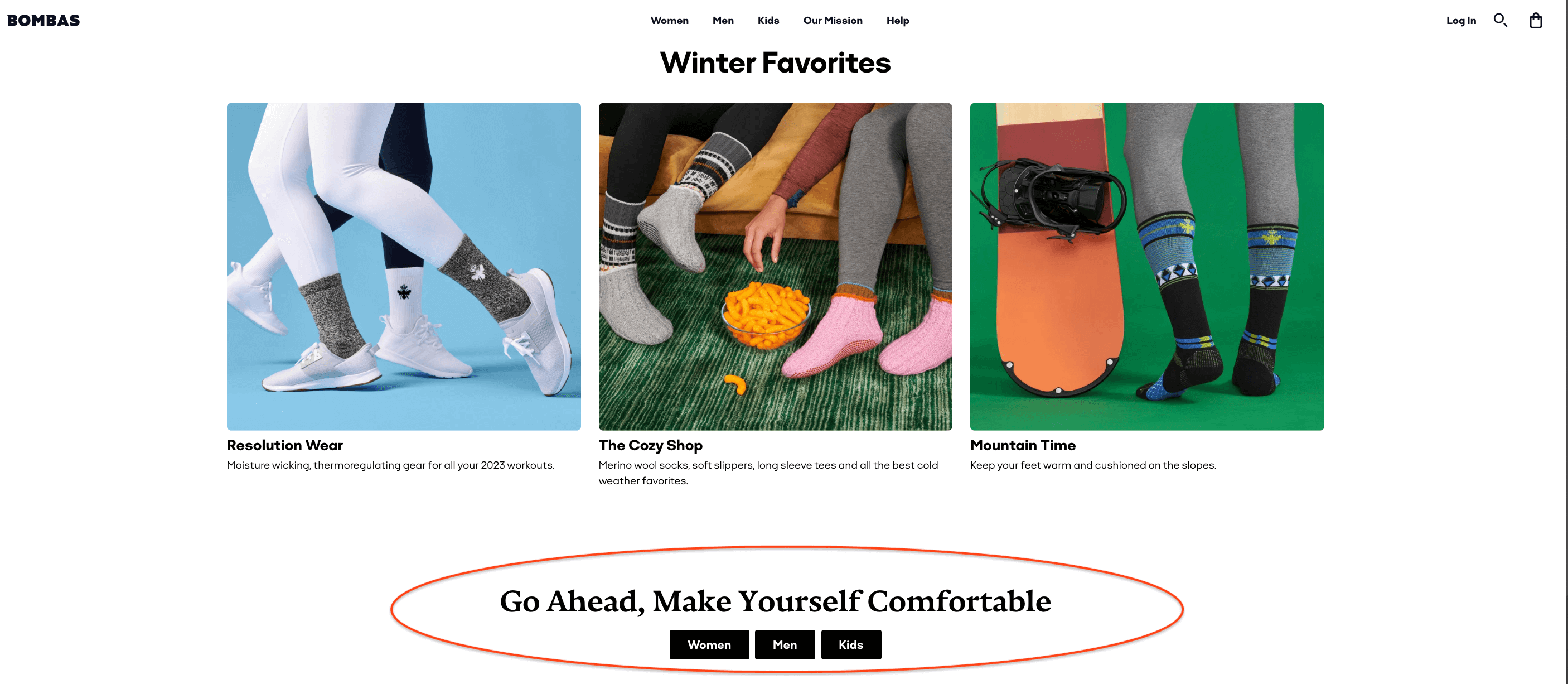
Example: Bombas makes comfortable socks, underwear, and t-shirts—and they’re pretty good at CTAs too. “Go ahead, make yourself comfortable” is an imperative command with a cozy promise that perfectly aligns with the brand.
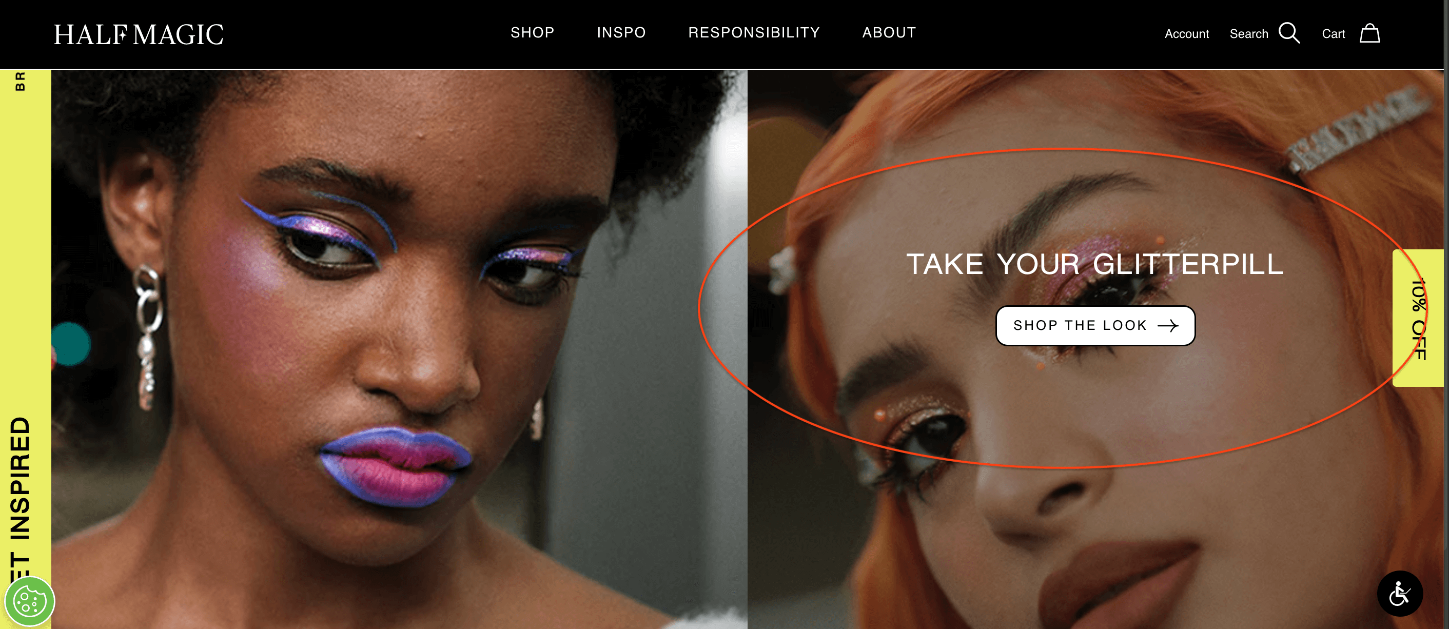
Example: Half Magic Beauty also uses an imperative command with “Take your glitterpill,” a cheeky play on words to encourage site viewers to shop their glitter cosmetics.
2) Speak to your audience’s desired future state.
A good brand tells a good brand story, and that is directly tied to the promise you’re making to your audience. What will they get by buying your product/service? How will they benefit? How does your product speak to their wants or needs, solve a problem, or improve their lives? Crafting a CTA that promises their ideal future state (in which they’ve bought and are now enjoying the desired results) will always make them want to click.
Tap into your audience’s emotions and you’ll make them want to click.
For example, B2B professionals are a busy group of people who value efficiency and productivity. They respond well to CTAs that emphasize time-saving benefits. For example, “Streamline your workflow today” or “Maximize your productivity with our services.” Whereas in the personal wellness industry, people are looking for personal change. CTAs like ” Transform your life” or “Achieve your goals” demonstrate the benefits of taking action. Pro tip: Add an exclamation point. It’s simple but effective.
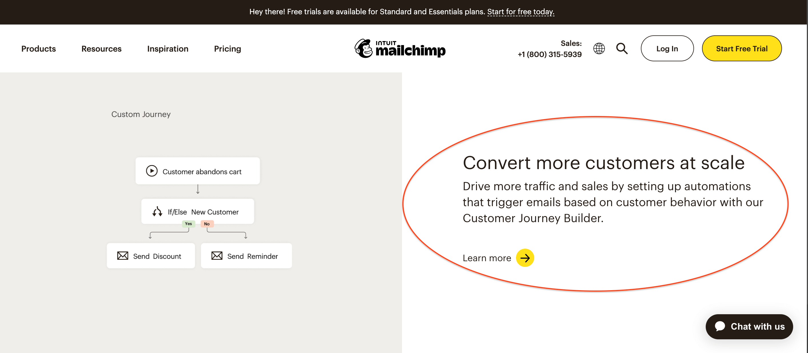
Example: Mailchimp is an all-in-one marketing platform that makes it easier for businesses to grow their customer base. They could say something basic like “send newsletters more efficiently,” but they tap into the true benefit of their platform by saying, “Convert more customers at scale.”
3) Speak to their pain points.
While the desired future state is always compelling, as it focuses on what the product/service adds to a user’s life, eliminating pain is just as powerful a prospect (and can sometimes be even more compelling). This is a smart way to not only present your brand as the problem-solver but also reinforce the pain that the user is currently experiencing.
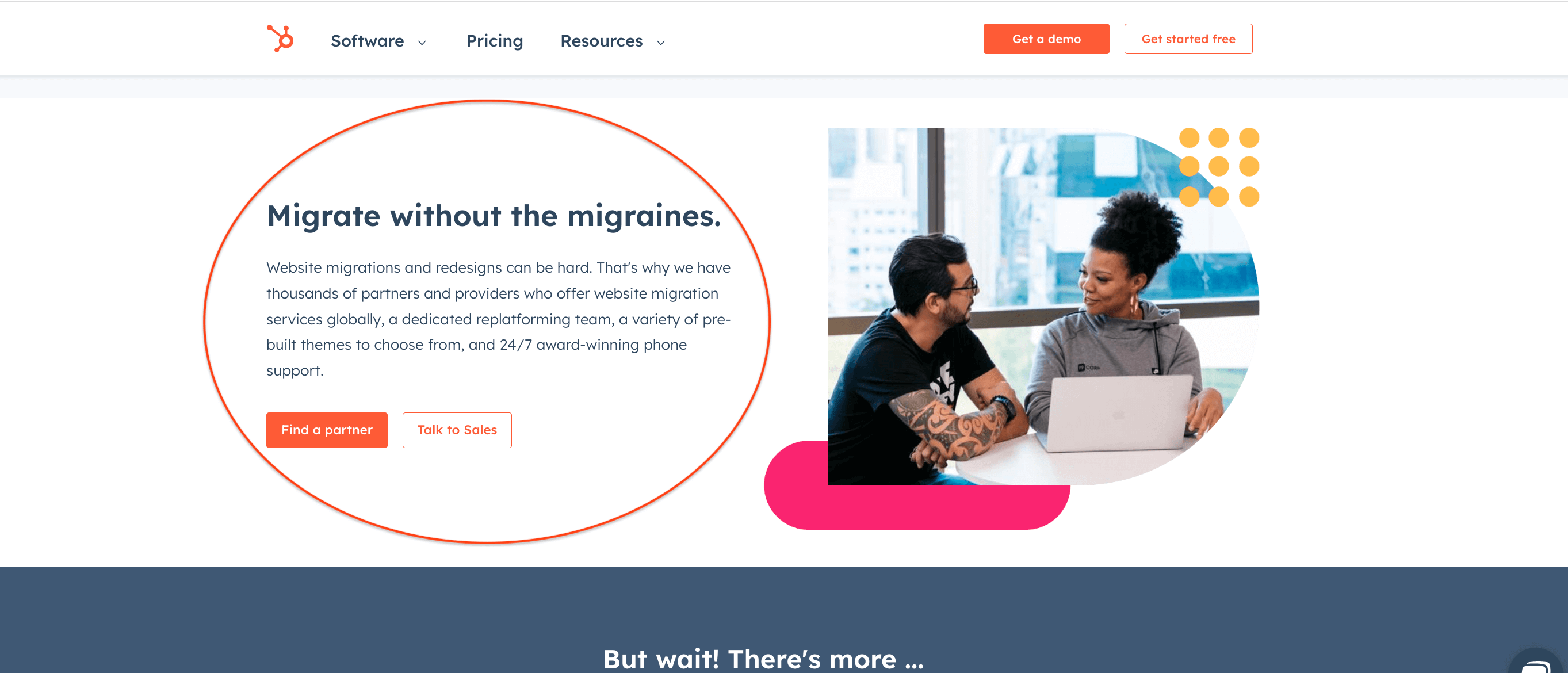
Example: Hubspot is also a marketing platform that automates the most tedious marketing challenges. They could say “Try Hubspot today!” but instead they say “Migrate without the migraines.” By leading with a pain point, they motivate users to try it out and solve that frustrating problem quickly.
4) Create a sense of urgency.
Creating a sense of urgency is an effective way to encourage your audience to take action. Use words like “now” or “today” to create a sense of immediacy, or highlight time-sensitive promotions or limited-time offers to encourage your audience to act quickly.
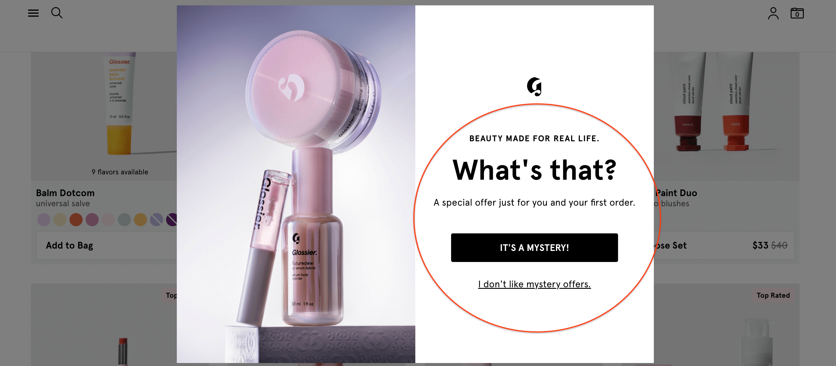
Of course, not every brand is peddling goods that can be bought with a flash sale for Black Friday. (For example, as a strategic content marketing agency, we don’t offer flash sales or holiday packages.) In that case, if you don’t have an inherent sense of urgency, look for ways to make your language more emotional and exciting to make people want to click ASAP. For example, say “Turbocharge your sales!” vs. “Increase customers.” If you’re a nonprofit, say “Save a dolphin’s life” vs. “Donate now.” Adding a sense of mystery or curiosity can also instill a sense of urgency, making people want to find out more.
Example: Glossier uses a mystery CTA to make curious people want to click and discover.
5) Use a number.
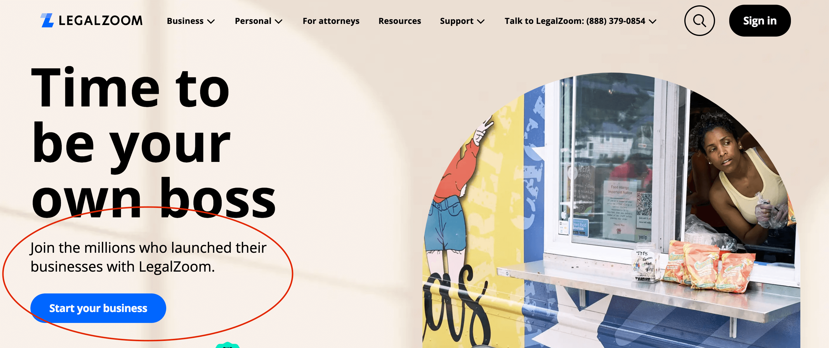
Numbers and data can be very compelling, and it adds a level of subtle credibility to your CTA. Whether you’re encouraging people to “Make 50% more sales,” “Save 4 hours a month,” or “Join a million people on the way to fitness,” adding a number can be a powerful tactic to make people click on your CTA. Whether they want the comfort of joining a crowd or a promise of saving a certain amount of money, that simple number can drastically improve your CTR.
Example: Legal Zoom makes it easy to start a legal business with a few clicks. They employ a bit of crowd psychology in their CTA by encouraging visitors to “Join the millions who launched their businesses with LegalZoom.”
6) Keep it short.
The ideal length of a CTA can vary depending on the context and the specific campaign. However, in general, a CTA should be short, concise, and to the point—ideally under 10 words.
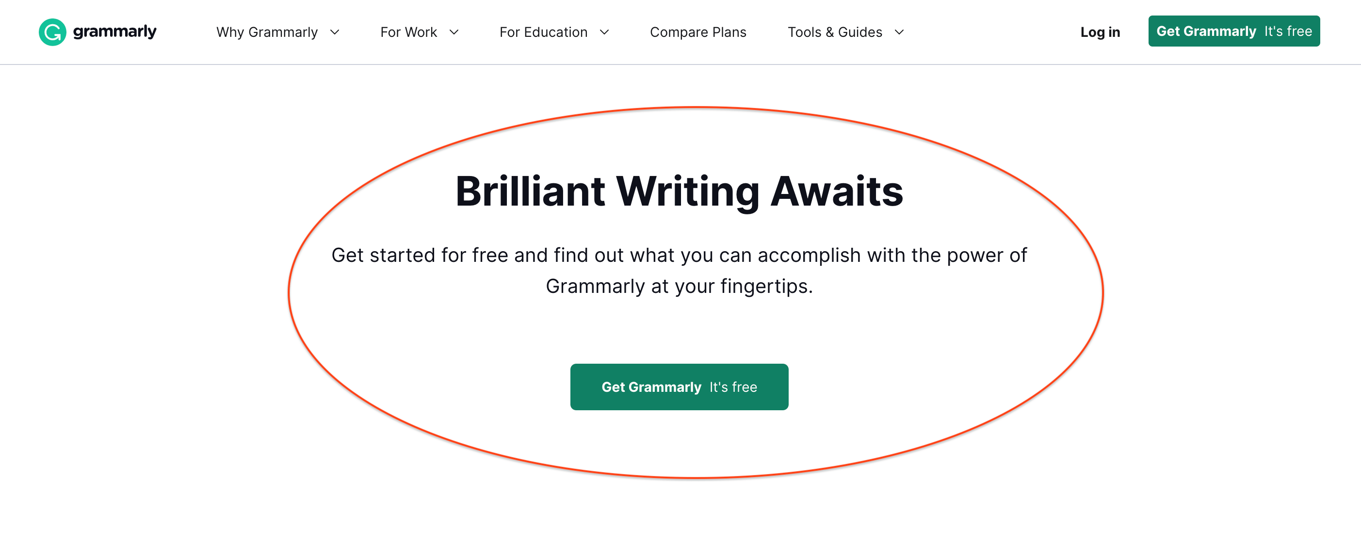
The goal of a CTA is to motivate your audience to take immediate action, so using clear and direct language is essential. That said, the length of your CTA should be determined by the clarity and effectiveness of the message, rather than a specific word count or character limit. Still, brevity is always best.
Example: Grammarly is an online writing assistant that helps users improve their writing skills. Their brief but elegant CTA says everything you need to know: “Brilliant Writing Awaits.”
7) Speak to your audience’s generational drivers.
You always want to tailor messaging for your audience, and their age may be an important thing to consider in that messaging. Different generations are driven by different things, so optimizing your CTAs to speak to their unique desires can be an incredibly powerful way to convert them.
- Baby Boomers: Baby boomers are an older generation that tends to be more traditional and value quality over quantity. They respond well to CTAs that emphasize the quality and durability of a product or service. For example, “Invest in quality that lasts a lifetime” or “Experience timeless elegance.”
- Gen X: As a generation of latchkey kids who were raised on anti-establishment values, you can cater to Gen X’s independent streak with messaging that speaks to their unique identity or independent thinking. For example, “Stand out from the crowd” or “Make your mark.”
- Millennials: Millennials are a tech-savvy generation that is always on the lookout for new and innovative products. They respond well to CTAs that emphasize the latest trends and technologies. For example, “Join the future of fitness” or “Get ahead of the game with the latest tech.”
- Gen Z: Gen Z is the youngest generation, and they are often considered to be more socially conscious than previous generations. They respond well to CTAs that emphasize the social impact of a product or service. For example, “Make a difference with every purchase” or “Join the movement for a better future.”
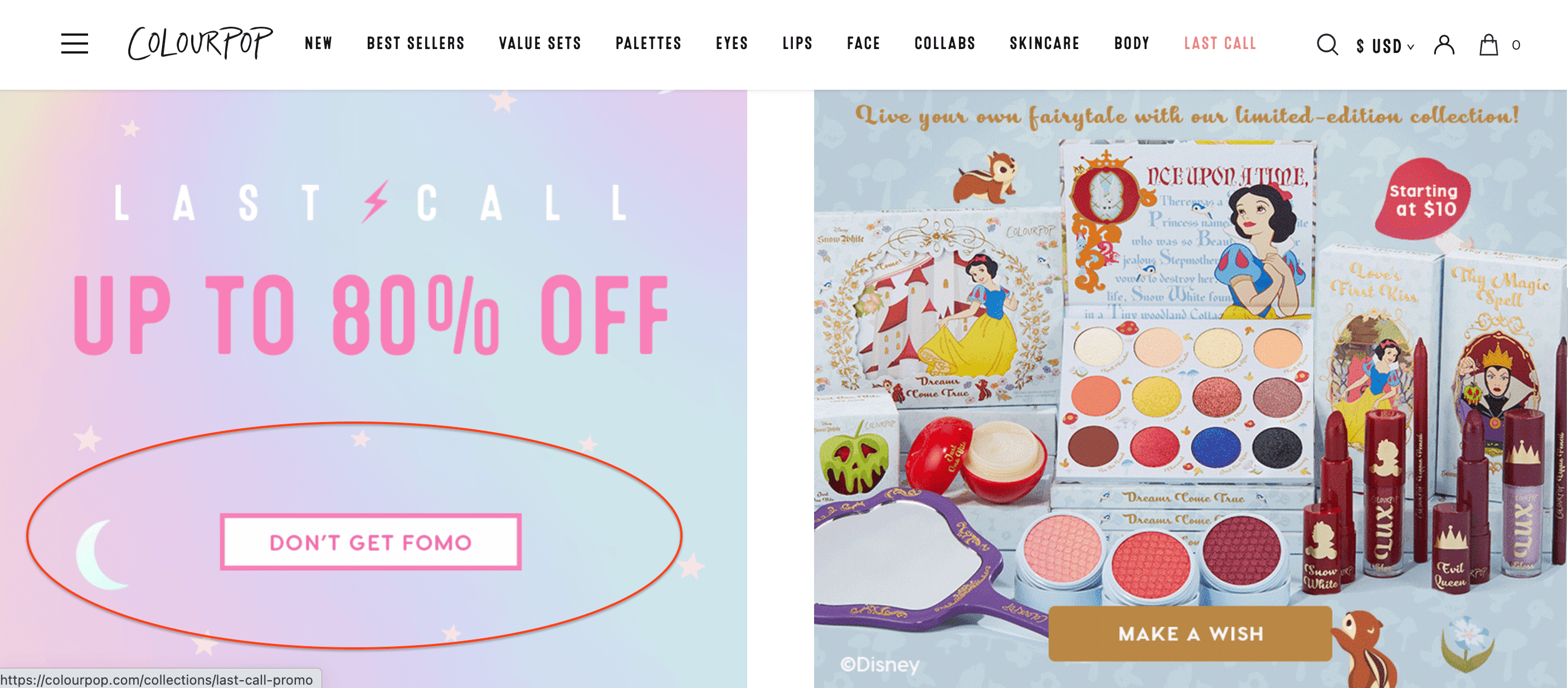
Example: Colourpop is a fun beauty brand that is focused on the Gen Z/Millennial buyer. Knowing this, they use the right language to speak to their audience. They could say “Try new makeup” but instead they say “Don’t get FOMO.” By using this relateable slang, they cultivate a sense of familiarity and create that emotional sense of urgency—a win-win.
How to Ensure Your CTAs Are Successful
If you want to write CTAs that always hit the mark, there are a few more ways to ensure your copy always lands.
- Keep your personas up to date. To effectively speak to your audience’s needs, wants, pain points, and emotions, you need to understand who they are and what they care about. Revisit your marketing personas every six months to make sure they’re still accurate.
- Inject your brand voice. To create a solid and cohesive brand experience, take every opportunity to infuse your content with your brand personality. CTAs are one of the most overlooked places to do this, so if you can do it well and naturally, it will only enhance your user experience. Note: You don’t have to get too creative. You need to walk the line between familiarity and clarity. This is why we always keep our homepage button labeled “Contact Us.” It keeps it simple and clear for people who know exactly what they want to do.
- A/B test. CTAs are one of the easiest things to test, and one of the best ways to get insight into your audience’s preferences. Test new messaging to see what resonates.
Of course, CTAs are only one part of the content marketing machine, and good content always starts with a good content strategy. To ensure every part of your content machine is aligned, see our free guide to content strategy. And if you need any support bringing that strategy to life, find out what it’s like to work with us on content strategy or reach out. We’d love to help you connect with your audience and build a community of lifelong fans—one CTA at a time.


This is FANTASTIC!!!
Thank you!
So happy to help!