When we kick off motion graphics projects with clients, the question always comes up: How long should this be? It’s a tricky question that everyone is trying to answer. Motion graphics are such a great tool to connect with people, deliver information, and tell powerful stories. Naturally, you want to create the best possible presentation, and length affects everything from the story told to the animation style used. But here’s the more important question: What’s your goal?

What Are You Trying to Achieve with Your Motion Graphics?
There isn’t a single formula to determine the length answer, but you can get closer if you have a firm grip on why you’re making motion graphics in the first place. Depending on your project goal, you should have identified the most important elements that will influence the project.
- The people you’re trying to reach: Who is your audience? What type of content do they prefer? What are they most accustomed to seeing?
-
The message you’re sending: Is it entertaining, educational, inspiring? Are you telling a story or explaining how something works?
-
The distribution: Where will this live and be shared? On your blog? Your website? At an event? On social?
The answers to these questions will determine how long your motion graphics should be. Different lengths are better for communicating different things. So it’s important to understand the benefits and constrictions of each.
Motion Graphics and Brand Awareness
While there is no prescriptive length, motion graphics—at any length—can help increase brand awareness, drive traffic, and convert, both alone and as part of larger campaigns.
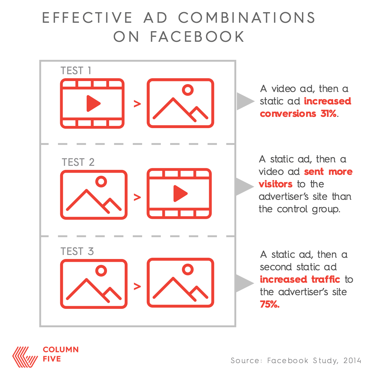
In 2014 Facebook conducted an interesting study to see how video enhanced an advertiser’s online campaign. To do so, they tested various combinations of both static and video ads, showing the test group the ads in different sequencing combinations:
- A video ad, then a static ad
- A static ad, then a video ad
- A static ad, then a second static ad
The results were pretty interesting:

While the study showed the affects of social video, there are plenty of use-cases where motion graphics are beneficial. To figure out what length might work best for your motion graphic, here’s a breakdown to guide your discussion. (It may even give you some ideas for uses you hadn’t thought about before.)
0-30 Seconds
Best for: Brand awareness
It may seem like motion graphics under 30 seconds couldn’t make that much impact, but you’d be surprised. You’ve surely noticed video filling your social feeds—and for good reason. It’s a quick and easy way to deliver a short message that keeps your brand top of mind.
A 2015 Facebook/Nielsen study examined how video affected ad recall, brand awareness, and purchase consideration and found that video increased brand awareness almost instantly.
“Results show that from the moment a video ad was viewed (even before one second), lift happened across ad recall, brand awareness, and purchase consideration. That means even people who never watched the video, but did see the impression, were still impacted by the ad. And, as expected, lift increased the longer people watch the ad,” Facebook says.
That means that even if a person watches a video for under 10 seconds, the video still makes an impact.
Use case: Most videos at this length are suited for social channels or instances where you need to deliver a message quickly and efficiently. This can include social media ads, videos used in presentations or at tradeshows, welcome videos on websites, etc. (According to an Animoto survey, 70.8% of marketers plan to invest in social video ads in the next 12 months.)
Example: We created a series of motion graphics to announce Cornell’s first-ever “Cornell Giving Day,” a single day of fundraising targeted at alumni, their parents, and friends of the university. With their guidance, we created 4 motion graphic teasers and 1 full-length motion graphic to showcase the campaign. We’re happy to report the inaugural Cornell Giving Day raised nearly $7 million in donations.
30 Seconds – 2 Minutes
Good for: Engagement
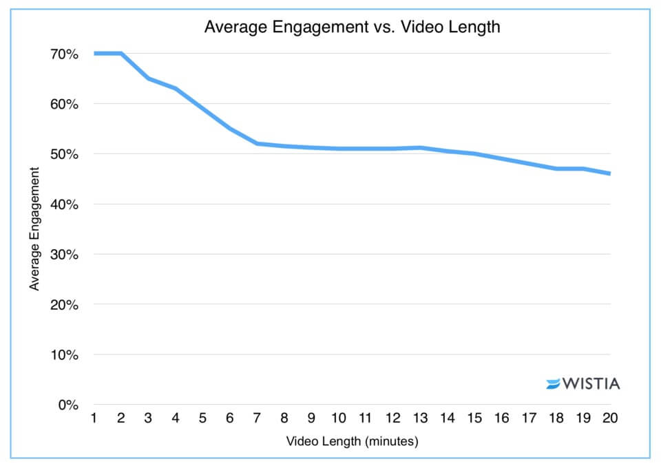
Most videos fall within this range. Again, that doesn’t mean that it’s the right range for your video, but it is the optimal range for engagement. Video company Wistia analyzed engagement vs. length of 564,710 videos. Their data showed something somewhat surprising. You’d assume that drop-off would increase with length. What they found, however, was that while that was true, videos up to 2 minutes maintained the same engagement rate: 70%.

That’s pretty great news if you’re just starting to make motion graphics. This is a healthy chunk of time to deliver information, tell a story, or explain something useful to people.
Use-cases: Things like explainer videos, product announcements, tutorials, product demos, and ads work well in this amount of time. This is especially helpful for things that are meant to give viewers information they need in their research and consideration phase. The key is to make sure you’re as economical as possible with your storytelling.
Example: We created two different motion graphics to help Microsoft share two different messages. One motion graphic spotlights the new Bing snapshots app, giving a full product overview in 0:51 seconds.
This motion graphic explains the work the W3C community does to create standards to define an open Web platform.
2 mins+
Best for: Storytelling
Some people might cringe at the idea of a 5-minute video or even a 10-minute video. But that’s not necessarily a bad thing. People who are interested in your brand, invested in a story, or eager to learn more are more than willing to engage with long-form content. In fact, you might be surprised at what the “sweet spot” of long-form content is. According to Wistia’s research, there’s hardly any dropoff between 6 and 12 minutes. Engagement at that range is around 50%—not bad.
Use cases: Motion graphics in this range are good for narrative storytelling, docustories, behind-the-scenes, entertainment, and educational content.
Example: To create buzz about Mercer’s 2015 National Survey for Employer-Sponsored Health Plans, we created a motion graphic that called out major insights, crafting a story that gives viewers an instant overview of the story uncovered in the survey.
We hope this info helps guide your thinking for your next motion project. If you’re ready to start making motion graphics, here are our tips for every stage of the process:
- Learn how to make compelling motion graphics in 4 steps.
- Try these tips to write an airtight motion graphic script.
- Get inspiration by checking out these 6 cutting-edge motion graphics.
- Use these 8 tactics to get more views for your motion graphics.
If you need a little help, let’s chat about your project.


