
If you’ve gone to the trouble to create a report, you want someone to read it. Whether you’re delivering insights or trying to get support for a new initiative, that information needs to make an impact. To do that most effectively, you need to deliver it in a package that is appealing and easy to digest. That’s especially true for data reporting.
Those numbers are important, yet too often we see reports that include dense data that is dry and boring (at best) and difficult to interpret (at worst). So how do you efficiently communicate data insights? Data storytelling is the key.
Why Data Storytelling Makes Data Reporting Easier to Understand
If you’re only presenting data in text form, you’re actually doing a disservice to your reader. Good data storytelling combines copy and data visualization to totally transform the way people consume your data.
Data visualization is particularly powerful because it actually targets the brain’s visual processing centers, allowing you to instantly process what you’re seeing. Through design elements like color, shape, and orientation, visualization helps us instantly “see” the story the data is telling us, increasing…
- Appeal: Charts and graphs are more aesthetically pleasing, making it easy and more enjoyable to engage with content. (Good design will always elevate your reports, whether they contain data or not.)
- Comprehension: Good design makes it easier to synthesize information more efficiently. Think about it. Is it easier to interpret a spreadsheet of numbers or a simple bar chart that goes up over time?
- Retention: Beyond comprehension, the brain stores visual images, making the information easier to recall later.
Check out this motion graphic to see the power of data visualization at work.
Remember: When it comes to data reporting, you’re not just trying to show people numbers. You’re trying to communicate the story behind those numbers—often to influence decision-making. Simple text or spreadsheets can’t do that very well. Not only will the story be lost but your audience will probably be too bored to get through it all. Thus, those insights won’t be understood and all that work will make very little impact.

How to Make Your Data Reporting More Memorable
Even if you’re not a data scientist, there are simple, strategic ways to incorporate data storytelling into your reports to bring those numbers to life in a compelling way. Here’s your step-by-step guide.
1) Find the story in the data.
Data is immensely valuable to an organization (particularly for marketers). It can show you what’s working and what’s not, inform your strategy, and reveal surprising truths. But to get the full picture, you need to dive into the data, extract those insights, and turn them into a proper story. That’s why data storytelling is so valuable, especially in a world desperate for hard facts.
Finding the unique story is crucial to connect with your reader, communicate important information, and make it stick.
Tip: To uncover the interesting insights in your data, you need to be data literate. Follow our 5-step guide to find the story in your data.
Example: This highly visual Human Rights Campaign Annual Report uses data visualization and infographics to shape a narrative around the theme of “Mobilizing The Road to Equality.”

2) Craft a narrative around that data.
When some people hear “data storytelling,” they assume you can just throw a few stats into your copy and call it a day. Nice try. Strong data storytelling follows a compelling narrative, guides readers through content, and helps them understand not just the data but what those insights mean. To craft a narrative effectively, you must:
- Engage your reader with an interesting title and subtitles.
- Provide context for the data.
- Create a logical flow.
- Highlight notable findings/insights in the data.
Tip: For more, follow these 10 report design and storytelling tips.
Example: This interactive Girls Who Code Annual Report includes plenty of data that highlights the company’s mission to educate girls and close the gender gap in technology. As such, it uses data visualization, as well as photos and backstories of the girls who benefit from the nonprofit.

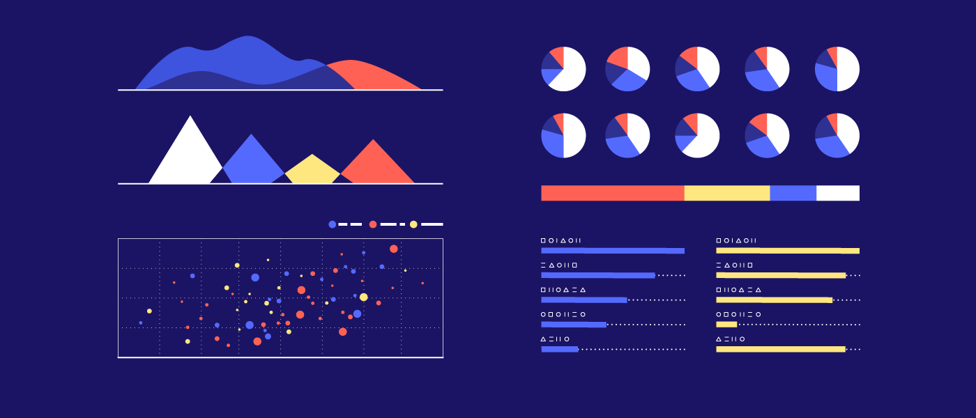
3) Choose the most effective data visualization.
With data reporting, it’s tempting to just throw your numbers into a table or chart. But that doesn’t mean you’re creating effective data visualization or telling a strong data story. It’s not about creating a chart or graph; it’s about representing your data with the right chart to maximize comprehension.
Applying good design principles and using elements like shape, color, size, labeling, ordering, comparison, etc. can make a big difference in how people interpret your data. For example, do you know how many slices a pie chart should have, or the ideal distance between bars in a bar chart? Knowing these little tricks will elevate your data visualizations immensely.
Tip: To brush up on your data skills, learn how to design the most common charts and graphs, and try these 25 tips to enhance your data visualizations.
Example: The National Association of Realtors’ 2014 Annual Report features simple, clean data visualizations that make the data easy to digest, as well as callouts that highlight significant numbers.

Put Your Data Reporting to Work Elsewhere
While you may be focused on internal data reporting, digging for these stories will often uncover interesting ideas that can become great content marketing too. Repurposing this data or using it as the basis for a fresh piece of marketing is a smart and economical way to use your resources. (And who isn’t a fan of working smarter, not harder?) If you want to take this approach…
- Try our tips to find those marketing stories in your data.
- Look at these 9 internal data sources to find great stories.
- See how these brands have turned their reports into marketing.
- Find out how to repurpose your data visualizations.
- Download the Content Marketer’s Guide to Data Storytelling.
And if you need help with your reporting or marketing (or both), we’re here. Let’s chat about how we can help you tell your brand story to your audience—whether it’s internal or external.


Let's upgrade your marketing game
Get fresh tips, how-tos, and expert marketing advice every week. (15,000 people already are.)


thank you
Glad you found it helpful.