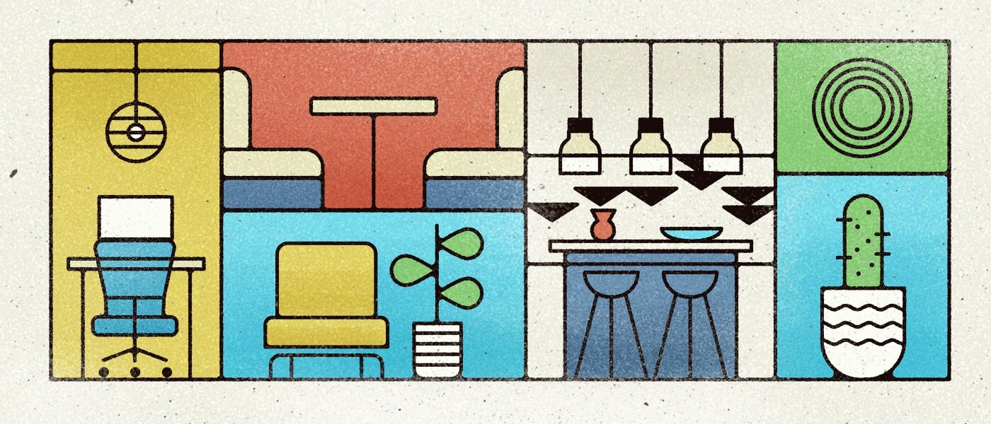
Work happens anywhere and everywhere. And while there are many factors that influence satisfaction and productivity, our physical environment is a pretty big one. So when we decided to simplify our office space last year, we realized it was time to rethink how our space influences the way we work—and how we influence our space. Now that we’ve settled into our new space, we thought we’d offer a behind-the-scenes look at how we tweaked our office space design to increase our productivity and peace of mind.
Office Space: The Column Five Edition
Our current spot is the fourth incarnation of Column Five’s California headquarters. Over the last decade, we’ve moved from a cramped and (possibly illegal) attic space, to a warehouse, to a 11,000-foot office, and finally to our new office: a 4,000-foot space in The Culture Yard in Costa Mesa. Moving offices is a pain, of course, but we were actually excited for this one. Led by our ops team, we were better equipped than ever, knowing what worked and didn’t in each previous office space. And while planning our new space was a formidable task, we were ready to make some major changes.
The Challenges of Office Space Design
The biggest change came in how we approached our floor plan. Since day one, we swore we’d never have cubicles. Instead, like many organizations, we used open floor plans in every space. (In the early days it was the only way to fit everyone in.) But as our team has evolved, more people have gone remote, and we’re more aware of our individual work styles, we’ve realized that a totally open floor plan doesn’t work for us for several reasons.
- Personal work styles. Introverts and extroverts can co-exist peacefully, but they have very different ideas of the ideal workspace. Introverts want privacy and cocooning to work or take a break. Extroverts like open spaces and visibility. We want everyone to have a sense of control and autonomy over their space, so we wanted to design a space that could work for both.
- Flexibility. We were moving into a smaller office, which meant we needed a flexible layout that could provide space for both a company-wide meeting and a private call. We also didn’t want any space to go unused, as much of our larger office did, especially now that our team has the autonomy to work where they want.
- Efficiency and logistics. While open floor plans seem nice, they can make it difficult to work around. For example, a kitchen blender could easily interrupt a conference call, and people’s entrances, exits, and mealtimes could disrupt other’s work. We needed a space that would help people do what they needed to do without affecting others.
Inspired by WeWork’s philosophy, we know we’re competing with people’s homes, so our office space design focused on blending comfort with functionality, streamlining the space, and helping people get—and stay—in flow.
Thus, we designed a new layout through the lense of behavior, intention, and mindfulness. Luckily, our ops team had the support of our aesthetically-minded designers, helping us create our best office design yet.
The Floorplan
During our research phase, we were heavily inspired by Cal Newport’s Deep Work, specifically his conversation with architect David Dewane, who created the concept of the Eudaimonia Machine, a unique floorplan designed to optimize human capability.
Inspired by Aristotle’s concept of eudaimonia (“the condition of human flourishing or of living well”), the Eudaimonia Machine is a design intended to guide people through spaces that trigger different emotions, ultimately ending in a space where they can do the most deep work.
For our office design, we looked for opportunities to infuse elements of the Eudaimonia Machine to provide an environment that served everyone’s needs. Thus, we designed our own interpretation of the Eudaimonia Machine’s five main spaces, as described by Newport in Deep Work.
1) The Gallery
Newport’s description: “The first room you enter when coming off the street is called the gallery. In Dewane’s plan, this room would contain examples of deep work produced in the building. It’s meant to inspire users of the machine, creating a ‘culture of healthy stress and peer pressure.’”
We call ours The Great Room. It’s the room you enter through, a bright, airy, and welcoming space that sets the emotional tone for the day. Here, you can greet a coworker, grab a coffee, and get in the headspace to start your work.
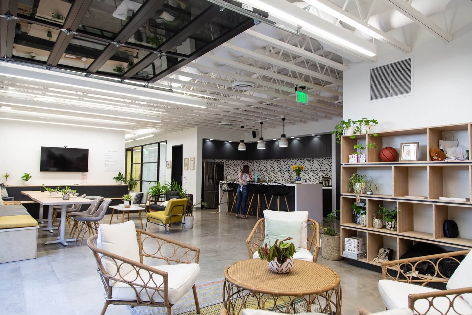
It includes the kitchen (an inherently social place), booths (allowing for coworking or semi-privacy), a large counter island, café tables, and auditorium seating for our all-company meetings.
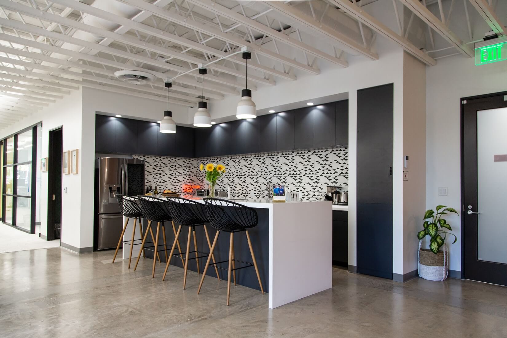
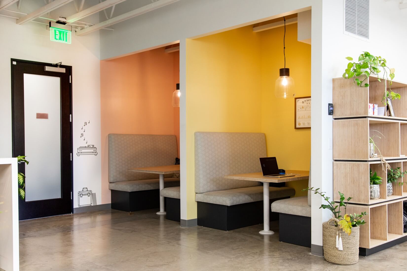
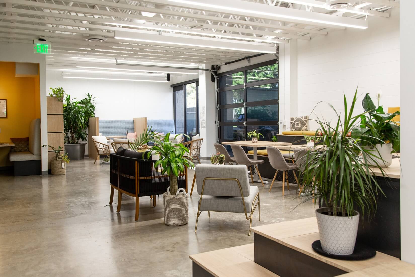
It’s a public, highly social and interactive space, the best place for noisy spillover. That said, we try to follow “library rules” in our public spaces, allowing for social interaction but still being cognizant of others.
2) The Salon
Newport’s description: “The Salon is designed to create a mood that ‘hovers between intense curiosity and argumentation.’ This is a place to debate, ‘brood,’ and in general work through the ideas that you’ll develop deeper in the machine.”
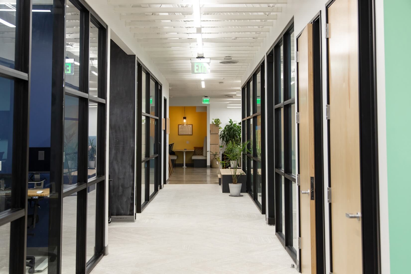
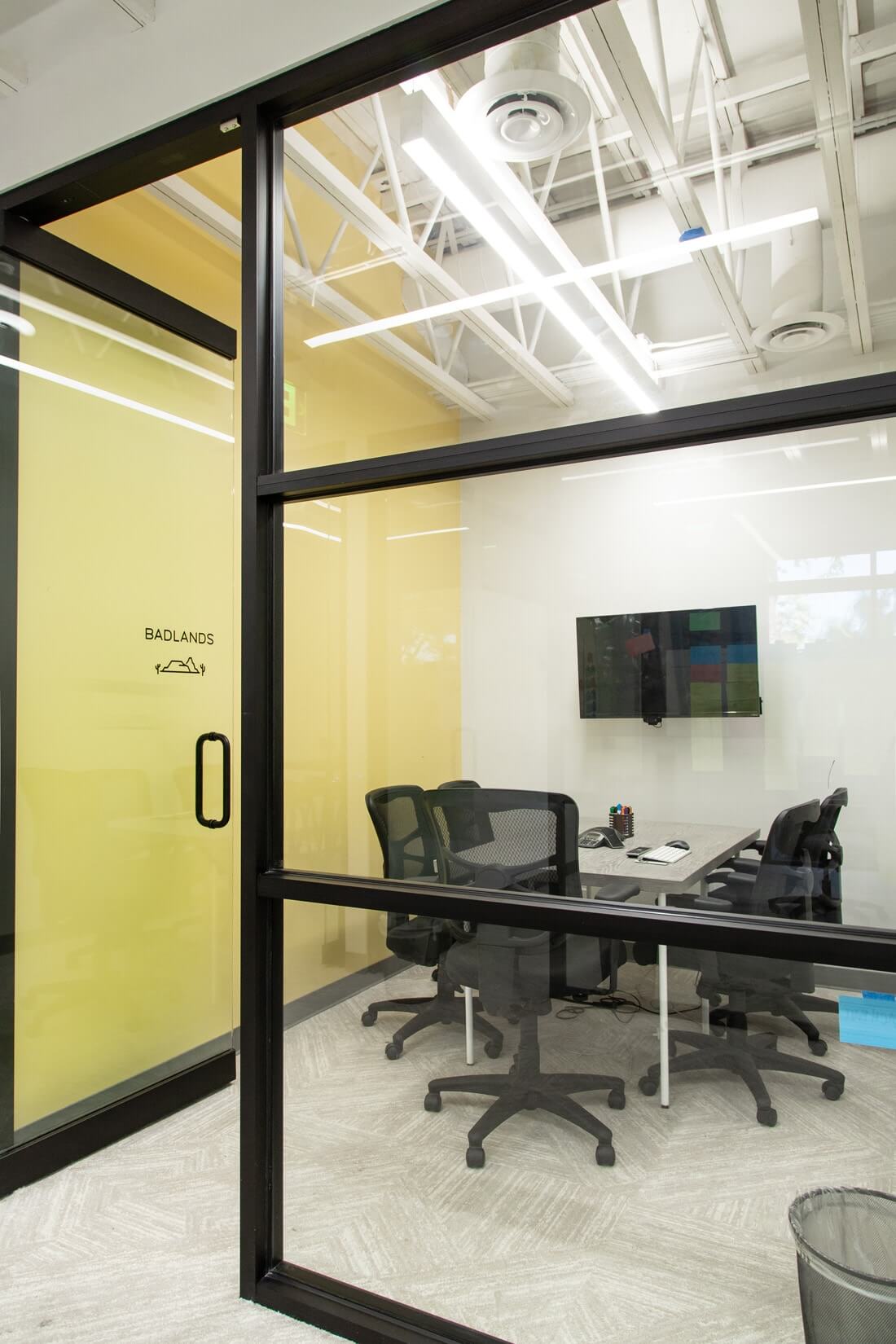
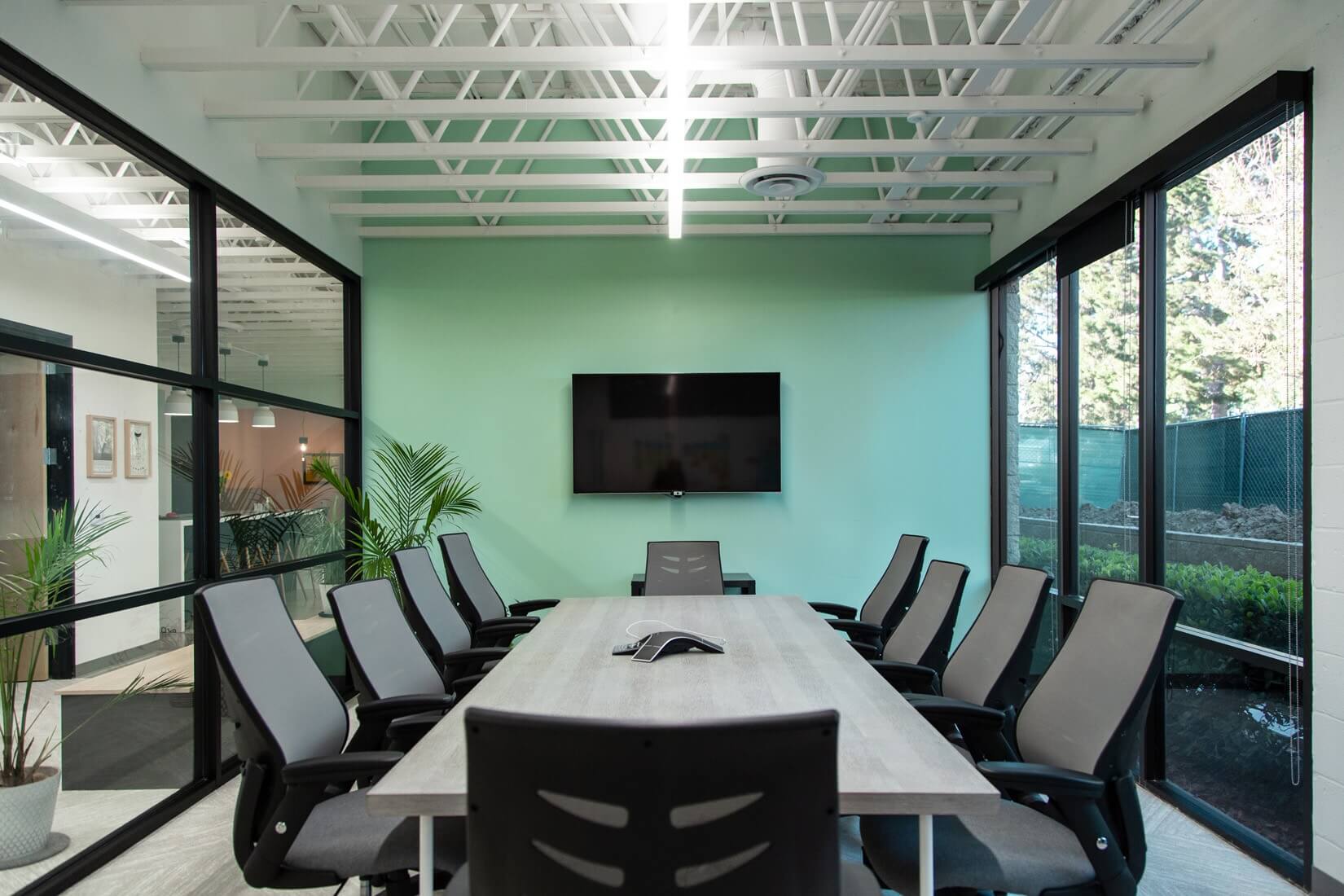
For us, this space is our hallway, lined with conference rooms and two phone rooms of varying sizes.
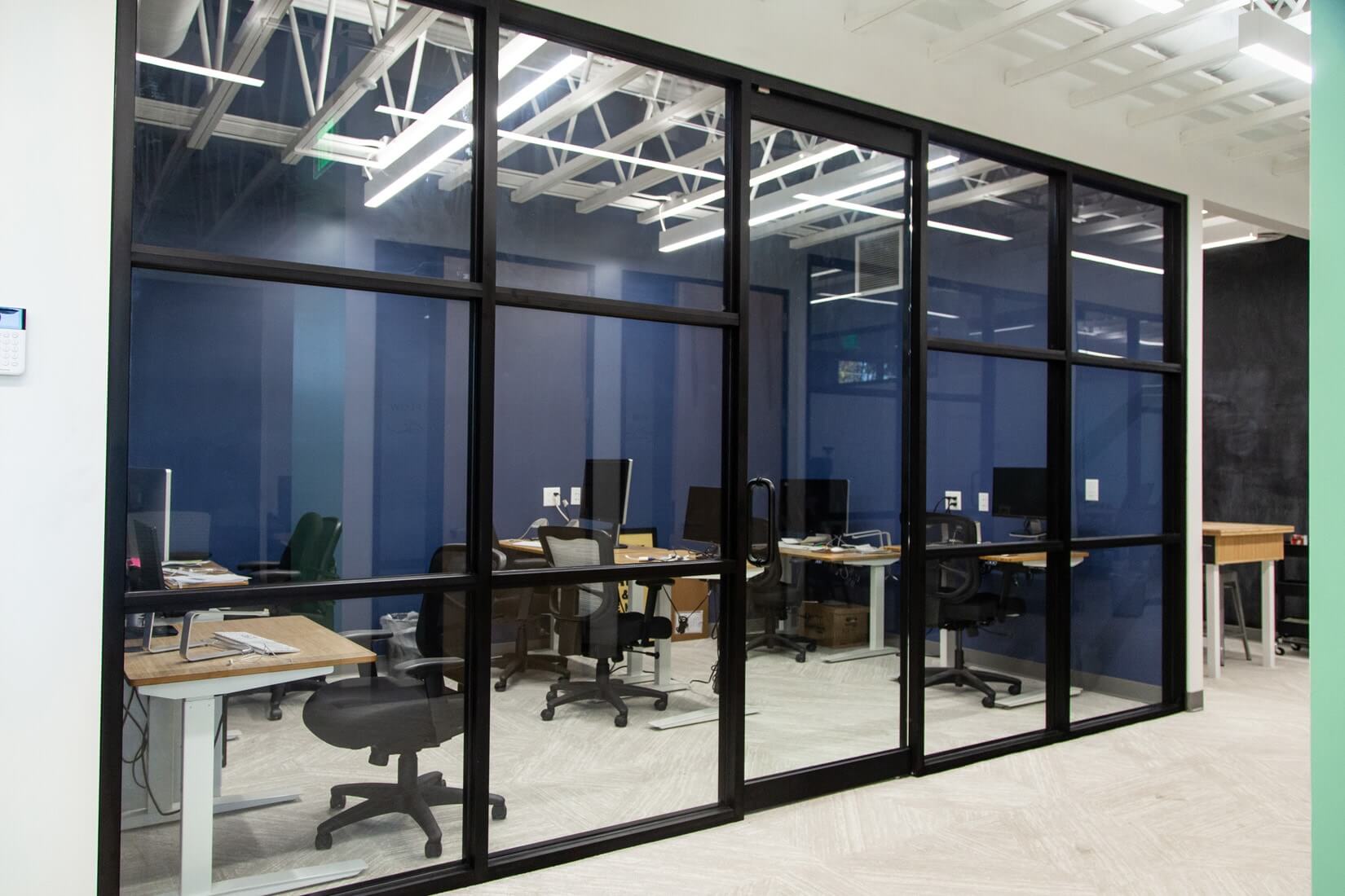
These rooms are where we do our main collaborative work. All have phones, all are public spaces (featuring glass doors and storefront windows along hallway). We hold meetings, entertain clients, do presentations, talk, and brainstorm in these spaces.
3) The Library
Newport’s description: “Beyond the salon you enter the library. This room stores a permanent record of all work produced in the machine, as well as the books and other resources used in this previous work.”
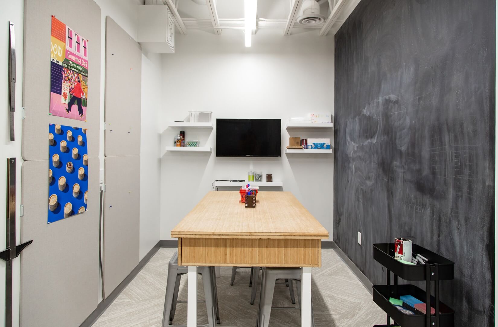
Our library is a creative nook space, featuring large a table with drawers, high stools, and shelves on the walls for books, ephemera, and knick knacks.Here we keep the resources we need for more physical work (such as papercraft) and other supplies. It also includes a chalkboard wall to doodle for inspiration, roadmap a project, or write a friendly message.
4) The Office
Newport’s description: “The next room is the office space. It contains a standard conference room with a whiteboard and some cubicles with desks.”
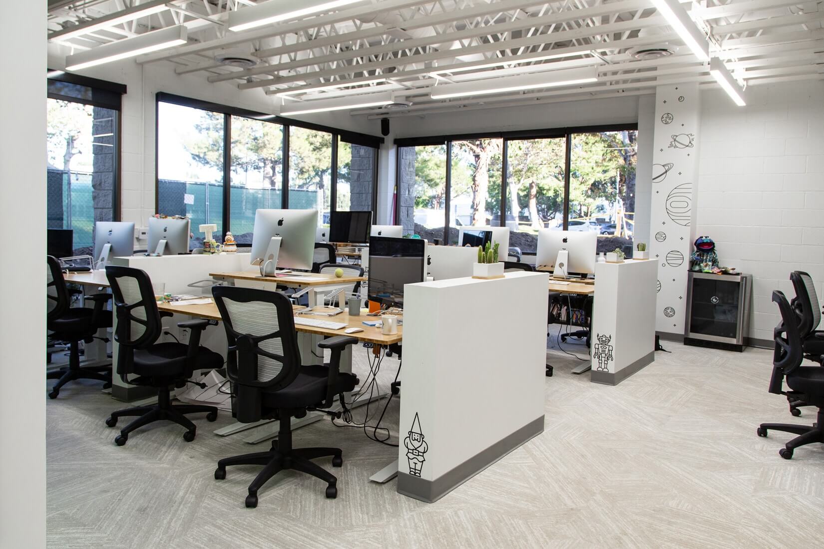
As we incorporated conference rooms into our salon space, our office includes a large, open floor desk area, ideal for low-intensity activities. Here we have assigned desks, as well as unassigned desks well-appointed for anyone who needs to use them (including second monitors, dongle baskets, etc.). This environment is a throwback to our open floor plan—without the distractions.
5) The Chamber
Newport’s description: “This brings us to the final room of the machine, a collection of what Dewane calls ‘deep work chambers.’…’The purpose of the deep work chamber is to allow for total focus and uninterrupted work flow,’ Dewane explains.”
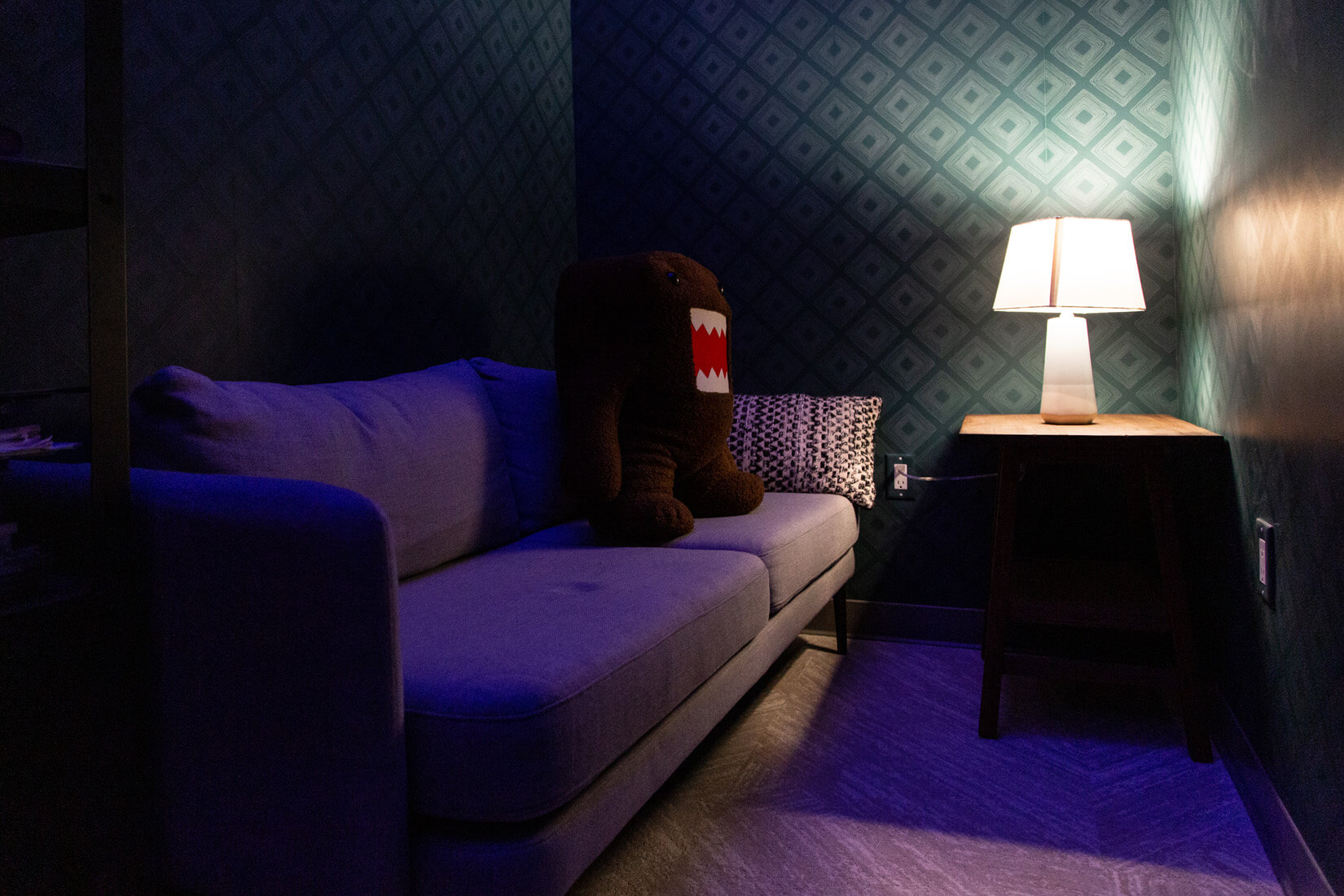
We have renamed this The Cavern. It’s a quiet space, painted a dark color. It has a door for privacy, and there is no talking or music allowed. This allows people to do deep work in a designated space.
Overall, each space has its own personality, but everything works symbiotically. For the overall aesthetic, we wanted to strike a balance between the coziness of a college student union (without the shabbiness) and the style of a designed space (without being too sterile).
To achieve this, we focused on natural materials, plenty of plants, and a bright, cheerful, and colorful palette that isn’t too visually “loud.” We’re also lucky to have a garage door, allowing natural light and air to flood our main space.
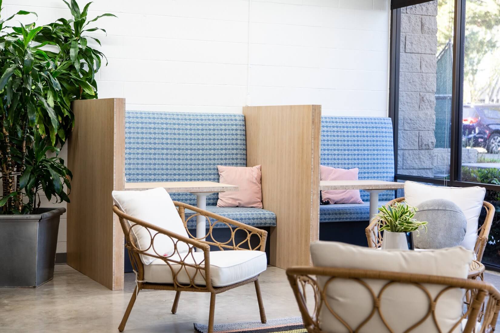
Ultimately, our goal was to create a space that was joyful, warm, welcoming, and comfortable. Thus far, it’s served our needs well—and made us even more eager to work more efficiently. Since moving in, we’ve taken major steps toward eliminating unnecessary processes, collaborating more effectively, and increasing productivity. (You can learn more about how we recently rebuilt our production process with AgencyAgile techniques as part of this push.)
As happiness researcher Gretchen Rubin says, “outer order contributes to inner calm,” so we’re glad to have an office that helps make our work lives happier—from the minute we step into the office each day.
Of course, we’d also like to give a special shoutout to the people who helped take on this enormous task: Our Cofounder Ross Crooks, VP of People and Culture Tamara Hlava, Office Manager Leanne Robinson, Creative Director Nate Butler, Designer Jenny Famularcano, Chris Cuaso Design, and Chris Pearson and Dave Macbeth at Macbeth Millwork. We couldn’t have done it without their work, insight, and talent.
Find Out More About How We Work
We’re always eager to experiment with new ways to work smarter and more effectively. To learn more about our latest undertakings:
- Check out our revised meeting rules that keep us on task.
- Find out about the 10 things we do to build bonds, let loose, and cultivate our creativity.
- Try our team’s best tips for working remotely.
And if you want to know more about how we work or have a project you need a hand with, holler at us.
