B2B content doesn’t have to be boring. From infographics to podcasts, there are so many content formats you can use to educate, entertain, inspire, and connect with your audience. But why do so many B2B marketers churn out boring, generic, or totally blah material? Maybe they don’t have the right resources. Maybe they don’t have the right content strategy. Or maybe they don’t have the right ideas. If you fall into any of these categories, don’t worry. We can help you get back on track, starting with some fresh inspiration. Here, you’ll find some of our favorite recent B2B marketing examples that prove just how creative you can be—even in B2B.

10 Unique and Exciting B2B Marketing Examples
The best brands use creativity, variety, and good storytelling to create engaging content that is far beyond the boring B2B ebook. These examples prove how different formats, good design, and valuable content can make your brand stand out at every stage of the buyer journey.
1) Simple Changes by Bynder (Video)
Why we love it: Absurdly entertaining
How do you use a small budget to pique people’s interest and tell your brand story in under 20 seconds? If you’re Bynder, you grab a dinosaur costume and get creative. This is a great example of smart content that stands out. It’s a simple and entertaining concept, but most importantly, it delivers a simple message: “Don’t get caught up in prehistoric processes.” Bynder invites you to think outside the box and evolve your content creation process, something they prove to be experts at with this video alone.
Tip: Find out how to create great marketing videos (even if you’re remote), follow our guide to write a strong explainer video script, and download our free e-book, The Content Marketer’s Guide to Brand Video. And if you want more inspiration, see these 15 excellent examples of b2b video.
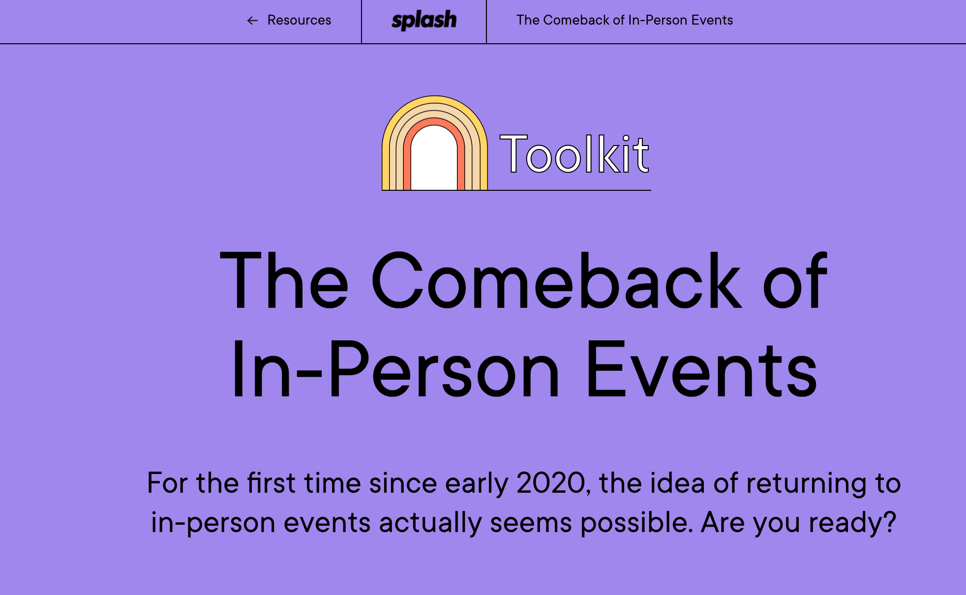
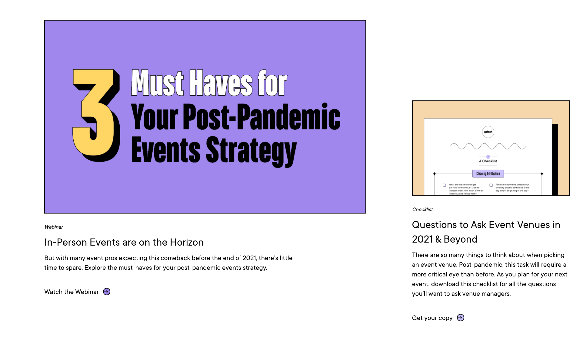
2) The Comeback of In-Person Events by Splash (Toolkit)
Why we love it: Bright, bold brand identity
Returning to in-person events after the pandemic may seem intimidating, but this delightful toolkit makes it feel exciting. It’s packed with helpful resources to make event planning easier, but it’s really the colorful creative treatment that caught our eye. So much B2B design is “safe,” but Splash follows through on their name and makes a true statement with a playful purple palette that makes you feel like you’re perusing a piece of entertainment.
Tip: Make your B2B content more memorable with a beautiful brand identity. Find out how to create a strong identity, craft easy-to-use brand guidelines, and use our checklist to make sure all of your content is on-brand.
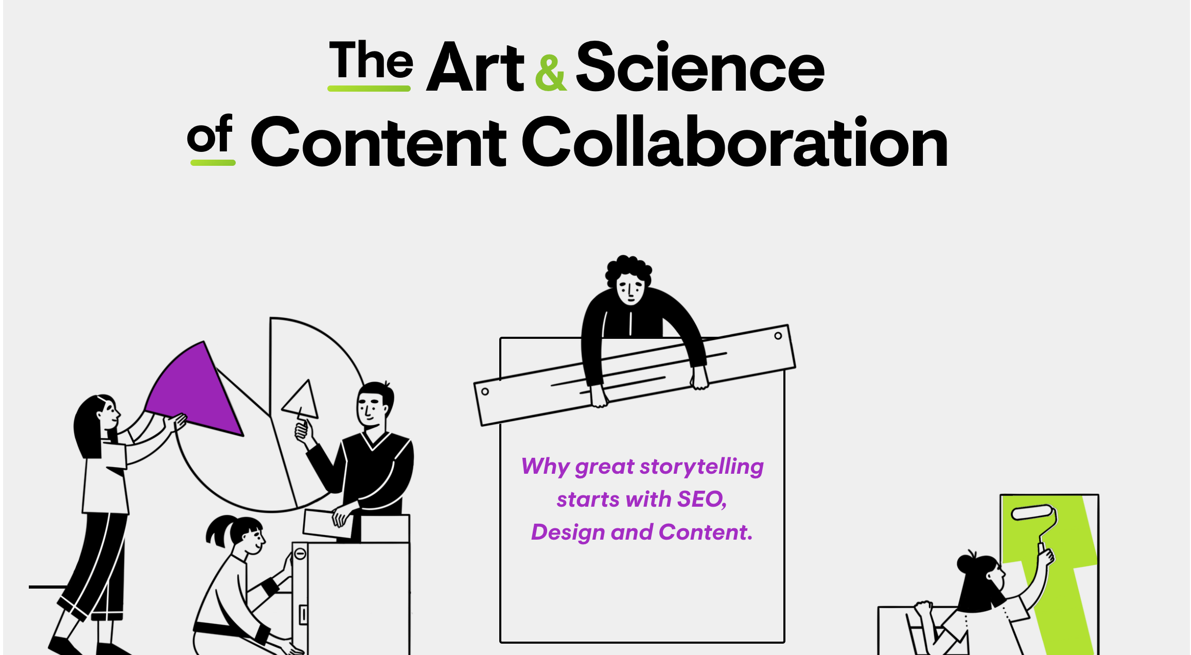
3) The Art & Science of Content Collaboration by Ceros (Interactive Guide)
Why we love it: A+ design
Ceros is a cloud-based design platform that powers the web’s most exceptional interactive content. It’s no surprise that they use interactivity in their marketing content. Not only is their content great but the presentation is perfect. The visuals have personality, the animation is seamless, and the content is easy to navigate. We’ve consumed plenty of content about the power of great storytelling, but this guide does a great job of telling the brand’s story too, as their personality is present in every portion. It’s the type of resource you want to bookmark and come back to again and again.

Tip: Find out how interactive storytelling can benefit your brand, and try these prompts to brainstorm your interactive ideas.
4) Searching for Salai by SAP (Podcast)
Why we love it: An experimental approach
This podcast was a unique part of the brand’s plan to market SAP Leonardo (an SAP business unit and software platform focused on putting intelligent technologies like blockchain and IOT to use in businesses). But instead of taking a more traditional approach (e.g., a business podcast that discussed innovations in tech from thought leaders), they decided to try something completely different and produce a 9-episode narrative podcast that combines time travel, mystery, and more. Ultimately, the goal was to reframe the cultural narrative around new technologies (like SAP’s) by using storytelling as a key tool. The project was so successful it earned the Content Marketing Institute’s Best Podcast and Content Marketing Project of the Year in 2019.
Tip: Find out more about how the project came to life, and try these prompts to brainstorm creative ideas for your brand.
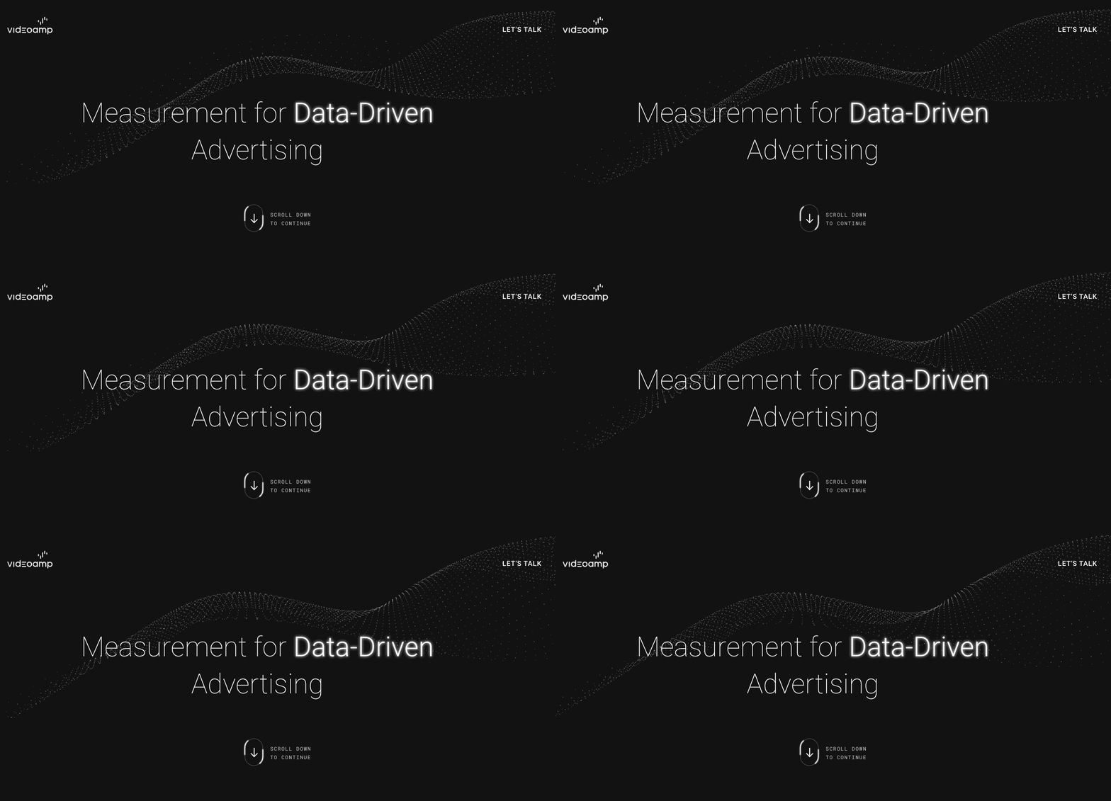
5) VideoAmp (Website)
Why we love it: Design that differentiates
Every piece of content your brand creates reflects who you are, and your website is one of the most important ways to convey that. At a time when so many B2B websites are completely generic, templatized, and uninteresting, VideoAmp used their website to tell their brand story from the moment you click on it. The sleek design, abstract data-inspired animations, and strong messaging set them apart from competitors and tell you everything you need to know about who they are and why you should work with them.
Tip: To make your website effective, you need to nail your brand messaging. Use our free template to articulate your tagline, value prop, and key stories. This will ensure you’re telling a consistent brand story across all touchpoints, from your website to your Twitter feed.
6) Divvy (Social Content)
Why we love it: Entertaining AF
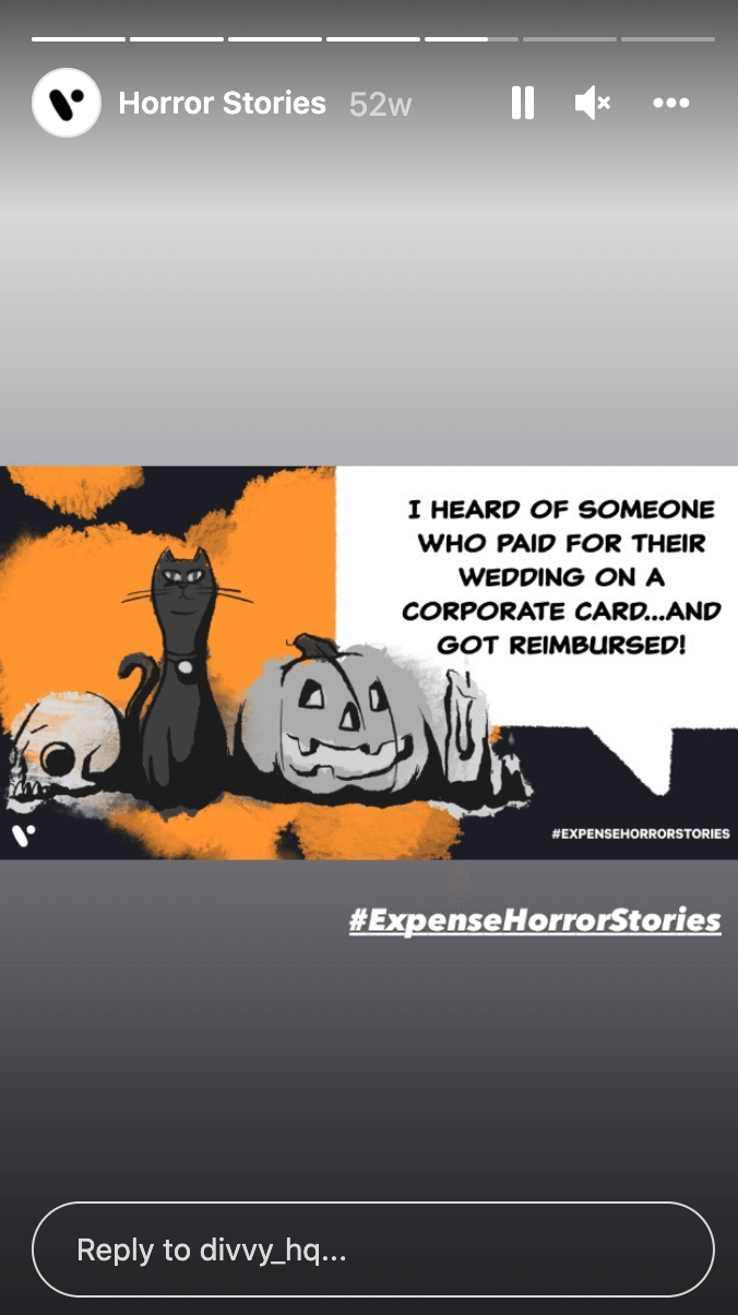
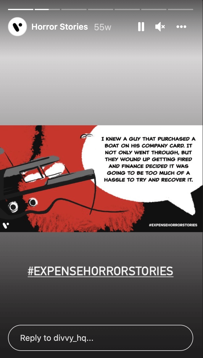
Credit card management isn’t always the sexiest or most interesting topic, and you rarely think of a financial company as an entertaining source of content. Then along came Divvy. Their social strategy blends great design and a dash of cheekiness to create compelling social content that will make you LOL. For example, their #ExpenseHorrorStories features anecdotes about the craziest things people have tried to submit as a company expense. Not only are the stories hilarious but it creates a sense of camaraderie and commiseration among Divvy’s customers. This is tough to do in B2B, but they do it masterfully.
Tip: Microcontent is a great way to engage people on social. Find out how to make microcontent work for you.
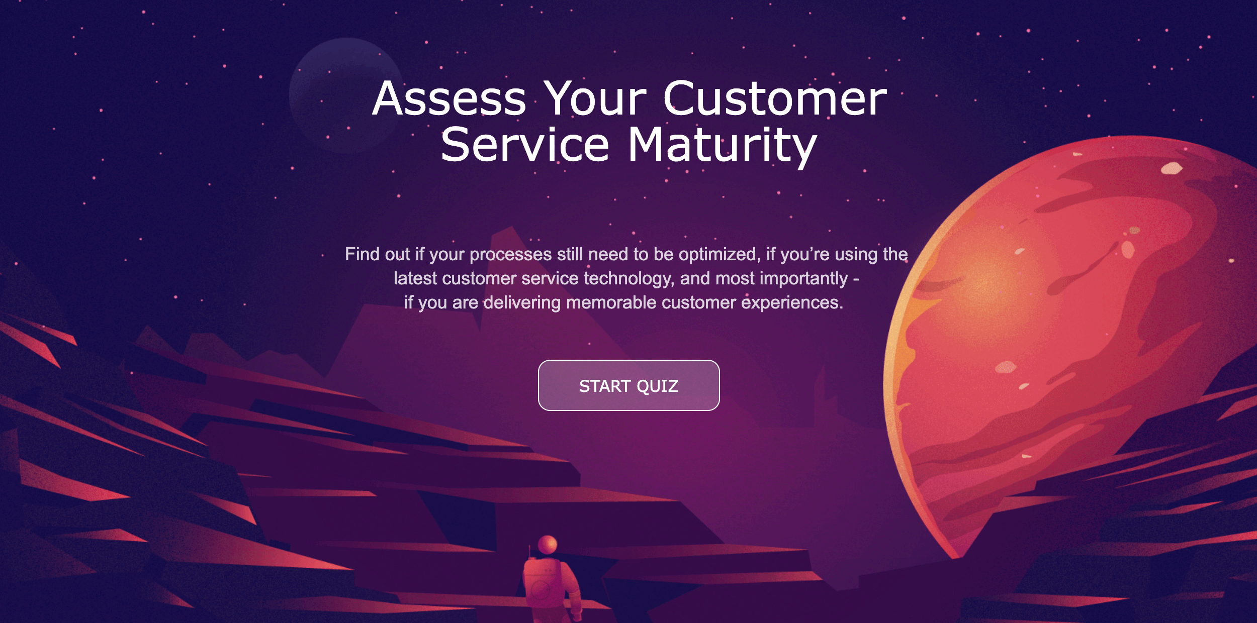
7) Assess Your Customer Service Maturity by Freshworks (Quiz)
Why we love it: Personal, valuable content
Quizzes are the perfect portal to help you build a relationship with a prospective customer. They are particularly effective because they build a personal story around the user, guiding them toward the information they need. This Freshworks quiz helps you understand the state of your customer service operation, providing an overall score, a detailed analysis of your performance, and recommended improvements. Presented in this simple, well-designed package, the quiz provides value and helps users make better decisions to improve their success.
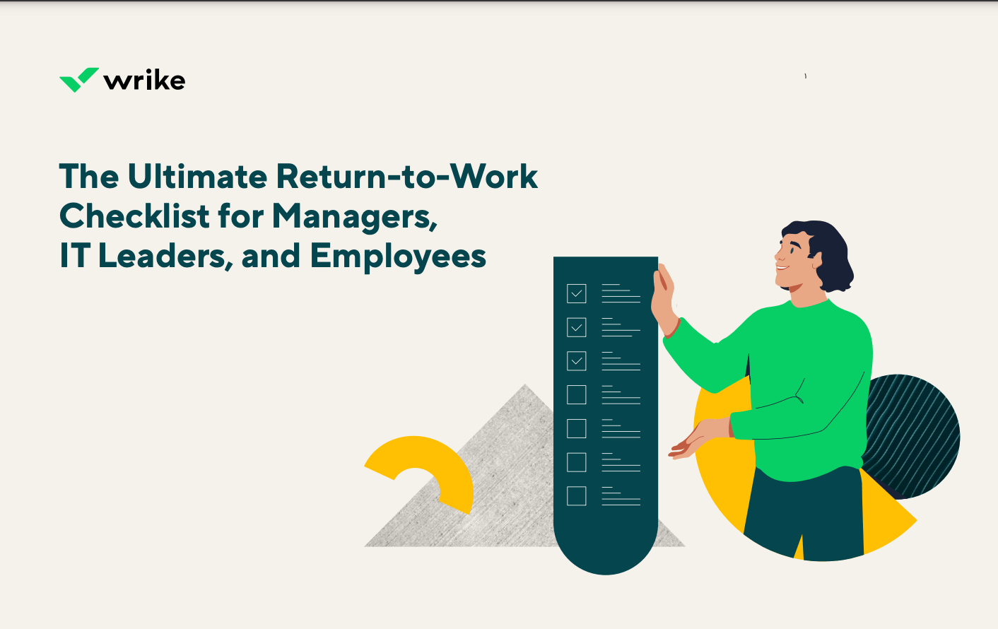
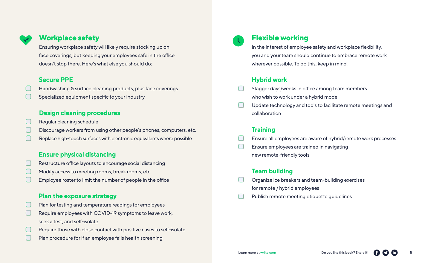
8) The Ultimate Return-to-Work Checklist for Managers, IT Leaders, and Employees by Wrike (Checklist)
Why we love it: Simple but effective
Anytime you make your audience’s lives easier, they will appreciate you. Guides, workbooks, toolkits, and checklists like this are particularly effective. We love Wrike’s simple checklist for two reasons: It’s well-designed, it’s on-brand, and it’s thorough, giving readers all the information they need to keep their workplace safe in the wake of the Pandemic.
Tip: Things like checklists make great supplemental content if you have a larger piece of content you’re trying to promote (e.g., a longer ebook). Find out how to get more mileage from every piece of content you create with a divisible content strategy.
9) Pardot ROI Calculator (Tool)
Why we love it: Practical with personality
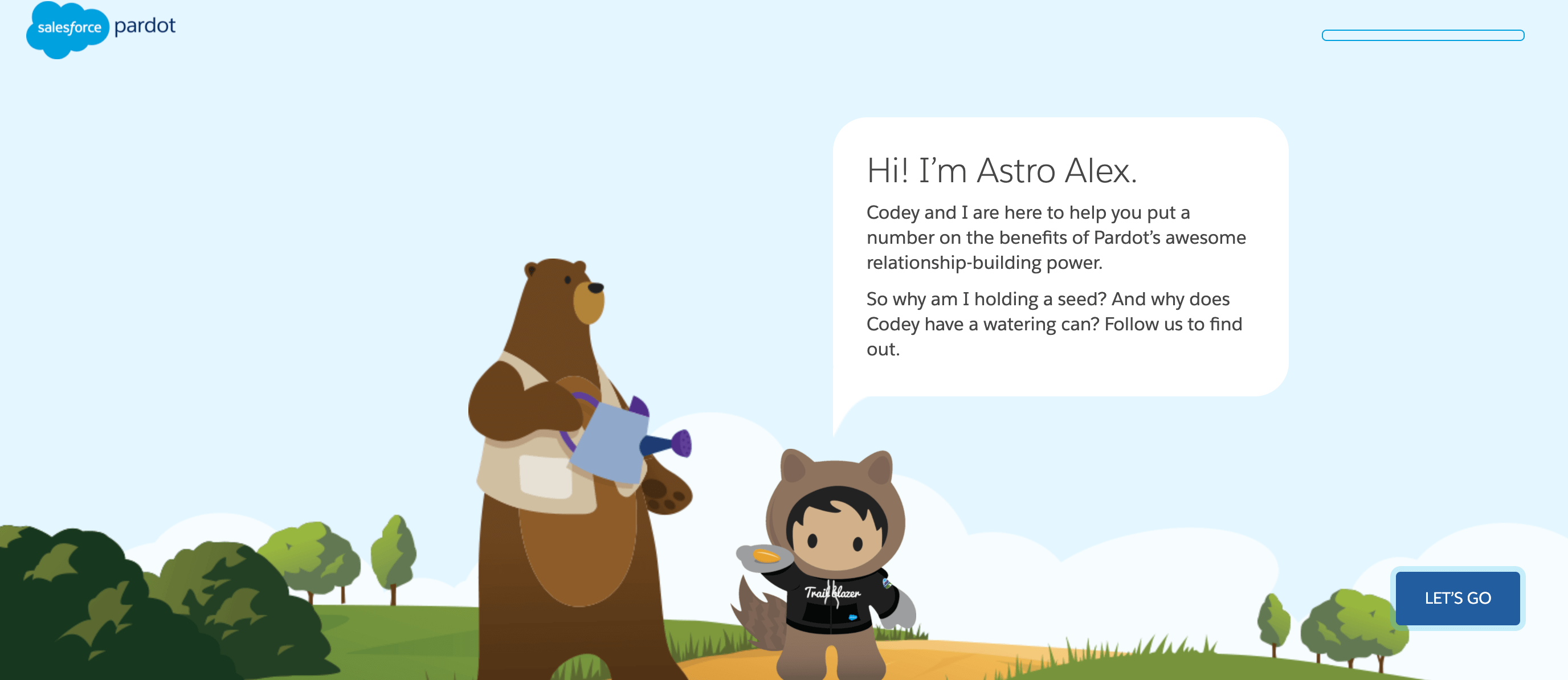
Tools are super userful, but they can be almost indistinguishable from each other. If your brand is providing valuable content to someone, you want them to know it’s your brand. Pardot does this well. Their ROI calculator is guided by a friendly mascot who adds context for each question. It feels less like a calculator and more like a game, which totally changes the experience.
Tip: Your brand voice and personality can transform how people experience any piece of content you create, making it both personable and memorable. See our guides to find your brand voice and personality if you’ve been struggling to figure out what they are.
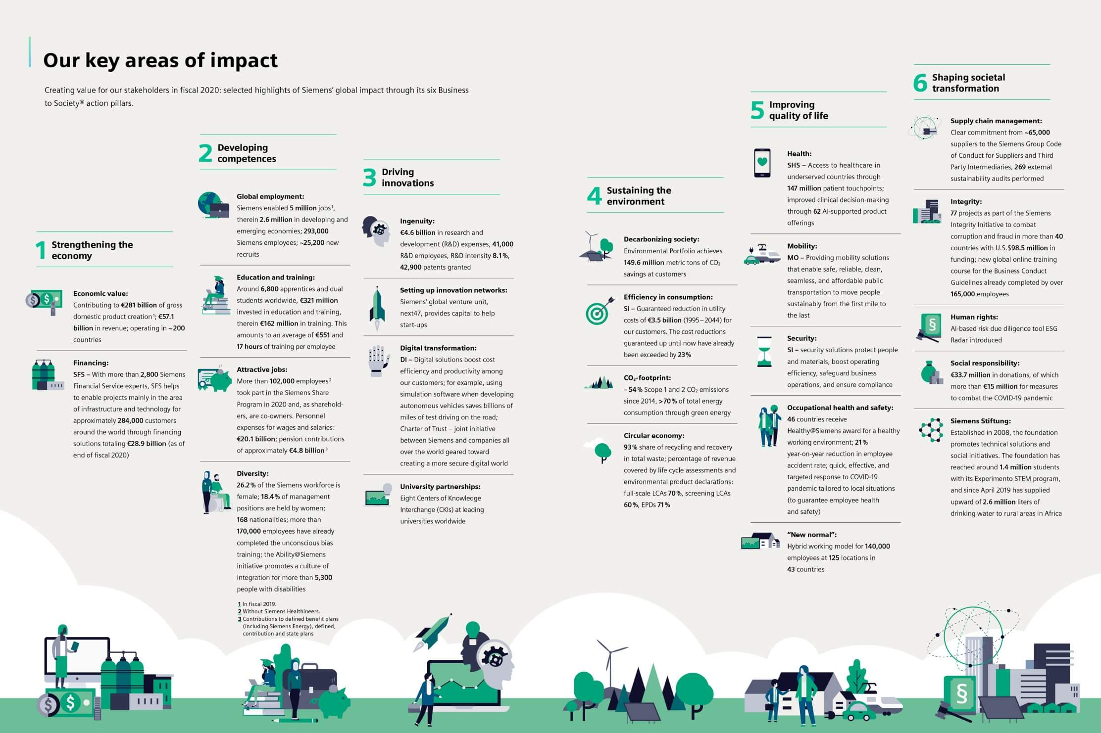
10) 2020 Sustainability Report by Siemens (Infographic)
Why we love it: Highlights save people time
Your company values are a big part of any B2B brand’s story, so creating content that highlights that is crucial. Siemens does this well with their 2020 sustainability report. To make the insights from the report more easily accessible, they created a simple infographic that details the progress made. By using design to bring the content to life, they’re able to share their highlights without making someone dig through the entire report. (That said, it’s also a great starting point to encourage people to see the full report.)
Tip: Infographics are especially helpful to communicate information at a glance. See our complete guide to creating infographics, which features free templates and tons of tips to make them more effective.
How to Make Better B2B Content
No matter what your product or service is, you can create interesting and engaging content if you have the strategy and infrastructure in place. For more tips to create content that really connects with your audience…
- Strengthen your strategy. See our complete guide to create a content strategy that gets you real results.
- Focus on providing value to your audience. Follow these tips to create engaging B2B content marketing.
- Optimize your process. Find out how to master content creation to make high-quality content consistently.
And if you need to get some extra support, see our tips to find a b2b marketing agency with the right expertise, or find out what it’s like to work with us.
