A great ebook is a huge asset for your brand. It educates people, demonstrates your thought-leadership, and helps you generate leads like nobody’s business. But good content is not enough; it’s good ebook design that really draws readers in. From an attention-grabbing cover and sleek data visualizations to unique illustrations and an intuitive layout, there are many ways to use design to keep readers engaged. But what does good design look like IRL? Here, we’ve rounded up 75 excellent ebook examples from around the web.
75 Amazing Ebook Examples
From content marketing and big data to social media and web design, here are 75 interactive and static ebooks that feature A+ design. We hope these ebook examples give you the inspiration you need to create an ebook that really connects with your audience.
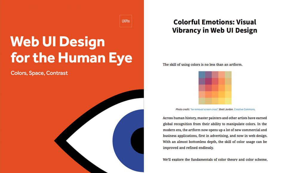
1) Web UI Design for the Human Eye by UXPin
Your ebook design doesn’t have to be complicated. A simple bold and graphic treatment is a great way to grab attention.
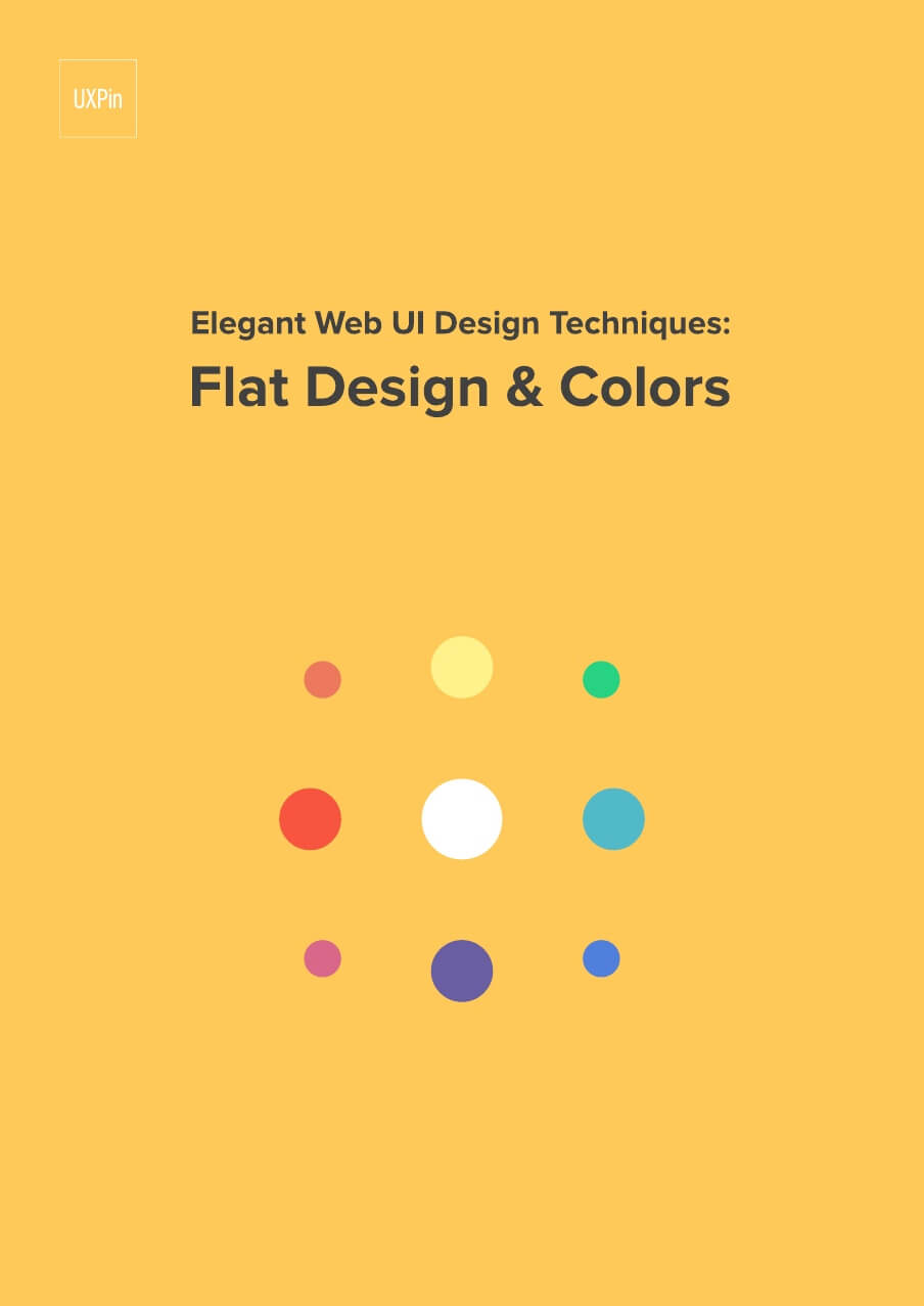
2) Elegant Web UI Design Techniques: Flat Design & Colors by UXPin
Cover design is everything, and a bright and colorful treatment is sure to turn heads.
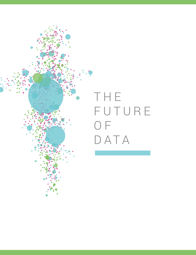
3) The Future of Data by Import.io/David White
A thematic cover is a great way to enhance content. This beautiful abstract data visualization looks like its own art piece—a great way to reinforce the theme.
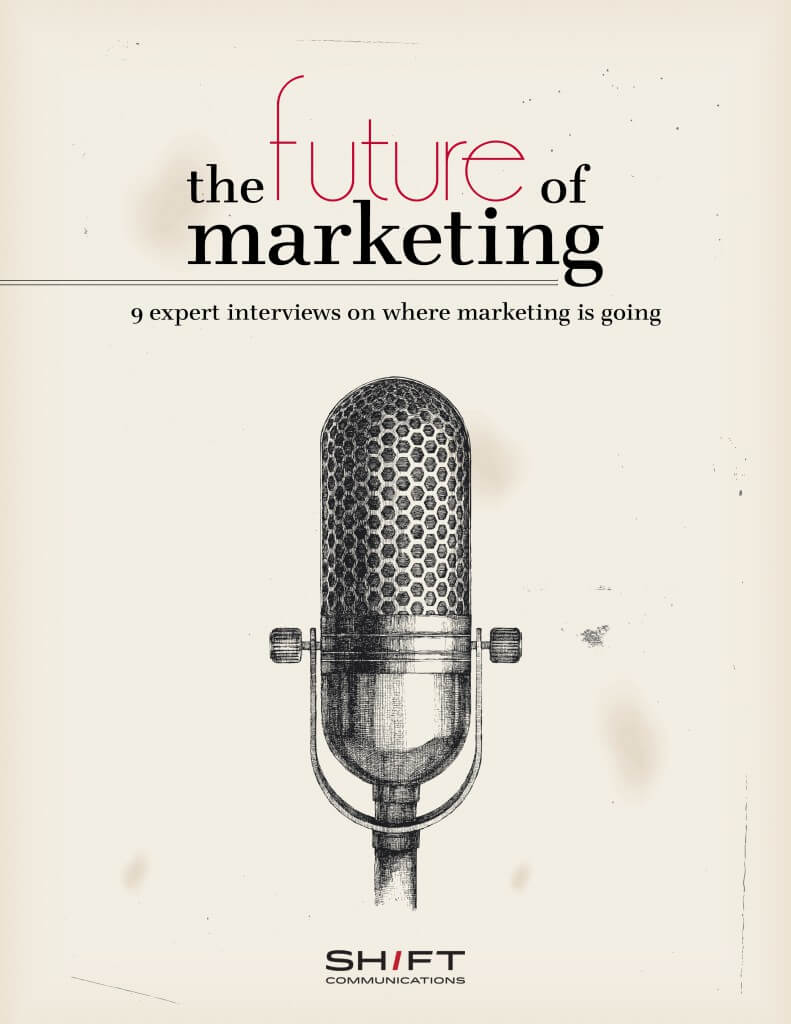
4) The Future of Marketing by Shift Communications
This design notably stands out because of its hand-drawn aesthetic. Whereas most marketing ebook examples are sleek and pristine, this cover is so unique it piques your interest from the jump.
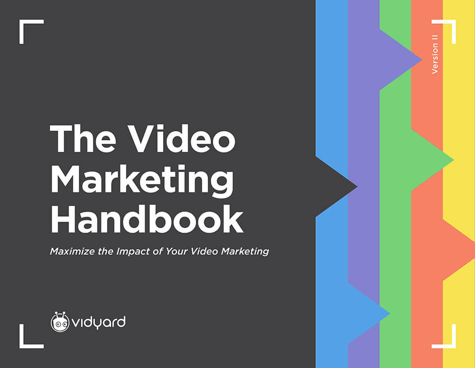
5) The Video Marketing Handbook by Vidyard
Again, a simple cover can be a much wanted break from content overload (especially in a social media feed), so using color and typography intentionally is a smart move.
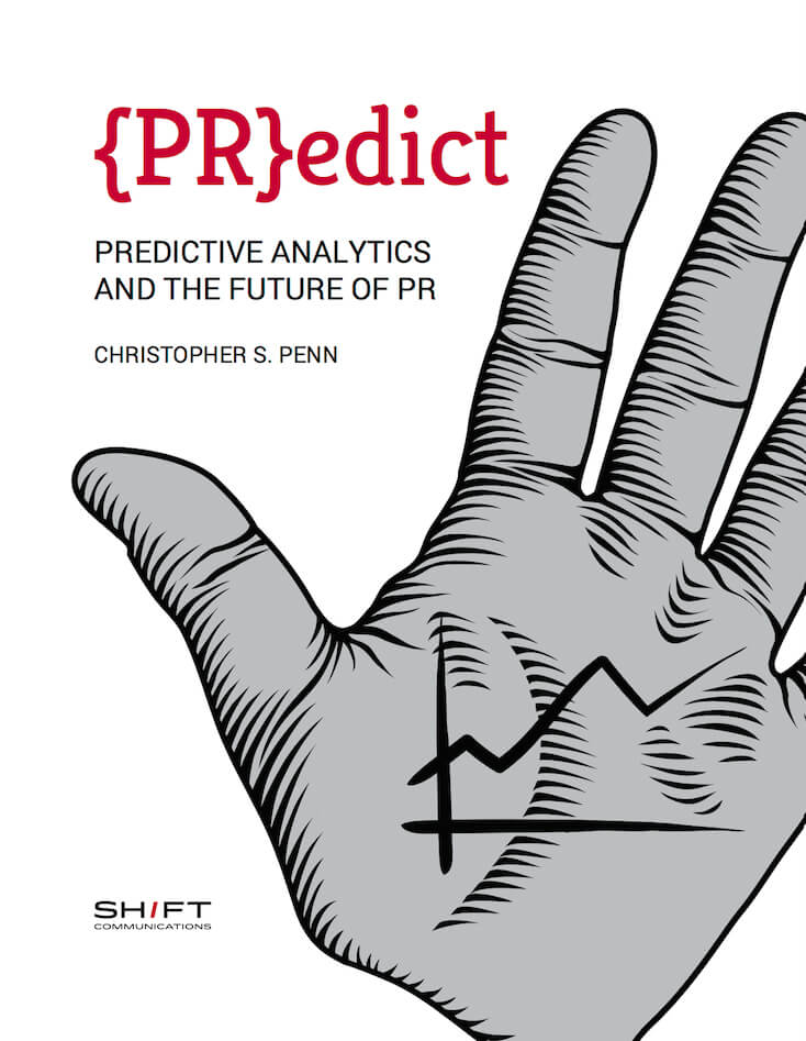
6) Predictive Analytics and the Future of PR by Shift Communication
The brackets around the “PR” here are particularly clever, as they use a common coding element to reinforce the theme (analytics).
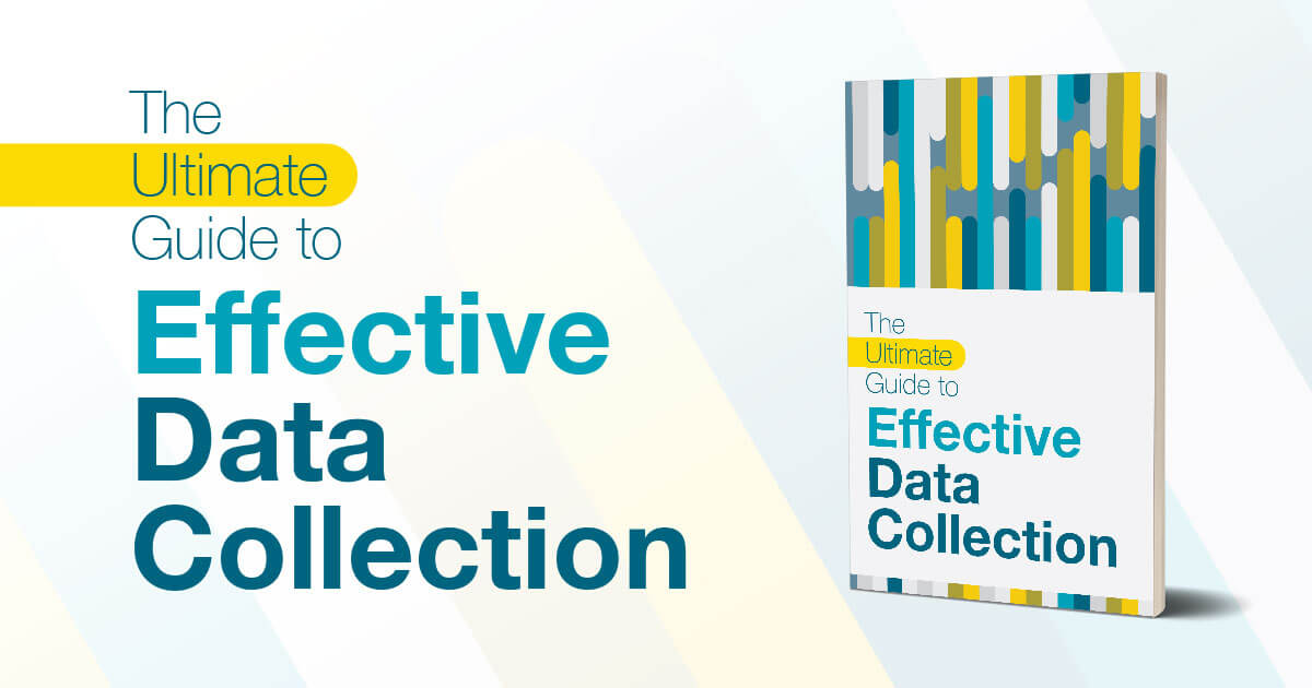
7) The Ultimate Guide to Effective Data Collection by Social Cops
This ebook example uses just the right amount of color to create an eye-catching cover without overwhelming the viewer.
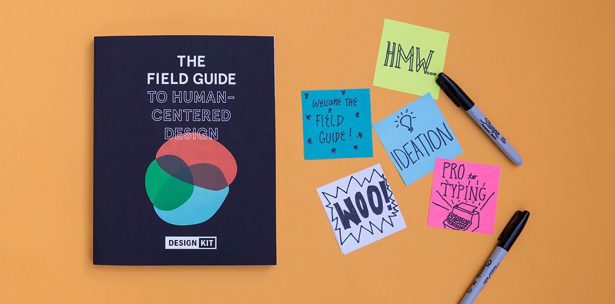
8) The Field Guide to Human-Centered Design by Design Kit
We just love the simplicity of this design, especially the intriguing abstract shapes.
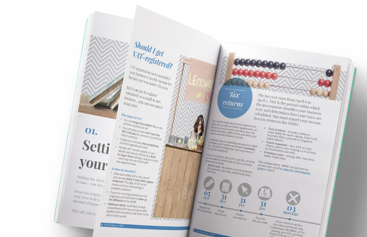
9) The Freelancer’s Bible by Route1 Print
Using things like callouts and a strong hierarchy, as this ebook example does, is a great way to help readers easily navigate content.
10) The Experience Optimization Playbook by Optimizely
Subtle design can also be a nice touch, as this “playbook” theme shows. The design is simple but effective, as the symbols create a nice border for the text.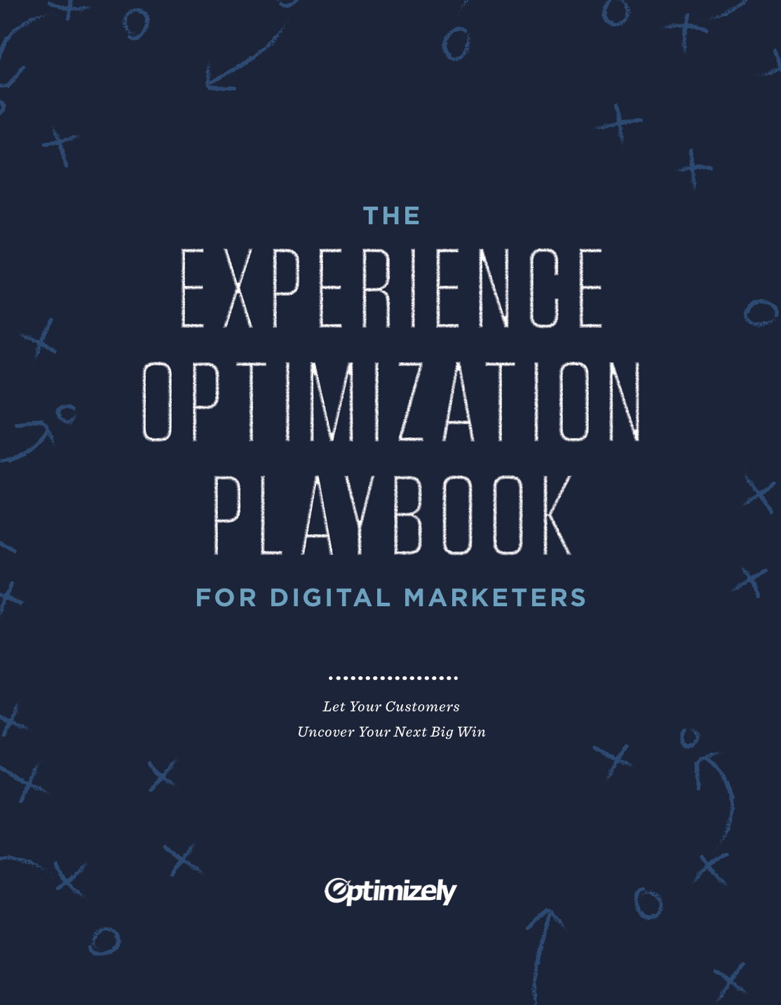
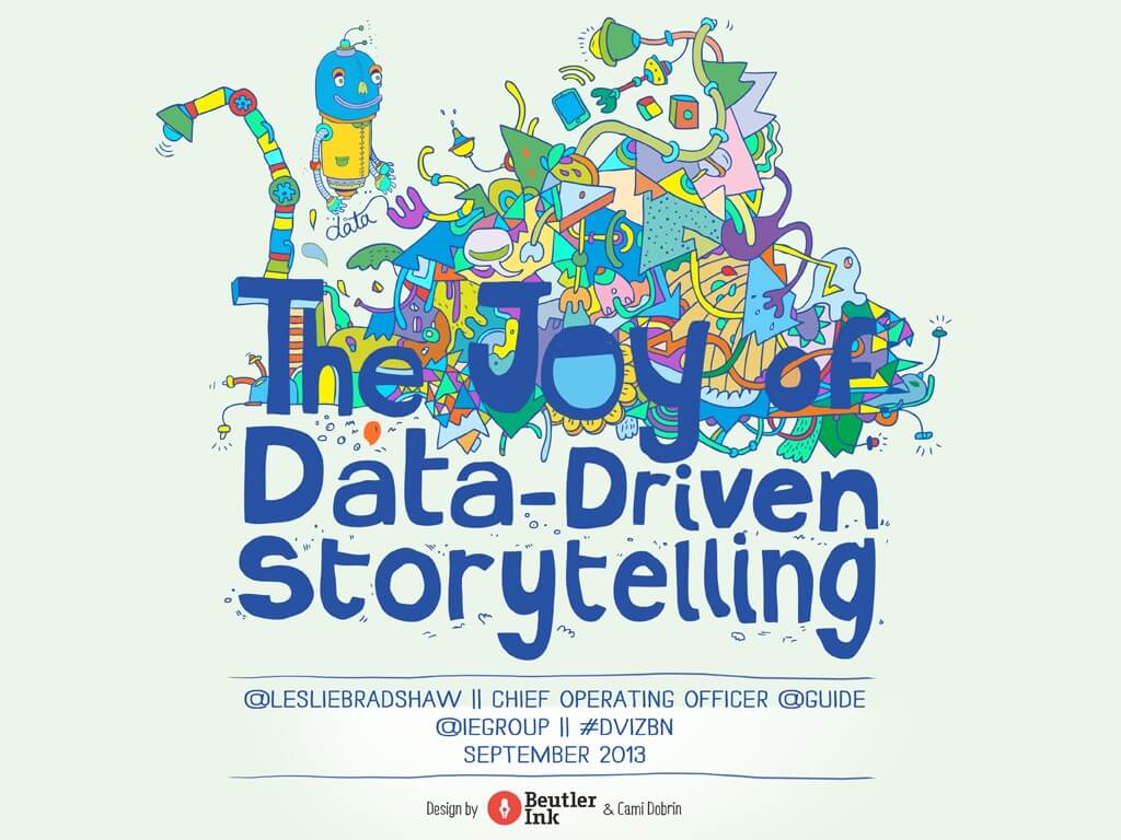
11) The Joy of Data-Driven Storytelling by Leslie Bradshaw
This ebook adds colorful whimsy via illustration, commuincating the “joy” of data—not just the dull numbers.
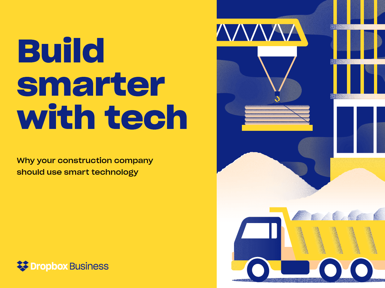
12) Build Smarter with Tech by Dropbox Business
Ebook design doesn’t have to be particularly fancy. Basic illustrations can still bring content to life effectively.
13) Everything You Need to Know About Visual Content by Column Five
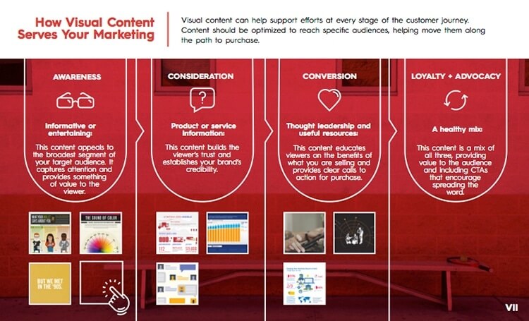
Charts, diagrams, and other information design can be tremendously helpful to communicate information quickly and easily, as this ebook proves.
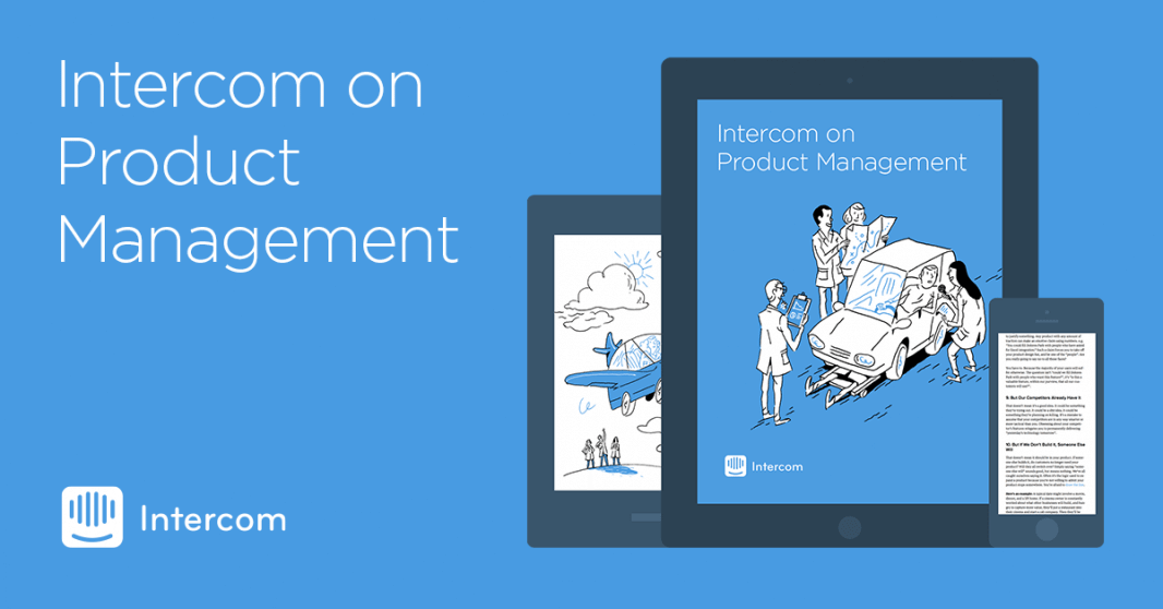
14) Product Management by Intercom
Not all ebooks need to feature a bold palette. Using a minimal palette in brand colors can also work nicely.
15) Data’s Untold Story by RJMetrics
Ebooks that look more like traditional books can be particularly interesting, as this illustration-heavy ebook demonstrates.
16) Rethink the B2B Buyer’s Journey by LinkedIn
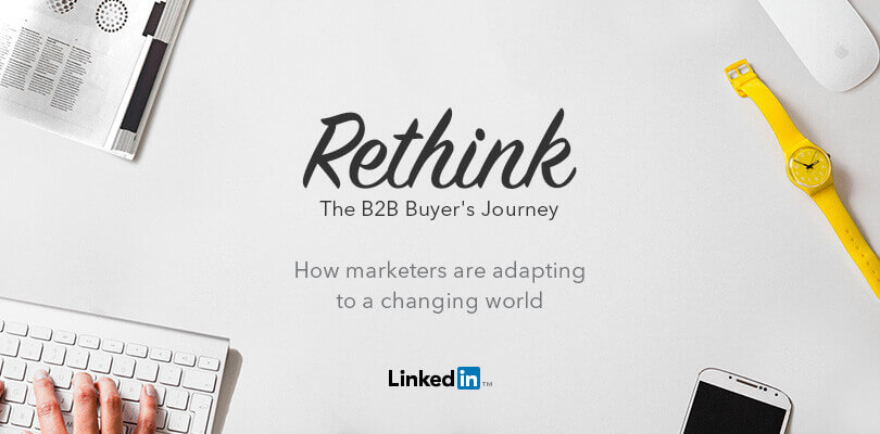
By playing with perspective (as in this overhead shot), this image presents a different visual aesthetic that captures attention.
17) The Definitive Guide to Marketing Metrics & Analytics by Marketo
Visualization will always capture attention. This cover is minimal but demonstrates how a marketing ecosystem is interconnected.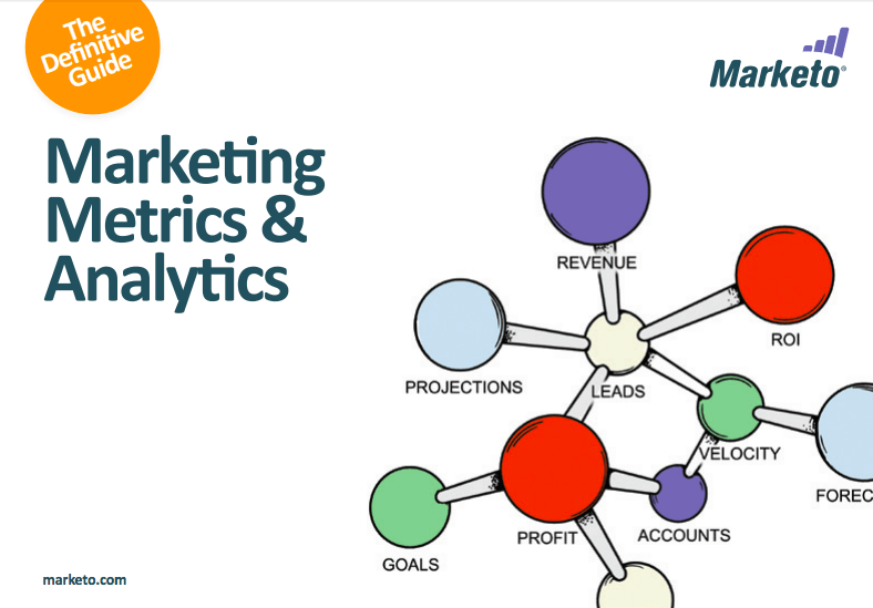
18) Create Better Work Together by Dropbox Business
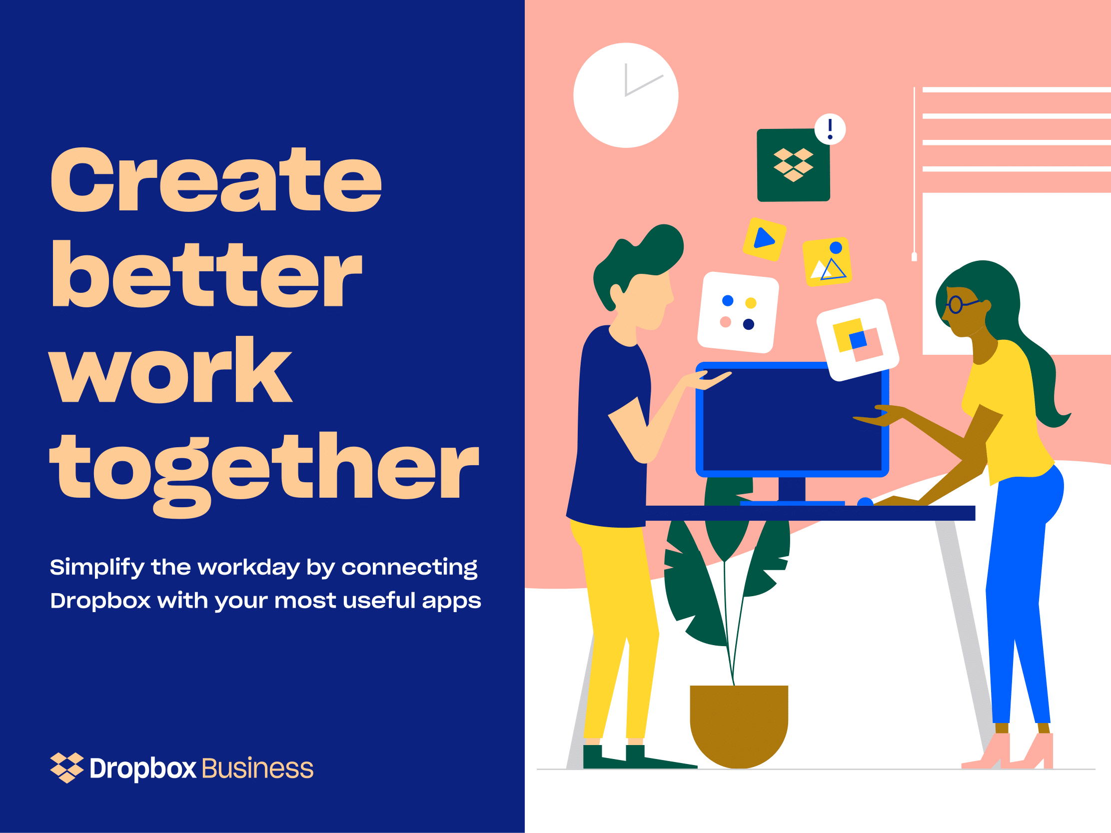
Dropbox does a fantastic job of carrying its brand aesthetic across its properties. Bold typography and a bright palette make their ebooks much more dynamic.
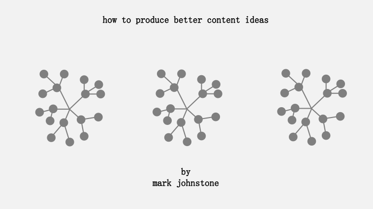
19) How to Produce Better Content Ideas by Mark Johnstone
Whereas many of these ebook examples boast a colorful cover, this black-and-white ebook cover uses shapes and minimal typography to create a clean, minimal aesthetic.
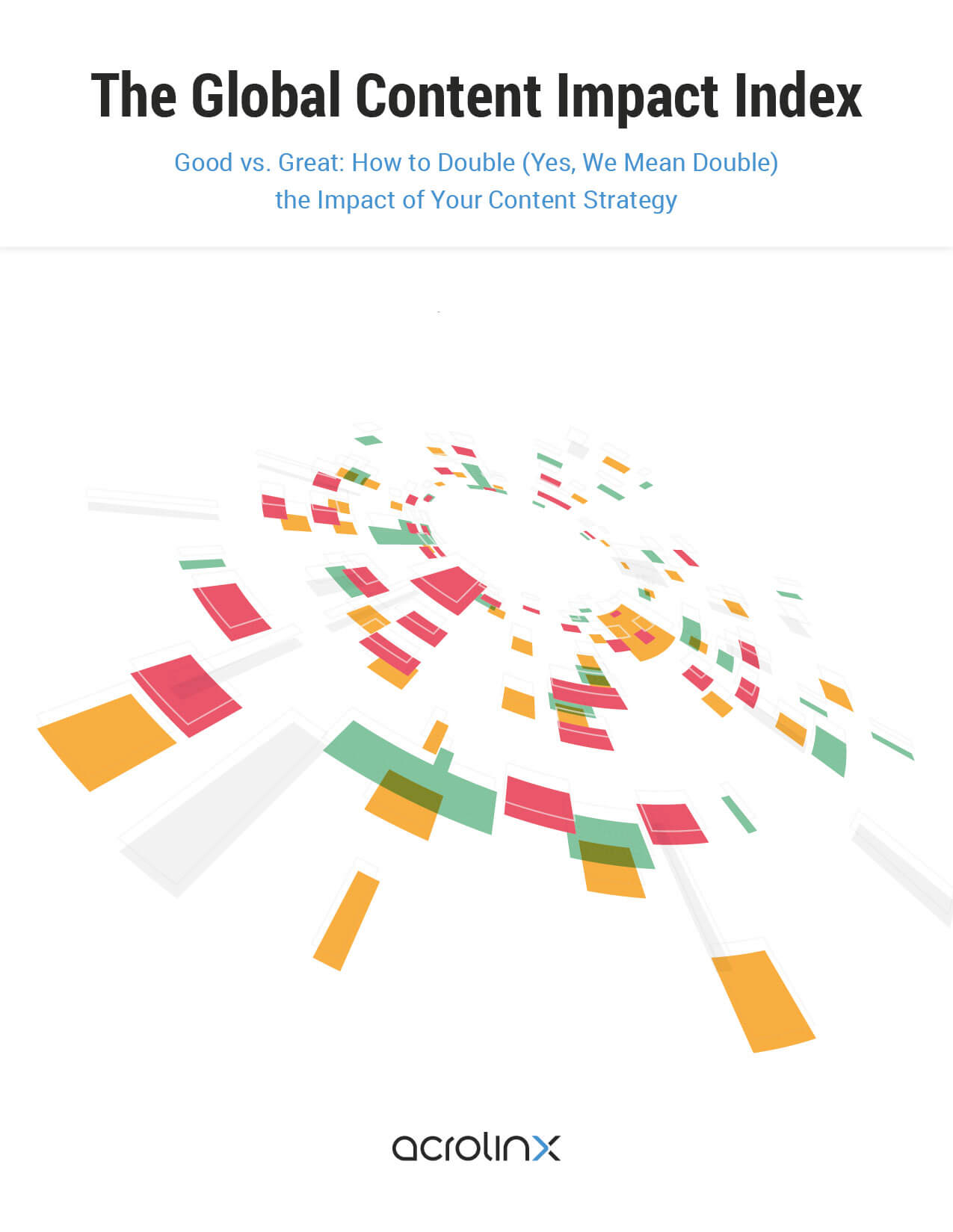
20) The ROI of Great Content by Acrolinx
Unique shapes, pops of color, and an abstract visualization bring this cover to life in an unexpected way.
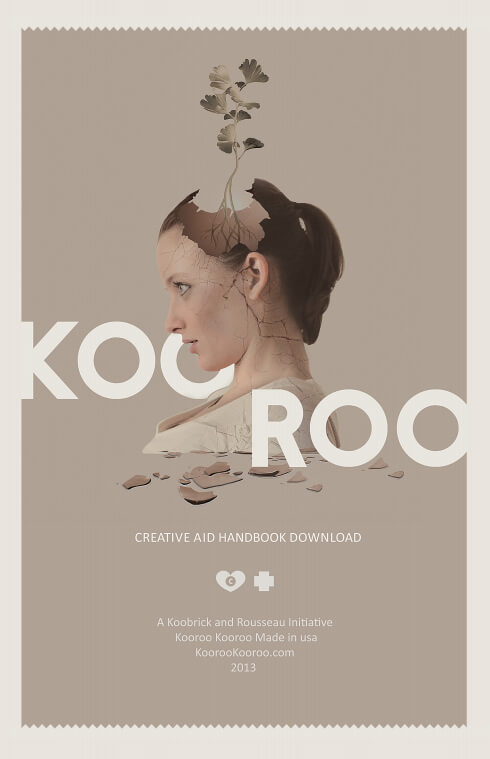
21) The Creative Aid by Nicole Smith and Richard Tapp
Is this an ebook or a coffee table? The beautiful visuals here make it hard to tell.
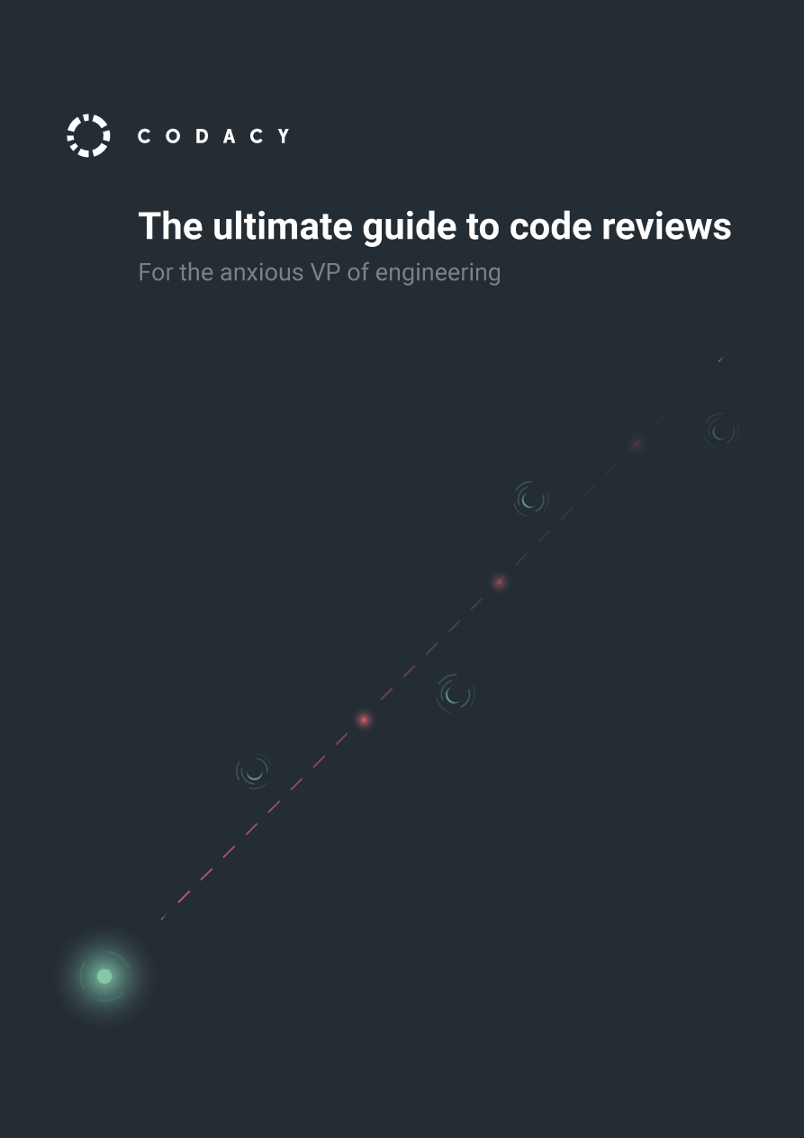
22) The Ultimate Guide To Code Reviews by Codacy
This is one of our favorite minimal ebook examples that shows how much impact you can make with minimal imagery.
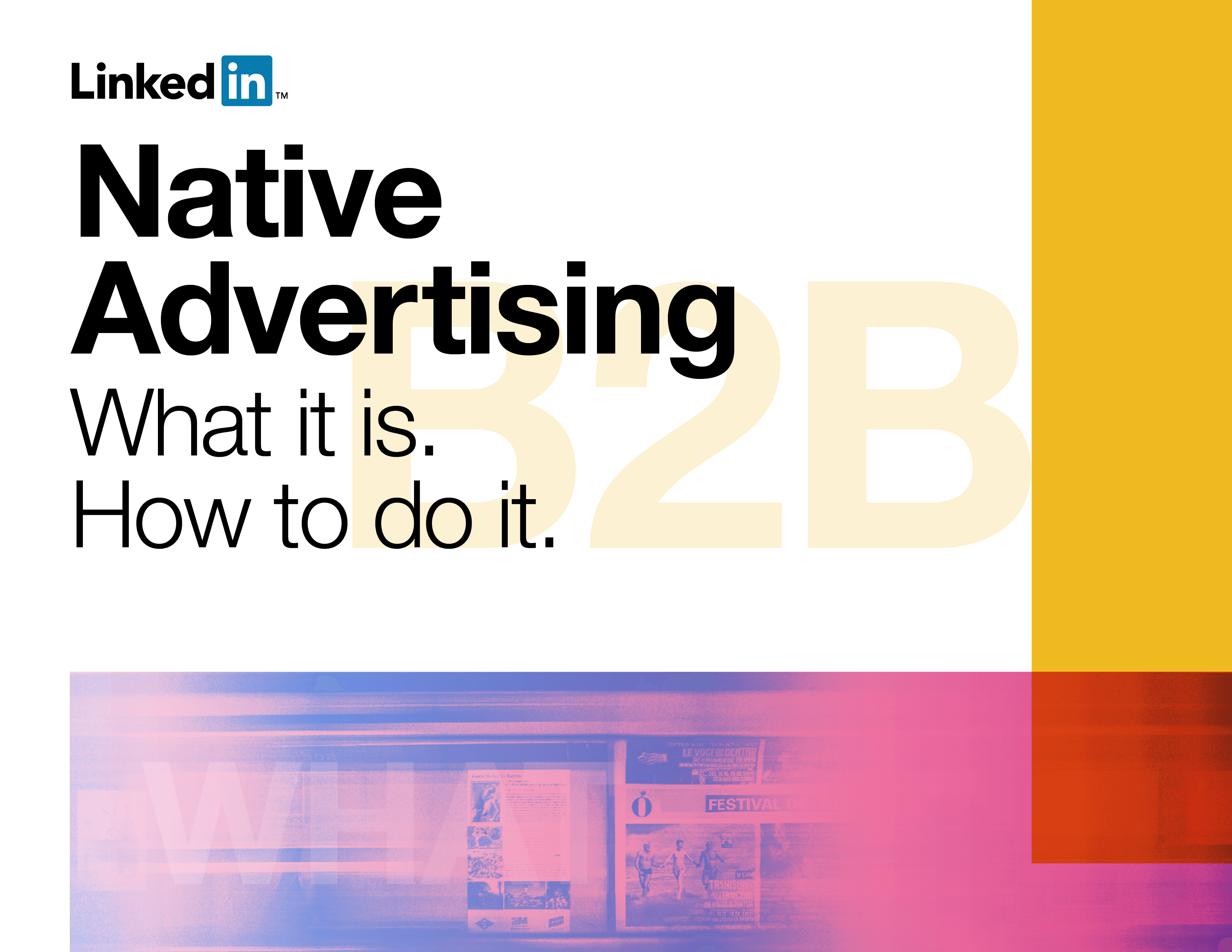
23) Native Advertising by LinkedIn
LinkedIn uses bright and bold color, balanced by minimal imagery, to bring this cover to life.
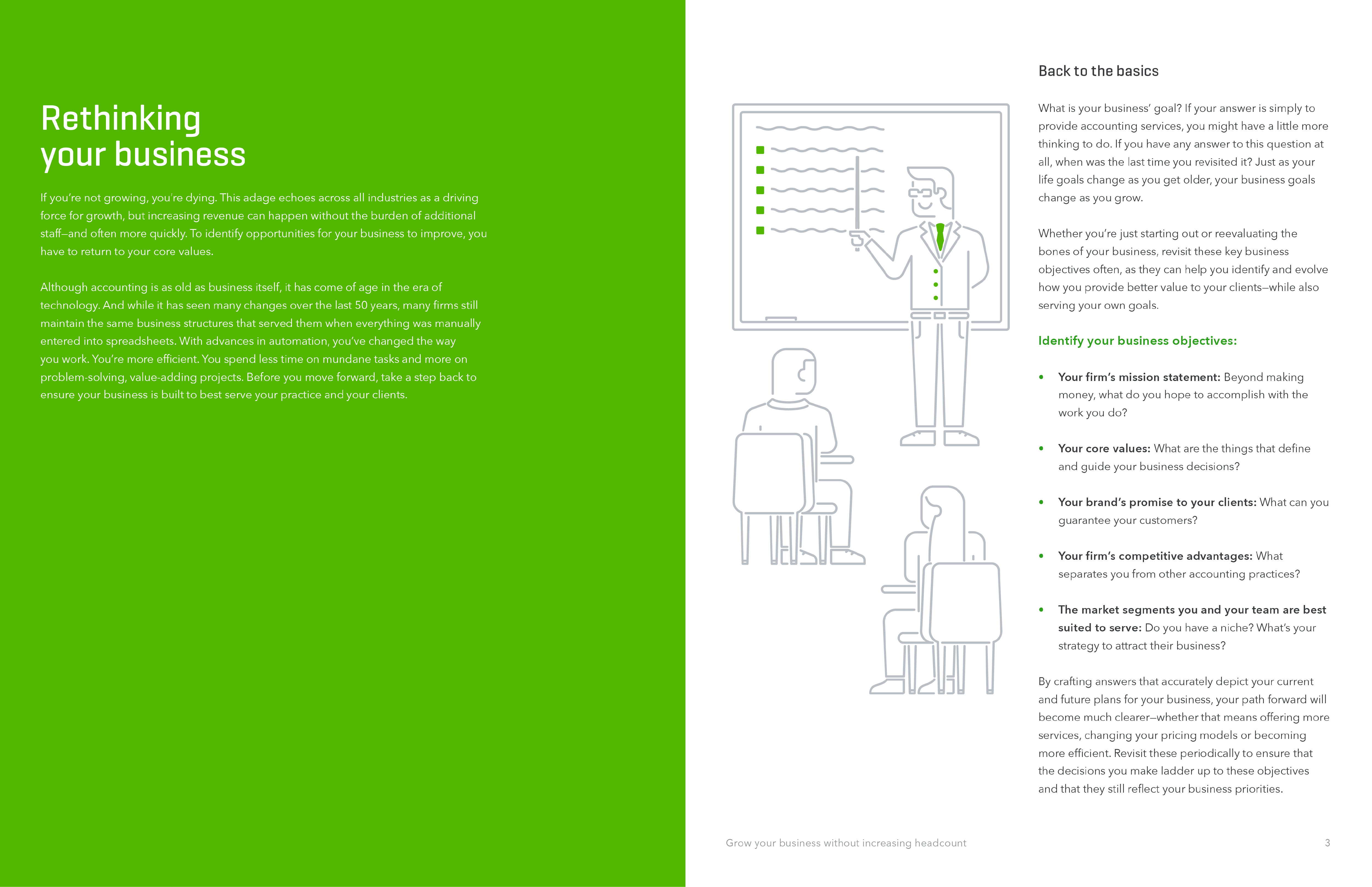
24) Grow Your Business Without Increasing Headcount by Firm of the Future and Intuit Quick Books
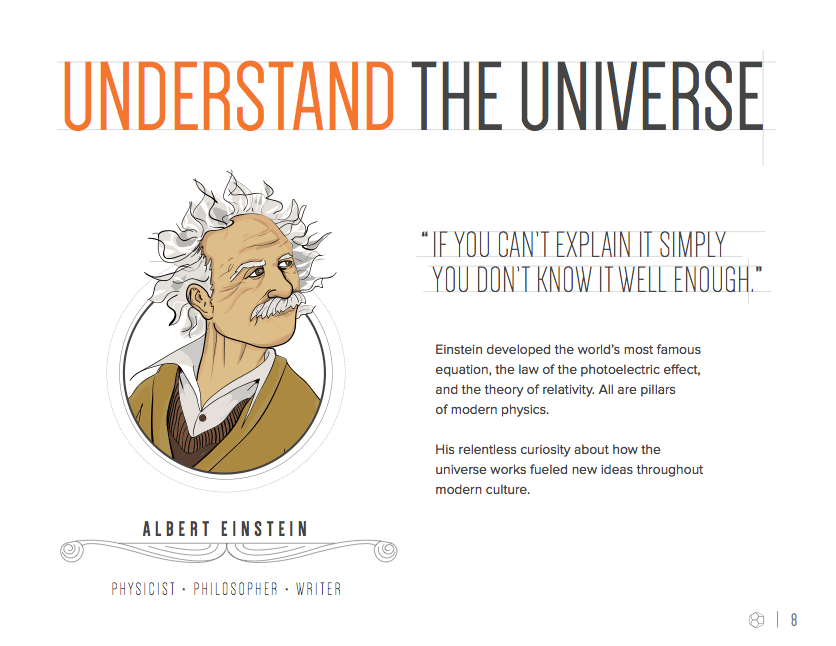
Illustrations are a great way to enhance book content throughout the chapters.
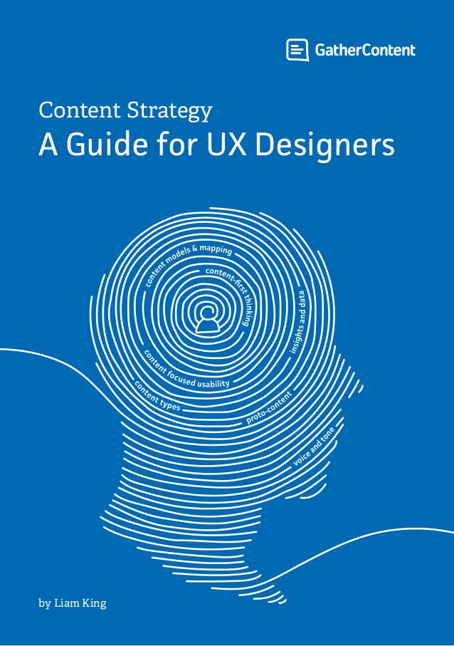
25) Content Strategy: a Guide for UX Designers by Liam King
This unique ebook uses a single impactful illustration to grab attention.
26) The Beginner’s Guide to Email Marketing by HubSpot
Marketing content is always at risk of being a little too stuffy. This illustration adds more humanity while conveying the theme.
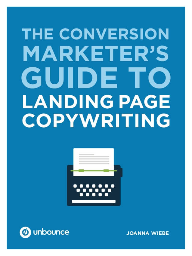
27) The Conversion Marketer’s Guide to Landing Page Copywriting by Unbounce
As an ebook about copywriting, this cover lets typography take the main stage—a smart choice.
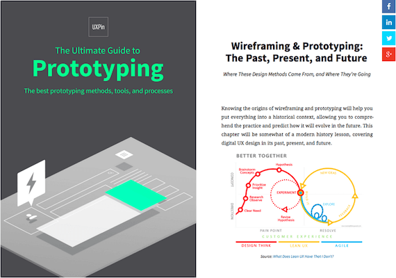
28) The Ultimate Guide to Prototyping by UXPin
Again, information design can be a powerful tool to communicate. Injecting visualizations throughout this ebook is a smart way to deliver information quickly and impactfully.
29) Data-Driven Recruiting by LinkedIn
Ultimately, recruiting is about finding the right people, so LinkedIn uses people-centric imagery throughout this ebook to reinforce the theme.
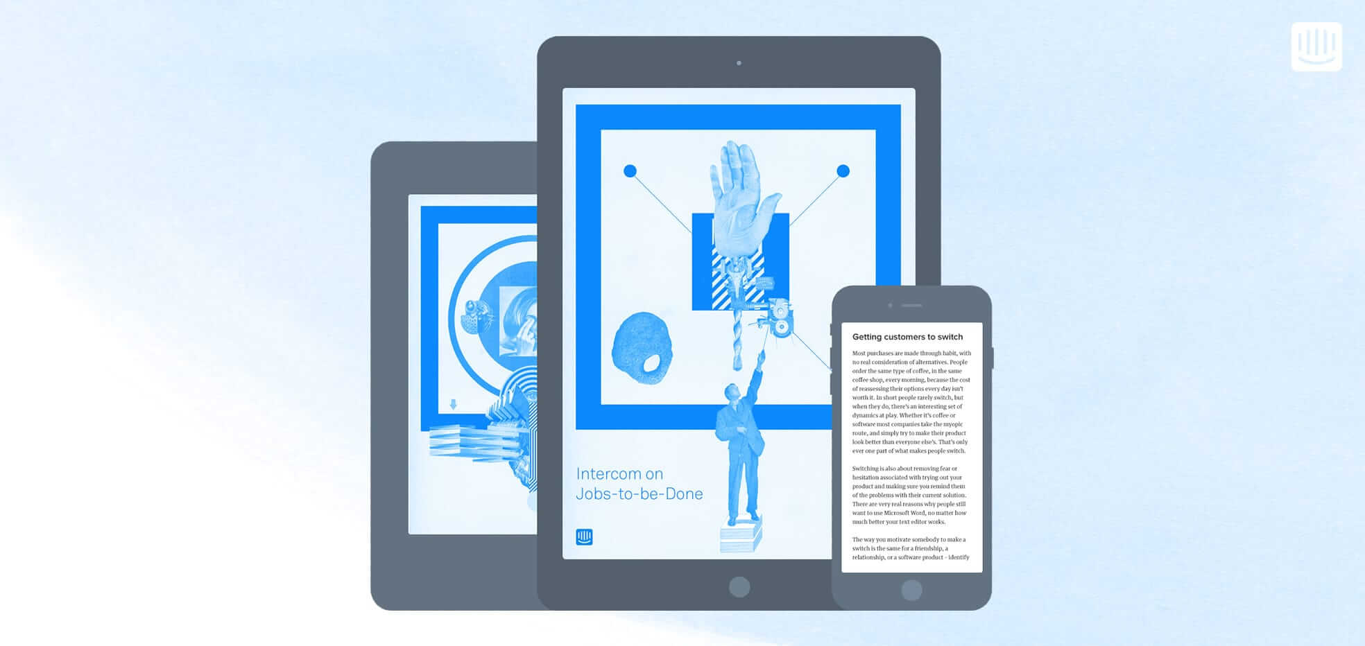
30) Intercom on Jobs-to-be-Done by Intercom
This collage style imagery adds more texture and depth to the design, enhancing the viewer’s experience overall.
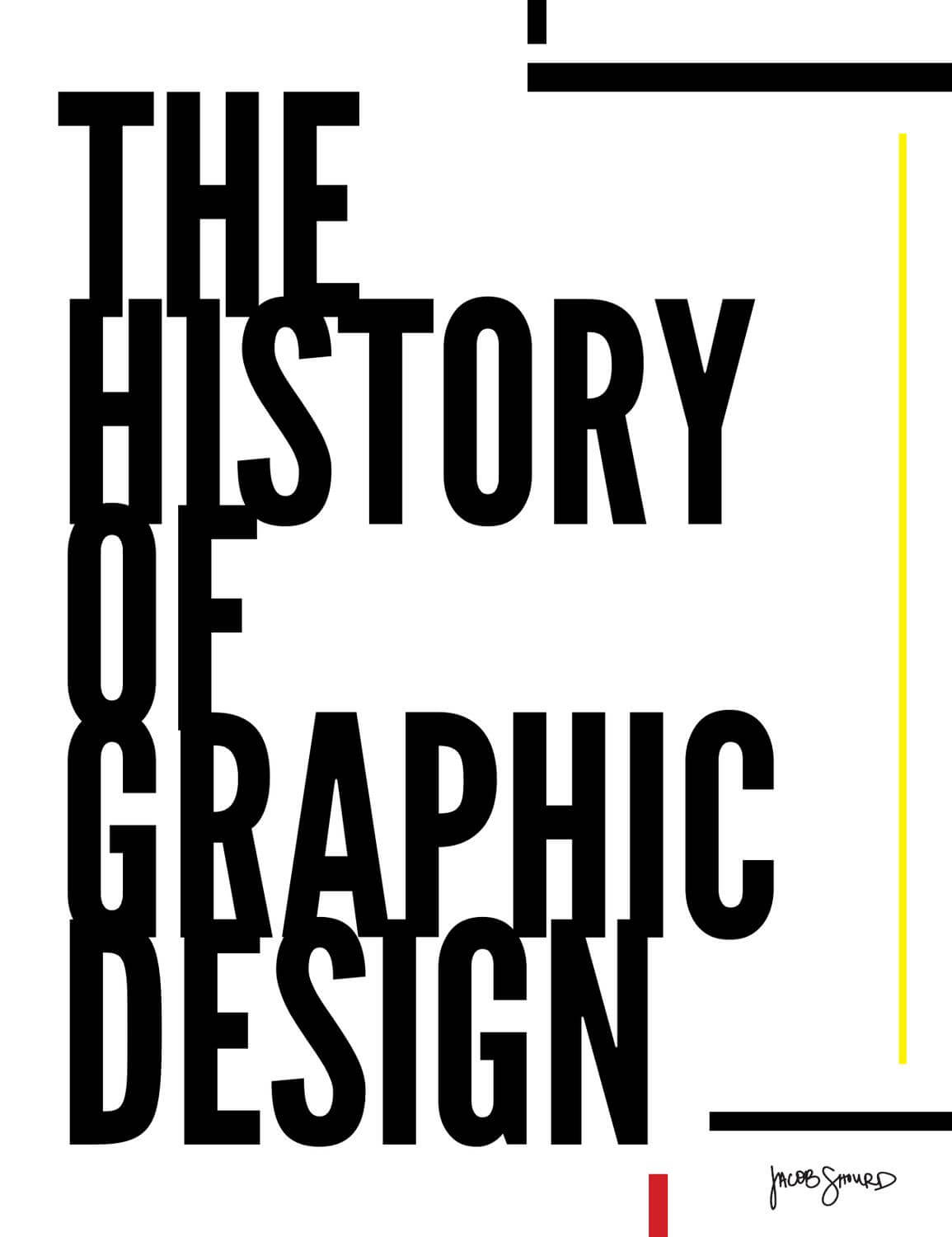
31) The History of Graphic Design by Jacob Shourd
Most of the ebook examples featured here are heavy on illustration, but this one is proof that great typography can create a cover just as impactful as an elaborate illustration.
32) Connected Shoppers Report by Salesforce
Here we have another ebook example that uses a visual theme to support the story. This can add more excitement to the content and let you express more creativity throughout your design.
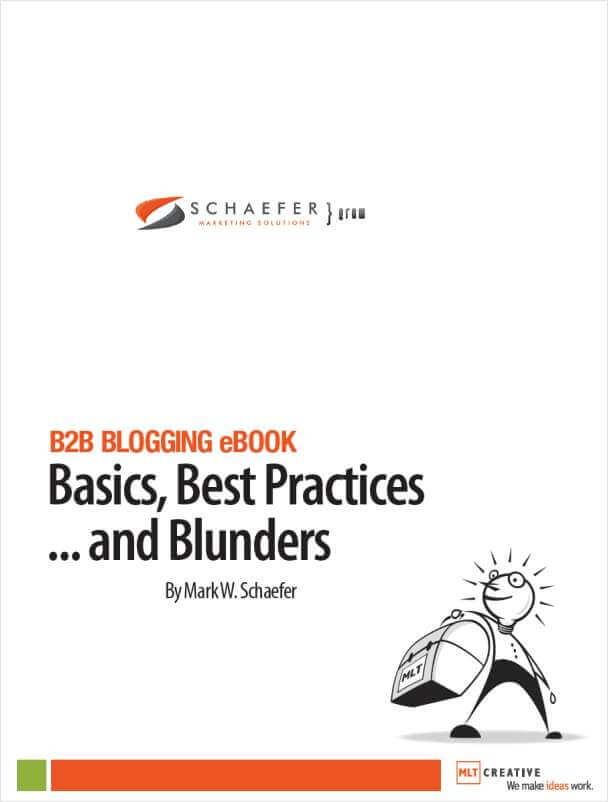
33) B2B Blogging Ebook: Basics, Best Practices and Blunders by MLT Creative
White space is a powerful thing, helping the viewer focus on what really matters.
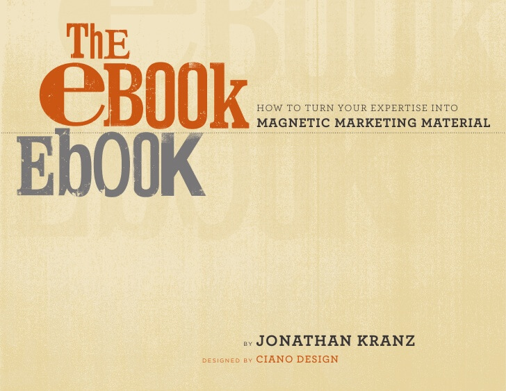
34) The Ebook Ebook by Kranz Communications
The unique typography here is something to behold (even the watermarked background is a unique touch that elevates the cover).
35) Maximize Your Citrix Workspace by Citrix
For a book about simplicity and clarity, this cover is the perfect choice.
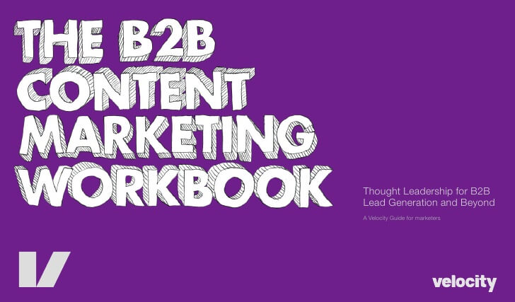
36) The B2B Content Marketing Workbook by Velocity Partners
Typography alone can add plenty of personality; that’s why we love this “hand-drawn” cover.
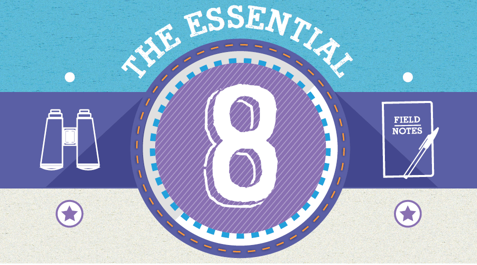
37) The Essential 8: Top Reports That Every Marketer Needs by Marketo
We love covers that reflect the theme. This cover uses simple design elements to create imagery that piques your interest.
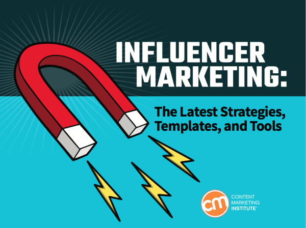
38) The Complete Guide to Influencer Marketing: Strategies, Templates & Tools by Content Marketing Institute
This comic book vibe is a departure from common marketing materials. If they wanted to make us turn our heads, mission accomplished.
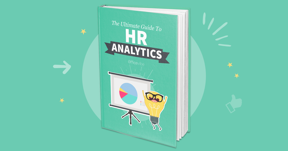
39) The Ultimate Guide to HR Analytics by Officevibe
When a cover can instantly elicit an emotion, you know it’s doing something right. This is a great ebook example that brings a smile to our face.
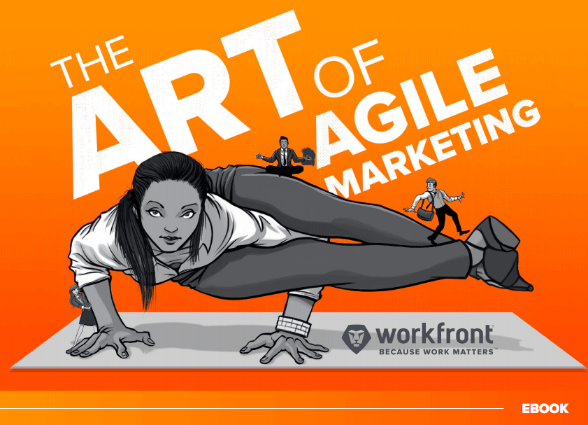
40) The Art of Agile Marketing by Workfront
All we can say is A+ for creativity.
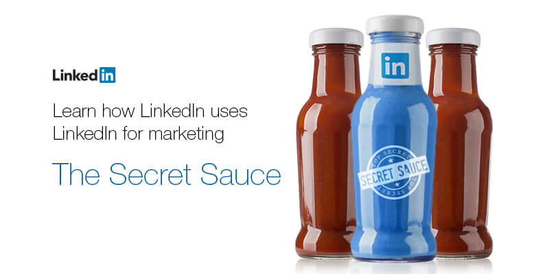
41) The Secret Sauce by LinkedIn
This secret sauce bottle imagery appears throughout the book, as a tasty visual treat.
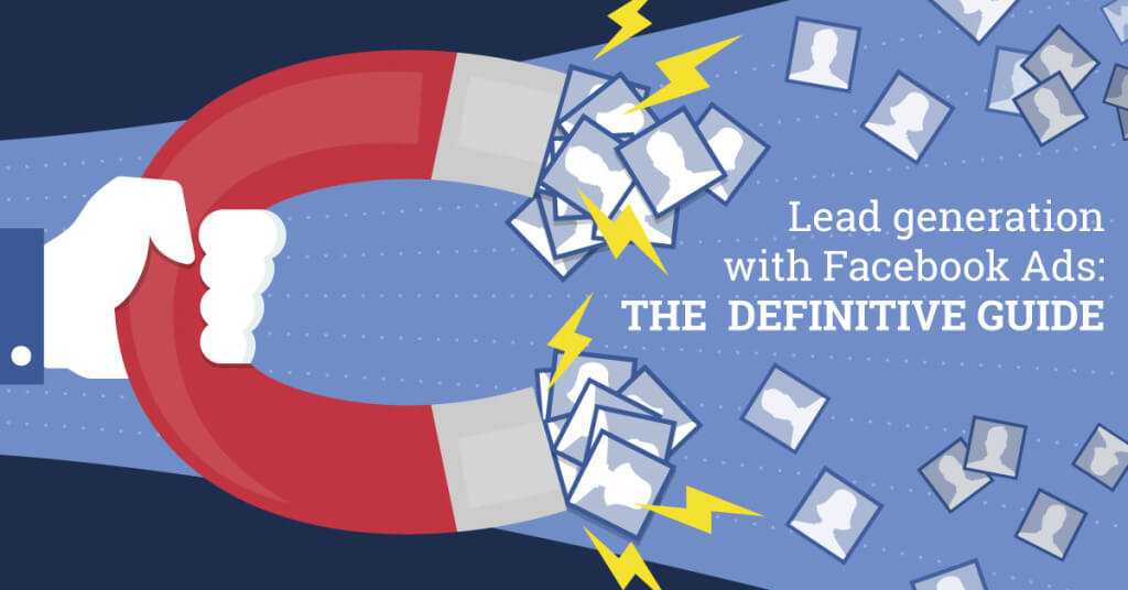
42) The Definitive Guide to Lead Generation with Facebook Ads by AdEspresso
Yes, this is the second book with a magnet-centric cover, but there’s a reason these images stick. (Sorry, we had to.)
43) The Ultimate Guide to Everything API by Safe Software
Can you tell we have a thing for hand-drawn illustrations? Only because they stand out so much, no matter how simple they are.
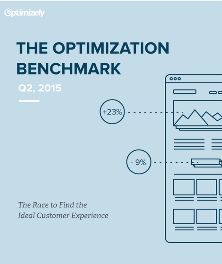
44) The Optimization Benchmark Survey by Optimizely
You don’t have to reinvent the wheel with your content design. This is one of those ebook examples that takes a straightforward approach, which works just fine.
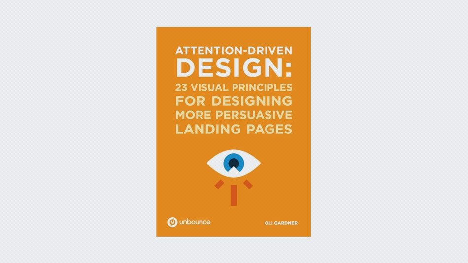
45) Attention-Driven Design: 23 Visual Principles for Designing More Persuasive Landing Pages by Unbounce
Some people are bothered by literal visual interpretations, but people are busy. Showing them what an ebook is about via illustration saves them time (and helps you connect with visual learners more effectively).
46) Consumer Banking by Blend
A cool lavender palette is an unexpected color choice for a financial institution, but it makes it stand out.
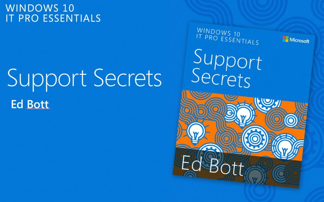
47) Windows 10 IT Pro Essentials Support Secrets by Microsoft
The eye-catching pattern here adds a jolt of personality you might not expect.
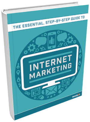
48) The Essential Guide to Internet Marketing by HubSpot
Putting the main title front and center (literally) helps people instantly understand what the ebook is about
49) Getting Started with Zendesk Talk by Zendesk
Zendesk is all about customer service solutions that help people help people. Using human-centric illustrations is a great way to promote their mission.
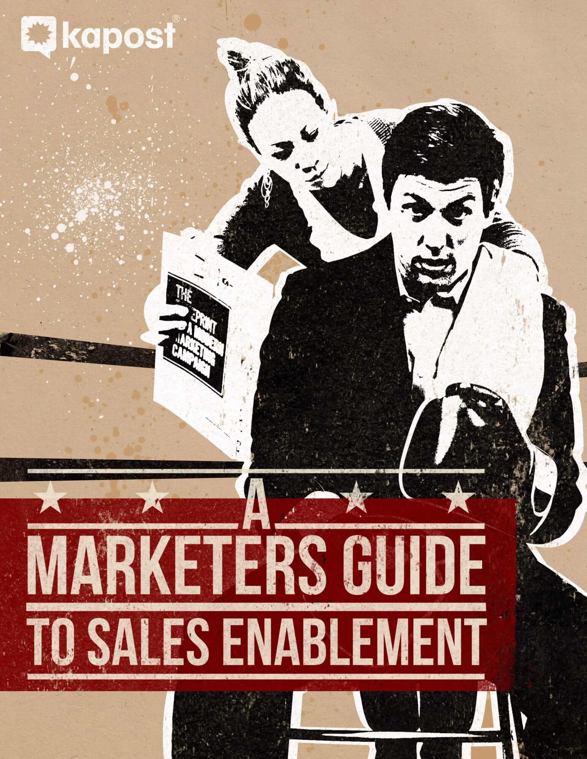
50) A Marketer’s Guide to Sales Enablement by Kapost
Photography isn’t always used in marketing ebooks, but it can be a great way to differentiate yourself.
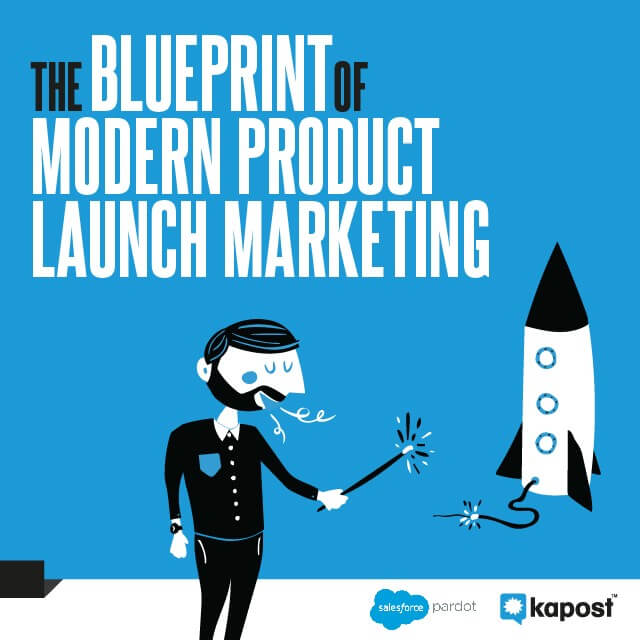
51) The Blueprint of Modern Product Launch Marketing by Kapost
This distinct illustration style, blue brand color, and overall ‘60s vibe showcases the brand’s personality perfectly.
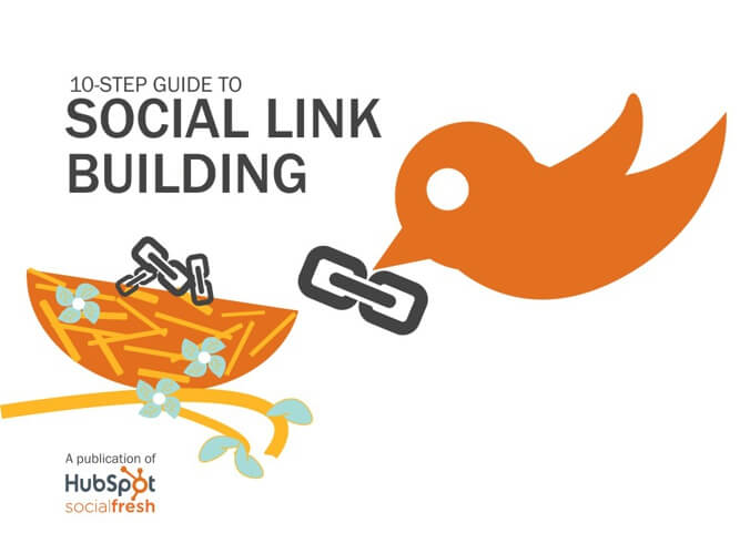
52) 10-Step Guide to Social Link Building by HubSpot
We’ve seen social media logos used in ebook covers, but using the bird/nest visual here is a creative twist.
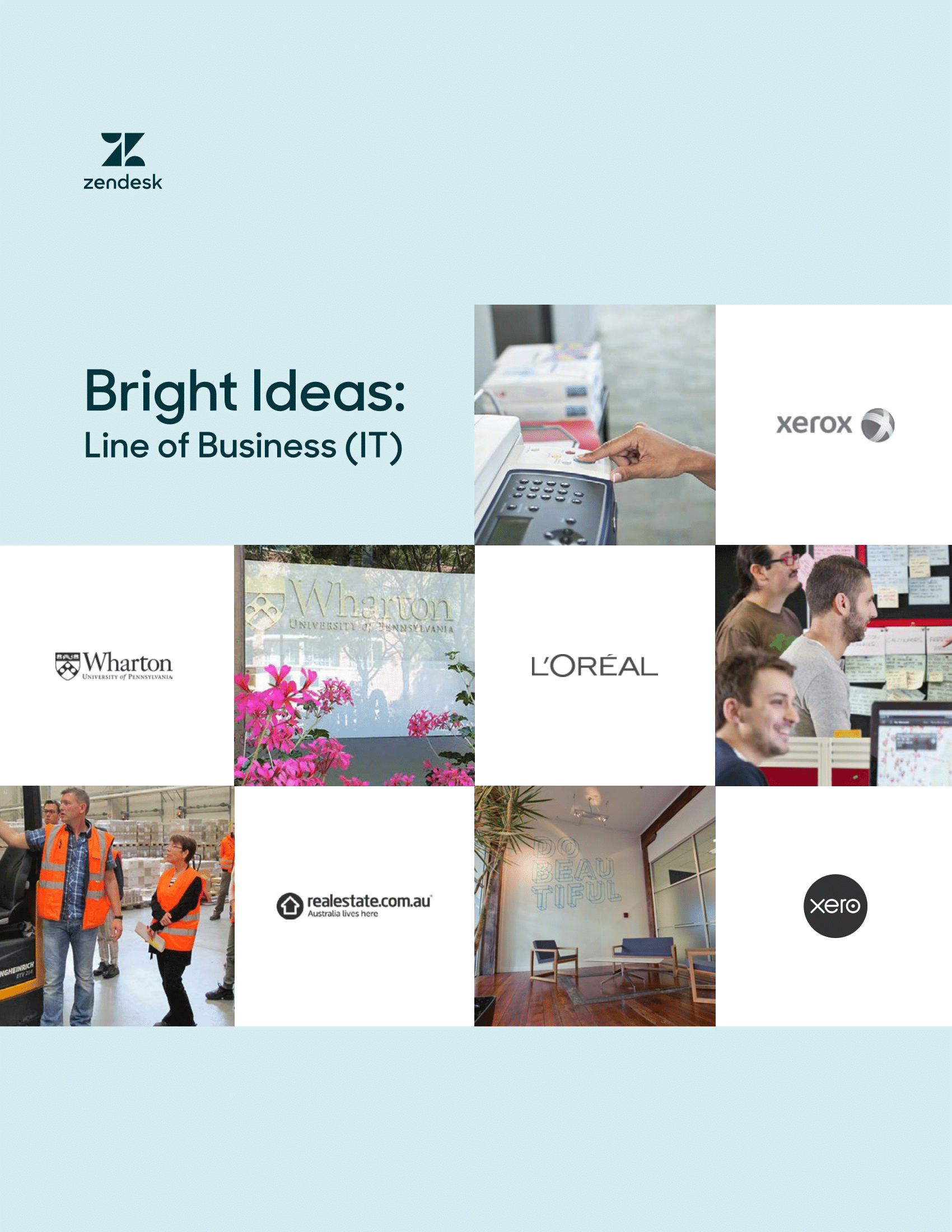
53) Bright Ideas: IT Customer Stories by Zendesk
This photo grid may be a basic layout, but it keeps it looking clean and minimal.
54) How Live Chat Helps Businesses and Consumers by Zendesk
Again, Zendesk comes through with yet another ebook example featuring people-centric imagery, maintaining a consistent identity across all their content.
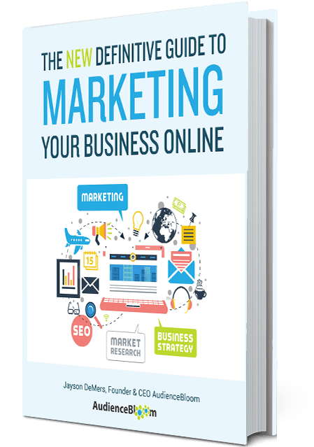
55) The Definitive Guide To Marketing Your Business Online by Audience Bloom
This ebook cover isn’t just a cluster of images; it feels dynamic and exciting.
56) The Modern Entrepreneur: How To Build A Successful Startup by Audience Bloom
In business, there are so many cliche ways to depict things. This cover adds a little more creativity with the mix of photography and hand-drawn illustrations.

57) The Ultimate Guide to Event Planning by Expo Logic
We love that this guide almost looks like a really cool textbook. Purple is a less used color that offers a welcome change.
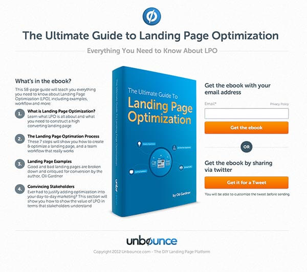
58) The Ultimate Guide to Landing Page Optimization by Unbounce
This cover isn’t very elaborate, but the blue color makes it stand out—and that’s what matters.
INTERACTIVE
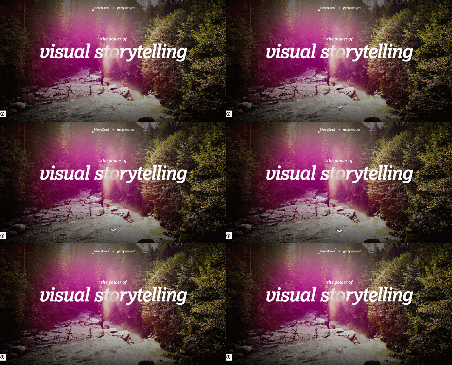
59) The Power of Visual Storytelling by Newscred and Getty Images
For an interactive ebook about the power of visual storytelling, you naturally need to lead with strong visuals. This hero photo is a great way to drop you into the story from the first click.
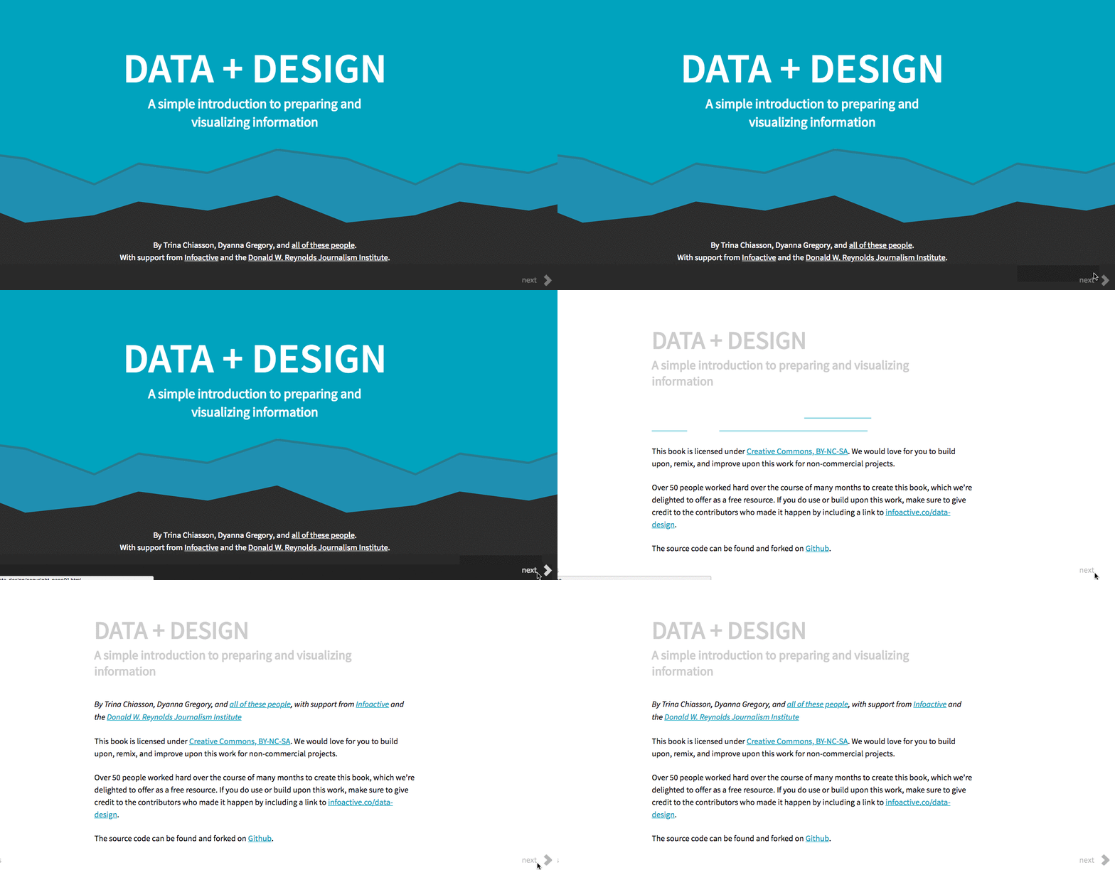
60) Data + Design by Trina Chiasson and Dyanna Gregory
For the data geek, you know that opening image isn’t an abstract mountain range. It’s an area chart—the perfect nod to the subject covered in this interactive.
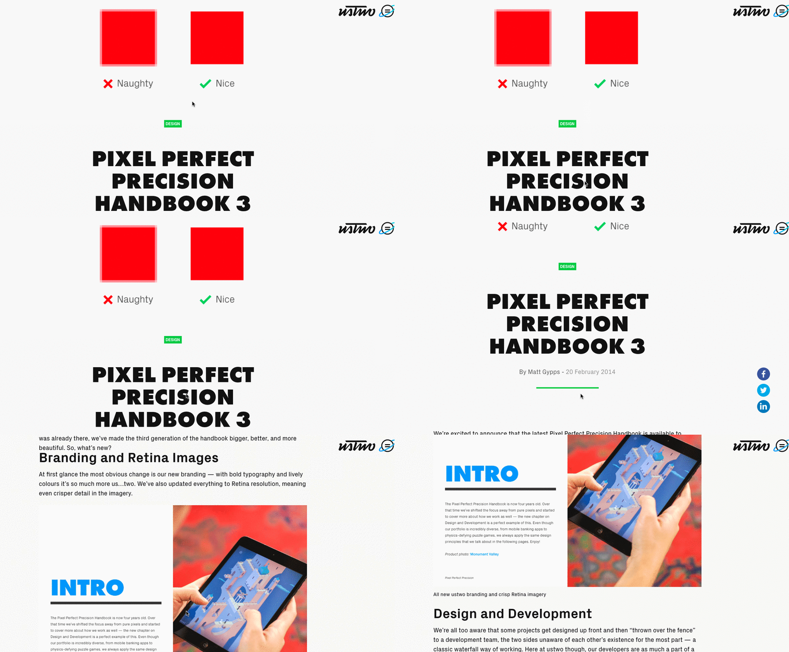
61) Pixel Perfect Precision by Ustwo
This interactive ebook is marked by clean visuals and bold pops of color to call out the most important information.
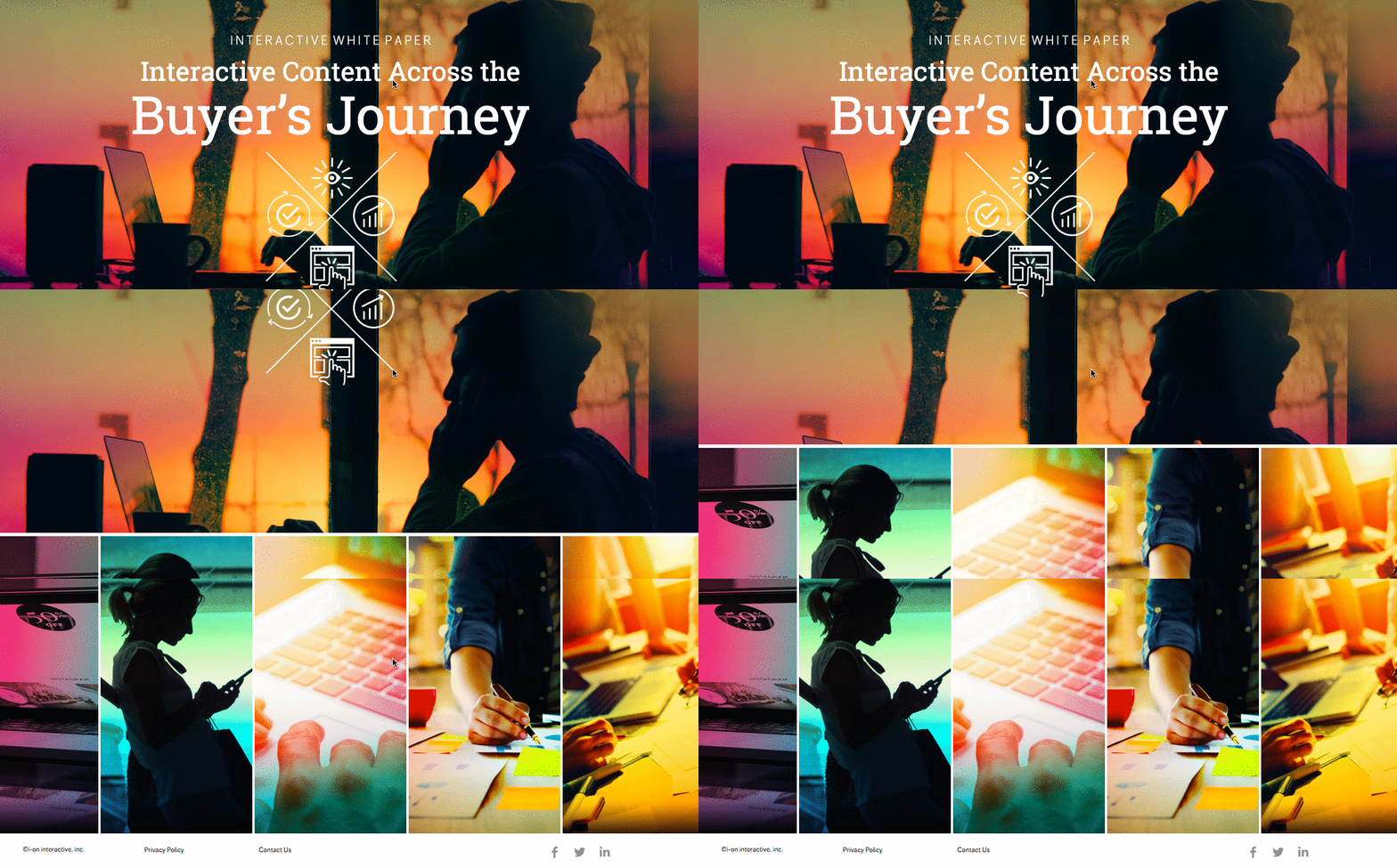
62) Interactive Content Marketing for Lead Generation by Ion Interactive
One of the best ways to dress up stock photography is to customize with filters and unique graphic treatments.
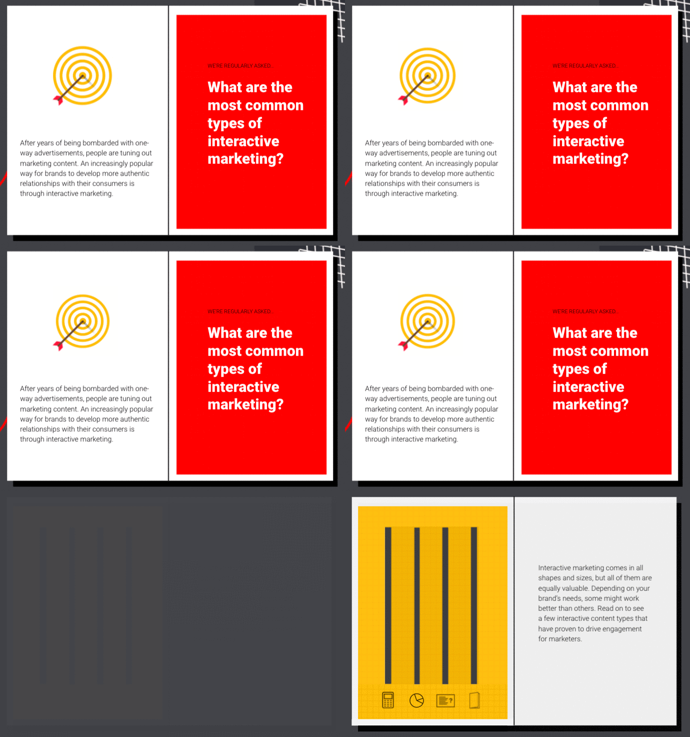
63) Guide to Interactive Marketing by Ceros
A clear, easy-to-navigate layout is the key to communicating information effectively. Bold section breaks, callouts, etc. make it easy to consume this information.
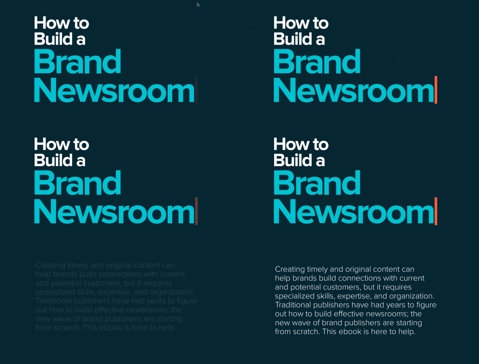
64) How to Build a Brand Newsroom by Contently and Ceros
Animated elements bring this guided narrative to life, telling the story in a more engaging way.
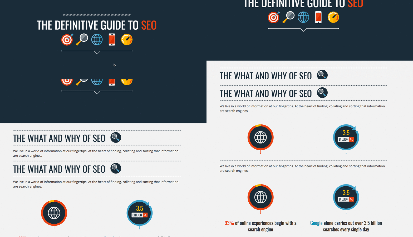
65) The Definitive Guide to SEO by Data Dial
The tasteful pops of color, simple iconography, and easy navigation make this interactive a great piece of storytelling.
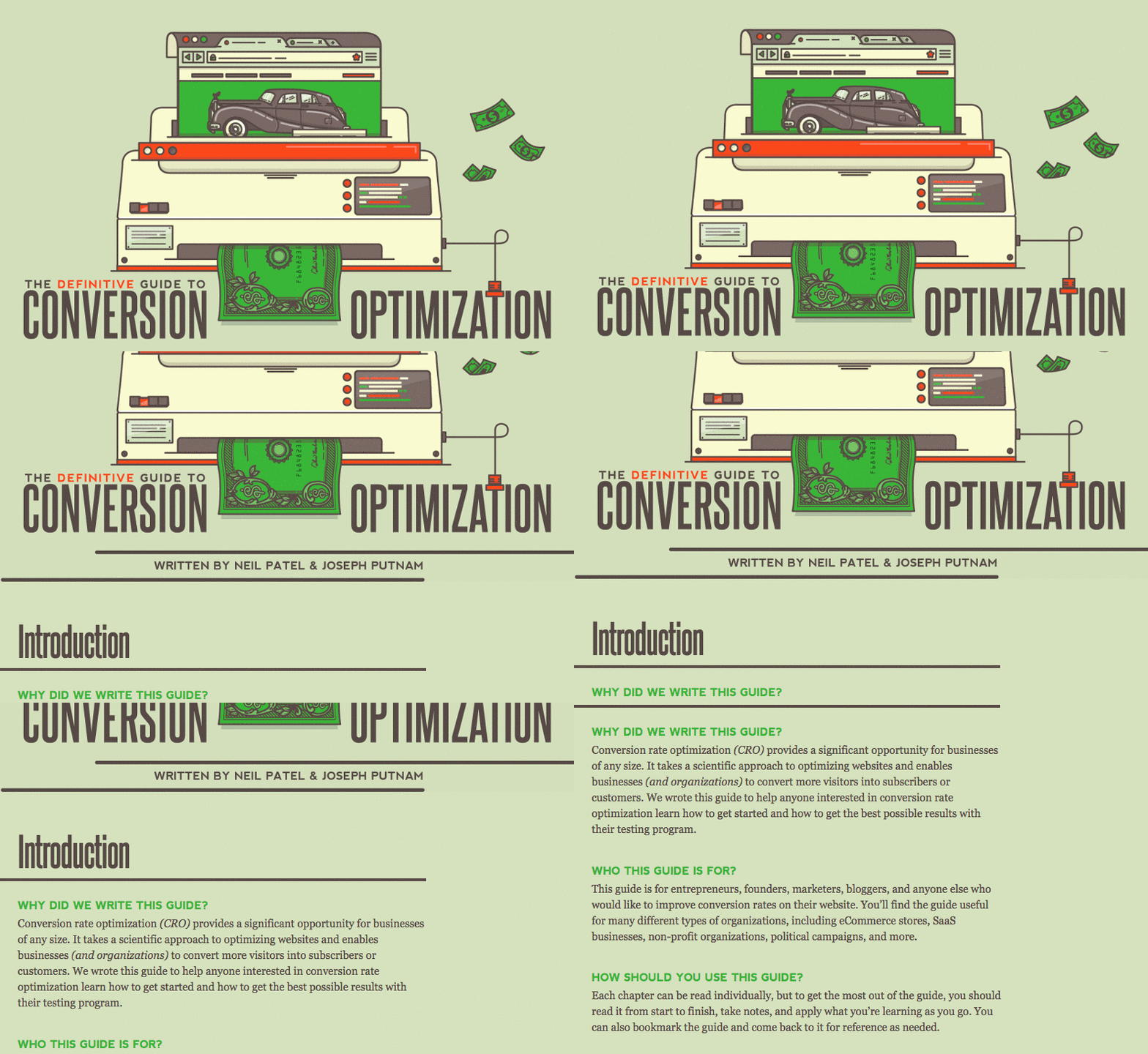
66) The Definitive Guide to Conversion Optimization by Quick Sprout
The creativity in illustrations is particularly notable, especially for a seemingly dull topic like optimization.
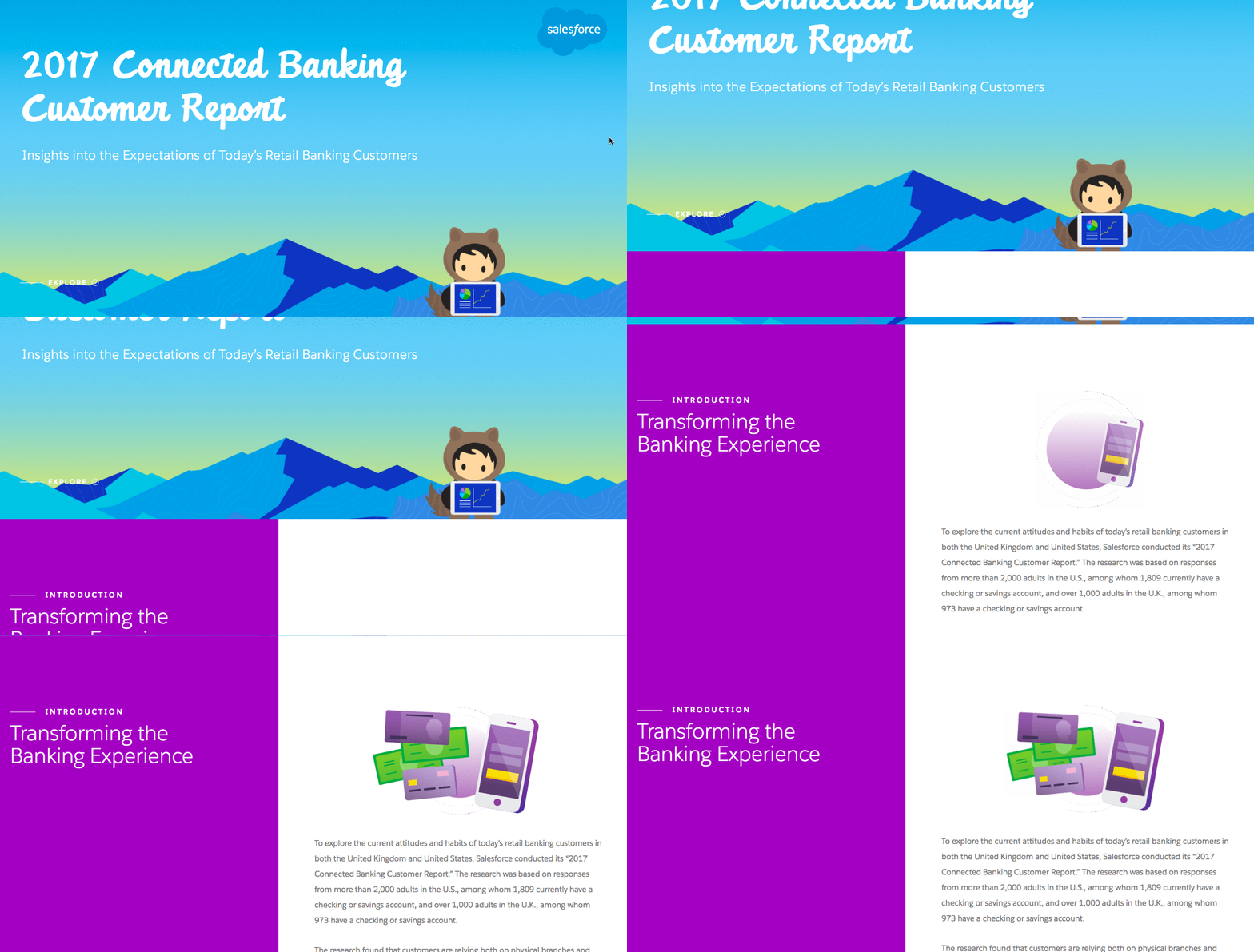
67) 2017 Connected Banking Customer Report by Salesforce
Animations don’t have to be terribly elaborate to be effective. This ebook brings illustrations and data to life with simple movement that creates a more dynamic experience.
68) People for Periods by Column Five
The content design here is particularly unique, letting the user explore the parts of the story they’re most interested in.
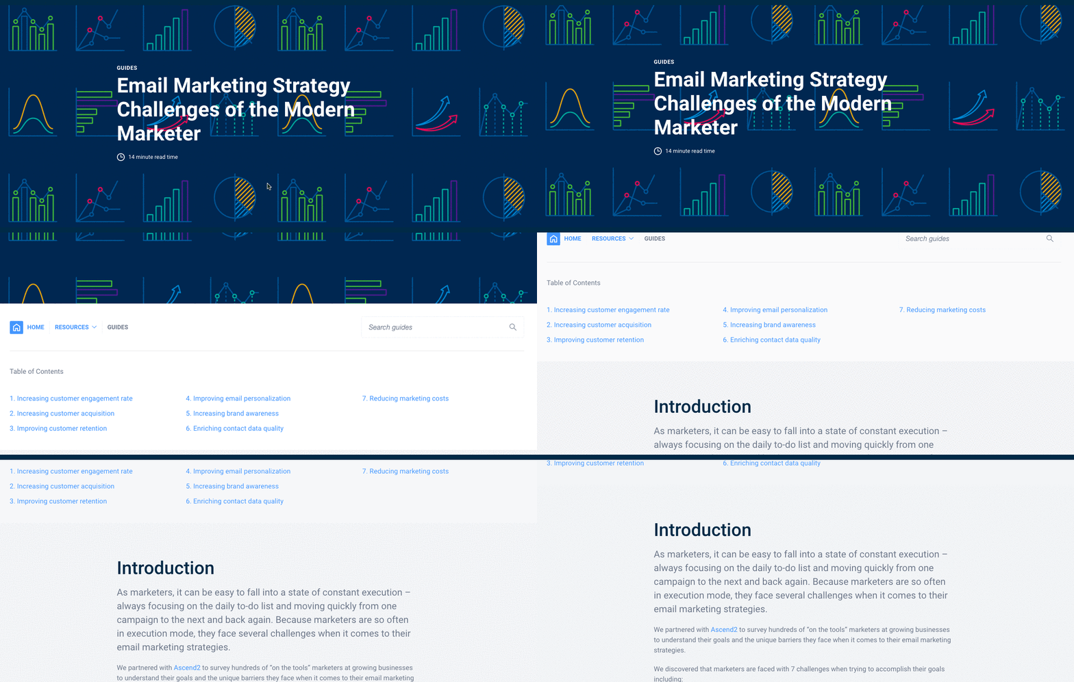
69) Email Marketing Strategy Challenges of the Modern Marketer by Campaign Monitor
We love data, and the data visualization motif here is all kinds of cool.
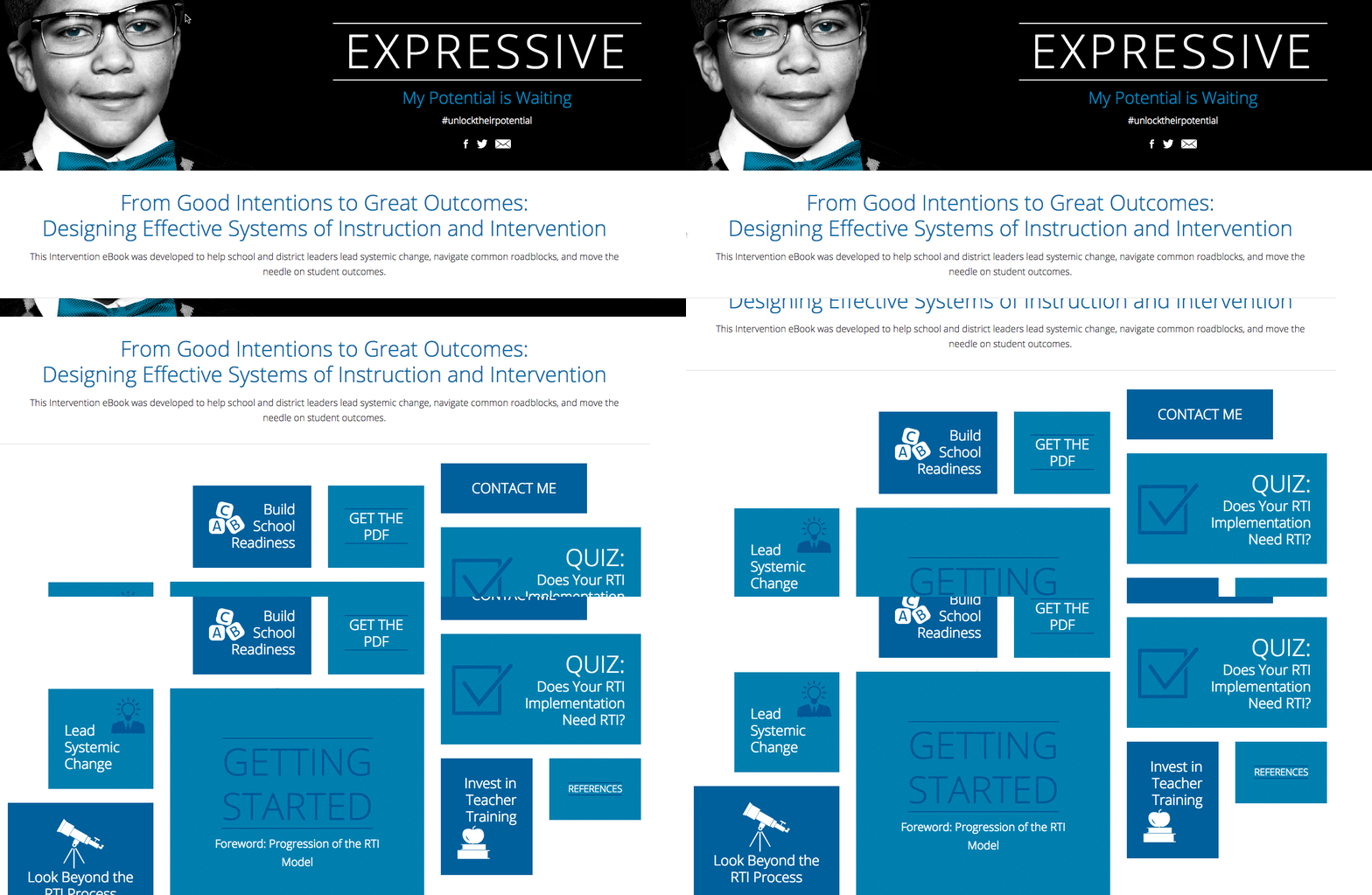
70) From Good Intentions to Great Outcomes: Designing Effective Systems of Instruction and Intervention by Pearson
This is another great example of exploratory storytelling, presenting all the information in a unique way to let the viewer choose their destination.
71) Break Free of Boring B2B by Ceros
There’s nothing boring about this massively creative interactive with splashes of color, photography, and movement.
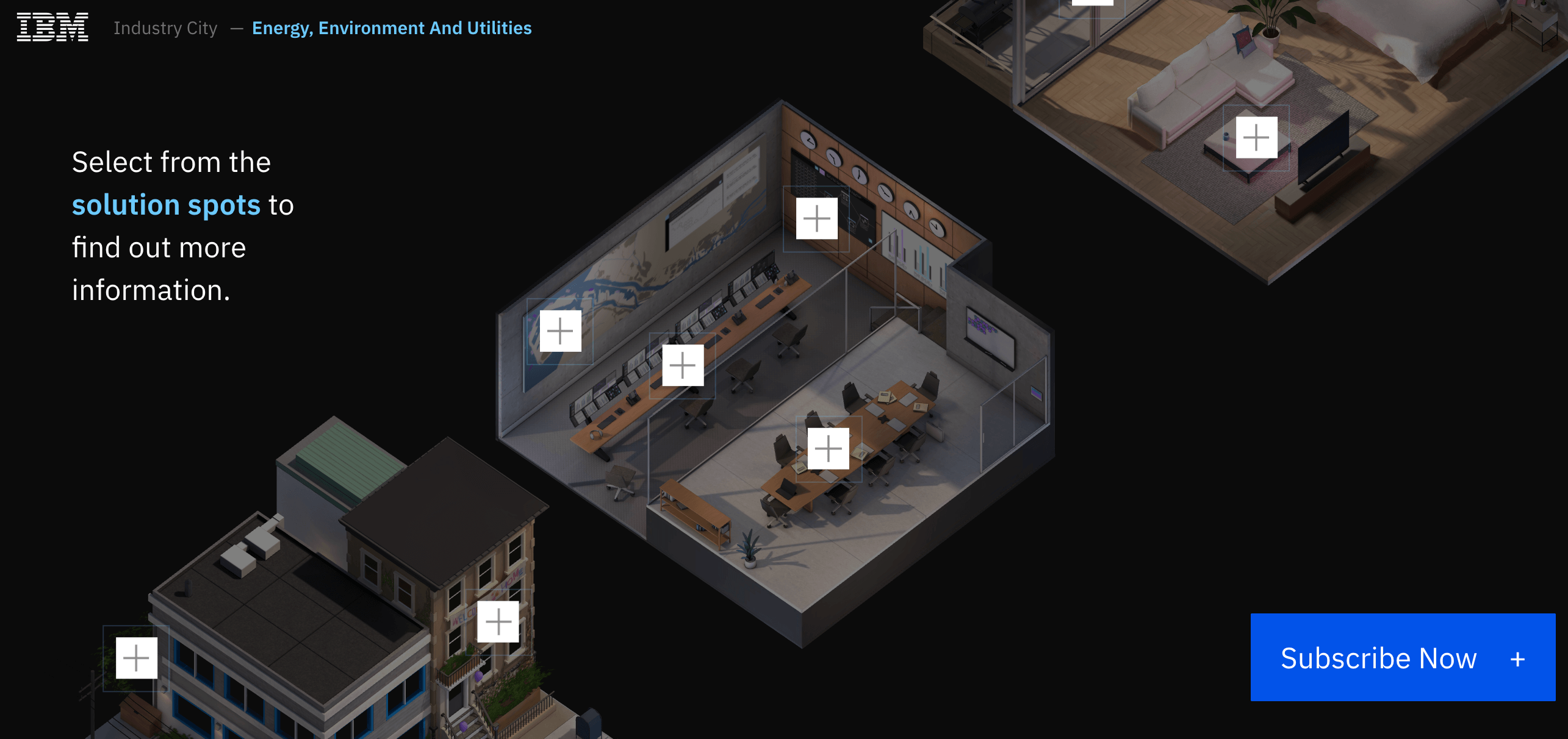
72) Think City by IBM
The impressive 3D animations here make you feel like you’re in a video game. 10 out of 10.
73) Diversity & Inclusion by Comcast
D&I is all about people, so Comcast also uses people-centric imagery to connect with viewers.
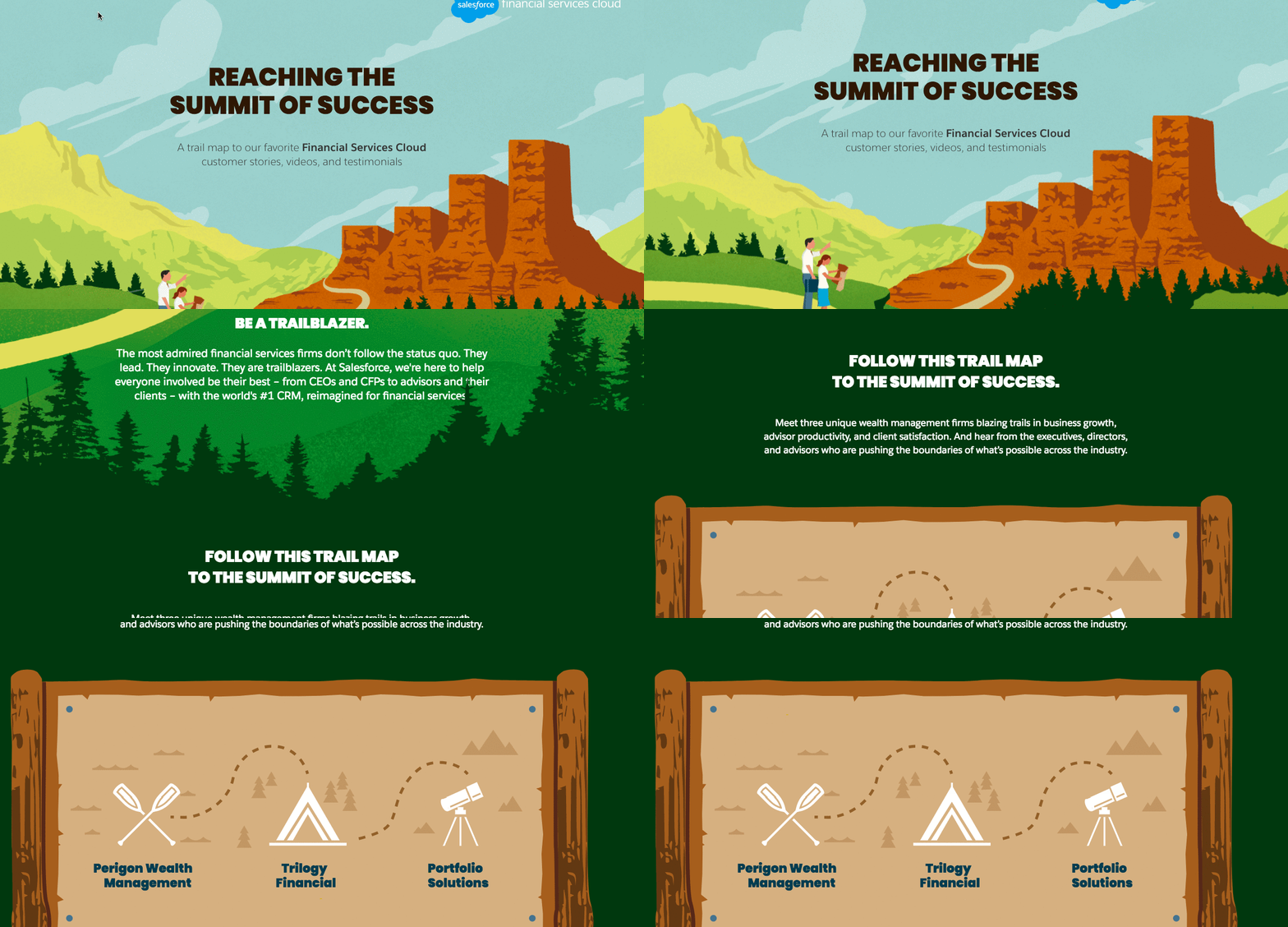
74) Reaching the Summit of Success by Salesforce
We love a theme, and this map-inspired interactive adds a novelty that is refreshing.
75) Chatbots and the Future of Real-Time Communication by Zendesk
Who doesn’t love robots? This interactive ebook smartly brings robots to life through animation.
How to Create Your Own Ebooks
We hope these ebook examples were inspiring, but don’t just stop at inspiration. Follow our tips to bring your next ebook idea to life—as efficiently as possible.
- Follow best practices. See our complete guide to create an ebook for more tips to improve every part of the process.
- Create a strong design. Here are 30 tips to design better ebooks.
- Work smarter, not harder. If you want to reduce the time and resources you spend on your ebooks, repurpose your existing content. Here’s how to turn your old content into lead-generating ebooks.
And if you need any expert help, we’re here for ya. Let’s chat about how we can help you lighten the load.

















Wow Thanks for this posting i find it hard to search for great resources out there when it comes to this topic appreciate for the write-up site
That’s great to hear!
Thanks a lot for this mind-blowing designs.
Thank you!