We’ve all seen those jaw-dropping rebranding examples that make you stop scrolling. A familiar logo suddenly looks completely different. A tired color palette transforms into something vibrant. A brand you thought you knew reveals a totally new side of itself. These transformations are fascinating to watch, but here’s what most people don’t realize: A successful rebrand isn’t just about picking prettier colors or sketching a new logo. It’s one of the most complex, high-stakes moves a company can make. Those who do it well should be celebrated and, more importantly, learned from.
But what does a strong rebrand look like? And what makes it successful? Today, we’re diving into some of our favorite rebranding examples to look at what they changed and, most importantly, why it worked.

What Brands Have Rebranded Themselves Successfully?
The list is surprisingly long—and it spans every industry you can think of. Airbnb introduced their now-iconic Bélo symbol and completely reimagined their brand identity. Mastercard dropped their name from their logo entirely, confident enough in their brand recognition to let the circles speak for themselves. Burger King went retro with a 90s-inspired redesign that felt both nostalgic and surprisingly fresh. Dropbox transformed from a basic cloud storage service into a colorful, expressive brand system. Even pharmaceutical giant Pfizer modernized their look with a refined, contemporary identity.
Some rebrands are subtle tweaks that most people barely notice. Others are dramatic transformations that make headlines and spark conversations across social media. The common thread? Each one represents a strategic decision to evolve how the brand shows up in the world. In the examples below, we’ve gathered 15 standout rebrands from the past few years that demonstrate what’s possible when companies approach this work thoughtfully.
15 Rebranding Examples to Inspire You
From print magazines to pain relievers, these brands demonstrate what happens when you understand your market, your customers, and the world you operate in.
1) Fast Company
Sometimes a company does not quite get a rebrand right the first time. The truth is, branding (and rebranding) is an iterative process. After their initial 2018 redesign, the team at Fast Company realized they needed to realign their visual identity to better fit the brand’s three core principles: sophisticated, playful, and gender-neutral.
The Shift in Brand Identity
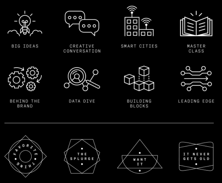
The design team anchored their updated brand identity through several thoughtful updates. They moved away from aggressive all-caps headers that felt too loud. They added custom iconography and adjusted page numbers to create a more dynamic feel. They also started weaving in a much more playful visual language. The refreshed color palette and the redesigned typography created a modern brand image that was significantly more aligned with their specific company vision.
Connecting with the Audience
This shift was crucial for connecting with both their existing audience and a younger audience. The result is a subtle but highly successful rebrand that keeps the brand coherent, compelling, and readable. It shows that audience feedback—even unspoken—matters.
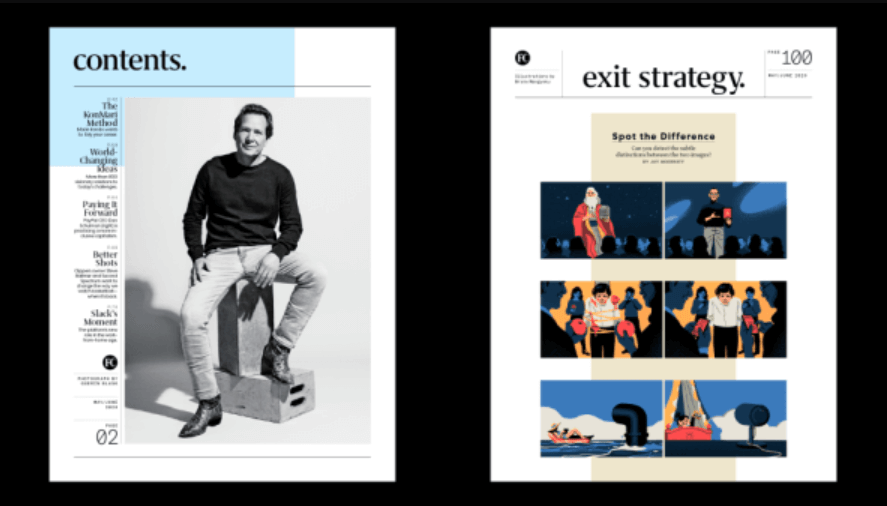
Image source: Fast Company; Photo: Guerin Blask; Illustration: Bruno Mangyoku
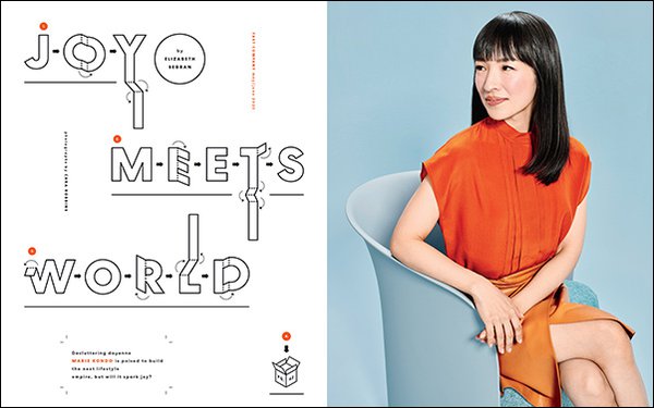
Image source: Fast Company; Photo: Cara Robbins
Image source: Fast Company; Icons: Chelsea Schiff
2) Rolls Royce
How do you take a legacy brand built entirely on concepts of elegance, extreme wealth, and history and make it resonate with a younger audience? That was the massive challenge Rolls-Royce faced during their 2020 brand refresh.
Balancing Heritage and Modernity
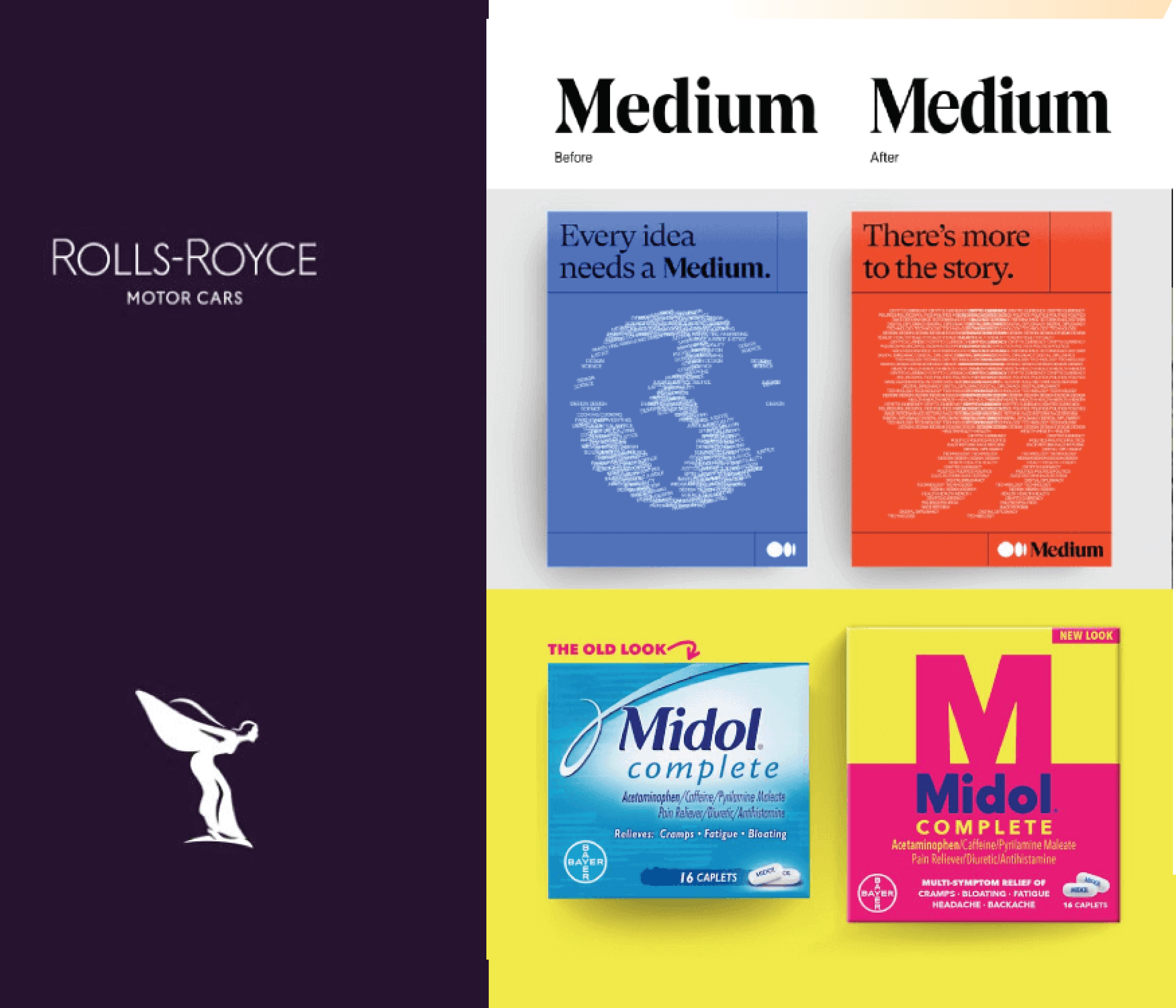
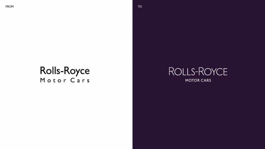
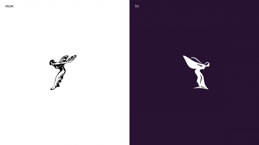
Pentagram, the agency behind this, had to balance a modern identity with the heavy heritage of the original brand. They refined the iconic double-R monogram logo, updated the famous Spirit of Ecstasy emblem to be smoother, and introduced a much more gender-neutral, elevated color palette.
A New Look for a New Audience
By using rich purples, rose gold tones, and sophisticated typography, they created a brand image that feels luxurious yet surprisingly approachable. It is a clever redesign that welcomes a new generation of wealthy consumers without alienating their loyal customers. This rebranding effort proves you can maintain brand equity while pivoting.
Images source: Pentagram/Rolls Royce
3) Medium
Medium reaches over 170 million readers, but their old logo and identity simply did not reflect the company’s rapid evolution. They needed a flexible visual identity that allowed designers to create, innovate, and visually communicate a wide array of ideas on the platform.
Language as Visual Identity
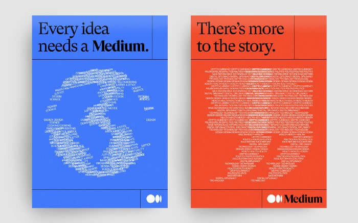
Collins delivered a refreshed, new logo (logomark) with cleaner lines and an ellipses-inspired symbol. They also introduced a far more expressive color palette and built a visual system where language itself becomes imagery. This reinforces Medium’s brand story and deepens its connection with writers, readers, and its massive global audience.
This rebranding works because it puts the core product—words—at the center of the brand identity. It is an A+ rebrand in our book because it understands the business it serves.
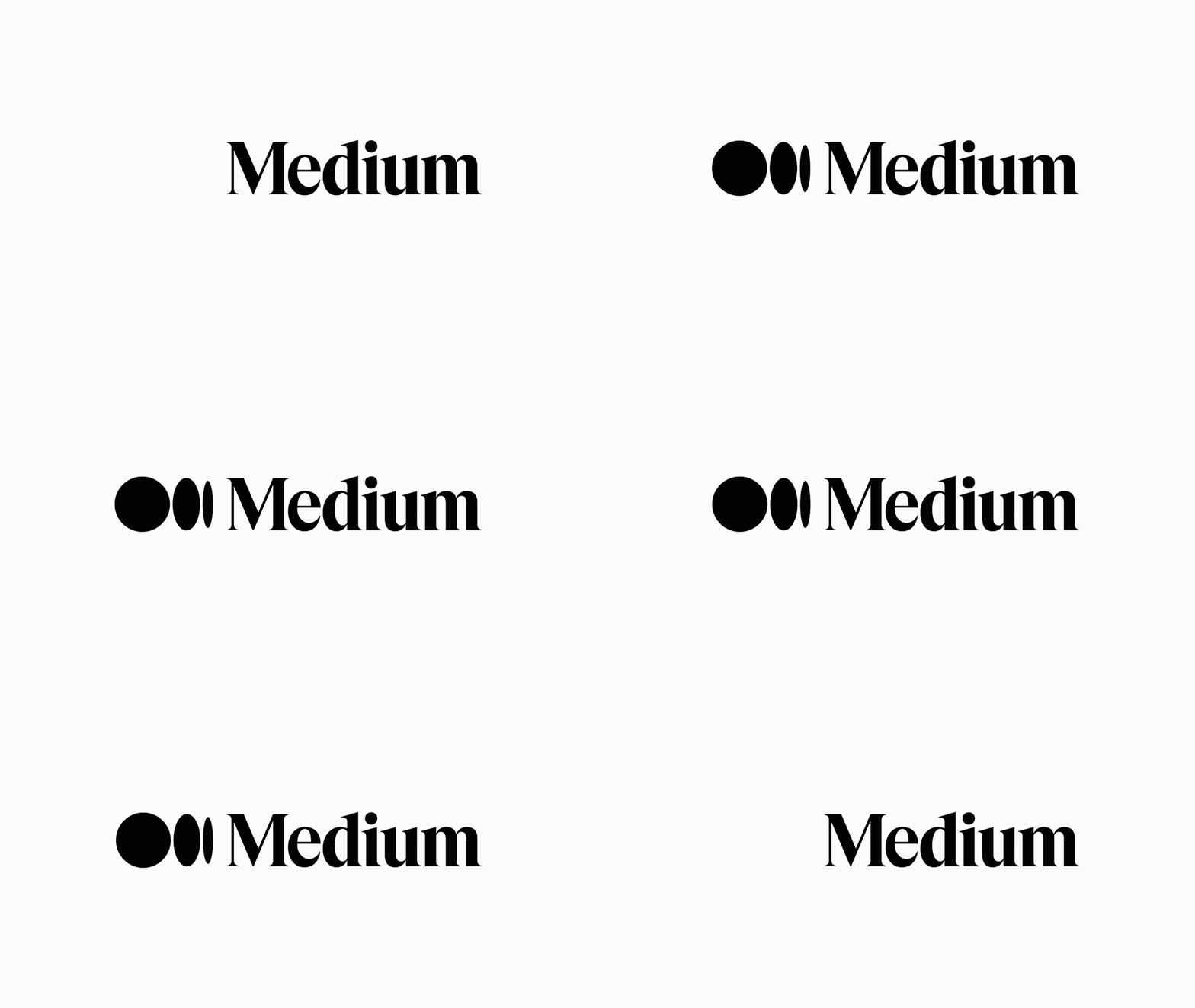
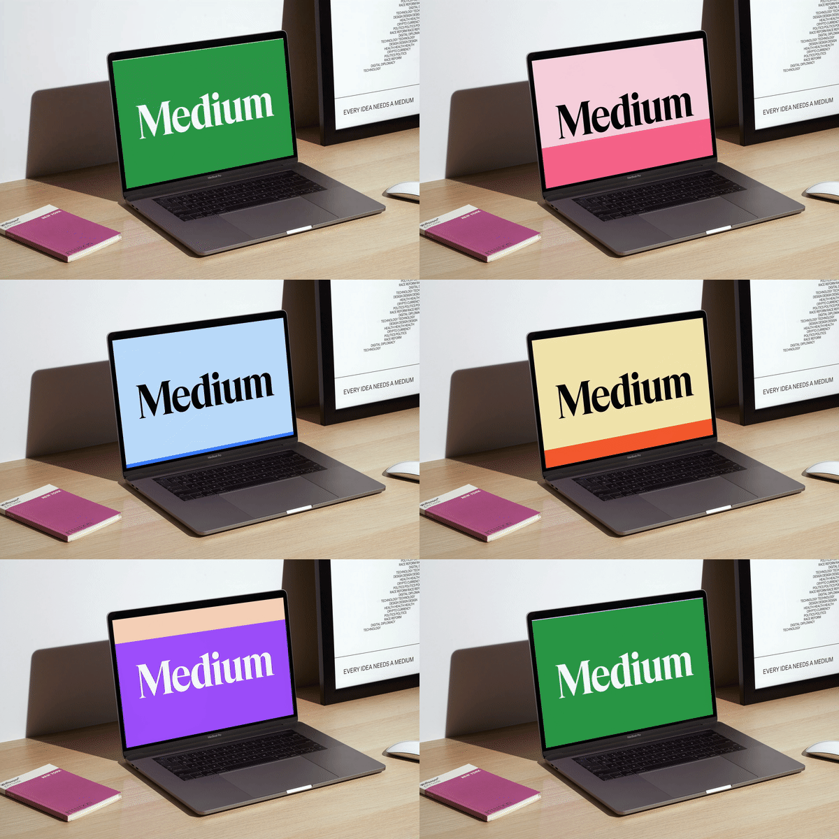
Images source: Medium
4) Buck
Buck’s rebranding proves how powerfully a specific brand story can live inside a visual identity.
Systematic Design Inspiration
Inspired by Buckminster Fuller’s systematic design approach, each letter of their wordmark is built on shared architecture. This creates a unified brand identity system where every piece fits together.
The Resulting Brand Image
The result feels bold, modern, and intentional. It is perfectly aligned with their company mission, and allows the brand to stand out in a crowded creative market.
Images source: Buck
5) GoDaddy
Here is a fun fact: GoDaddy had not touched their branding in over 20 years. Naturally, their business had evolved significantly in that time, moving from just selling domains to providing a suite of tools, so a full redesign was drastically overdue.
The New Logo Strategy
The new logo transforms the “g” and “o” into an interlocking heart shape. This is an unexpected but clever symbol for the brand’s modern direction, and it centers the entrepreneur they serve.
Updating the Color Palette
The vibrant, inclusive color palette features bold teal accents. Combined with the functional GD Sherpa typeface, this gives the brand a confident new identity. It speaks to today’s customers and market expectations far better than the risqué ads of the past, making it a strong example of how a fresh visual identity can reshape brand perception.
Images source: GoDaddy
6) Origo Coffee
To compete in the intense luxury coffee category—where giants like Tim Hortons or Starbucks dominate the lower end—Origo needed a brand identity that captured sophistication, craftsmanship, and cultural pride.
Cultural Inspiration
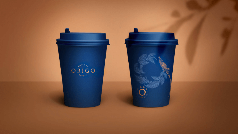
MetaDesign Beijing introduced a serene circular logomark inspired by the fluid movement of coffee being poured. This was paired with an earth-toned color palette that strengthens the brand’s origin story.
The Premium Brand Image
From hand-drawn illustrations to modern typography, every detail reinforces the premium experience Origo offers. This is a beautiful case of brand image meeting brand equity. The packaging looks incredible on a shelf, helping the brand stand apart.
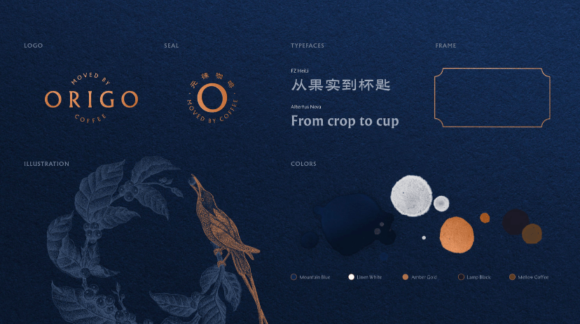
Images source: Origo
7) GO1
For GO1’s 5-year anniversary, DesignStudio crafted a rebrand centered around the concept of “Learn Athletic.” This overarching theme celebrates agility, movement, and the joy of learning.
Visualizing Movement
A bold color palette, connected shapes, playful illustrations, and a dynamic logomark reflect the brand’s mission (to help people learn quickly and effectively).
Targeting the Expanding Audience
It is modern, memorable, and perfectly aligned with their expanding audience. This rebranding effort captures the energy of the company and translates it into visual assets.
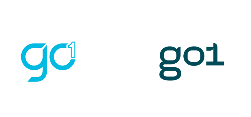
Logomark Before/After

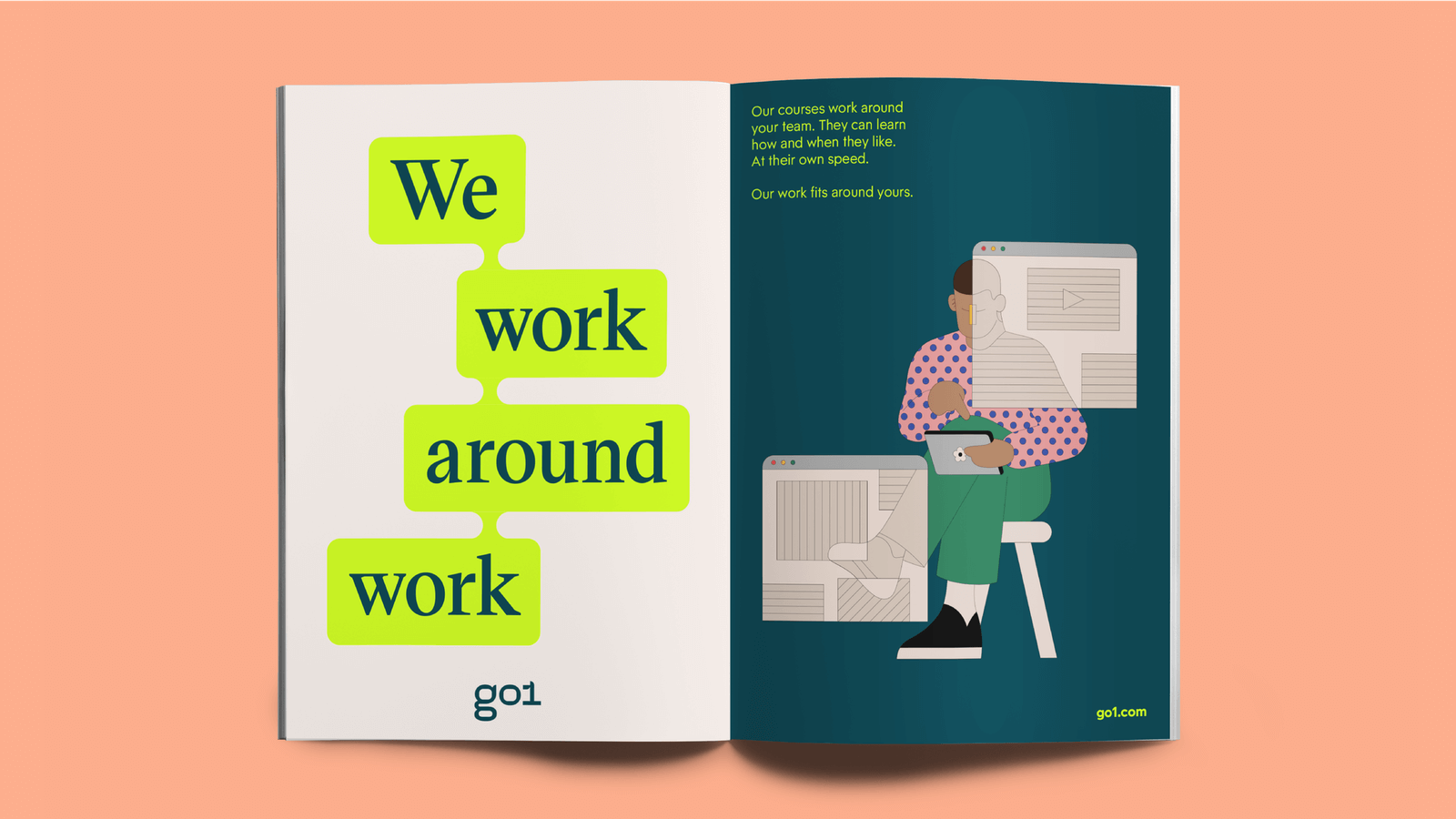
lllustrations: Camilo Huinca
8) Laka
Laka operates an insurance model built entirely on community. Therefore, Ragged Edge made the community itself the hero of the rebrand.
A Bold Declaration
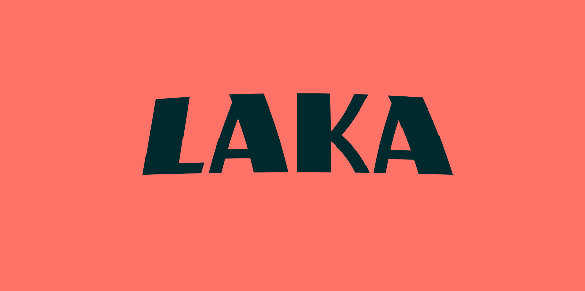
Bright colors evoke the joy of cycling, while patterns mimic the grit and intensity of real rides. The bold type and diverse member portraits give the brand a human touch.
Lifestyle Over Insurance
This creates a brand image that feels more like a lifestyle brand than a traditional, boring insurer. It acts as a bold declaration that insurance does not have to be dull—and makes it an unexpected standout among our rebranding examples.
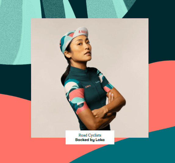
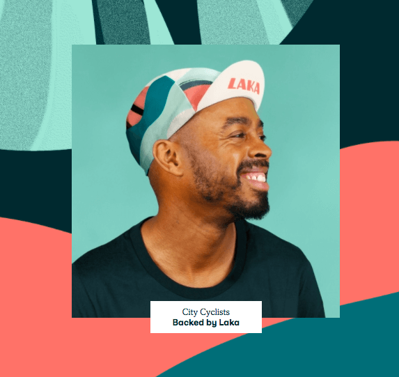
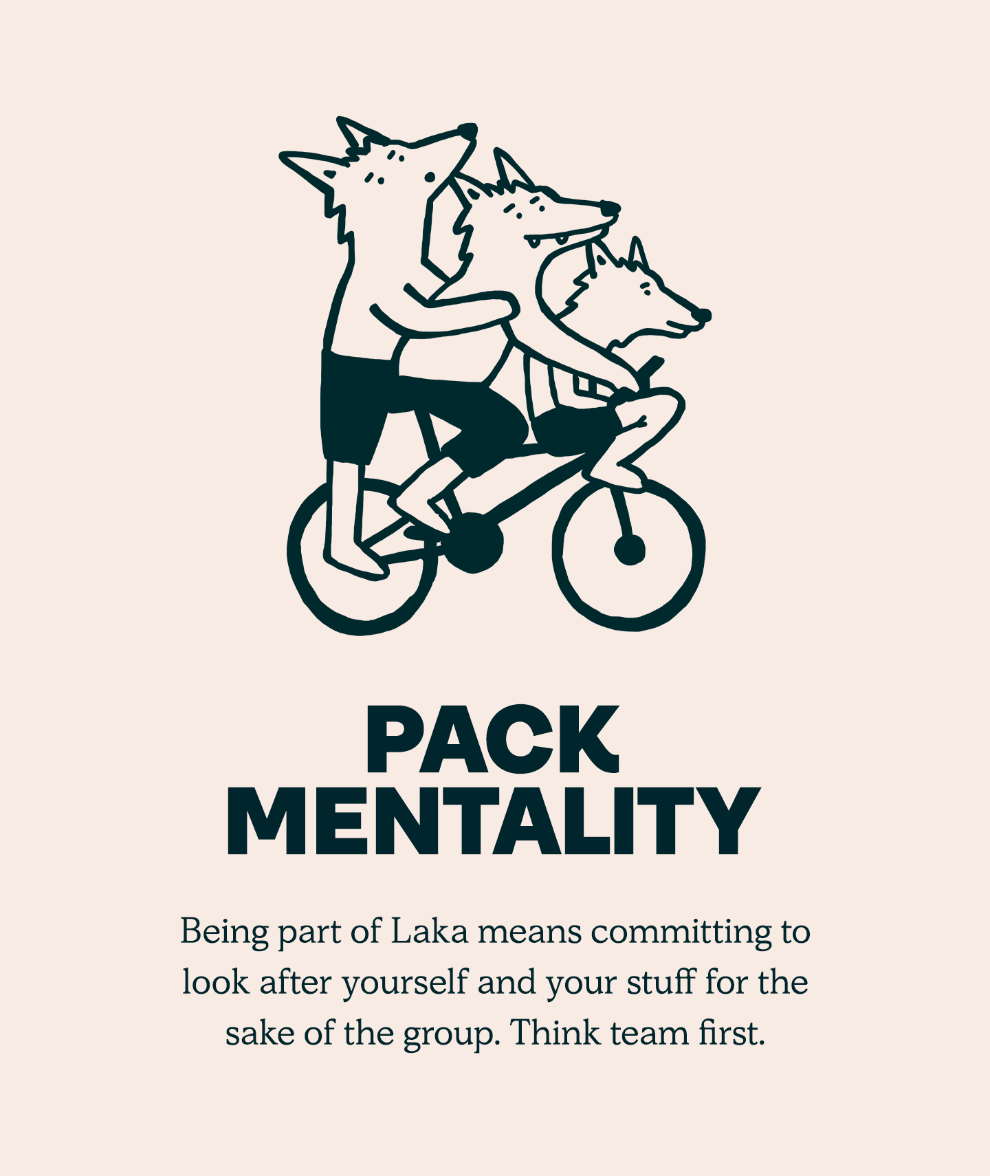
Images source: Laka
9) Intel
In over 50 years, Intel has only had two logos. This makes this particular redesign a monumental brand moment.
Minimalism and Modernity
The updated brand identity embraces minimalism. It expands the color palette significantly and incorporates subtle nods to the past year and history while pushing the brand into a modern era.
Strengthening Brand Equity
It is a strategic, practical redesign that strengthens brand equity. It modernizes their visual language for a new generation of customers and markets who demand clarity.
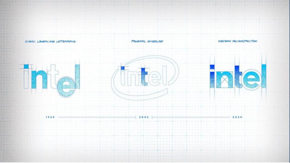
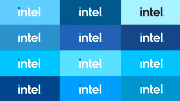
Images source: Intel
10) Midol
Midol is a classic case of a legacy product needing a specific refresh. They needed to reconnect with Millennials and Gen Z—audiences who barely remembered their old packaging or saw it as their mother’s medicine.
Reclaiming the Narrative
To reposition the brand for a new era, designers embraced a bolder, brighter color palette, while the typography now reflects strength, confidence, and independence.
The Unapologetic Brand Refresh
The result is a modern, unapologetic rebrand that speaks directly to a younger audience, helping distance the brand from outdated perceptions or the “period stigma” of the past.
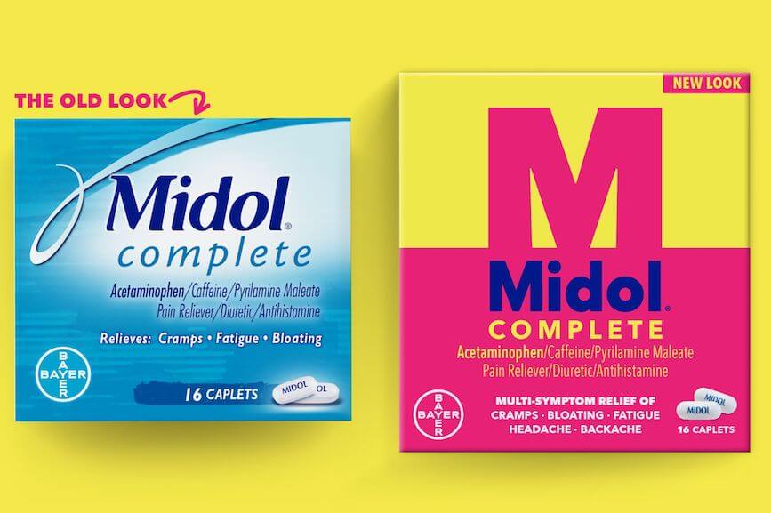
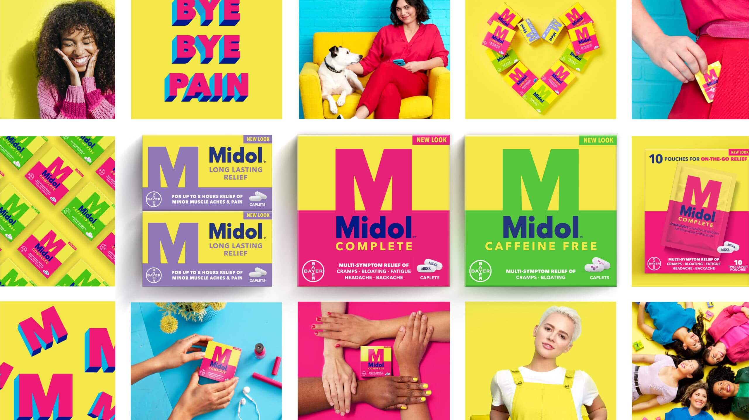
Images source: Midol
11) Stonewall
Named after the Stonewall riots, the Stonewall charity is a UK-based organization that fights for LGBTQ+ rights. In need of a rebrand, the organization turned to creative agency Jones Knowles Ritchie, who used expert visual storytelling to pay homage to the past and create an identity for the future.
Symbolism in Design
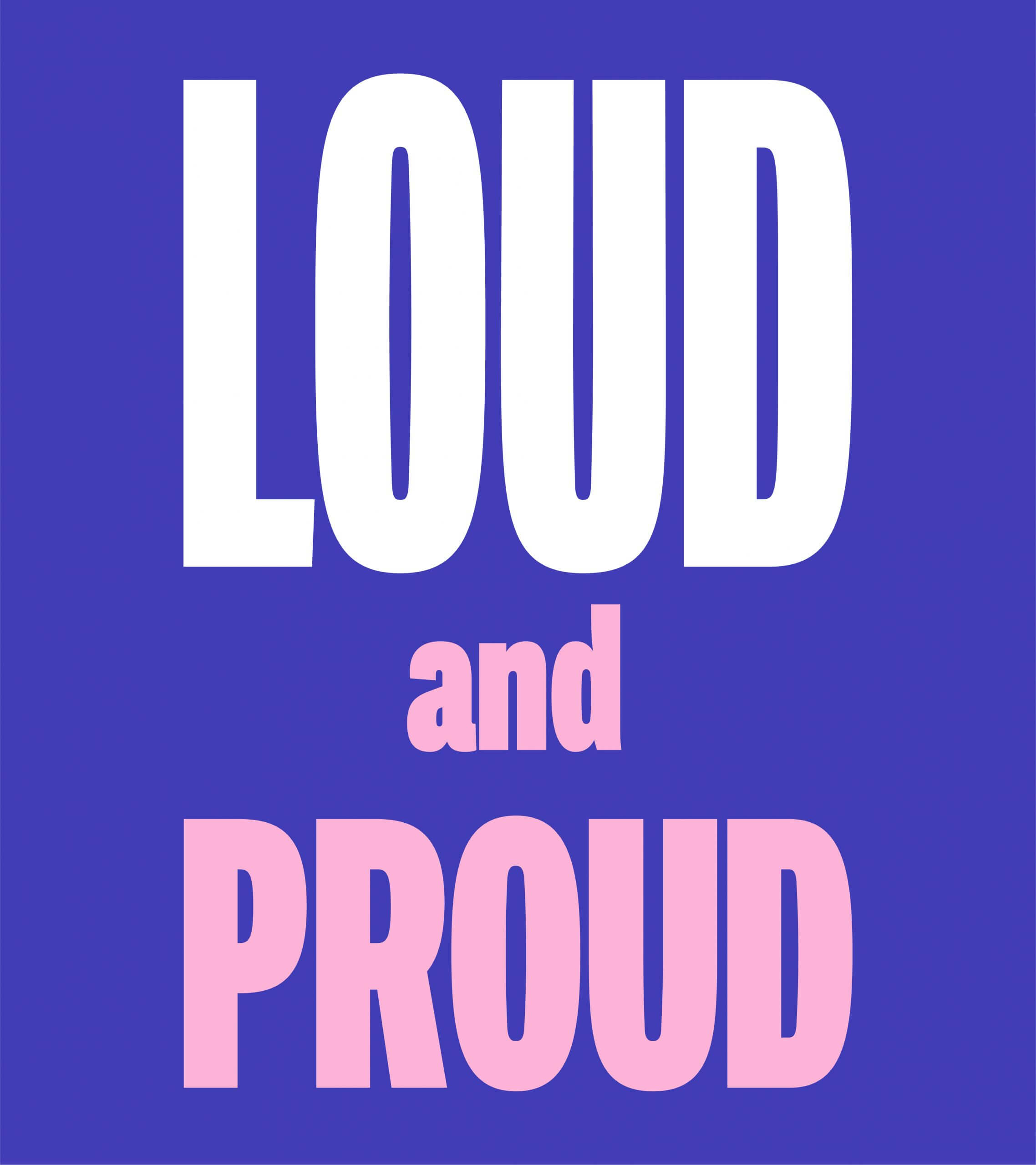
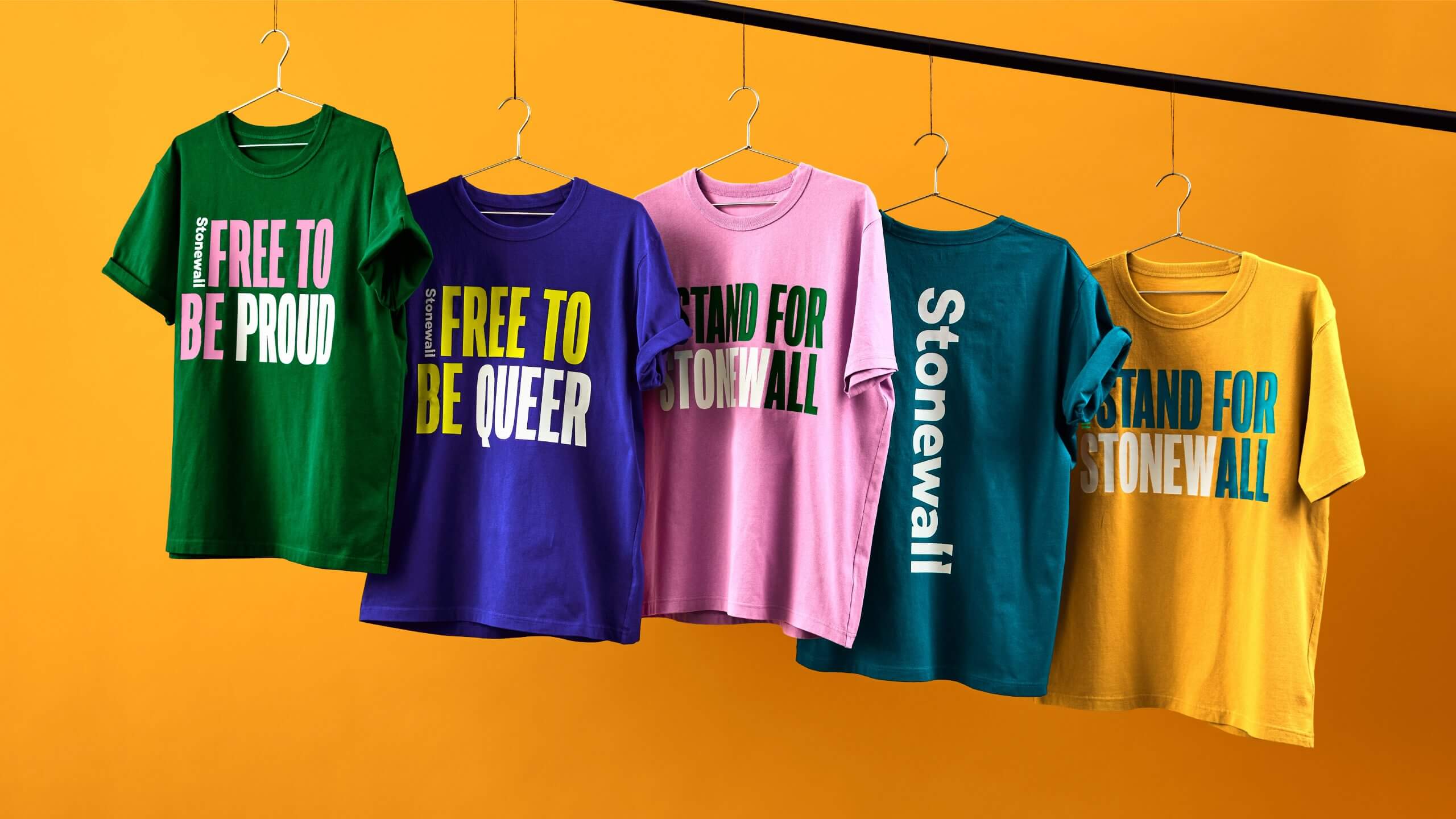
JKR introduced a rainbow-inspired color palette and a custom protest-style font as a nod to its historical roots. The new logo features an arrow nestled between an equal sign—a brilliant use of negative space and symbolism.
Emotional Rebranding
This rebrand forces you to feel something. It feels emotional, powerful, and deeply connected to the brand’s mission and audience, aligning the non-profit with the energy of modern activism.
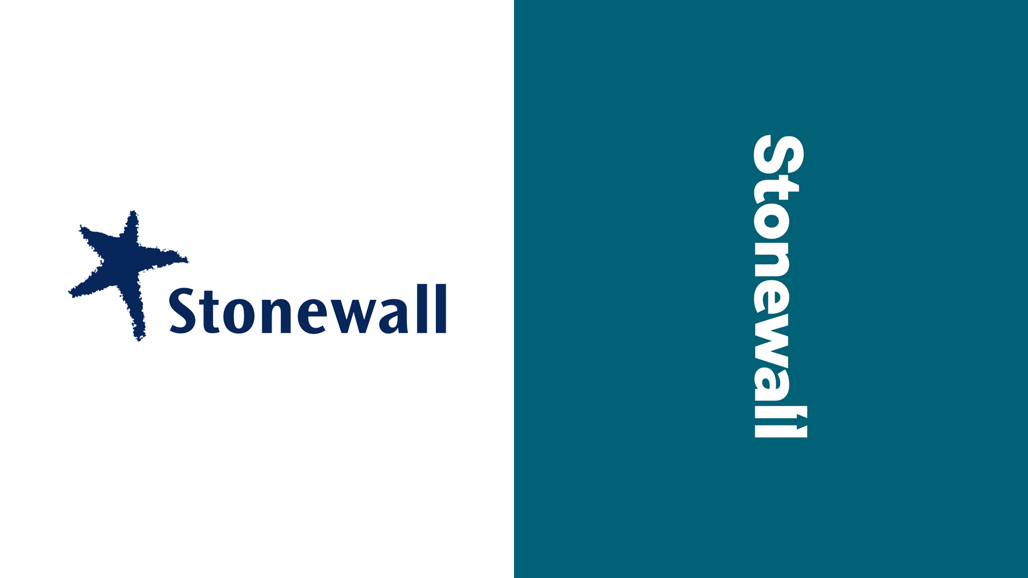
Images source: JKR
12)Mailchimp
Mailchimp’s 2018 rebrand transformed them from a quirky email tool into a serious marketing platform—without losing the personality that made people love them in the first place.
Balancing Playful and Professional
Collins helped Mailchimp expand beyond their iconic chimp mascot (named Freddie) by introducing a distinctive visual system. The custom typeface “Cooper Light” gives the brand a retro, approachable feel, while bold illustrations and a vibrant color palette keep things energetic. They also introduced “Freddieisms”—illustrated metaphors and visual puns that bring warmth to marketing automation.
Growing Up Without Selling Out
This rebrand works because it acknowledges Mailchimp’s evolution from startup darling to enterprise marketing platform while maintaining the friendly, accessible personality that differentiated them from competitors like Salesforce or HubSpot. It’s a masterclass in maturing your brand without alienating the community that got you there.
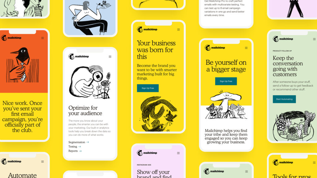
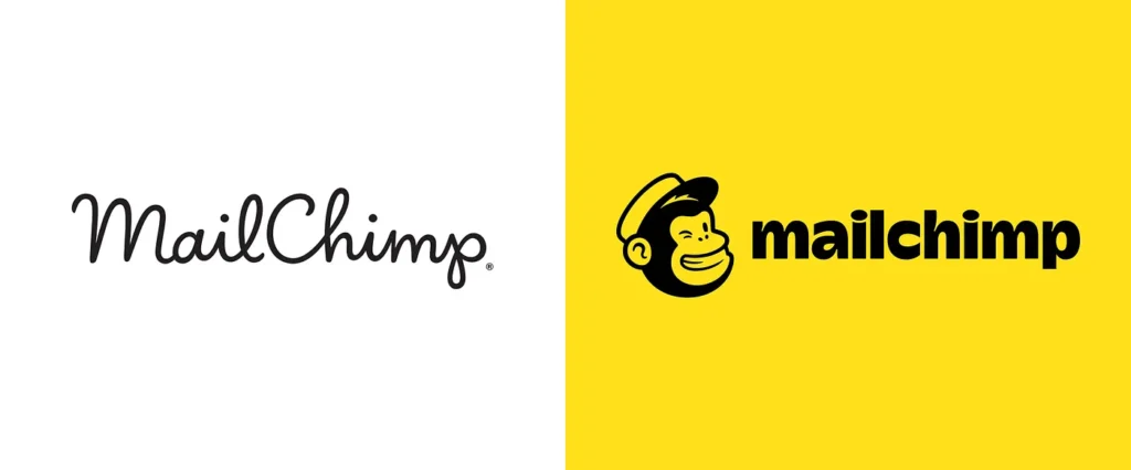
Image source: Mailchimp
13) GlobalFoundries
The semiconductor industry is steeped in technology and innovation, but that doesn’t always translate to branding. Hence, semiconductor manufacturer GlobalFoundries desperately needed to rebrand. Their old logo was a ’90s relic, and the brand was eager to usher in a new era focused on optimism and innovation within the industry.
Visualizing Technology
Their new logo features two geometric squares forming an “F”. This symbolizes semiconductors, while the updated color palette adds bold accents of yellow and purple, standing out from the “tech blue” sea of competitors.
Warmth in Tech
It is a modern, confident brand refresh that proves even heavy tech can be warm, human, and visually compelling.
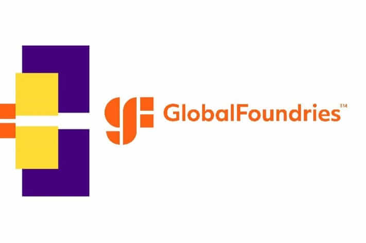
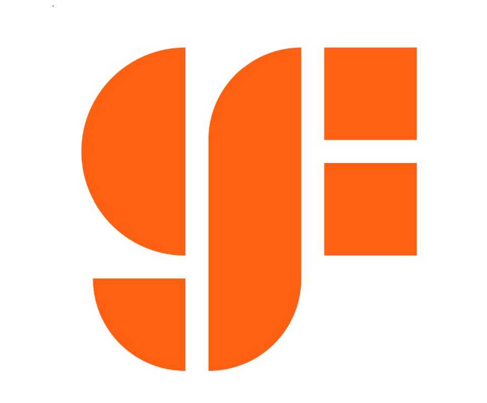
Image source: GlobalFoundries
14) King Arthur Baking Company
As baking surged in popularity (during the pandemic and beyond), King Arthur realized their brand identity no longer reflected their offerings or their inclusive community.
Updating the Symbol
The redesigned logo replaces the literal horseback knight with a wheat-crown symbol. This preserves heritage while modernizing the visual identity.
Expanding the Appeal
The updated sans serif font, refined color palette, and simplified mark help appeal to a wider audience, helping attract new bakers without losing loyal customers who love the brand’s legacy.
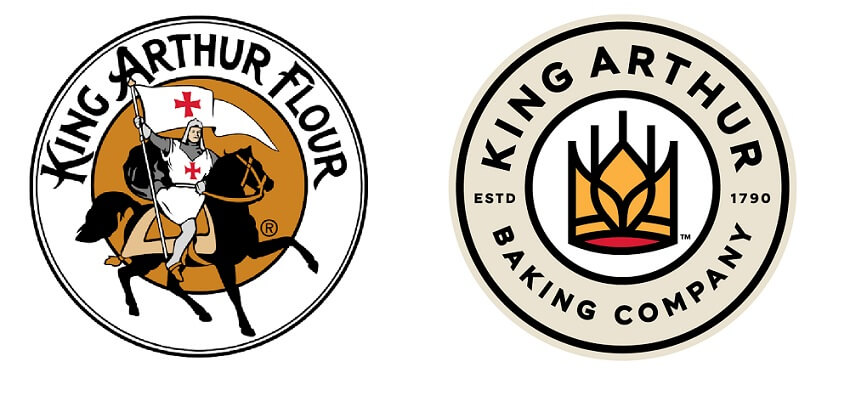
Image source: King Arthur Baking Company
15) Kroger
When Kroger tackled its rebrand in 2019, they went all in. With their new “fresh for everyone” tagline, they found their brand ethos and built a fresh identity that is inviting and engaging.
The Kroji Characters
With a bright, modern color palette, redesigned logo, and playful “Kroji” characters representing their diverse audience, Kroger created a brand image that feels friendly.
Business Impact
This brand refresh makes the massive chain feel fresh and inclusive. It is a strong example of how a modern brand identity can strengthen business and customer connection.

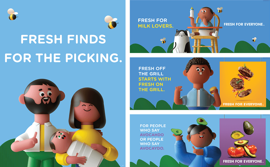
Image source: Kroger
What is the Most Successful Rebrand of All Time?
While there are many contenders for this title, including the shift from Dunkin Donuts to just Dunkin’, or the brand refresh of Old Spice, many argue that Apple’s rebranding in the late ’90s stands as the gold standard. It wasn’t just a logo change; it was a fundamental shift in brand story and brand identity. They went from a beige computer company to a lifestyle brand driven by innovation and a bold “Think Different” philosophy. It set the stage for the future of the company.
So what can we learn from all of these brands, and how do you put these lessons to work?
How Do I Rebrand My Brand?
As all these examples show, successful rebrands are the result of intense preparation. You cannot just slap a new logo on a bad product and expect success. If you do that, you might see the opposite effect, where people get confused or angry or alienated.
To tackle your own rebrand:
- Develop a strong marketing strategy. Know exactly what you want to achieve.
- Engage in smart planning. Do not rush the process.
- Gain a deep understanding of your audience. Who are they? What do they want?
- Focus on creative problem-solving. Design is about solutions, not just decoration.
- Align your company vision. Ensure internal stakeholders are on board.
- Clarify your brand story. What are you trying to tell the world?
If you are preparing for your own major rebrand, there are specific steps you should take to ensure you don’t miss the mark.
Steps for Success
- Know why you’re doing it. Is it a merger? A new audience? A bad reputation? To truly fix a brand, you must possess a deep understanding of your current brand identity, your existing audience, your core audience, and the new audience you hope to attract. A rebrand forces a business to align its company’s vision, reinforce the foundational brand story, and rebuild the total brand image with serious intention.
- Follow best practices for creating a cohesive brand identity. Consistency is key across all touchpoints, so make sure your logo, color palette, typography, tagline, and other brand elements all tell the same story.
- Study rebranding examples that show what works. Look at the best rebrands and learn from them. (Here are 25 more examples to dive into.)
- Consider how your new logo, color palette, and visual identity align with your market. Everything must work together to tell the right story to the right people.
But none of this can be done overnight. You need to approach any rebrand intentionally, methodically, and with the right resources. If you need a partner to help navigate the complex world of rebranding, we are always happy to chat about how to bring a fresh, modern identity to your business. Remember: Whether you need a new logo, a new slogan, or a total brand refresh, the effort you put in now will pay dividends with your customers later.
