We’re proud of the work we do for our clients, but sometimes we see other designers’ work that makes us a little jealous. This is especially true when we see incredible annual report design. When you can turn dry data into a gorgeous visualization, or bring an organization’s work to life through a unique visual concept, you’re doing a huge service to the brand, the reader, and the design community. We love to shout out good work, so today we’ve rounded up some of our favorite annual report examples that use unique design to tell an impactful story. 
10 Creative Annual Report Examples
From clever packaging to creative visuals, these brands use a variety of design tools to bring their work to life in brilliant ways. If you’re looking for inspiration, here are 10 ideas you can use to take your own annual report design to the next level.
1) Illustration
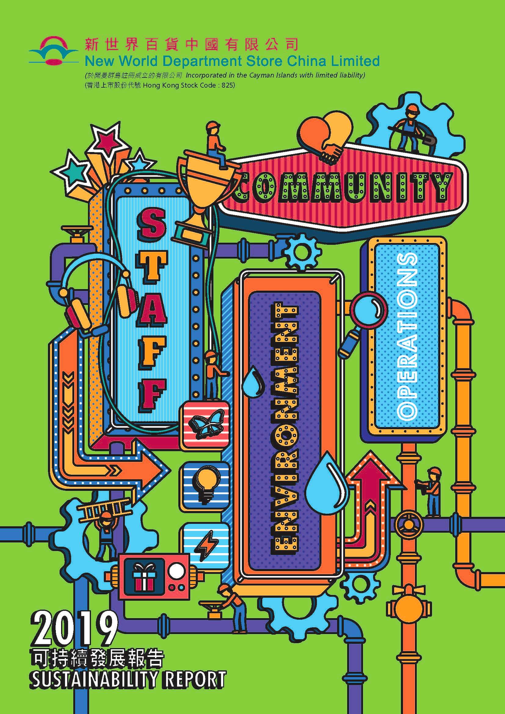
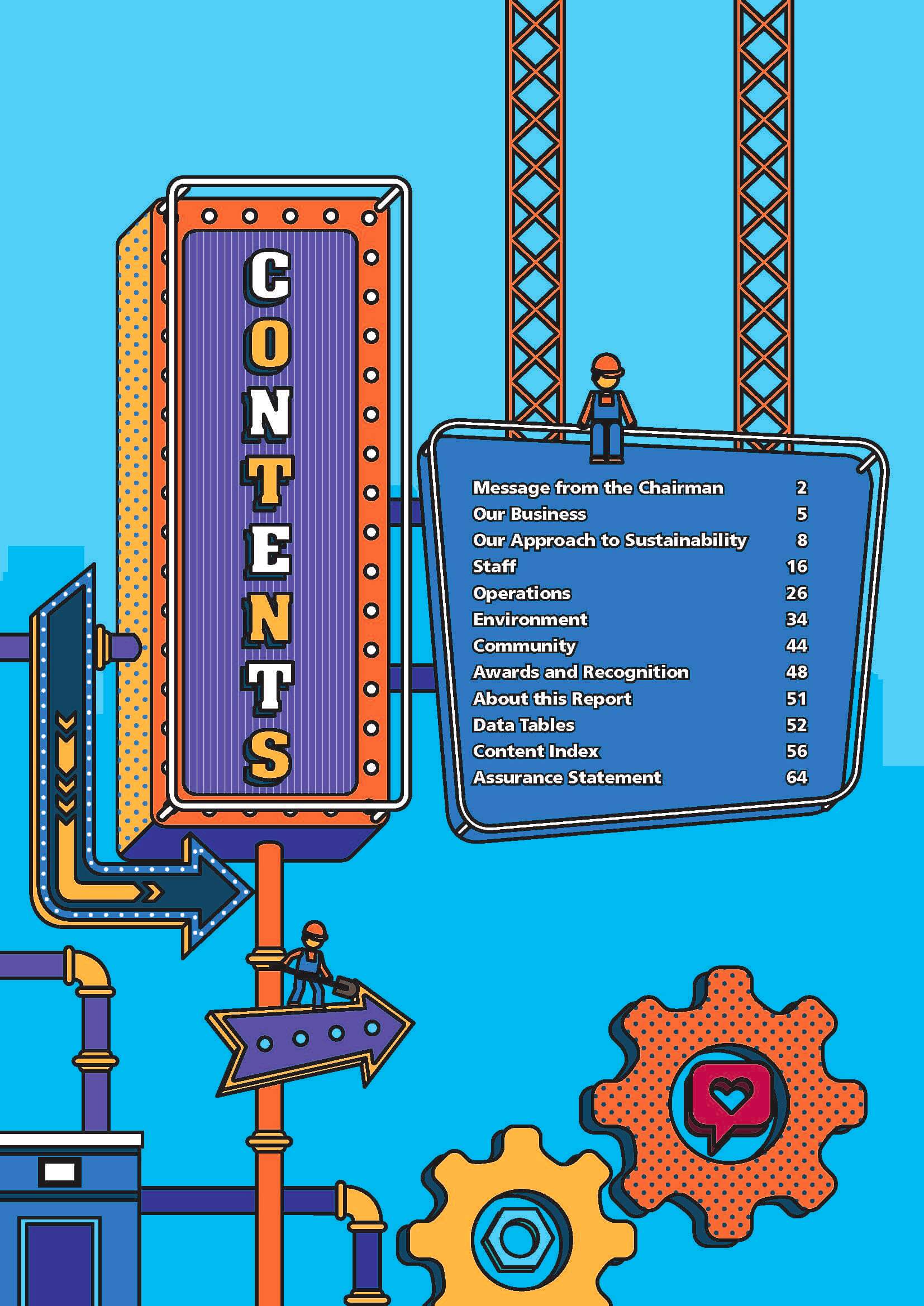
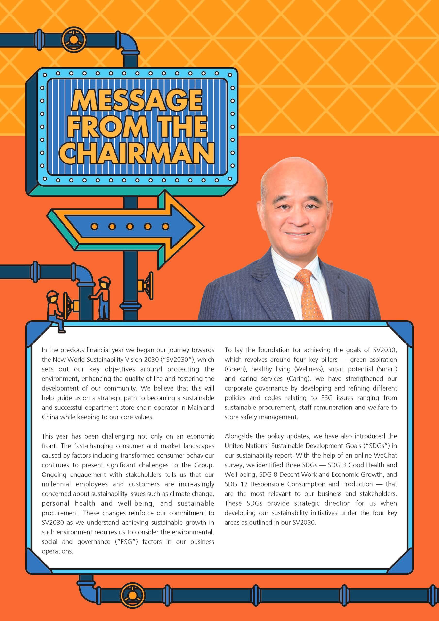
If you want an easy way to upgrade your annual report, illustration is the answer. Whether you’re a financial institution or a shoe company, any visual addition instantly elevates your annual report design, as the New World Department Store 2019 Sustainability Report shows. Packed with colorful, playful illustrations, it makes you feel like you’re reading a comic book—not a retail business report.
2) Papercraft
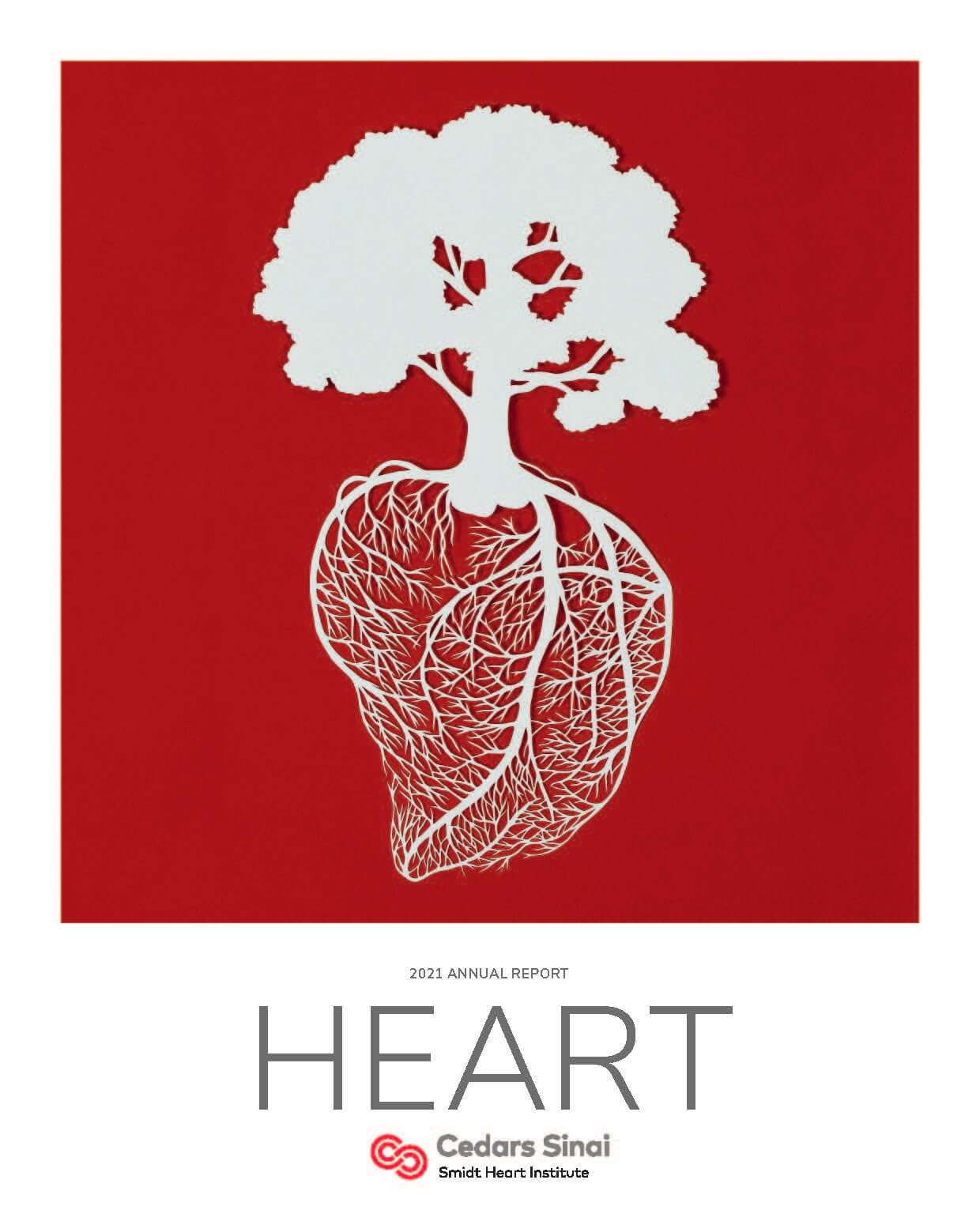
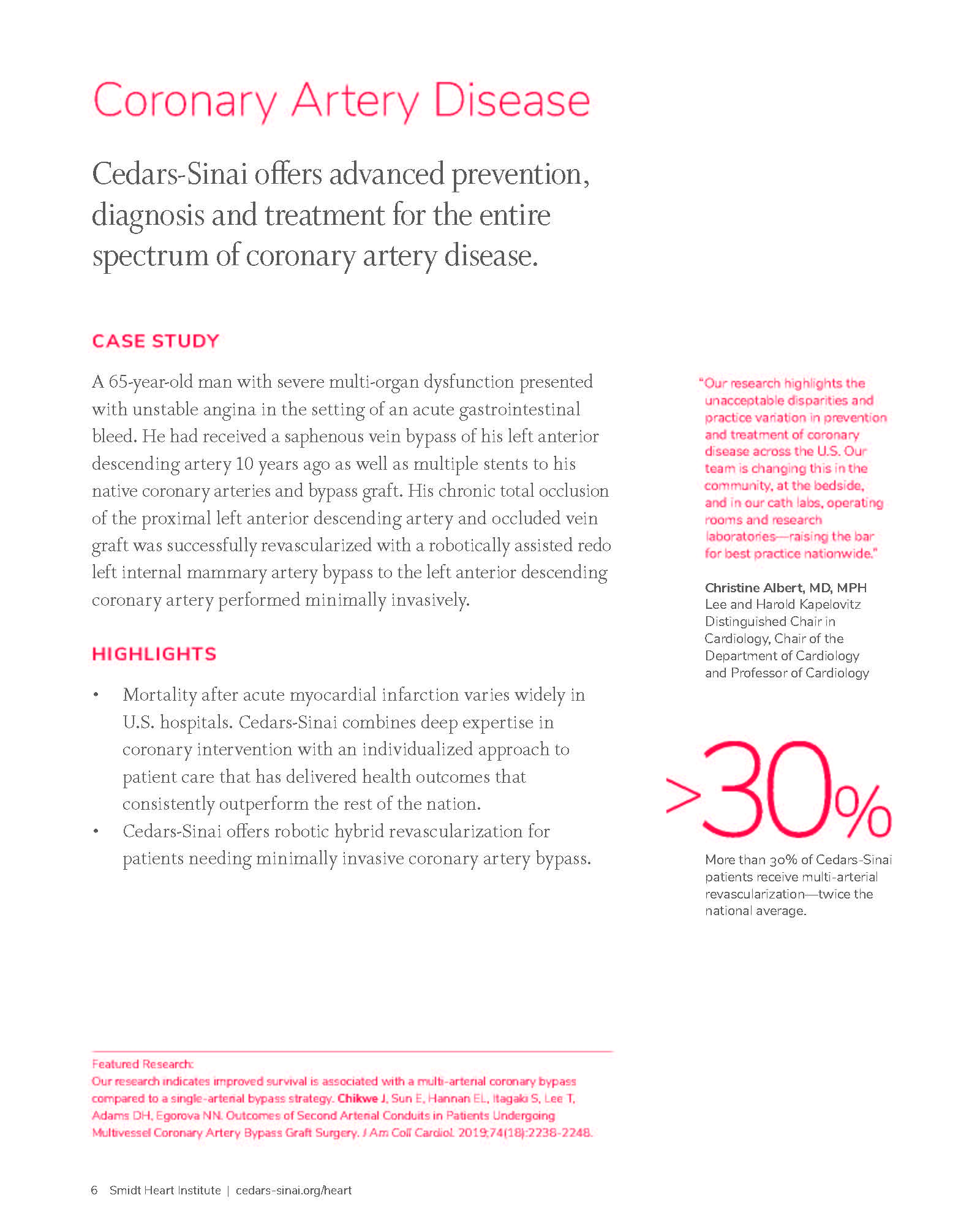
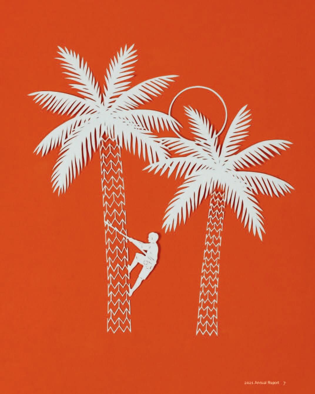
When crafting an annual report, you want to grab people’s attention. Using unique visuals is a great way to do that, as the 2021 Heart Institute Annual Report shows. Through intricate papercraft, the report tells the story of the organization’s work in a beautiful and memorable way.

3) Coloring Book
Annual reports usually provide information—but not much else. The 2018 Community Foundation for Greater Atlanta Annual Report flips that idea on its head. The foundation reminds ATL residents that the region is “full of colorful, vibrant neighborhoods.” To bring that concept to life, they actually designed their annual report as a coloring book, making it interactive and informative. Whereas most reports are destined straight for the trash, this one may be destined for the gallery on your fridge.
4) Watercolor
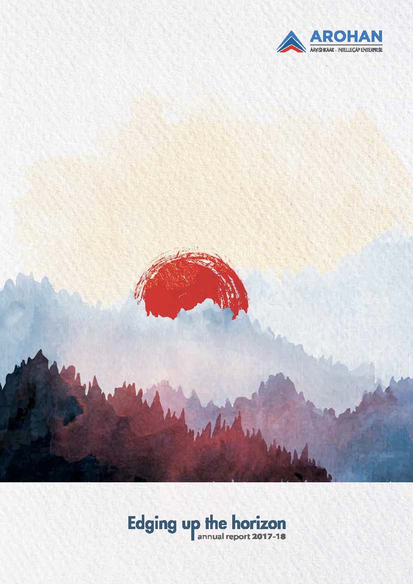
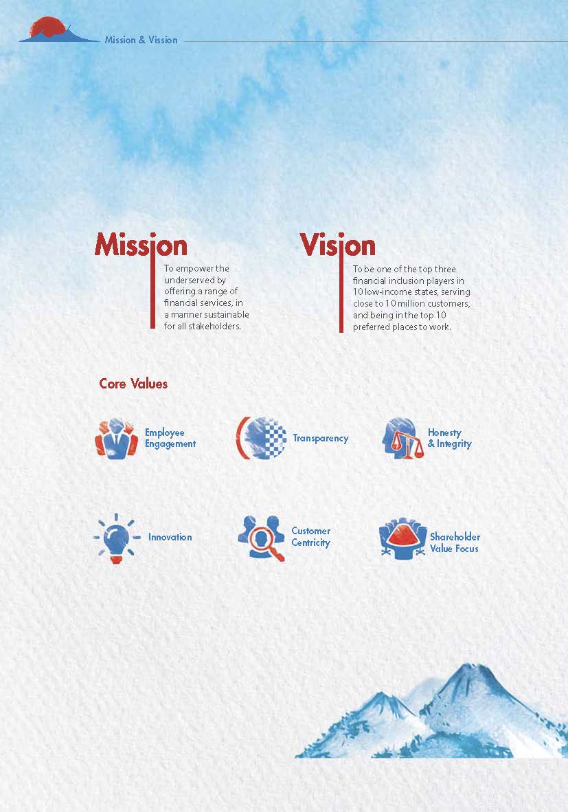
No matter your industry, your annual report can become a work of art—if you use a little creativity. That’s exactly what we see in the 2018 Arohan Annual Report. This microfinance company turned their report into an artist’s sketchbook. Through beautiful watercolor illustrations and sketches, they communicate important information in an aesthetically pleasing package. This is the perfect example of how a simple visual treatment can transform a report.
5) Seed Paper
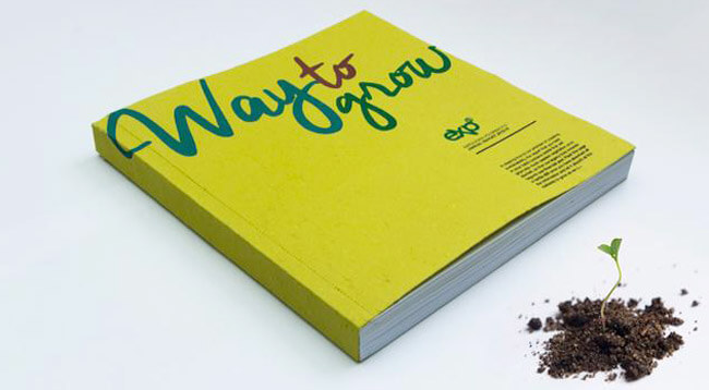
Expolanka’s 2016 Annual Report theme was “Ways to Grow,” as the company focused on planting the seeds of entrepreneurship across sectors. To bring this theme to life—literally—they printed the annual report using seed paper. Yep, you read that right. When they finished the report, readers could plant the cover page and chapter break pages, and watch it grow into new life. That gets an A+ for creativity.
6) Claymation
Video can be a great way to expand your reach and share the highlights of your annual report. As a companion to the Derbyshire County Council’s 2019 Public Health Annual Report, which focuses on helping the community live “stronger for longer,” the organization created a claymation video reinforcing the importance of health and directing people to the report for more tips.
7) Pop-Up Book
How do you make your design “pop”? Make it a pop-up book. That’s exactly what Malaysian nonprofit myHarapan did with their 2013 Annual Report. As a youth-focused nonprofit, this storybook approach was the perfect way to capture the brand’s personality—and communicate their story in a hard-to-resist package. (TBH, the organization creates an annual report masterpiece every year. Check out their full report gallery to geek out.)
8) Cards
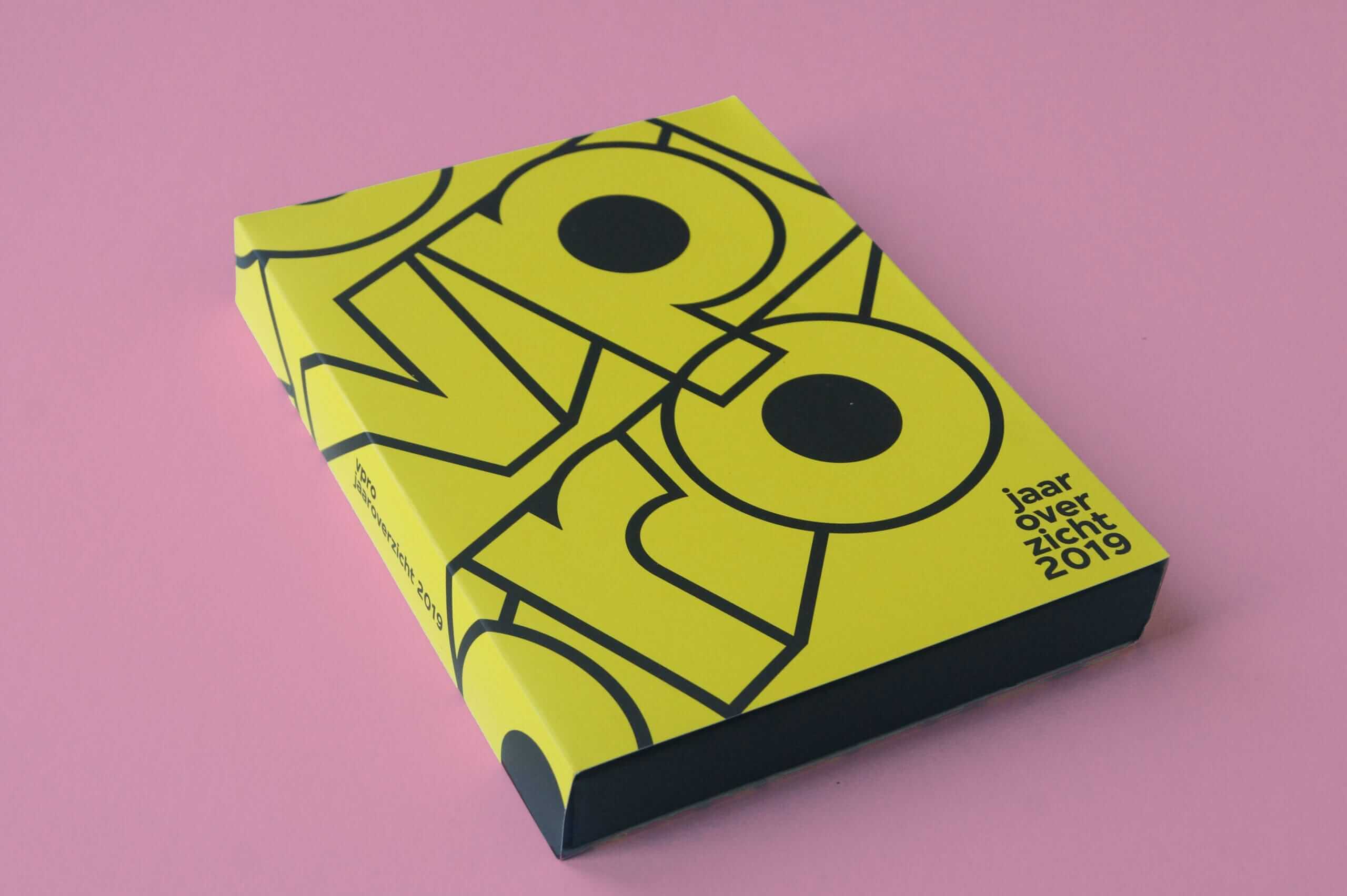
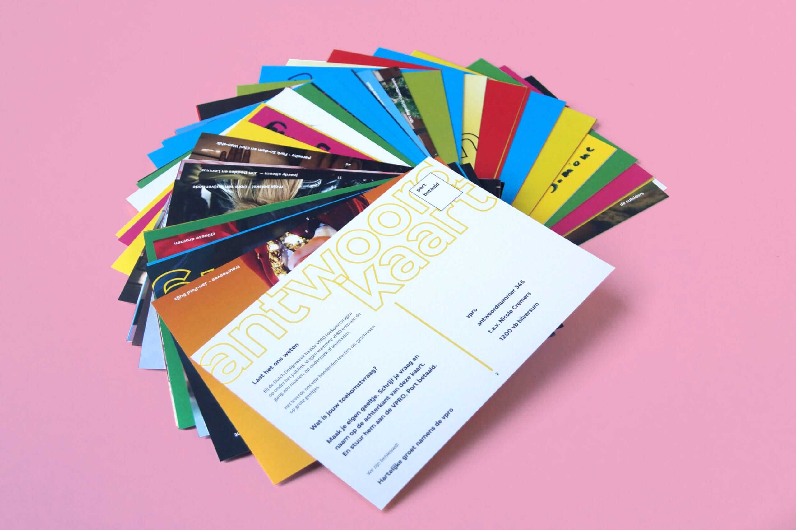
Annual reports can come in all sorts of packages—video, digital, and print. And while digital is increasingly common, there is something just irresistible about holding something in your hands, especially if it comes in a novel package. That’s why the 2019 VPRO Annual Review designed by Trapped in Suburbia caught our eye. Instead of a traditional bound book, it was designed as a stack of cards packaged in a gift box. This element of surprise is a great way to grab people’s attention and entice them to view all of the content.
9) Interactive Animation
Interactive annual reports are a great way to tell your story, and they allow you to communicate more info in a unique package. But a good interactive doesn’t just present the information to click through; it adds a little something extra. The Russian Railways 2019 Annual Report introduces an element of surprise with animated trains that move toward you as you scroll. Since the report theme was “picking up speed,” this was a perfect way to reinforce the narrative.

10) A Group Project
Sometimes you just don’t know what creative direction you want to go in with your annual report. For the 2020 MCB Annual Report, the company wanted bold visuals and an exciting visual treatment. But they couldn’t decide which agency to use. The solution? Ask a group of agencies to contribute to each portion. Using standard illustration, paint, fabric, thread, sculpture, food, photography, and more, the report ultimately became a visual feast for all.
How to Add More Creativity to Your Annual Report Design
As these examples show, the possibilities are endless when it comes to your annual report design. If you’re looking for more inspiration…
- Find out how to tell a strong story in your annual report.
- See how these 7 brands nailed their annual reports.
- Enjoy these 50 examples of annual report design.
And if you need someone to help you tell your story, bring in a pro. Follow our tips to find a good content agency, or hit us up. We’d love to talk.


