Your brand identity is one of the most powerful ways to communicate your brand’s essence: who you are, what you do, and how you do it. That makes it one of the best tools to help you tell your brand story—if you do it well. Unfortunately, many brands assume that their identity is effective, simply because they have one. Not so. If your identity isn’t cohesive or doesn’t accurately represent your brand, you’re providing a less than stellar customer experience (at best) or degrading your brand overall (at worst). That’s why it’s important to audit your brand from time to time to determine if it’s time for a brand refresh.
Not sure if yours is? Here are a few ways to find out.

10 Ways to Know if You Need a Brand Refresh
It’s easy to become stagnant if you’ve been doing the same thing for a long time. This is especially true if your brand has been around for a while.
That said, not every brand needs to change for the sake of change. We only recommend undertaking a brand refresh if you’re facing several of the issues below. And if you’re just struggling with one or two issues, you can follow our tips to fix ’em.)
1) Your Logo Isn’t Flexible
The world has changed. The Internet has introduced a whole new world of branding, and some brand’s logos are not well-suited for the unique format. For example, if your logo mark or word mark is overly detailed or too long, it might not fit nicely on a banner ad, homepage, or favicon. This can make it difficult to work with or design around. Ideally, you want a logo that’s clean, simple, and renders well at any resolution.
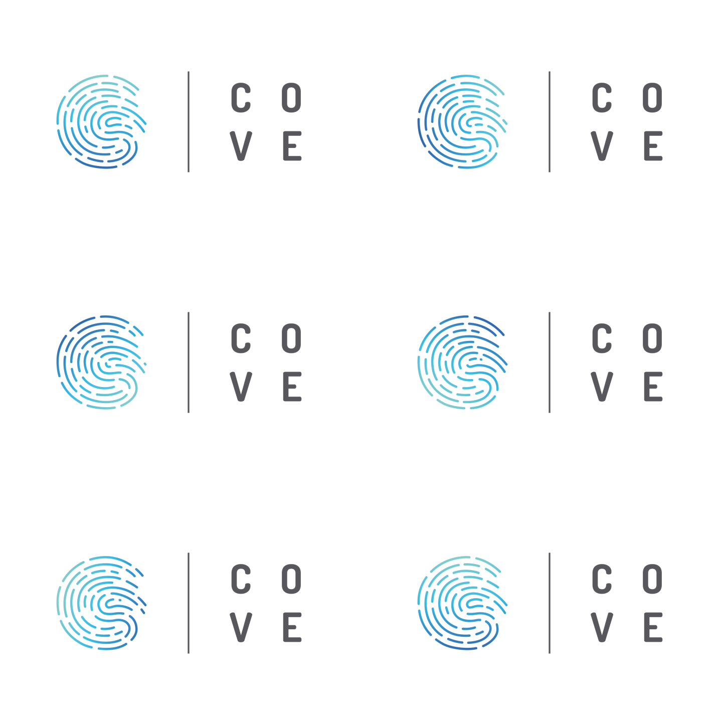
Example: When we helped UCI Applied Innovation create a fresh brand identity for The Cove, a new workspace for community and innovation, we designed both a static and animated logo that 1) reflects the dynamic brand and 2) can be used for multiple applications.

On a related note, some brands over rely on their logo because they have a limited visual identity. That type of excessive overbranding can turn people off. If you’ve been guilty of this, consider designing a full identity that gives you more tools to work with.
Tip: If you just need to tweak your logo, follow our simple process to design a logo you love with less stress.
2) Design Matters More Than Brand Experience
Some brands don’t just have a brand identity; they have a next-level aesthetic that’s great for an art exhibit but frustrating if you’re a user trying to find your contact button.
We’re all for beautiful design, but sometimes a brand’s artistic aspirations steamroll a user’s most basic needs. If your sleekly designed app is buggy or your groundbreaking site is all but impossible to navigate, people won’t stick around long enough to be impressed by your “innovative” design.
Tip: Look at your brand like a newcomer. If you knew nothing about your brand, would you instantly understand who you are, what you do, or how to navigate your site? If not, take steps to resolve these issues.
3) Your Brand Messaging Isn’t Working
To connect with people, you need to tell a clear and consistent brand story at every touchpoint. However, one of the biggest telltale signs of an ineffective brand identity is weak or inconsistent brand messaging.
Do you know your Brand Heart (purpose, vision, mission, values)? Do you talk about what you do effectively? Can you describe your brand succinctly? Do you know your brand stories (aka selling points) off the top of your head? Is that clear in the content you create? If not, it might be time to re-examine your brand identity.
Tip: Follow our guide to craft strong brand messaging, which also includes a free template. This will help you craft a tagline, value prop, and brand stories to create strong content that supports your brand goals. You can also see our guide to craft compelling copy that converts.
4) Your Brand Identity Is Visually Inconsistent
Here’s a quick and easy test. Go to your website, Instagram, and Facebook. If you take a quick look at all three, do you see a consistent visual language? Would a regular person instantly recognize the similarities? If not, your brand identity could probably use some work.
Remember: Your goal is to create a cohesive experience at all times, whether someone is reading your blog or checking your product page.
Example: Sleep brand Buffy has a strong brand identity that translates across properties, from their site to their Instagram.


Tip: Follow our guide to identify your brand personality, and use our visual identity checklist to design a comprehensive visual identity that lets you create strong content across mediums. (And for more inspiration, check out these 15 brands whose visual identity perfectly captures their personality.)
5) Your Packaging Is Outdated
This one seems obvious, but it’s shocking how many brands are stuck in the ‘90s. Lest we forget, there’s a difference between dated design and classic design. If your product has undergone several iterations but your design is a holdover from v1, a fresh identity may be in order.
Tip: There’s no point in redesigning packaging if the rest of your content is outdated. Find out how to do a full brand audit to see whether or not you should tackle a full brand refresh.
6) Your Brand Identity Looks Like Your Competition
Does your packaging stand out from your competitor? How about your website? Your logo? Your social presence? If you’re losing market share although nothing has changed, consider how your branding might play into that. Over time, it’s easy to blend in with a competitor (certain industries tend to suffer from hivemind), but a bold color palette or beautiful logo might be just the thing you need to stand out.
Tip: To figure out where you stand against your competitors, do a competitive analysis. This will help you identify opportunities to differentiate through your brand identity.
7) It Doesn’t Reflect Your Values
A strong brand is built on a strong core identity: your purpose, vision, mission, and values. If your brand never articulated those elements, or developed a brand identity long beforehand, it’s important to reassess whether or not your identity accurately reflects your brand.
Every visual element, from your logo to your typography, is an opportunity to communicate and reinforce who you are. If yours isn’t doing this effectively, it won’t resonate with people.
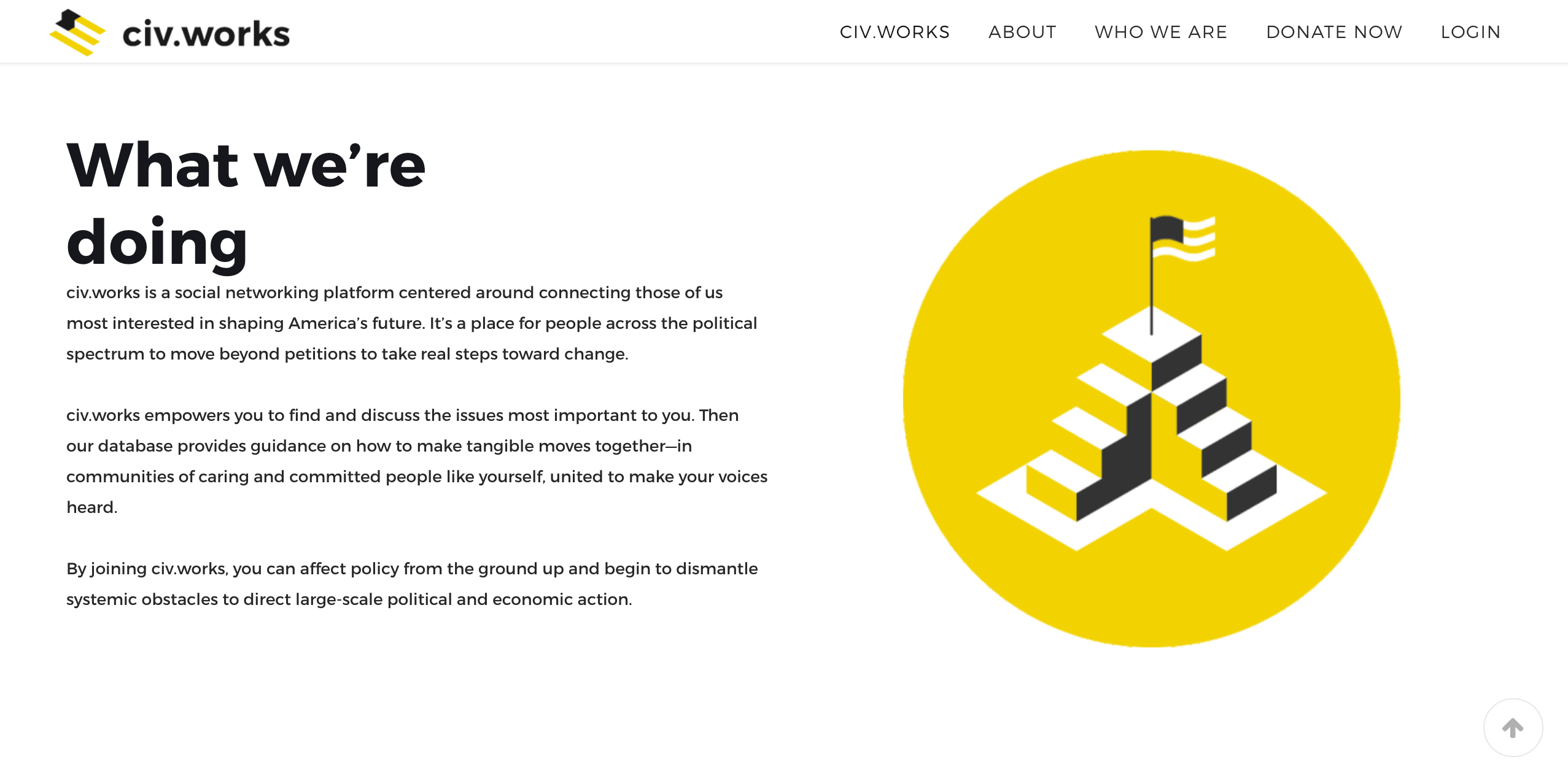
Example: We created a fresh brand identity for Civ.works, a social network that connects and empowers Americans to affect change. Drawing inspiration from the brand’s mission, their identity incorporates elements that reflect their values, from the hand-drawn founder illustrations that add a human element to the logo that renders the American flag as stairs, symbolizing steps toward change.

Tip: Use our free Brand Heart workbook to identify your purpose, vision, mission, and values. If you’re not sure how to incorporate your values into your visual identity or content, get inspired by these 10 brands that put their values front and center.
8) You Follow Too Many Design Trends
Sometimes some brands are a little too eager to adopt new design trends, creating a totally disjointed look. If you were using skeuomorphic styles, then hopped on the flat design train, you might need a fresh visual identity with a clean, cohesive look.
Tip: Follow these 7 tips to design a beautiful brand identity and create a cohesive identity across touchpoints.
9) Your Brand Is Expanding
A good brand identity is flexible enough to grow with your brand and strong enough to build upon it. Whether you’re launching an entirely new product line or targeting a new group of people, you likely need to adjust your strategy, and your brand identity should play a role in that.
For example, different cultures may react differently to certain imagery, or a specific type of consumer may demand different ways of interacting. (If you’re skewing younger, find out how design helps you communicate with Gen Z.)
Tip: Follow our guide to build a brand identity from the ground up. This will help you ensure you create a flexible and functional identity that can grow with you.
10) You Don’t Have a Brand Style Guide
This is the most obvious sign that you need a brand identity. If your brand has no guidelines at all (or they’re buried somewhere no one has ever seen), you can almost guarantee that your brand is all over the place.
Example: The brand style guide for SpeakUp Now clearly details how to use everything from images to color palettes to create a cohesive brand.
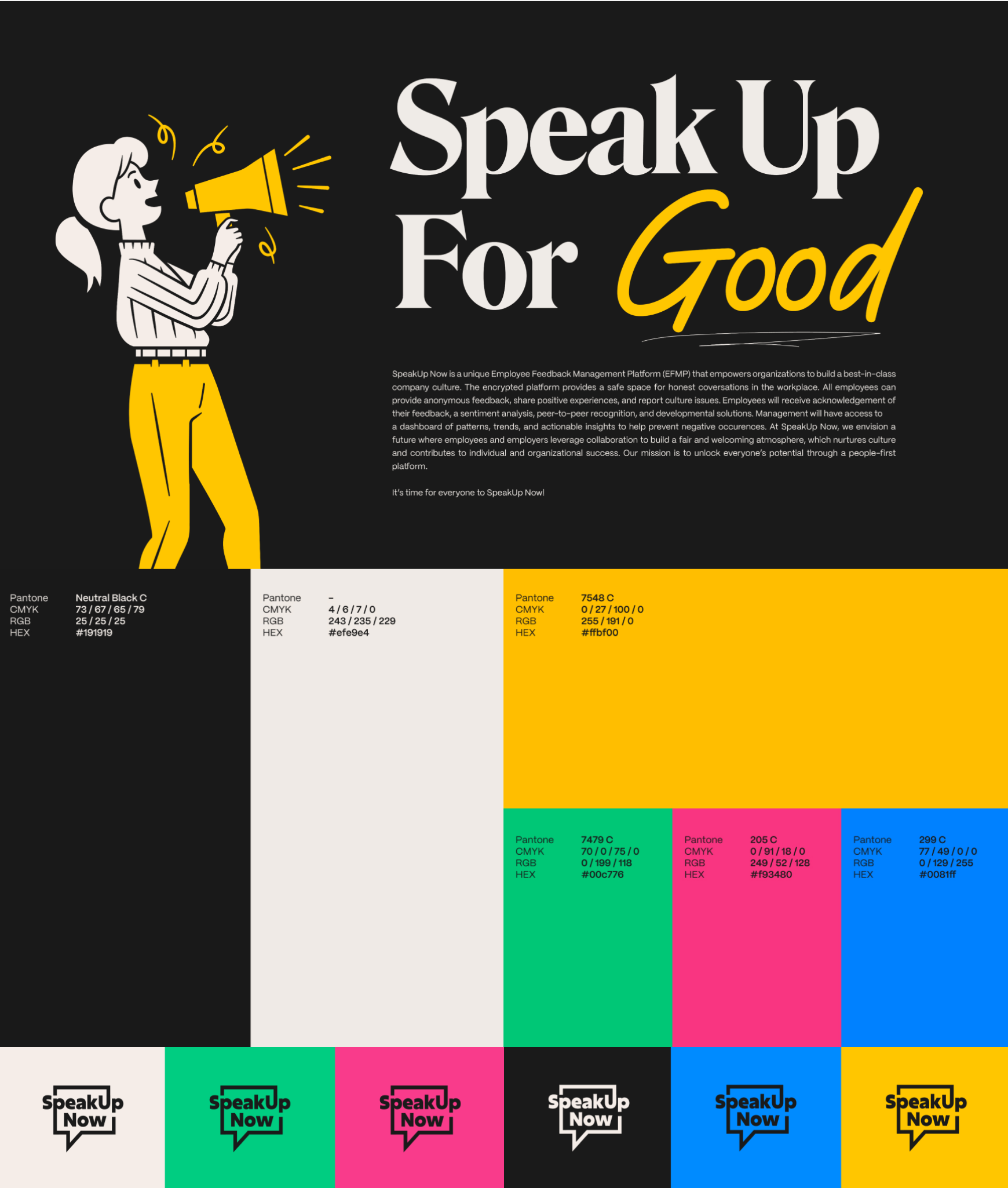

Tip: To get your team on the same page, try our step-by-step guide to build a style guide people will actually use.
How to Do a Brand Refresh
A new brand identity requires time, thought, and intention. Whether you go in-house or use a design agency, make sure you have a clear vision and sign-off on what you’re trying to achieve.
As for next steps…
- Know why you’re rebranding. If you’re still wondering if you should pursue a brand refresh, here are a few more reasons why you might want to.
- Start with your brand strategy. See our guide to complete your brand strategy to build a strong, healthy, and aligned brand from the jump.
- Follow best practices. Find out how to do a successful rebrand, and know what mistakes to avoid.
- Get inspired. Here are 25 amazing rebrand examples to show you how to do it the right way.
- Launch your rebrand successfully. Find out how to roll it out smoothly and effectively to eliminate confusion.
And if you’re overwhelmed by any stage of the process, let’s chat about how to get through it.
