Infographics are a powerful tool to help marketers communicate, hence they’ve grown in popularity over the last decade. Why do they work so well? In addition to helping your brain process content quicker, they’re visually appealing and highly shareable, which is why they come in handy for all sorts of applications, from presentations to content marketing. To us, however, a well-crafted infographic isn’t just a piece of content; it’s a thing of beauty. That’s why we’ve compiled some of our favorite infographic examples for your inspiration.
From how-tos to social issues, these infographics are awesome examples of how to do brand storytelling through a visual medium.
9 of the Best Infographic Examples
Whether you’re looking for general design inspiration or a few fresh content ideas, here are some of our favorite infographics, plus a few tips on how to put infographics to work for you.
1) A Well-Balanced Blog by LinkedIn
As the market becomes saturated with infographics, finding unique and creative ways to rise above the noise is essential. This LinkedIn infographic does just that in two ways.
First, it takes a thematic approach to the content. Rather than providing a matrix outlining when to post certain types of blog content, LinkedIn uses a visual metaphor to communicate the information. This helps make the subject matter more exciting and easier to understand.
Second, the use of photography is visually appealing. With photos of meats, vegetables, and grains, the infographic design takes on its own personality. What could be better? We’re left with a great resource that’s amazing to look at.

Pro tip: Take a cue from LinkedIn and mix up your design. It’s easy to get stuck in the same infographic style, but you don’t have to do the same thing over and over. From photography to line art, here are 7 different infographic styles to experiment with. You might also be inspired by these minimal infographic design examples.
2) The Sound Of Color by Kelly-Moore Paints
Choosing the right color is a challenge, whether you’re buying a new car or decorating your nursery. Kelly-Moore Paints knows this, so they came up with a brilliant idea: Why not choose a color based on your favorite music? It’s a novel and fun way to showcase their color expertise, but best of all, it’s also a beautiful infographic.
More conceptual art piece than infographic, this piece turned favorite albums into colorful data visualizations based on emotions experienced while listening to the music. The result is one of our infographic design examples.

Pro tip: This piece proves you can find plenty of creative ways to show off your brand, no matter your industry. If you and your team are stuck, here are 16 ways to think of infographic ideas. (For more data visualization inspired by things in everyday life, take a look at our coffee-themed data visualization poster.)
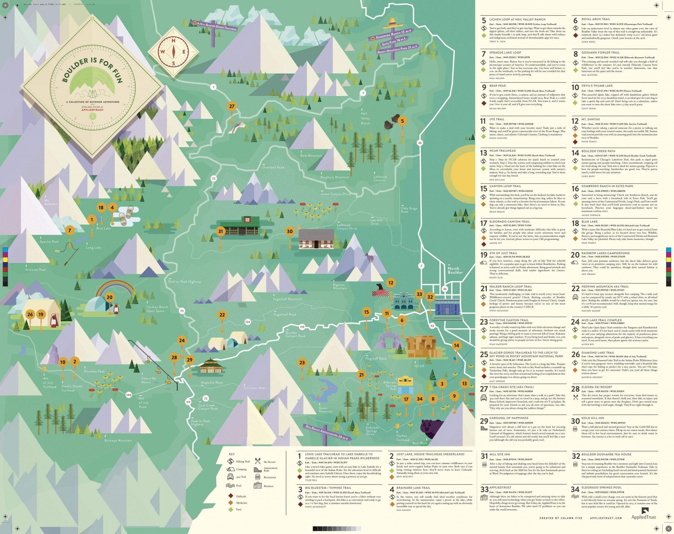
3) Boulder Is For Fun by AppliedTrust
You can’t have a roundup of infographic design examples without featuring a map of some kind. (We’re pretty sure it might be a law.) This infographic by AppliedTrust is a tourist’s guide to the nature trails of Boulder, Colorado, and it leaves us with some serious wanderlust.
With a bit of a retro style and intricate illustrations, this infographic proves a great practical resource for the hipster traveler in us all. So print this poster, stick it in your Herschel bag next to your Toms shoes, and get ready for one happy adventure in The Centennial State.
Pro tip: As this piece proves, there are plenty of ways to turn info into visually appealing content. From press releases to annual reports, find out what type of content you can turn into an awesome infographic. (If you’re looking for more travel-related visualizations, check out our interactive map of San Diego.)
4) Carbs Are Killing You by Massive Health
We’ve all heard how curbing our fatty food consumption will help us lose weight. But according to this awesome infographic by Massive Health, carbs (not fats) may really be to blame.
This infographic does an excellent job of walking the reader through a somewhat complex process, while still maintaining a single takeaway: Fats don’t make us fat; carbs do. What’s more, visual learners can stand up and applaud the clear illustration style that accompanies it.

Pro tip: Great design is the key to elevating your infographics. Find out how to avoid the 15 most common infographic design mistakes. (If you’re looking for more health-related infographics, we have plenty for you to check out.)
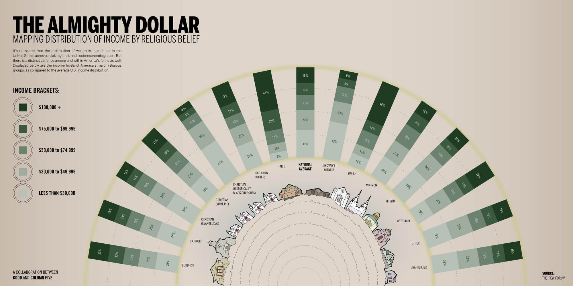
5) The Almighty Dollar by GOOD Magazine
Great infographic design starts at the content level, especially when you’re telling a story through data.
This infographic, produced by GOOD, examines income levels among different religious groups in the United States. With an unbiased approach, it does a fantastic job of visually presenting the data in a straightforward way—carefully opening up conversation around a somewhat touchy topic.
Pro tip: Great data visualization can do a lot to help people understand complicated data, but to do it well, you need to design data for clarity and comprehension. Find out how to design charts and graphs the right way before you attempt it, and follow these 25 tips to improve your data visualization.
6) How Marketers Create and Consume Content by NewsCred
Not all infographics have to be static. This NewsCred infographic (or infoGIF) proves this, as it visualizes the brand’s survey findings in a creative way.
The data visualization is presented along with animated illustrations that reflect the survey question. Even better, the graphic was designed modularly, allowing it to be sliced up into stand-alone panels, which can be published in blog posts, on social, etc.

Pro tip: Motion is always a visually engaging way to enhance content, whether on your blog or in your social feed. Try these 3 ways to animate your infographics and step up your game. You can even go a step further and turn your infographics into interactive experiences.
7) Ascend To New Heights In Content Marketing by Captora
A good infographic can enhance any subject, as this photo-heavy piece shows.
In this infographic, Captora breaks down the tracking tools and metrics that marketers find most useful for tracking the results of their content marketing strategy.
From a design perspective, the balance between photo elements and vector illustrations is visually stimulating, while the modular layout enables users to quickly find the content that interests them.

Pro tip: Even if you experiment with different infographic styles, remember that every infographic you create should fit your brand identity. Here’s how to make sure your infographics match your visual language so that you can express your creativity—but still stay on brand.
8) A Lyrical Good Time by Digit
Illustration can also be used well in infographics. For this infographic, financial company Digit had a unique concept: Tally up exactly how much a “good time” would cost, according to the lyrics of different songs.
The information is accompanied by detailed illustrations of all the trappings described in the songs, offering an entertaining (and slightly whimsical) presentation.
(Illustrations are a great technique for narrative storytelling in infographics. You might also take a look at this Course Hero series, which visualizes famous novels.)

Pro tip: Infographic inspiration can come from anywhere; what matters most is that it’s something that people will be interested in. To make sure your content connects, create marketing personas and vet your ideas through them.
9) Seeing Green by Digit
The topic of marijuana legalization is nothing new, but the conversation has shifted in recent years, as laws relax in various states throughout the U.S.
Taking a more journalistic approach to join the conversation, the folks at Digit sought to examine shifting public opinion, new taxation policies, and how global economies function under legal marijuana status.
Naturally, the infographic design is also a driving force behind the popularity of this graphic. Its subtle use of texture, clear breakdown of sections, and overall sharp design show how to use a visual theme (e.g., weed) but not overpower the graphic.

Pro tip: Timely topics can make great infographics if you approach them the right way. Find out how to newsjack your next infographic without being a jackass.
How to Make Better Infographics
To create great infographics, you need the time, skill, and creative capacity. Most importantly, you need the knowledge to execute them well—and efficiently. We’ve created thousands of infographics for brands, so we know what will make or break you along the way. To make sure you’re setting yourself up for success:
- Start with a creative brief. A good infographic always starts with a good brief. Use this infographic brief template to make sure you give your designers everything they need to execute the project well.
- Follow infographic best practices. There are tons of little things that can greatly improve your infographic process. Follow our step-by-step guide to make every stage of the process easier.
- Tell the right story. Download our free e-book The Content Marketer’s Guide to Data Storytelling for more storytelling tips.
- Work smarter. Bookmark this helpful roundup of 100+ tools and resources for making infographics.
- Get inspired. Check out these infographic design examples by brands who are doing content marketing the right way.
- Promote it well. Find out how to optimize your infographic for more traffic, or download The Ultimate Guide to Content Distribution.
Lastly, if your team is strapped for time, energy, or resources, you might consider using an infographic agency to help you create content at the volume you need. If you’re looking to outsource, here are 10 questions to ask an infographic agency, plus a few tips on how to work together once you find the right match. Of course, we’re always happy to chat about any of your infographic ideas.






Good information about powerpoint presentation
An excellent post, thank you!
Thanks much!
It’s hard to find well-informed people on this subject, but you sound like you know what you’re talking about! Thanks
https://donteventrytotouchme.tumblr.com/post/621043423280070656/httpsyoutubemlkb2-sbok
Thanks! We try 🙂
Nice post. I learn something more challenging on different blogs everyday. It will always be stimulating to read content from other writers and practice a little something from their store. I?d prefer to use some with the content on my blog whether you don?t mind. Natually I?ll give you a link on your web blog. Thanks for sharing.
sobaniec.pl
Hi, you can feel free to link to this blog from yours, so long as you are not directly reposting our content.
Nice Post. That infographic is beautiful! Keep it up
Thanks so much!
Great design and tips. As we are newly started coffee boutique in Sunshine Coast, We are working with a leading branding agency in Sunshine Coast to build our website. Currently, we need to design social media posts to reach our potential customers. Here I got great tips to design an infographic that attracts our customers. Thanks for sharing.
Nice post…
Designs are amazing. Infographics are a great way to make people understand easily.
Thanks
Thanks, Jason. Glad you like it.
CARBS DON’T MAKE US FAT! FAT DOES!
Great post, I apperciate it!
designlix.com
Glad to hear it!
Back in ’06 my instructor showed examples of a info graphics designer, a very good one, and I cannot remember the name. I searched for 30 mins with various keywords but nothing is ringing the bell. Can anyone throw out some well known names circa 2000 whose creative visualization for info graphics charts etc were exemplary?
Hi, Ed. You might be thinking of Nicholas Felton. (His site is http://feltron.com/)
Thanks for the interesting examples. I like animated gif and html5 infographics too as they can be more engaging, as long as they don’t distract. If you do an infographic search, you see just how bad most are. Too much pointless data, no focus, too busy and ugly with little engagement (see my post on content engagement http://gordcollins.com/marketing/visitor-engagement/ means they actually send visitors away. And it is important to get the piece’s UVP across right away!
Does an infographic actually have a chart in it or does the different information make up for there not being a graph (bar graph, line graph and etc).
Hi, Christina. Good question. An infographic doesn’t always have to have data. You can find out more about the differences between info design, data visualization, and infographics here: https://www.columnfivemedia.com/infographic.
Amazing infographic design this article is very useful for those who want to make his own Infographics videos and design and your website is best for those animators thanks for always posting new things.
These designs are awesome .. Carry on :p
Glad you like ’em!
Excellent infographic designs. Will be helpful for people who want to create their own infographic design. Thanks for sharing.
http://www.vectorartgraphicdesign.com/
this is so cool!
Thanks, Piper! Glad you enjoy it.
nice
Its not bad…pretty good 🙂