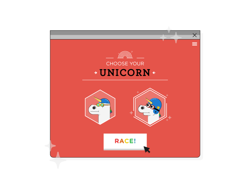
There’s a very simple way to get your audience to engage with your content: Give them engaging content. With an interactive infographic, you can do just that. The visual doesn’t start until that first button is pushed, and then it blossoms into a wondrous world of…well, anything you want, really. Interactive infographics have the capability to build a captivating narrative, execute it with precision, and offer your audience a guided or open tour of your choosing. It’s all up to you.

An interactive infographic can tell your story in more ways than you might imagine. When thinking about what you want to tell others, consider this:
1. An interactive infographic (can) say a lot.

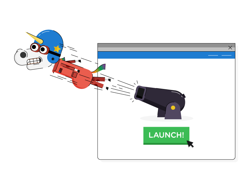
You don’t often consider the many when you see the whole. A building is a lot of bricks, a beach is a lot of sand, a rainbow is a lot of tiny adorable unicorns shooting from cannons across the sky. Similarly, interactive infographics are a lot of data focused on the sum of all parts: They distill the data without overwhelming your audience, since you never lay out all of the contents at once. The data presented in an interactive infographic is displayed collectively—enabling you to curate a fluid experience, regardless of the total amount of content. It’s a matter of creating a well-designed user interface to seamlessly navigate those pieces of data within the whole.
2. An interactive infographic is engaging.

If you’re in the mood for interaction and engagement, you’re usually better off driving in a demolition derby than watching from the sidelines. Interactive infographics are similar. Letting your audience drive instead of sitting them shotgun immediately ups their attention and dedication to your content. Just like listening to a speech isn’t the same as participating in a Q&A session, by inviting your audience to participate, they become immediately more aware and perceptive.
3. An interactive infographic is flexible.

Whether guiding the user through a narrative or creating an exploratory experience, you can program an interactive to direct the story you want in any direction you want it to go. From animation and filters to surveys and you name it, determining what methods you want to use to fascinate, intrigue, and inform your audience is up to you. With statics, you’re asking users to read. With motion graphics, you’re asking them to watch. With interactives, you’re asking them to become a variable, as you determine how much involvement you want from them and decide what the experience will be like.
4. An interactive infographic is immersive.

Let your narrative, its supporting content, and the world you’ve created swallow your audience whole. Empower users by letting them dive right in to explore for themselves. But don’t think of it like drowning in a pool of water. Instead, remember when you “swam” around the ball pit as a kid: big world around you, yet individual, colorful items to sift through everywhere. Destination-based storytelling is similar, enabling the user to travel various narrative paths so that it becomes an experience rather than a presentation. By the time they’re ready to leave the ball pit, they’ll remember how tactile the activity was and better remember your content for it.
5. An interactive infographics is easier to digest.

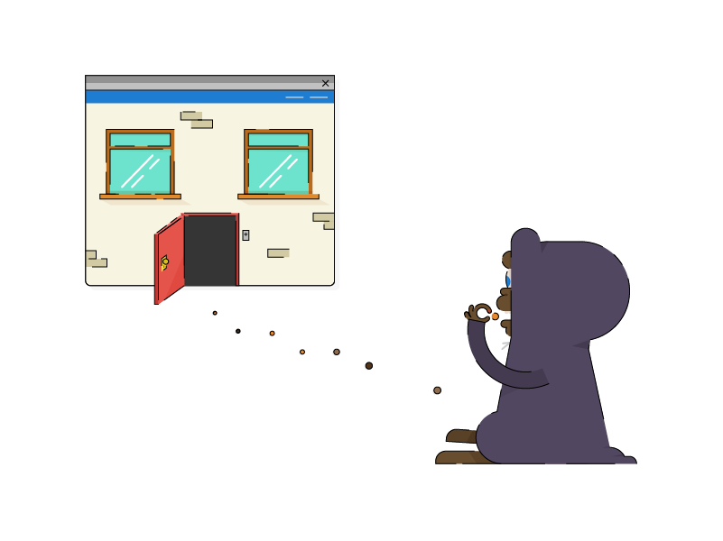
You can tell the full story, but you don’t have to do it all at once. Interactive infographics enable your audience to observe the big picture while taking in the little details. Breaking up the narrative screen by screen, topic by topic, or point by point helps the user to absorb information more consciously and/or in the order you determine. Think of Elliott luring E.T. into the house with a trail of Reese’s Pieces. If Elliott had just handed E.T. the whole bag of candy, would he still have come inside and ultimately taught the world about friendship beyond all imaginable borders?
6. An interactive infographic is gorgeous.

Interactives infographics are special because they balance between the worlds of stationary and activity. You don’t have to worry about how the interactive will print on paper. You don’t have to worry about how it’ll look in constant motion. You’re able to utilize the best techniques digital has to offer, crafting stunning visuals that come to life—like a party for your eyes. Interactives make data look sharp, words read clean, and illustrations appear complex yet unchallenging. Users will move through the interactive admiring the colorful and compulsive aesthetics before them.
7. An iteractive infographic is unique.

Good interactive infographics are revealing, vibrant, and impactful. They make data come alive and do it with style. They’re masterpieces of storytelling, design, and development. Expressive prose, slick artwork, and a fresh experience—there’s so much at play that when it all comes together, it feels orchestral. And it’s rare for two interactives to look or feel the same, let alone tell the same story.
In storytelling, all mediums have their time, place, and purpose. Whereas museums (statics) and movie theaters (motion graphics) hold the audience in somewhat more passive capacities, interactives are inherently livelier and more dynamic in nature. They necessitate involvement, participation, and action—interactives are like murder mystery dinner theater.
Remember: Don’t just hand your audience the content; give them the experience.
- Find out how to get the most mileage from your content by Maximizing Your Publishing with Microcontent.
- Learn everything you need to know about visual content in The Ultimate Guide to Visual Content Marketing.
- Get the most eyes on your content by reading The Ultimate Guide to Content Distribution.


