Good data storytelling can do wonders. It helps you find interesting insights. It helps you tell unique stories that people want to hear. And with beautiful data visualization, you can deliver that story, no matter how complex, in an easy-to-digest package. This is why data visualization is such a useful tool—and why it’s become so popular. But like many things, the more people do it, the more mistakes get made. This is a disservice not only to the practice but to the very people these data visualizations are for.
At the very least, bad data visualization is a nuisance. At worst, it can seriously hurt your readers’ trust in you, and, ultimately, your relationship. We are on a mission to rid the world of BS visualization, so we’re breaking down 6 ways to avoid the bad data visualization epidemic. Keep these in mind for your next project.
1) Use Really Good Data
Good data storytelling starts with good data. But in an “alternative facts” world, not all data is good data—and because people want to jump on the data train, they’re churning out infographics right and left with subpar sources. That is some major BS. So how do you know what counts as “good” data?
- It comes from a solid source: Data can be tricky because it can be easily misrepresented or inaccurately collected by organizations with an agenda. Source your data from trusted, credible sources. Even better, use your own internal data. Here are a few more tips on how to properly source data, as well as some great places to find data if you’re stuck.
- It’s clean and complete: Missing or incomplete data can affect your interpretation and throw things off. Before you dive in, clean and sort data so you know you’re working with the right stuff.
- It has a story: Just because you inject a few stats into a blog post doesn’t mean you’re really doing data storytelling. A great story lies in the interesting insights you extract from a data set. Follow our primer to find out how to find a story in your data. (It also has tips on cleaning your data, too.)
2) Tell the Full Story
It’s tempting to hone in on a single data point that supports a pre-conceived narrative, but if it doesn’t really fall in line with what the data is telling you, don’t present it as such. For example, let’s say your team saw a 50% increase in sales in Q1. Showing that increase alone makes it look like you’re killing it. But if you include the full set, including numbers from the previous quarter that show a 75% decrease in sales, it’s a very different story. Data helps you establish trust and build a relationship by showing readers information. Withholding or misrepresenting erodes that trust in a second.
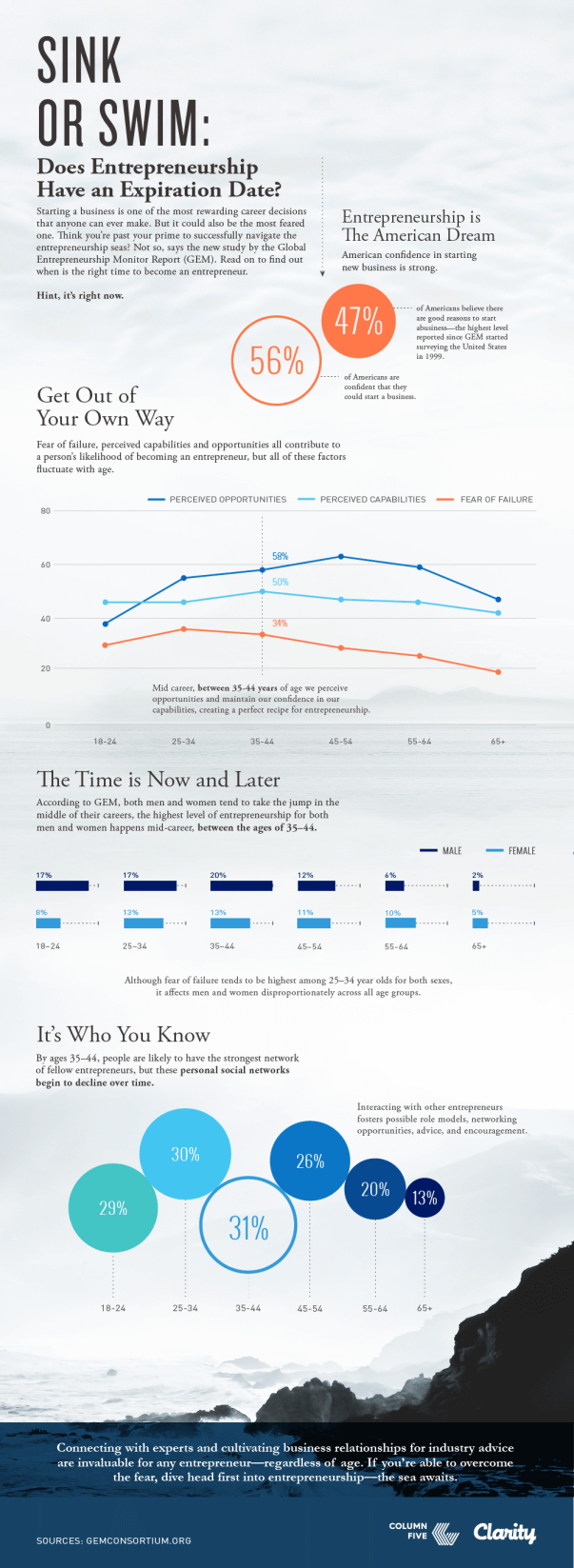
Example: We used data from the Clarity‘s Global Entrepreneurship Monitor Report to craft an interesting infographic about the ages that entrepreneurs are most likely to pursue their business. With that data, the reader was able to see the larger picture and identify where they land on the age spectrum.

3) Choose the Right Chart
We admire any designer who attempts data visualization—so long as they take the time to learn how to properly do it. (To start, check out our guide to designing the most common charts and graphs.) Choosing the right visualization is crucial not just to the aesthetic of your piece but also to your readers’ understanding. Did you know 3D charts can visually skew data? That patterns distract from the data? That negative numbers should never be represented with the color green? These may seem like pesky rules, but they do affect the way a chart is interpreted.
4) Don’t Make Your Reader Do More Work
Data visualization is all about making things easier to understand and interpret. But oftentimes little things can interrupt the experience, like when…
- A reader has to hunt for a chart legend
- The legend is so far away from the chart they have to keep looking back and forth to try to make sense of what they’re seeing
- Data that is meant to be compared is presented in two separate, difficult-to-compare charts (e.g., five pie charts side by side vs. two stacked bar charts together)
The beauty of data visualization is that you use the best of both worlds—design and text—to enhance. So let design do the heavy lifting where needed. After you design anything, give it a pass to see if anything may be added, removed, or condensed to improve comprehension. For more on this, see the 8 design mistakes you should avoid in your visual communication.
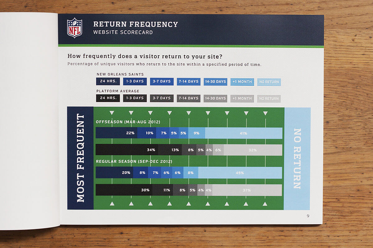
Example: We partnered with the NFL to produce print reports featuring data and analytics for each team’s web performance. Each report contained detailed information, presented in an appropriate visualization.

5) Ditch BS Chart Junk
Design can do a lot to enhance your data visualization. But too many designers care more about the design than the data. This results in a lot of unnecessary chart junk. These cluttered charts, filled with icons, illustrated characters, or outrageous creative “treatments,” make us cringe—definitely not the reaction you want.
6) Double Check E-V-E-R-Y-T-H-I-N-G
Obviously, you’re not willfully trying to sabotage your data visualization. But regular old carelessness is usually the cause of the biggest mistakes we see. (Remember the Fox News pie chart that totaled 193%?) Something always happens when data travels from spreadsheet to fully designed layout. That stray label, transposed number, or missing data point can throw everything out of whack. Things to keep an eye on:
- Labels: Are they all there, and do they match the data?
- Numbers: Do they match the original text?
- Visualizations: Do the bar charts match the data? Are bubbles sized proportionately? Is each segment on your pie chart accurate?
- Copy: Are chart labels, legends, etc. typo-free? Is anything cutoff or misplaced?
Always give it a final pass before you send it into the world.
Above all, if you really want to keep the BS out of your data visualization, always challenge yourself to improve your skills. To get started, here are a few more resources to keep you on your toes:
- Find out how to craft an effective data narrative.
- Learn how to pick the right visualization for your data.
- Follow design best practices for data visualization.
If you still need a little help with your data storytelling, we’d love to work together.


