It’s easy to fall into a rut with your creative content. When you stick to the “if it ain’t broke, don’t fix it” mentality, it can put you on the fast track to stale content—especially when it comes to design. One of the most exciting things about content marketing is that you have the freedom and flexibility to tell your brand story in a lot of different ways. That means exploring entirely new types of creative content and tweaking what you have to make sure you’re getting the most from it.
But if you churn out infographic after infographic with the same design style, or your visual tweets all follow the same template, then you definitely have room to grow. This is especially true for static content. Your content is fighting for attention, so breaking the mold and trying a new creative approach is not just eye-catching; it might be game-changing.
5 Creative Content Formats to Try in Your Marketing Design
There are lots of ways to upgrade your design and add a dash of something different. Sometimes that means trying an old-school style in new ways or using creative tools to make something exciting and different. If you’re not sure where to start but want to give your design team the greenlight to try something new, here are five of our favorite ways to mix it up.
1) Papercraft
This old-school art still feels new in modern iterations. (Trust us, this is not your grade-school origami.) Beautiful paper art can create a sense of childlike excitement, tell stories in unique ways, and generally delight viewers. You might incorporate papercraft into fun social content, videos, infographics, or more.
It’s important to use this art appropriately, however, as it can still be perceived as novel or fanciful. But if your message matches, then go nuts.
Example: We have some very talented papercrafters in house, and they’ve helped us experiment more with our creative content. One year we used a short papercraft video to announce that we were headed to South by Southwest. It was a fun way to show off our personality while delivering what could have otherwise been a mundane message.
2) Photography
Stock photography makes most of us wince. But photography certainly has its place in content marketing. While stock photography is boring, generic, and often just plain bad, custom photography can add an enticing element to content. Whether it’s used in infographics, visual tweets, or e-books, playing with photography is a great way to mix it up.
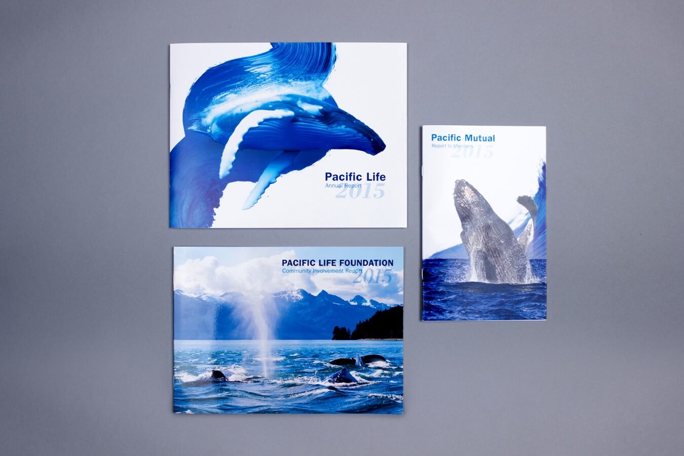
Example: We used stunning marine-themed imagery to reflect the vibrant, energetic brand persona of insurance company Pacific Life.
Even stock photography can be creatively used, as this infographic we created for Captora proves. The landscape photography turned data visualization adds interesting variety to an infographic that could have been simply illustrated.

3) Stop Motion
If all your videos follow the same format or aesthetic, you might consider mixing it up with some stop motion. (It’s not just for Tim Burton.) It’s especially useful for microcontent—think GIFS, in-feed ads, or short videos—or occasions where movement will help you stand out. But because it takes more time to produce, you might want to experiment with some small stuff first.
Example: To wish everyone a happy Fourth of July, we created a simple little stop-motion video for our Instagram (bonus points because it also featured a papercraft popsicle).
4) Tactile Data Visualization
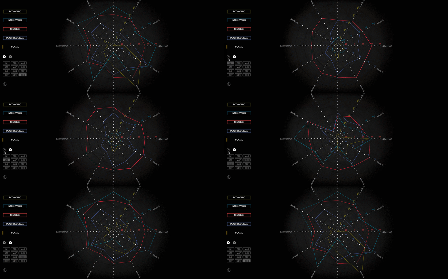
We are huge fans of data visualization—in every iteration. But we are especially excited by unique presentations. Charts and graphs are useful to help you interpret data, but they are often presented in the most simple, straightforward manner. While there’s nothing inherently wrong about that, it is a missed opportunity to let those data visualizations enhance the narrative (as all good design should).
There are many clever ways to craft data visualizations, but one of our favorite is to create tactile visualizations that, when photographed, can be added to both static and dynamic content.
Example: We created a unique annual report for krochet kids intl., a conscious clothing company. To help tell the brand story and create a unique aesthetic, we created data visualizations with thread, then photographed, animated, and incorporated them into the interactive report. This level of detail made the report more visually appealing and reinforced the brand’s mission.
5) Time Lapse
Sometimes the creation of something is just as compelling as the final product. That’s why time lapse is so exciting. Whether it’s a work in progress, the building of a project, or an experiment, we’ve pretty much all watched a few seconds of a time lapse just for the fascinating movement of time.
For content marketing, time lapse can be an awesome way to bring people into the process. You might give them a peek at a new project or use it to shape a narrative.
Example: We used time-lapse for our own brand video, where we hand-crafted words with different materials to spell out our values.
We also collaborated with Microsoft to create a mural timelapse in a brand video showcasing Internet Explorer.
Challenge Your Creative Boundaries
No matter how you decide to mix it up, always work to educate your team, follow best design practices, and figure out ways to provide the most value in your content. For a few more tips:
- Avoid these 8 design mistakes in your creative content
- Find out what 7 traits will make you a better marketer.
- Learn how to make creative content that provides true value to your audience
If you need a little more help with your creative content, we’d love to chat.







I have been reading out many of your stories and i can state clever stuff. I will definitely bookmark your site.
Happy to hear!