Your e-books are one of the most valuable pieces of communication you make. These lead-generation gems help you demonstrate your knowledge, educate your readers, and, hopefully, engage them enough to start a relationship with you. But they only work if you deliver the right info—in the right package.
And yet, few marketers truly put a premium on ebook design. This is a disservice to your content and your brand. Great ebook design isn’t just about the aesthetics; it’s about creating a better experience from cover to cover.

How Ebook Design Benefits Your Readers
By applying design principles, you can actually create a content experience that biologically compels people to engage with your content, helping you make the strongest impact possible. Why?
1) Great Ebook Design Makes People Want to Read Your Content
We’ve talked about the power of visual communication a lot. (Take a look at our guide to visual content marketing if you’ve missed it.) In essence, humans are biologically hardwired to process visual content. Our brains process it faster than text, we’re more stimulated when we see it, and it’s more memorable. It’s why we love movies and graphic novels. The same extends to marketing e-books.
A beautiful ebook cover or teaser image—just like a hardcover book design—stands out and piques your readers’ interest. This is especially important for promotion; when it shows up in a reader’s Facebook feed or on your website, you want it to catch their eye.
Sidenote: When you put in the work to make a piece of content, you want to make the most of it. A well-designed ebook can give you plenty. Visuals can be extracted and shared on social or used to enhance other pieces of content. (Try these 9 ways to turn your old ebook design into fresh content to get even more mileage out of it.)
Example: To help promote the LinkedIn Data Driven Recruiting e-book, we extracted content and turned it into an easily shareable infographic. This allowed the team to promo the ebook while providing useful information.

2) People Will Actually Remember Your E-Book
“Hear a piece of information, and three days later you’ll remember 10% of it. Add a picture, and you’ll remember 65%,” says John Medina says in Brain Rules.
When your brain processes visual content, it recalls stored information to help interpret what it’s seeing. Once it interprets what it’s seeing, it transmits that new information to your stored memory for later reference.
An ebook design based on the principles of visual communication is able to apply design elements in a way that makes it easier for your brain to comprehend. When done well by a skilled designer, things like hierarchy, imagery, data visualization, narrative flow, colors, and iconography turn every page into a valuable piece of communication optimized for maximum comprehension.
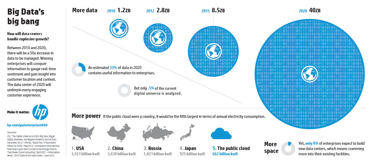
Example: We used plenty of data visualization in the ebook design we created for HP’s Enterprise 2020 report, helping make the numbers easier to understand.
3) Better Design Helps People Get Through Content Faster
Your reader’s time is more valuable than yours—remember that always. People don’t want to go hunting for a ton of articles online. They don’t want to wade through dense research or boring reports. They want an ebook because it contains everything they want to know in a single piece of content.
If you present them with bad ebook design—a page of dense text in a tiny font, pointless pages to click through—you steal time and energy that your reader does not have.
But applying good design principles lets you create an experience that makes it easier for them to get in, get out, and get on with their day. Most importantly, they’ll remember how useful and easy it was to get that information, and they’ll be far more eager to come back to you next time they need to know something. And that is the key to building the relationship you want. (To make sure you create the best design, avoid these 30 ebook design mistakes.)
Example: We teamed up with Salesforce to create an interactive ebook detailing the findings of the 2017 Connected Banking Customer Report. The interactive design allowed readers to easily explore the data to access the information most relevant to them. 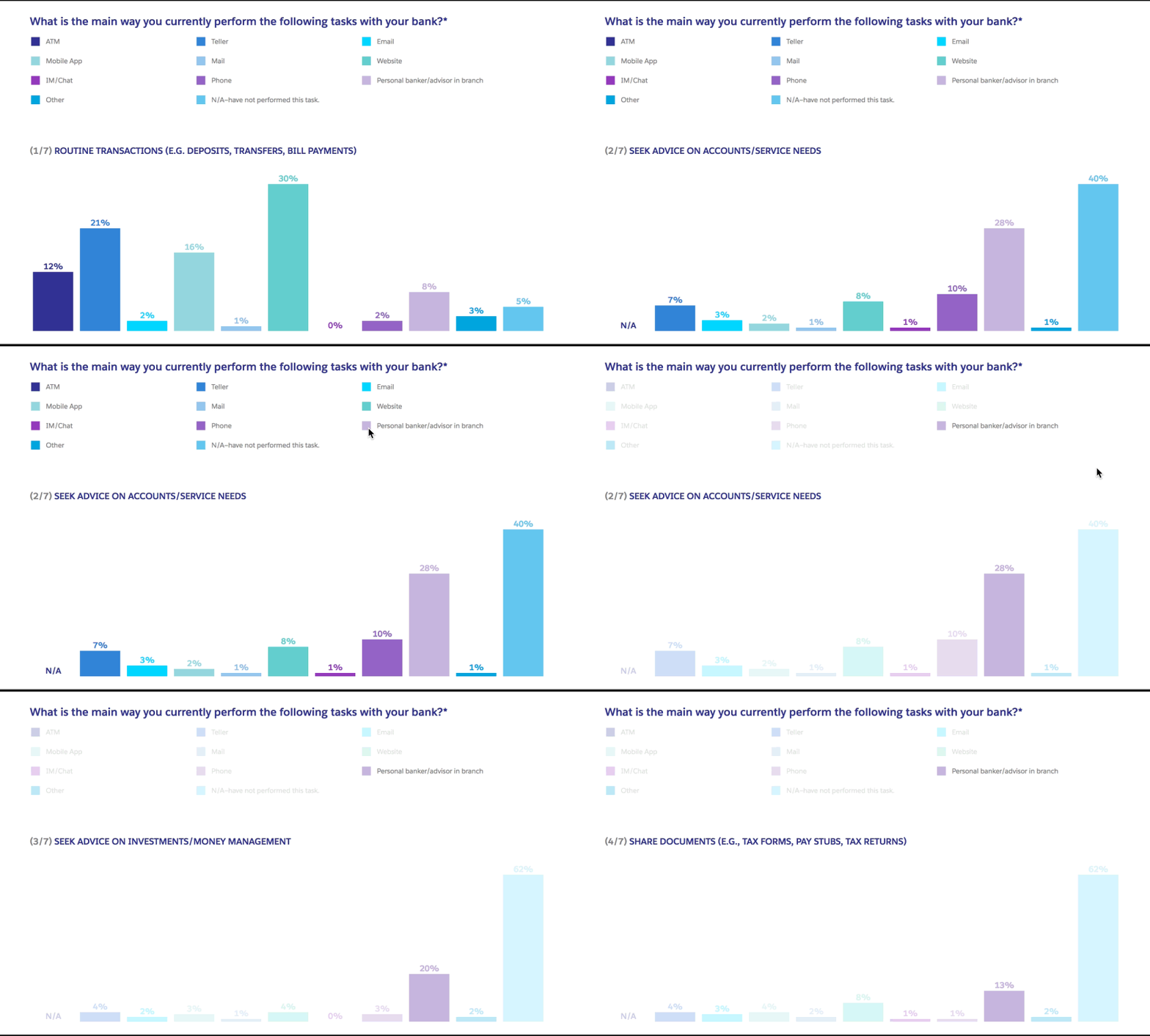
How Ebook Design Benefits Your Brand
Great ebook design isn’t just a service to your readers; it helps you cultivate stronger connections with them.
4) It Strengthens Your Branding
Every piece of communication gives you an opportunity to show off who you are and what you’re about. An ebook does this as much—if not more—than any other piece of content. Through ebook design, you can express your visual language in every element.
Beyond the words you use, things like color and imagery influence the reader’s experience. Are you fun and playful? Serious and sophisticated? Good ebook design reflects and reiterates that. (If you don’t have a visual language, find out how to build a brand style guide that includes one.)
Example: We helped Google bring their Trust/SMB Whitepaper to life in an e-book. Using the brand’s iconic colors and light-hearted imagery, we created a piece that encapsulates the brand’s personality.

5) Strong Design Demonstrates Credibility
This seems shallow, but it’s important to take seriously. Good design lends an air of legitimacy to anything. It’s why we inherently gravitate to one brand over the other. When you invest in good ebook design, you show that you are professional, trustworthy, and serious about what you do. This makes readers perceive it as more valuable, too. Even if you have a playful brand, making the most of your creativity will attract the people who are interested in what you do.
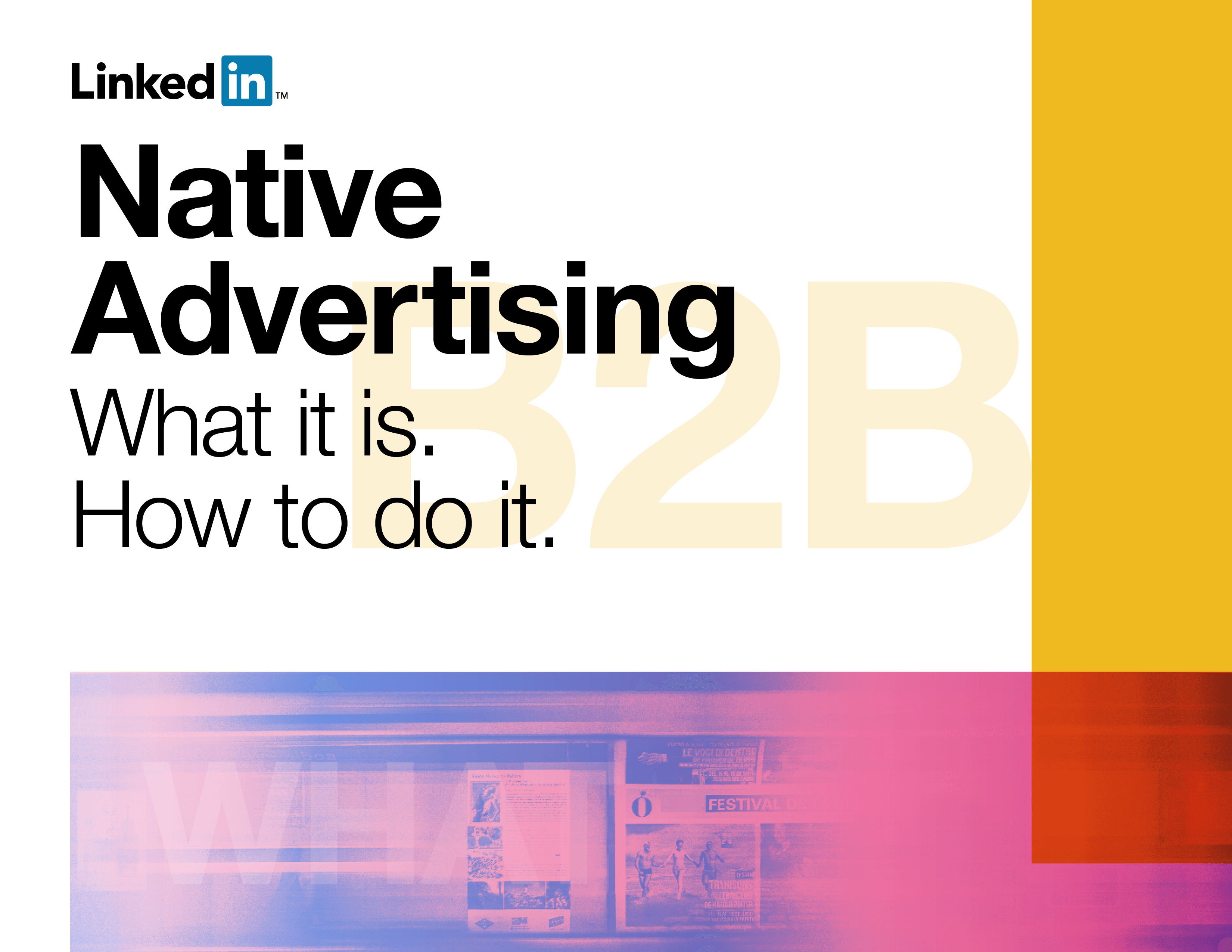
Example: We partnered with LinkedIn Marketing Solutions to create an ebook about native advertising. As such, the cover conveys the subject directly and simply, presented in a clean, professional visual, demonstrating LinkedIn’s authority and expertise.
6) Good Ebook Design Is Easy to Replicate
While e-books are fantastic content marketing tools, many marketers can’t produce them as often as they’d like because they take a lot of resources to create. But good ebook design doesn’t have to take long at all. You can easily create ebook design templates that cut design time in half, saving money and energy while ensuring that you always create content that is on brand. (Follow this 3-step process to build out templates that are easy for anyone to use.)
How to Make the Most of Your E-Books
Whether you make several e-books a year or just one to support a major campaign, make sure your content is optimized to make the most impact. Not sure where to start? Try our best tips, tricks, and resources for ebook creation:
- Bookmark these 101 tools and resources for ebook design, writing, and more.
- Find out how to design the most common charts and graphs.
- Get inspired by these awesome ebook design examples.
- Give your old e-books a makeover with these 6 easy fixes.
- Try these 10 ebook design tips to increase conversions.
And if you need an expert to help you out, let’s chat.
