Just the thought of reading a company’s annual report is enough to make most people’s eyes go blurry, but that doesn’t have to be the case. With a strong story, good design, and the right format, you can transform your company data, milestones, and highlights into an engaging piece of content that helps you cultivate stronger connections with your audience and generate more enthusiasm about your brand. But what do those types of annual reports look like? Well, you came to the right place.
7 Awesome Examples of Great Annual Reports
Any brand can create a stellar report—even if you don’t feel particularly inspired, and even if you had a bad year (more on that later). To prove it, we’ve assembled some great examples of annual reports from brands across all industries. While they may have, what they have in common is a dash of creativity and an intimate understanding of how to turn facts into an interesting story.
1) MailChimp Annual Report (2020)
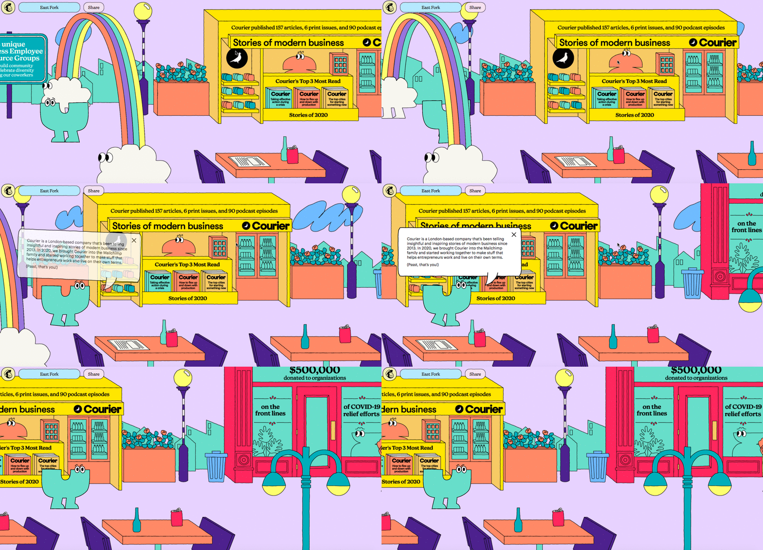
When it comes to great branding, MailChimp is always a winner. Not only do they manage to make sending email campaigns look like a load of fun but they turn their annual report into a genuinely entertaining adventure each year.
With bold colors and playful illustrations, their 2020 report is an interactive experience that feels more like a video game than a standard report. They include traditional annual report content (e.g., info about products and sales), but they also pepper in fun anecdotes about their culture and data about their value-based initiatives (e.g., number of zoom backgrounds created by employees and $500,000 donated to nonprofit organizations). The result is an interesting and entertaining recap of the year in a delightful package.
2) Toms Global Impact Report (2019)
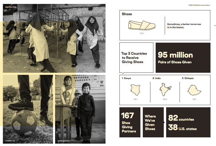
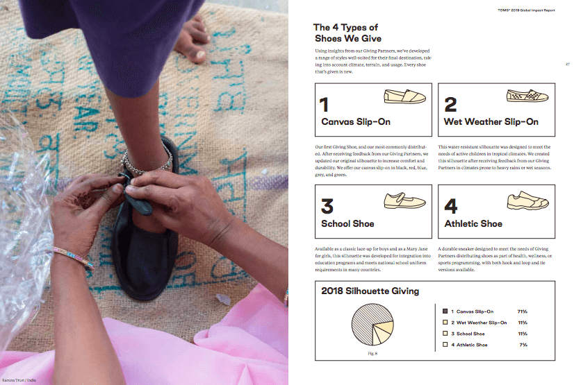
Even if a brand does good work, a boring report can overshadow the good they do. Toms makes the most of their global impact report by putting the people they help front and center while detailing exactly how they help them.
From clean water to shoes for school, the report educates the reader through impactful photography, data visualization, and deep dives into their various initiatives. The result is an impressive and, ultimately, inspiring report that makes you look forward to their next year of work.
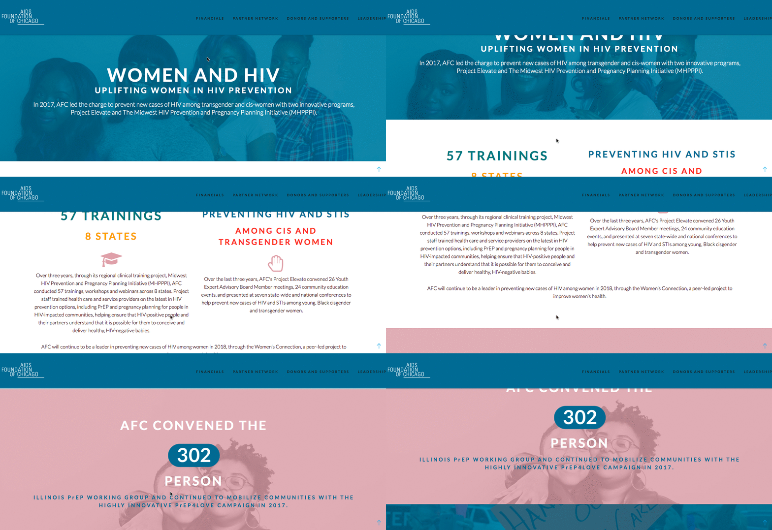
3) Aids Foundation of Chicago (2017)
One of the smartest ways to craft a narrative in your annual report is to choose an overarching theme. For the Aids Foundation of Chicago’s 2017 report, “positive momentum” is the rally cry (inspired by their Positive Momentum 3-year plan).
While their interactive site is far less flashy than Adidas’, it is grounded in human-centric storytelling that brings people together. Through audio clips, video interviews, and data, they highlight a year’s worth of successes in a sweet and simple way that shows people how their work translates to real life.
4) ASML Annual Report (2019)
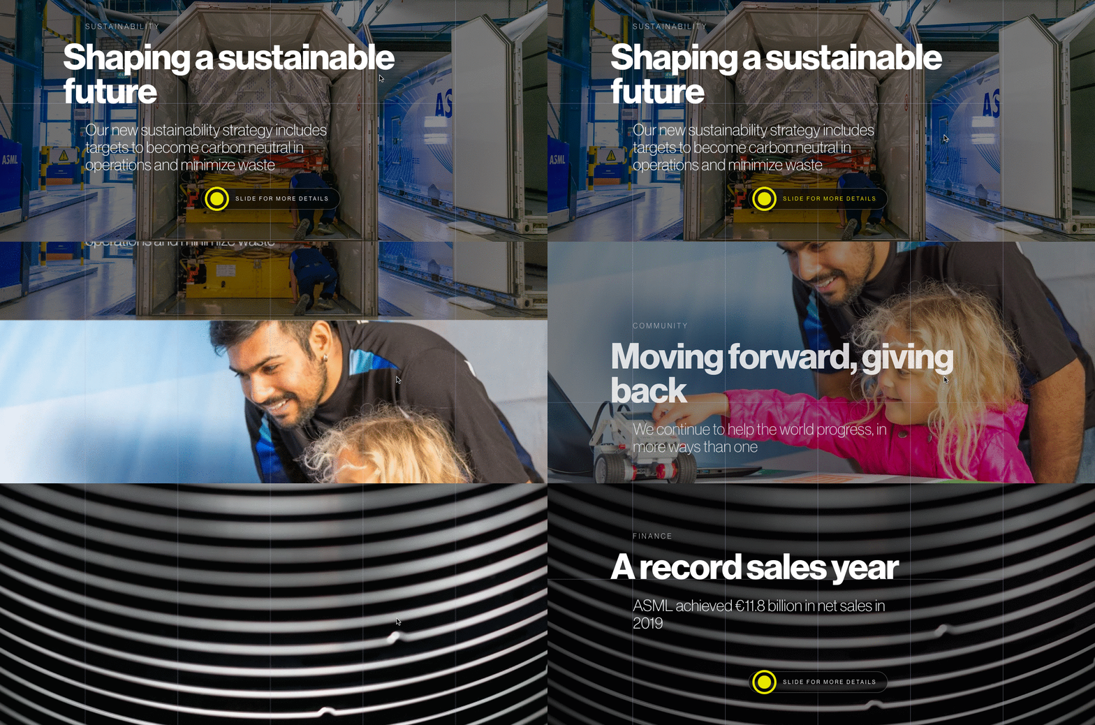
The semiconductor industry doesn’t sound particularly exciting or sexy, which is why this annual report is notable. Whereas most companies (especially in tech) default to dull stock photography and generic templates, ASML comes in with a strong and dare we say sexy interactive report that covers everything from sustainability and technology to their community and financials. They use just about every storytelling tool available too, including bold imagery, highlight video, and an interactive layout that lets you explore what you find most interesting. This presentation only reinforces their forward-thinking innovation, cultivating trust in the brand with every click.
5) California Water Service Annual Report (2018)
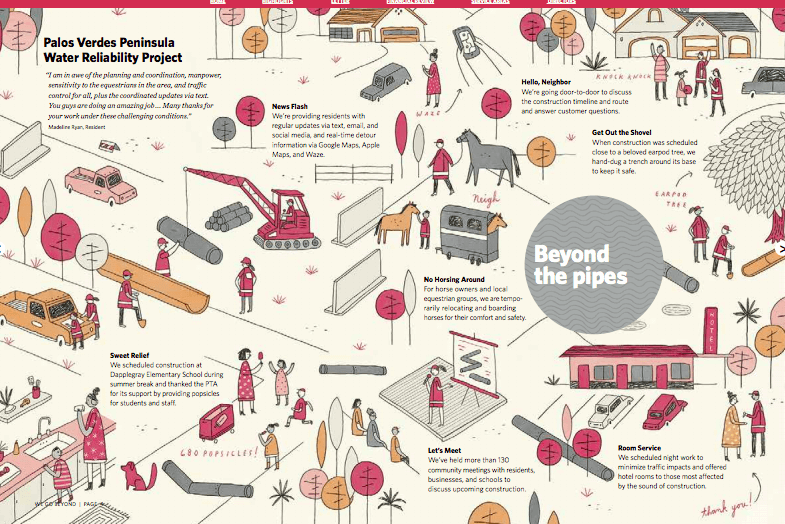
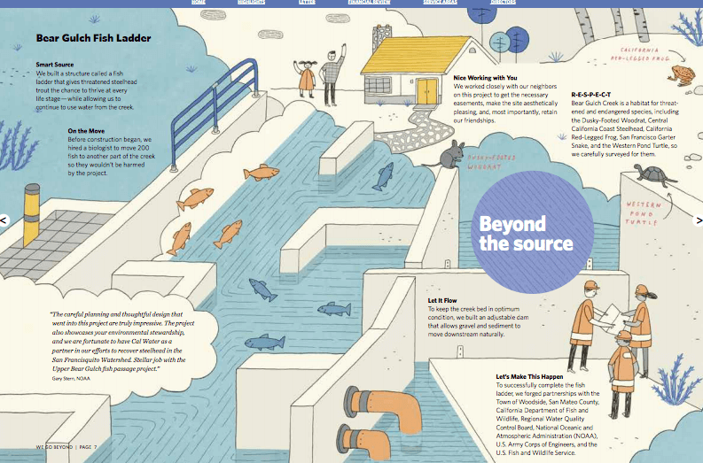
Much like the semiconductor industry, public utilities are not usually at the forefront of design, which is why the California Water Service’s report, well, blew us out of the water. They take storytelling seriously, with an illustrated report that feels more like a quality children’s book. Whether they’re telling us how a fish ladder works, how they help fight fires, or how one of their meter readers returned a lost wallet, they bring their work to life in meaningful ways.
6) Adidas Annual Report (2019)
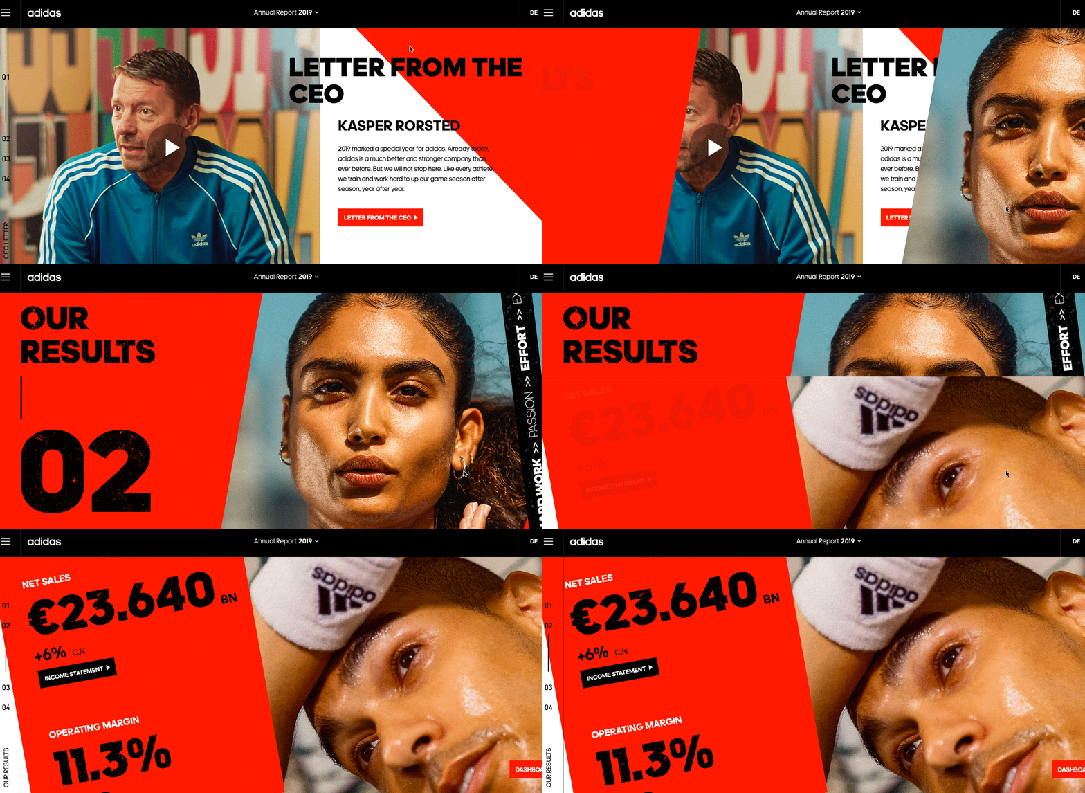
Adidas has an inherent design aesthetic, which is infused throughout their interactive annual report. In fact, the whole piece feels more like an editorial layout than a report. They use high-quality photography to add a sense of energy, as well as video to commemorate major milestones, such as their Beyonce Ivy Park collaboration. Simple features like their chart generator add an element of entertainment, while interactive animation adds physical motion to the experience. Overall the report tells the story of an energetic, dynamic brand that will continue to make waves.
7) Women For Women Annual Report (2019)
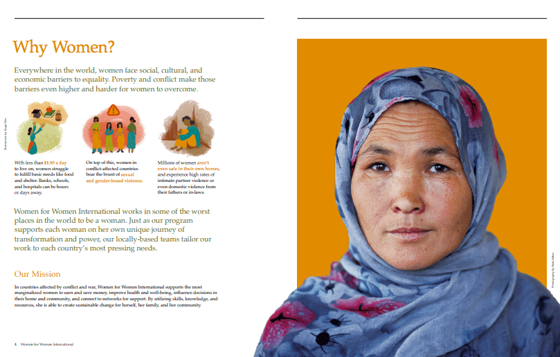
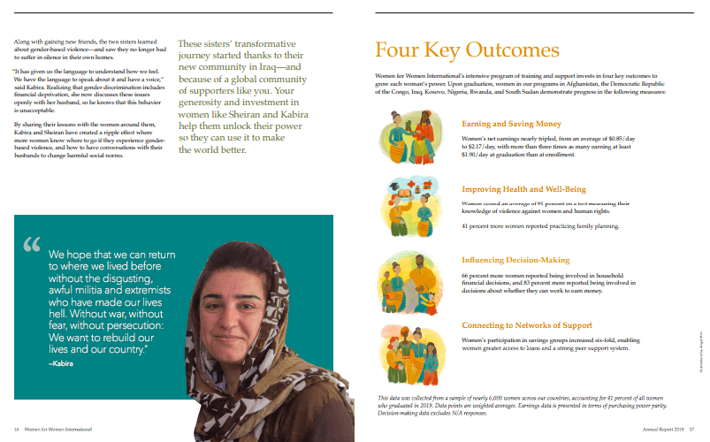
The more you provide context for your work, the more invested people will be in it. Women For Women’s annual report is about far more than their financial problems. From the global challenges facing women in different countries to the unique ways they are helping them overcome them, the organization does a fantastic job of humanizing the people they work for by telling their individual stories, sharing what they’ve found in their research, and outlining how they will continue to succeed going forward.
What About Your Next Report?
We hope these examples have given you something to think about as you approach your next annual report. That said, if you’re hungry for even more inspiration, check out these 50 awesome annual reports, and follow our guide to tell a strong story in your annual report.
But if you’re feeling a little overwhelmed, you don’t have to do it alone. Let’s chat about how we can bring your annual report to life.





I am seeking agencies who do annual reports. Did you produce these ARs? If not, do you have examples of ones that you have done that you can share with me?
Hi Ann, if you’re curious about working with us, feel free to reach out here: https://www.columnfivemedia.com/contact