A brand identity is an important tool to help your brand communicate, but just because you have one doesn’t mean it’s effective. There are many things, large and small, that can sabotage your brand identity design, from sloppy design to indecipherable text. These simple oversights, whether intentional or not, make it difficult to build a consistent brand identity that connects with people. Worse, many brands (we’re talking global brands) don’t even know they’re making these mistakes. Not sure if you’re one of them? You’re about to find out.
The Biggest Mistakes in Brand Identity Design
Here, we’ve compiled the most common brand identity design issues we see, along with our best tips to help you upgrade your identity, differentiate your brand, and connect with the right people.

Mistake 1: Not Knowing Who You’re Trying to Reach
Designing a strong visual identity isn’t about what you want; it’s how you want to be perceived. The better you communicate who you are, the more authentically you can connect with people.
But if your brand identity isn’t aligned to your true identity, and it doesn’t resonate with the right people, it won’t be successful about (no matter how pretty your logo is).
The Fix: To communicate honestly, you need to know who you really are (and, thus, how you want to be perceived). Start by using our Brand Heart workbook to articulate your brand’s purpose, vision, mission, and values. This will help you realign your brand identity to your core principles.
You should also create marketing personas to get insight into who your target customer is, what they think, and what entices them. With both your Brand Heart and your personas articulated, you can tweak your brand identity to deliver the right message to the right people.
Mistake 2: A Meaningless Logo
Logos are super fun to design, but they can also be a huge headache. Sure, you can design something pretty and call it a day. But a really strong logo supports and reinforces your brand’s core identity, mission, and business. If you can’t connect your logo to your brand, it’s time to refresh.
Of course, logo design takes a lot of deep thinking and serious brainstorming. (FYI, we’re used to designing at least 50 options for a brand—just to start.)
The Fix: If you’re struggling to come up with a logo that connects to your brand, try our simple process to find a logo you love, and find out what logo design mistakes to avoid.
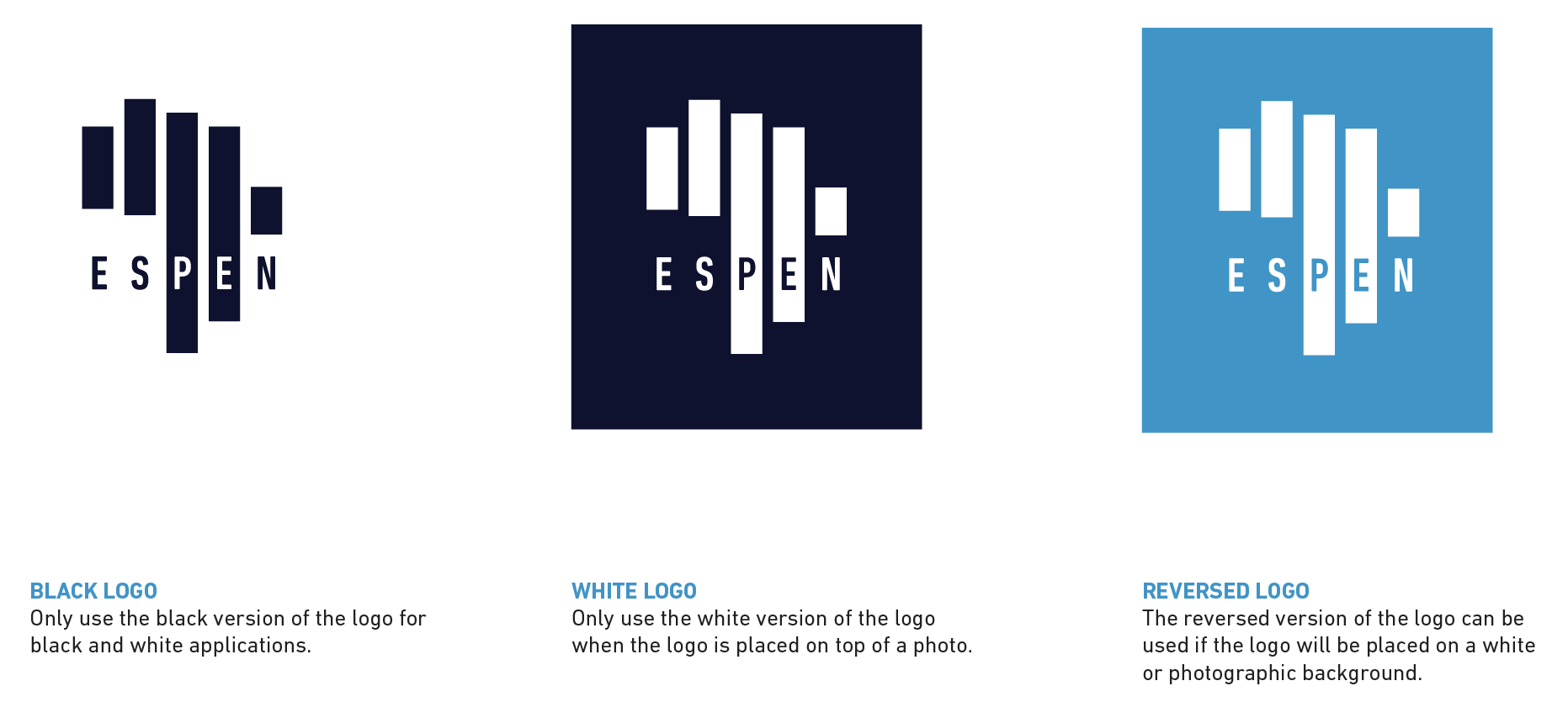
Example: We created a new visual brand identity for the Expanded Special Project for Elimination of Neglected Tropical Diseases(ESPEN), a WHO organization on a mission to eliminate five specific tropical diseases. To bring their mission to life, we created a symbolic logo that features a rendering of the African continent, made of five bars: one for each disease they’re battling.
Mistake 3: A Limited Visual Brand Identity
Your visual identity is meant to help you communicate effectively in many use cases. As such, you need to give your designers the tools they need to create on-brand content, no matter the medium. If you don’t provide these guidelines (and leave them to their own devices), you’re sure to end up with inconsistent content.
The Fix: You might not need an encyclopedia-thick brand bible for your lean startup, but it’s important to give your team guidelines for the basics, including:
- Logo
- Colors
- Fonts and typography
- Hierarchy
- Photography
- Illustration
- Iconography
- Data visualization
- Interactive elements
- Video and motion
- Web design
For more tips on designing these elements, follow our guide to designing a memorable brand identity (based on science), and use our handy visual identity checklist.
Mistake 4: Clunky Web Design
A good brand identity isn’t just robust; it features intuitive design. Indecipherable favicons, unresponsive websites, low-res images—these are the types of things that can make people turn away (and degrade your brand experience).
The Fix: Whether you’re designing your logo or your website, consider various use cases and user experiences. Will your logo render well as a small social profile pic? Is that new interactive infographic mobile-responsive? These are the crucial questions to ask.
Mistake 5: Inconsistent Elements
Just because you designed a logo, combined some colors, and chose a typeface doesn’t mean your visual brand identity is cohesive. If you want to create a unified experience, you need to design every element as a complement to the other.
The Fix: Start with your logo, then flesh out each element from there. Your typeface should work well with your logo (e.g., character shape and personality). Similarly, your colors should work well with your typeface (e.g., not too light to read).
Mistake 6: No Diversity in Imagery
No, we’re not talking about image styles. We’re talking about the people and/or characters you’re depicting, whether it’s in photographs or illustrations. It’s easy to fall into a rut, creating the same things over and over simply out of habit. But representation is important. Think about what the imagery you use says about your brand, your values, etc.
The Fix: Be mindful of diversity (age, race, gender, etc.) in the images you choose. Include specific direction in your brand guidelines, and give your team easy access to an image library that reflects your brand. Check out these 101+ tools to build a brand identity (including free stock sites) to find them.
Mistake 7: Poor Typography
Typography can enhance or hinder your brand experience. If things are too cluttered, indecipherable, or overwhelming, you’re only doing yourself a disservice. This is often an issue for online content, and it is one of the easiest ways to turn people off.
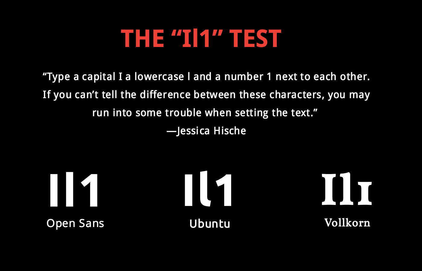
The Fix: To ensure your typography is always legible, try this clever test as recommended by lettering artist Jessica Hische:
For more tips on selecting the right font pairings, see our guide to find the right typography for your brand
Mistake 8: No Design System
Much like designing a piecemeal brand identity with no cohesion, brands are also guilty of lacking a proper design system. It’s not just about the parts; it’s about how they go together.
The Fix: Is there an intuitive hierarchy? Can people navigate your content easily? Designate the proper order of content, including headers, subheaders, body copy, images, blurbs, etc.
Mistake 9: Too Many Colors
This is one of the most common rookie mistakes (and a tell tale sign that you let an intern design your brand identity). Luckily, it’s easily remedied.
The Fix: Simplify it with:
- 2 primary colors
- 3-5 complementary colors
- 2 accent colors
For more tips on curating the proper palette, follow our guide to choose the right colors
Mistake 10: Indecipherable Icons
Icons make life easier because they’re a visual cue to communicate quickly and effectively—without words. Therefore, simplicity and clarity are key. Unfortunately, too many brands get carried away with icons that are either redundant or too abstract to understand.
The Fix: If you’re not sure, have someone do a sanity check to confirm your icons are intuitive and appropriate.
Example: We collaborated with Avalere Health to create custom iconography for its health care-related content.
Mistake 11: Inaccurate Data Visualization
Thanks to the explosion of big data, brands are communicating with data more than ever. Data visualization is a powerful tool to make data easier to comprehend, but it can also do a lot of damage when data is misinterpreted or inaccurately represented.
The Fix: To make sure your data visualization is correct, use our Data Visualization 101 guide to design the most common charts and graphs.
Mistake 12: No Brand Style Guide
One of the biggest reasons brands struggle to preserve their brand identity is because their content is consistently…inconsistent. Content creators are either “expected to know” how to apply their brand guidelines, or they’re left to their own devices. When this happens, it’s no surprise that content ends up looking Frankenstein-ed.
The Fix: To keep your team on the same page, document your brand guidelines, and makes sure to include various examples that demonstrate proper application.
More Tips for Creating A Strong Brand Identity Design
If you’re starting from square one, don’t be overwhelmed. Creating a good visual identity is a collaborative process, so make the most of your team’s creativity.
A few ways to do that:
- Learn to collaborate with fellow creatives. Find out how to work with 4 different types of creative thinkers.
- Follow best practices. Try these 7 tips to build a beautiful brand identity.
- See how other brands do it. Get inspired by these 15 brands with a visual identity that perfectly captures their personality.
- Use shortcuts. Bookmark these 75 tools to help you build a great brand identity.
But if you’re struggling, don’t be afraid to ask for help. Find out what it’s like to work with us on your brand identity or holler at us.
